When software – like Excel – hampers scientific research

Statistical software can be very helpful but it does not automatically guarantee correct analyses:

A team of Australian researchers analyzed nearly 3,600 genetics papers published in a number of leading scientific journals — like Nature, Science and PLoS One. As is common practice in the field, these papers all came with supplementary files containing lists of genes used in the research.

The Australian researchers found that roughly 1 in 5 of these papers included errors in their gene lists that were due to Excel automatically converting gene names to things like calendar dates or random numbers…

Genetics isn’t the only field where a life’s work can potentially be undermined by a spreadsheet error. Harvard economists Carmen Reinhart and Kenneth Rogoff famously made an Excel goof — omitting a few rows of data from a calculation — that caused them to drastically overstate the negative GDP impact of high debt burdens. Researchers in other fields occasionally have to issue retractions after finding Excel errors as well…

For the time being, the only fix for the issue is for researchers and journal editors to remain vigilant when working with their data files. Even better, they could abandon Excel completely in favor of programs and languages that were built for statistical research, like R and Python.

Excel has particular autoformatting issues but all statistical programs have unique ways of handling data. Spreadsheets of data – often formatted with cases in the rows and variables in the columns – don’t automatically read in correctly.

Additionally, user error can lead to issues with any sort of statistical software. Different programs may have different quirks but various researchers can do all sort of weird things from recoding incorrectly to misreading missing data to misinterpreting results. Data doesn’t analyze itself and statistical software is just a tool that needs to be used correctly.

A number of researchers have in recent years called for open data once a paper is published and this could help those in an academic field spot mistakes. Of course, the best solution is to double-check (at least) data before review and publication. Yet, when you are buried in a quantitative project and there are dozens of steps of data work and analysis, it can be hard to (1) keep track of everything and (2) closely watch for errors. Perhaps we need independent data review even before publication.

Scientists have difficulty explaining p-values

Scientists regularly use p-values to evaluate their findings but apparently have difficulty explain exactly what they mean:

To be clear, everyone I spoke with at METRICS could tell me the technical definition of a p-value — the probability of getting results at least as extreme as the ones you observed, given that the null hypothesis is correct — but almost no one could translate that into something easy to understand.

It’s not their fault, said Steven Goodman, co-director of METRICS. Even after spending his “entire career” thinking about p-values, he said he could tell me the definition, “but I cannot tell you what it means, and almost nobody can.” Scientists regularly get it wrong, and so do most textbooks, he said. When Goodman speaks to large audiences of scientists, he often presents correct and incorrect definitions of the p-value, and they “very confidently” raise their hand for the wrong answer. “Almost all of them think it gives some direct information about how likely they are to be wrong, and that’s definitely not what a p-value does,” Goodman said.

We want to know if results are right, but a p-value doesn’t measure that. It can’t tell you the magnitude of an effect, the strength of the evidence or the probability that the finding was the result of chance.

So what information can you glean from a p-value? The most straightforward explanation I found came from Stuart Buck, vice president of research integrity at the Laura and John Arnold Foundation. Imagine, he said, that you have a coin that you suspect is weighted toward heads. (Your null hypothesis is then that the coin is fair.) You flip it 100 times and get more heads than tails. The p-value won’t tell you whether the coin is fair, but it will tell you the probability that you’d get at least as many heads as you did if the coin was fair. That’s it — nothing more. And that’s about as simple as I can make it, which means I’ve probably oversimplified it and will soon receive exasperated messages from statisticians telling me so.

Complicated but necessary? This can lead to fun situations when teaching statistics: students need to know enough to do the statistical work and evaluate findings (we at least need to know what to do with a calculated p-value, even if we don’t quite understand what it means) but explaining the complexity of some of these techniques wouldn’t necessarily help the learning process. In fact, the more you learn about statistics, you tend to find that the various methods and techniques have limitations even as they can help us better understand phenomena.

The formula to resettle refugees in European countries

How will refugees be dispersed among European countries? This formula:

On Wednesday, shortly after European Commission President Jean-Claude Juncker announced a new plan to distribute 120,000 asylum-seekers currently in Greece, Hungary, and Italy among the EU’s 28 member states, Duncan Robinson of the Financial Times tweeted a series of grainy equations from the annex of a proposed European regulation, which establishes a mechanism for relocating asylum-seekers during emergency situations beyond today’s acute crisis. Robinson’s message: “So, how do they decide how many refugees each country should receive? ‘Well, it’s very simple…’”

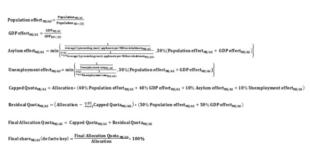
In an FAQ posted on Wednesday, the European Commission expanded on the thinking behind the elaborate math. Under the proposed plan, if the Commission determines at some point in the future that there is a refugee crisis in a given country (as there is today in Greece, Hungary, and Italy, the countries migrants reach first upon arriving in Europe), it will set a number for how many refugees in that country should be relocated throughout the EU. That number will be “not higher than 40% of the number of [asylum] applications made [in that country] in the past six months.”…

What’s most striking to me is the contrast between the sigmas and subscripts in the refugee formula—the inhumanity of technocratic compromise by mathematical equation—and the raw, tragic, heroic humanity on display in recent coverage of the refugees from Syria, Afghanistan, Eritrea, and elsewhere who are pouring into Europe.

The writer hints at the end here that the bureaucratic formula and stories of human lives at stake are incompatible. How could we translate people who need help into cold, impersonal numbers? This is a common claim: statistics take away human stories and dignity. They are unfeeling. They can’t sum the experiences of individuals. One online quote sums this up: “Statistics are human beings with the tears wiped off.

Yet, we need both the stories and the numbers to truly address the situation. Individual stories are important and interesting. Tragic cases tend to draw people’s attention, particularly if presented in attractive ways. But, it is difficult to convey all the stories of the refugees and migrants. Where would they be told and who would sit through them all? The statistics and formulas help give us the big picture. Just how many refugees are there? (Imagine a situation where there are only 10 refugees but with very compelling stories. Would this compel nations to act.) How can they be slotted into existing countries and systems?

On top of that, you can’t really have the nations of today without bureaucracies. We might not like that they are slow moving or inefficient at times or can be overwhelming. How can you run a major social system without a bureaucratic structure? Would we like to go to a hospital that was not a bureaucracy? How do you keep millions of citizens in a country moving in a similar direction? Decentralization or non-hierarchical systems can only go so far in addressing major tasks.

With that said, the formula looks complicated but the explanation in the text is fairly easy to understand: there are a set of weighted factors that dictate how many refugees will be assigned to each country.

When public anger can prompt the collection of better data

I’ve seen this argument several places, including this AP story: collecting national data about fatalities due to police would be helpful.

To many Americans, it feels like a national tidal wave. And yet, no firm statistics can say whether this spate of officer-involved deaths is a growing trend or simply a series of coincidences generating a deafening buzz in news reports and social media.

“We have a huge scandal in that we don’t have an accurate count of the number of people who die in police custody,” says Samuel Walker, emeritus professor of criminal justice at the University of Nebraska at Omaha and a leading scholar on policing and civil liberties. “That’s outrageous.”…

The FBI’s Uniform Crime Reports, for instance, track justifiable police homicides – there were 1,688 between 2010 and 2013 – but the statistics rely on voluntary reporting by local law enforcement agencies and are incomplete. Circumstances of the deaths, and other information such as age and race, also aren’t required.

The Wall Street Journal, detailing its own examination of officer-involved deaths at 105 of the nation’s 110 largest police departments, reported last week that federal data failed to include or mislabeled hundreds of fatal police encounters…

Chettiar is hopeful that recent events will create the “political and public will” to begin gathering and analyzing the facts.

A few quick thoughts:

1. Just because this data hasn’t been collected doesn’t necessarily mean this was intentional. Government agencies collect lots of data but it takes some deliberate action and foresight regarding what should and shouldn’t be reported. Given that there are a least a few hundred such deaths each year, you would think someone would have flagged such information as interesting but apparently not. Now would be a good time to start reporting and collecting such data.

2. Statistics would be helpful in providing a broader perspective on the issue but, as the article notes, statistics have certain kinds of persuasive power as do individual events or broad narratives not necessarily backed by statistics. In our individualistic culture, specific stories can often go a long ways. At the same time, social problems are often defined by their scope which involves statistical measures of how many people are affected.

Organizations can’t keep up with the statistics of how many people ISIS have killed

Measuring many things rests on the ability to observe or collect the data. But, a number of organizations have found that they can’t keep up with the actions of ISIS:

He and his colleagues have (alone among wire services) built up a detailed spreadsheet total of civilian and combatant casualties, but faced with the near impossibility of verifying multiple daily reports of massacres in provinces rendered inaccessible since the early weeks of ISIS’s June offensive, they now largely restrict its use for internal purposes.Officials in UN’s Iraq mission (UNAMI) are similarly downbeat about the accuracy of their records.

“Since the armed conflict escalated, I would say that our figures are significantly under reported,” said Francesco Motta, Director of UNAMI’s human rights office.

“We are getting hundreds of reports in addition to those we verify that we are just simply not able to verify owing to our limited access to areas where incidents are taking place,” he added…

It’s the sheer magnitude of the slaughter that’s overstretching these groups’ resources, but ISIS’s murderous approach to the media has compounded the problem. On top of the much publicized recent beheadings of two American journalists, ISIS also has killed dozens of Syrian and Iraqi reporters. Body counts rely heavily on local news articles for coverage of incidents in towns and rural pockets far from Baghdad, and the jihadists’ seizure of up to a third of Iraq has complicated attempts to report within their areas of control.

It may be a macabre task but an important one. As the article goes on to note, this matters for political ends (different sides will spin the available or estimated numbers in different ways) and for public perceptions. In fact, social problems are often defined by the number of people they affect. Higher numbers of deaths would tend to prompt more reaction from the public but overestimates that are later shown to be false could decrease attention.

Argument: Sociologists should learn more statistics to get paid like economists

A finance professor suggests the wage gap between economists and sociologists can be explained by the lack of statistical skills among sociologists:

Statistics is hugely valuable in the real world. Simply knowing how to run, and interpret, a regression is invaluable to management consultants. Statistics is now permeating the IT world, as a component of data science — and to do statistics, economists have to learn how to manage data. And statistics forces economists to learn to code, usually in Matlab.

As Econ 101 would tell us, these skills command a large premium. Unless universities want to shrink their economics departments, they have to shell out more money to keep the professors from bolting to consulting and financial firms.

If sociologists want to crack this bastion of economists’ “superiority,” they need to tech up with statistics. Sociologists do use some statistics, but in general it’s just much less rigorous and advanced than in economics. But there is no reason why that has to continue. Sociologists work with many quantitative topics. There are vast amounts of quantitative data available to them — and if there is a shortage, survey research centers such as the University of Michigan’s Institute for Social Research can generate more.

Using more and harder statistics will probably require more quantitative modeling of social phenomena. But it won’t require sociologists to adopt a single one of econ’s optimization models, or embrace any economics concepts. It won’t require giving one inch to the “imperialist” economics of Gary Becker’s disciples. All it will require is for sociologists to learn a lot more advanced statistics, and the data management and coding skills that go with it. The best way to make that happen is to start using a lot more sophisticated statistics in sociology papers. Eventually, the word “sociologist” will start to carry the connotation of “someone who is a whiz with data.” I’m sure some departments have already started to move in this direction.

I imagine this would generate a wide range of responses from sociologists. A few quick thoughts:

1. Using more advanced statistical techniques is one thing but it also involves a lot of interpretation and explanation. This is not just a technical recommendation but also requires links to conceptual and theoretical changes.

2. Can we statistically model the most complex social realities? Would having more and more big data make this possible? Statistics aren’t everything.

3. Any way to quantify this anecdotal argument? I can’t resist asking this…

Calories, as a statistic, don’t mean much to consumers

A group of scientists is suggesting food packaging should replace calories with data on how much exercise is required to burn off that food:

A 500ml bottle of Coke, for example, contains 210 calories, more than a 10th of the daily recommended intake for a woman.

But US scientists think that statistic is ignored by most people and does not work as a health message.

Instead, telling them that it would take a 4.2 mile run or 42-minute walk to burn off the calories is far more effective.

The researchers, from the Johns Hopkins Bloomberg School of Public Health in Baltimore, found that teenagers given the information chose healthier drinks or smaller bottles…

They say that if a menu tells you a double cheeseburger will take a 5.6-mile hike before the calories are burned off, most people would rather choose a smaller hamburger which would require a walk of 2.6 miles…

Study leader Professor Sara Bleich said: ‘People don’t really understand what it means to say a typical soda has 250 calories.

The public vaguely knows what a calorie is – a measure of the amount of energy in food. However, the technical definition is difficult to translate into real life since a calorie is defined as “the energy needed to raise the temperature of 1 gram of water through 1 °C.” (Side note: does this mean Americans are even worse in judging calories due to not using the metric system?) This proposal does just that, translating the scientific term into one that practically makes sense to the average person. And, having such information could make comparisons easier.

I would wonder if the new exercise data would have diminishing returns over time. A new interpretation might catch people’s attention for a while. But, as time goes on, what is really the difference between that 3.6 mile burger and that 2.6 mile burger?

Summarizing a year of your life in an infographic report

One designer has put together another yearly report on his own life that is a series of infographics:

For nearly a decade, designer Nicholas Felton has tracked his interests, locations, and the myriad beginnings and ends that make up a life in a series of sumptuously designed “annual reports.” The upcoming edition, looking back at 2013, uses 94,824 data points: 44,041 texts, 31,769 emails, 12,464 interpersonal conversations, 4,511 Facebook status updates, 1,719 articles of snail mail, and assorted notes to tell the tale of a year that started with his departure from Facebook and ended with the release of his app, called Reporter…

New types of data forced Felton to experiment with novel visualizations. One of Felton’s favorite graphics from this report is a “topic graph” that plots the use and frequency of specific phrases over time. It started as a tangled mess of curves, but by parsing his conversation data using the Natural Language Toolkit and reducing the topics to flat lines, a coherent picture of his year emerges a few words at a time.

After nine years of fastidious reporting, Felton has an unparalleled perspective on his changing tastes, diets, and interests. Despite a trove of historical data, Felton has found few forward-looking applications for the data. “The purpose of these reports has always been exploration rather than optimization,” he says. “Think of them more as data travelogues than report cards.”…

Felton says it’s relatively easy for companies to make sense of physical data, but properly quantifying other tasks like email is much harder. Email can be a productivity tool or a way to avoid the real work at hand making proper quantification fuzzy. “The next great apps in this space will embrace the grayness of personal data,” says Felton. “They will correlate more dimensions and recognize that life is not merely a continuum of exercising versus not exercising.”

Fascinating project and you can see images from the report at the link.

I like the conclusion: even all of this data about a single year lived requires a level of interpretation that involves skills and nuance. Quantification of some tasks or information could be quite helpful – like health data – but even that requires useful interpretation because numbers don’t speak for themselves. Even infographics need to address this issue: do they help viewers make sense of a year or do they simply operate as flashy graphics?

Statistical anomalies show problems with Chicago’s red light cameras

There has been a lot of fallout from the Chicago Tribune‘s report on problems with Chicago’s red light cameras. And the smoking gun was the improbable spikes in tickets handed out on single days or in short stretches:

From April 29 to June 19, 2011, one of the two cameras at Wague’s West Pullman intersection tagged drivers for 1,717 red light violations. That was more violations in 52 days than the camera captured in the previous year and a half…

On the Near West Side, the corner of North Ashland Avenue and West Madison Street generated 949 tickets in a 17-day period beginning June 23, 2013. That is a rate of about 56 tickets per day. In the previous two years, that camera on Ashland averaged 1.3 tickets per day…

City officials insisted the city has not changed its enforcement practices. They also said they have no records indicating camera malfunctions or adjustments that would have affected the volume of tickets.

The lack of records is significant, because Redflex was required to document any time the operation of a camera was disrupted for more than a day, as well as work “that will affect incident volume” — in other words, adjustments or repairs that could increase or decrease the number of violations.

In other words, graphs showing the number of tickets over time show big spikes. Here is one such graph from the intersection of Halsted and 119th Street:

As the article notes, there are a number of these big outliers in the data, outliers that would be difficult to miss if anyone was examining the data like they were supposed to. Given the regularities in traffic, you would expect fairly similar patterns over time but graphs like this suggest something else at work. Outside of someone directly testifying to underhanded activities, it is difficult to imagine more damaging evidence than graphs like these.

Using statistics to find lost airplanes

Here is a quick look at how Bayesian statistics helped find Air France 447 in the Atlantic Ocean:

Stone and co are statisticians who were brought in to reëxamine the evidence after four intensive searches had failed to find the aircraft. What’s interesting about this story is that their analysis pointed to a location not far from the last known position, in an area that had almost certainly been searched soon after the disaster. The wreckage was found almost exactly where they predicted at a depth of 14,000 feet after only one week’s additional search…

This is what statisticians call the posterior distribution. To calculate it, Stone and co had to take into account the failure of four different searches after the plane went down. The first was the failure to find debris or bodies for six days after the plane went missing in June 2009; then there was the failure of acoustic searches in July 2009 to detect the pings from underwater locator beacons on the flight data recorder and cockpit voice recorder; next, another search in August 2009 failed to find anything using side-scanning sonar; and finally, there was another unsuccessful search using side-scanning sonar in April and May 2010…

That’s an important point. A different analysis might have excluded this location on the basis that it had already been covered. But Stone and co chose to include the possibility that the acoustic beacons may have failed, a crucial decision that led directly to the discovery of the wreckage. Indeed, it seems likely that the beacons did fail and that this was the main reason why the search took so long.

The key point, of course, is that Bayesian inference by itself can’t solve these problems. Instead, statisticians themselves play a crucial role in evaluating the evidence, deciding what it means and then incorporating it in an appropriate way into the Bayesian model.

It is not just about knowing where to look – it is also about knowing how to look. Finding a needle in a haystack is a difficult business whether it is looking for small social trends in mounds of big data or finding a crashed plane in the middle of the ocean.

This could also be a good reminder that only having one search in such circumstances may not be enough. When working with data, failures are not necessarily bad as long as they can help move to a solution.