Let’s say you are a resident in a community and want to know more about it. Who lives near you? What businesses or industries are local? What events are happening nearby? How is land used? Where are all these things on a map? What are residents thinking?
There are numerous online tools that can help you answer these questions. Here are ones I rely on quite a bit:
- QuickFacts from the US Census. Put in a geography and you get basic information about the community, often based on the American Community Survey. Median household income? Racial and ethnic demographics? Total employment among businesses? It is all there in one table (and you can compare multiple communities at the same time).
- Local government websites and data portals. You might be able to access datasets, maps, regulations, plans. Communities will tell you their history while also pointing you to where you pay your utility bills.
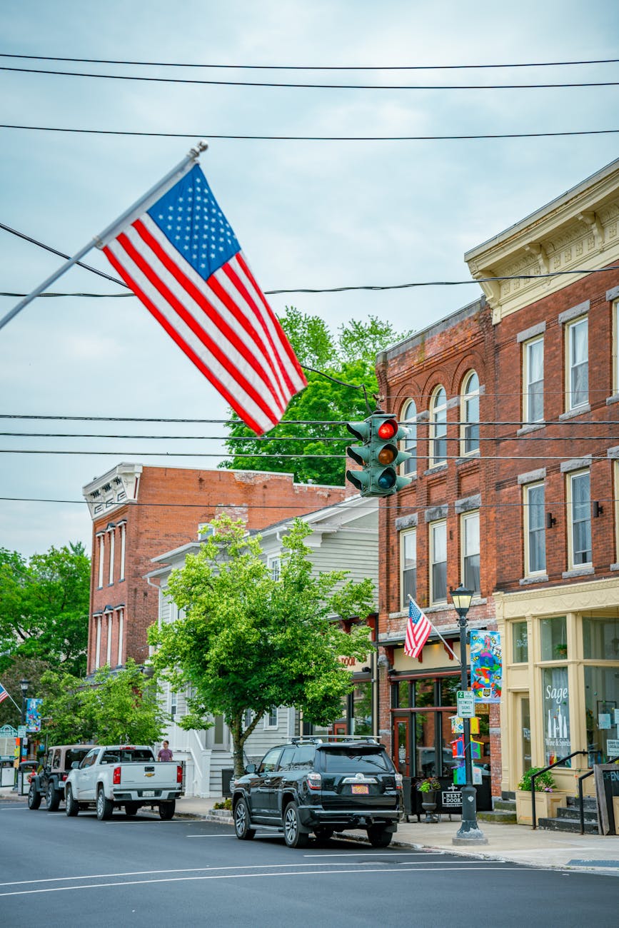
- Google Maps can help you visualize where things are. Major roadways, waterways, railroad lines, green spaces – these are fairly visible. How is land used: for single-family homes, denser developments, parks, or something else? What information Google chooses to highlight is less clear; why pick out the coffee shops versus displaying the locations of public libraries? Use Google Streetview to mimic driving or strolling around. Additionally, review information, user photos, and more is attached to the maps.
- Find a local media or information source. This may no longer be a local newspaper or TV station. It could be Patch, a volunteer run website, a social media group, a subreddit. There are ways of getting consistent information and discussion even if the discourse is fragmented across platforms.
For more options (including IRL), see earlier posts on knowing your community (post #1 and post #2),