
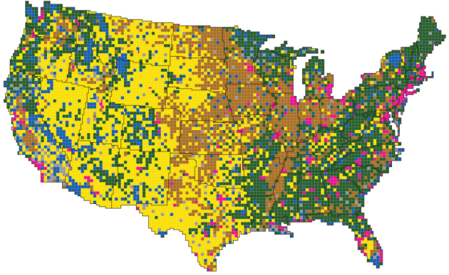
Bloomberg put together a set of graphics to illustrate how Americans use land. Here are a few of the maps interspersed with information. First, the general patterns of land use:
The U.S. is becoming more urban—at an average rate of about 1 million additional acres a year. That’s the equivalent of adding new urban area the size of Los Angeles, Houston and Phoenix combined. U.S. urban areas have more than quadrupled since 1945…
More than one-third of U.S. land is used for pasture—by far the largest land-use type in the contiguous 48 states. And nearly 25 percent of that land is administered by the federal government, with most occurring in the West. That land is open to grazing for a fee.
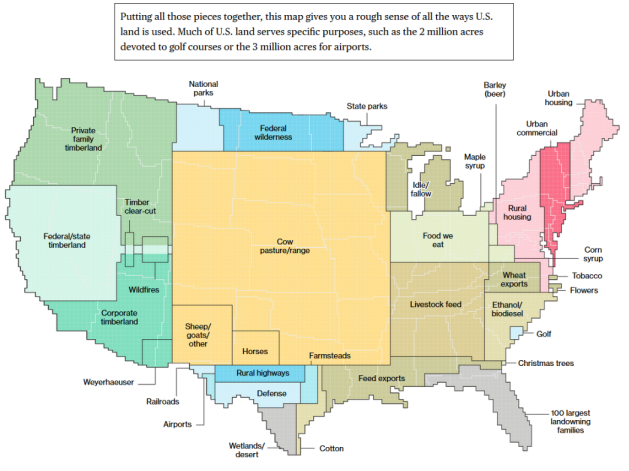
There is some data here that could be viewed as conflicting: urban areas are the fastest growing land use – watch out for sprawl! – but the biggest land use overall is pasture and range – open land yet given over to creatures that are land and resource intensive!
One nice feature of these maps is that they are helpful for making comparisons between land uses. Given the size of the country plus the limited day-to-day experiences of many in different parts of the country, it can be hard to get a handle on all the land uses.
After looking this all over, I wonder what Americans and policymakers would say an ideal land use mix is for the entire country. This is a difficult question to answer, particularly since many people would not necessarily regularly encounter all the uses. If people want more protected land, what other land uses should be reduced and how would this affect individual lives as well as the American way of life?
