
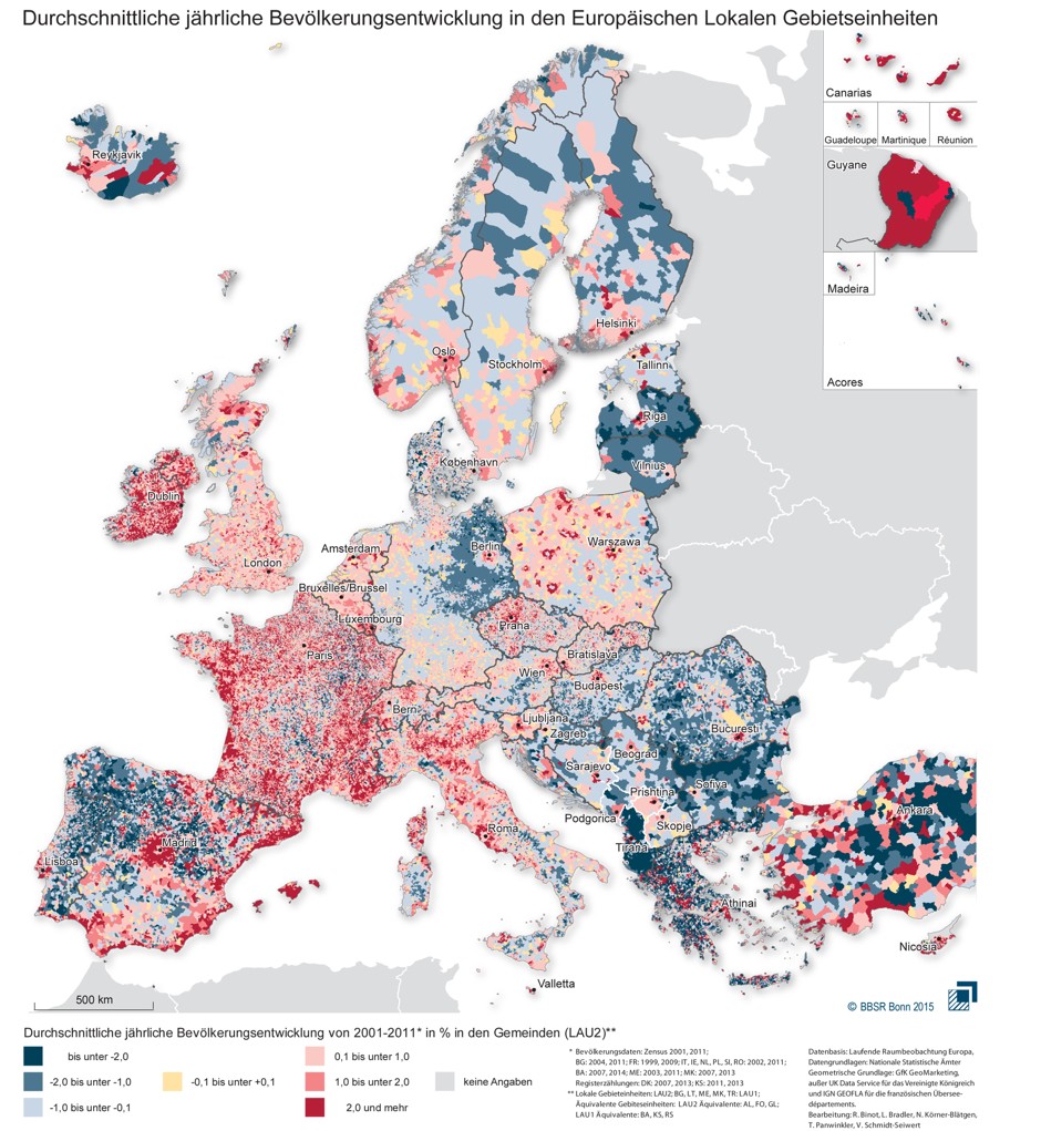
A new map shows the population trends at work in Europe between 2001 and 2011:
Look at the Eastern section of the map and you’ll see that many cities, including Prague, Bucharest, and the Polish cities of Pozna? and Wroc?aw, are ringed with a deep red circle that shows a particularly high rise in average annual population of 2 percent or more. As this paper from Krakow’s Jagiellonian University’s Institute of Geography notes, Eastern cities began to spread out in the new millennium because it was their first chance to do so in decades…
We already know from other available data that Europe is experiencing a migration to the northwest, but the BBSR map adds complexity to this picture and reveals some interesting micro-trends. The dark blue coloring of the map’s Eastern section shows that the lean years for Eastern states are by no means over. Residents have continued to leave Albania, Bulgaria and Latvia in particular in search of jobs, while even relatively wealthy eastern Germany has been hollowed out almost everywhere except the Berlin region.
Population growth in the Northwest, meanwhile, is far from even. While large sections of Northern Scandinavia’s inland are losing people, there’s still modest growth on the Arctic coasts. And while the Scottish Highlands contain some the least peopled lands in all of Europe, Scotland’s Northeast shows remarkable population gains, a likely result of the North Sea oil industry concentrated in Aberdeen…
Spain’s trends look a little different from those of Europe as a whole. It’s actually in the country’s Northwest where the population has dropped most sharply, notably in the provinces of Galicia and León, which have long been known to produce many of Spain’s migrants.
But other previously impoverished regions, such as Southwestern Murcia, have grown, a trend continuing along the Mediterranean coast where population levels have risen sharply.
All of this may help explain reactions to migrants – population pressure is high in some places, particularly wealthier regions, while population loss is occurring in more economically depressed areas. It is also a helpful reminder of how relatively free people are to move between places. I don’t know how exactly this lines up with historic migration rates – particularly before the rise of nation-states which presumably allowed more of an ability to control population flows – but the industrialized world (and much of the rest of the world as well) is quite a mobile one.
