Geology and a favorable location for humans in Concord, MA

Why did Concord, Massachusetts, become the site of an opening battle in the American Revolution and later become identified with the transcendentalists? It was a favorable spot for human settlement:

Photo by Phil Evenden on Pexels.com

The Concord River runs north, rather than southeasterly down the regional slope toward the sea. When the edge of the great ice sheet began to retreat from the area about 17,000 years ago, the Concord River was dammed up by the ice to create a ribbon-shaped glacial lake with a muddy bottom. Eventually the lake drained away, allowing the Concord River to cut an inner valley beneath a moist and fertile lowland.

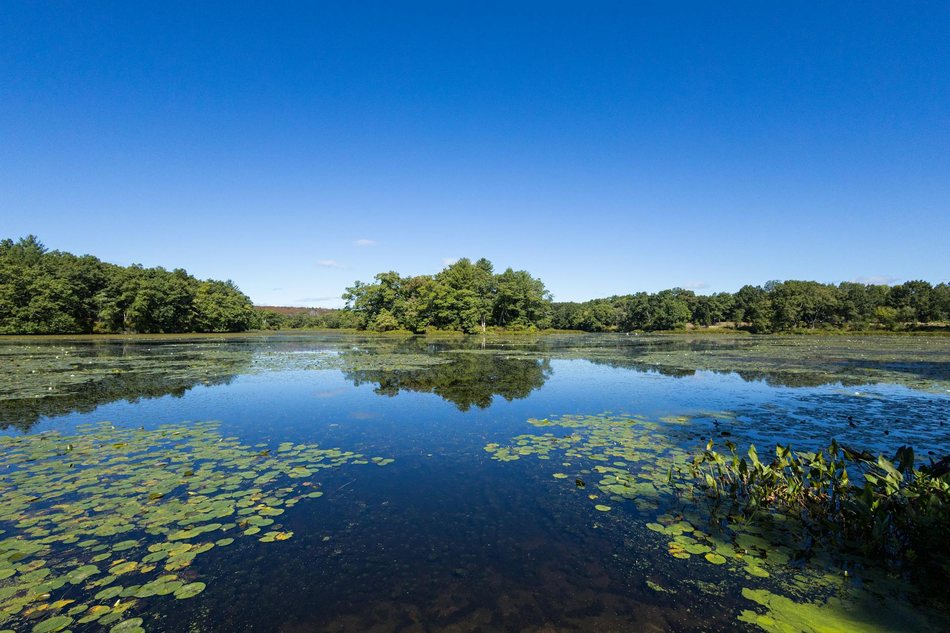
This process set the stage for the creation of what the Indigenous Massachusett, Nipmuc, and Pawtucket peoples called Musketaquid, meaning “grass-ground river,” a marsh about 20 miles long and so flat and so uninterrupted that Thoreau skated the entire round-trip distance one freezing day—January 31, 1855. The languid stream passed through broad meadows to create a northern version of the Everglades (without the alligators). Nathaniel Hawthorne lived along the bank for three weeks before he discerned which way the river flowed.

This riparian ecology attracted colonists: Concord became the first English town in North America above tidewater, beyond the sight and scent of the sea. Here the lush growth of freshwater hay would undergird a system of English husbandry dependent on livestock. Here migrating shad, herring, and salmon thrived in the aquatic richness, furnishing plentiful protein sources, vitamins, and minerals. Here the firm, muddy banks made an ideal habitat for the freshwater mussels on which other animals depended: muskrat, otters, turtles, human beings. On July 3, 1852, Thoreau estimated that more than 16,335 freshwater clams lay along 330 feet of the riverbank. Migrating waterfowl followed the meadows. Songbirds nested along their edges…

The physical separation between Boston and Concord involves more than the linear distance between two points. The population centers occupy different watersheds—the Charles River watershed to the east and the Concord River watershed to the west. In fact, they lie on different bedrock terranes that originated in different places in different eras. The terrane boundary coincides with the Bloody Bluff fault, named for a rocky notch where British troops were trapped by ferocious provincial fire. Here the land leans toward the security of the sea. To the west, it leans toward a hinterland where pioneering residents looked to one another for community support. Without the Lexington Road and its regular stagecoach traffic, 18th-century Concord would have remained an agricultural village. Instead, it became a prominent node in an expanding trade network. The significance of the watershed divide between country and city diminished only after the Fitchburg Railroad reached Concord in 1844.

I cannot remember who said it but I recall a quote where someone says if someone wanted to start a great city today, it would be really hard because all of the good locations have been taken. The geology and ecology of Concord made it good spot for humans to settle.

To take into account the geography and ecology of land and places will continue to be important, even in an era when it is easy to ignore the physical features of places. In the world of Internet and airplanes, everything seems accessible from anywhere. But this is not true: certain places have particular advantages with access to water, protected settings, mineral resources, land for farming and livestock, good spots along trade routes, and more. Some of this can shift over time; does it matter as much today as it did in the past that Chicago was a key portage location between the Great Lakes and the Mississippi River watershed? And this could change in the future: particular locations might have new advantages in the future as the earth and societies around the world change.

Measuring Walmart’s reach by its geographic proximity to 90% of Americans

How much does Walmart matter in the United States? The company uses this statistic to get at this:

Photo by John-Mark Smith on Pexels.com

Walmart operates more than 5,200 stores across the country, and 90% of Americans live within 10 miles of a Walmart or Sam’s Club, the company estimates

In this story, this figure is cited regarding the rollout of electronic vehicle chargers. The implication is that many potential drivers could then access Walmart’s network.

Part of the Walmart percentage could be the sheer number of stores and it could also be about corporate decisions about where to locate. The company grew from its first store in Rogers, Arkansas to being in many communities across the United States. Do all retailers go for the same sort of locations as Walmart?

It would be interesting to compare to other kinds of business. Take fast food chains that have thousands of locations; would 90% of Americans live within 10 miles of a McDonald’s or a Domino’s? Or what about distances from dollar stores? (Or were once within 10 miles of a Blockbusters?)

Or we could consider other important places. How many Americans live within 10 miles of a park? A school? A police or fire department?

All that said, being close to roughly 300 million people in the United States is an achievement. This likely contributes to figures I’ve seen that suggest roughly 90% of Americans shop at a Walmart at least once a year. And a story from several months ago suggested 95% of Americans were within a 3 hour delivery of Walmart. Proximity has to help even if Walmart cannot be everywhere.

“Map lines are inherently political”

Maps document human interpretations of physical and spatial features:

Photo by Andrew Neel on Pexels.com

Map lines are inherently political. After all, they’re representations of the places that are important to human beings — and those priorities can be delicate and contentious, even more so in a globalized world where multiple nations often share the same maps.

Numerous examples follow:

The water bordered by the Southern United States, Mexico and Cuba will be critical to shipping lanes and vacationers whether it’s called the Gulf of Mexico, as it has been for four centuries, or the Gulf of America, as President Donald Trump ordered this week. North America’s highest mountain peak will still loom above Alaska whether it’s called Denali, as ordered by former President Barack Obama in 2015, or changed back to Mt. McKinley as Trump also decreed…

The Persian Gulf has been widely known by that name since the 16th century, although usage of “Gulf” and “Arabian Gulf” is dominant in many countries in the Middle East. The government of Iran — formerly Persia — threatened to sue Google in 2012 over the company’s decision not to label the body of water at all on its maps. Many Arab countries don’t recognize Israel and instead call it Palestine. And in many official releases, Israel calls the occupied West Bank by its biblical name, “Judea and Samaria.”…

The Associated Press, which disseminates news around the world to multiple audiences, will refer to the Gulf of Mexico by its original name while acknowledging the name Gulf of America. AP will, however, use the name Mount McKinley instead of Denali; the area lies solely in the United States and as president, Trump has the authority to change federal geographical names within the country.

Humans make meaning of the world around them and maps capture some of that meaning. And because meaning is sometimes agreed upon and sometimes contested, maps reflect these realities.

What are innovative ways to include multiple names or meanings on a map? Or layer changes in a map over time? I have seen some interesting displays online that attempt to do this. How can maps be more dynamic and flexible?

Geography and why there is so much bad weather in the United States

Storms and natural disasters seem to occur regularly in the United States. Why?

Photo by Pixabay on Pexels.com

It starts with “where we are on the globe,” North Carolina state climatologist Kathie Dello said. “It’s truly a little bit … unlucky.”

China may have more people, and a large land area like the United States, but “they don’t have the same kind of clash of air masses as much as you do in the U.S. that is producing a lot of the severe weather,” said Susan Cutter, director of the Hazards Vulnerability and Resilience Institute at the University of South Carolina…

With colder air up in the Arctic and warmer air in the tropics, the area between them — the mid-latitudes, where the United States is — gets the most interesting weather because of how the air acts in clashing temperatures, and that north-south temperature gradient drives the jet stream, said Northern Illinois meteorology professor Walker Ashley.

Then add mountain ranges that go north-south, jutting into the winds flowing from west to east, and underneath it all the toasty Gulf of Mexico.

The geography of the Untied States is often described as an advantage. Lots of land. Many natural resources. A range of temperatures and climates. Across the oceans from major global conflicts.

In this case, the unique geography leads to issues. The expanse and variation in land puts air masses in conflict.

As the article suggests, have American communities adapted to this? If bad weather and disasters are somewhat predictable, do we have structures and planning that mitigates some of this impact? Just as one example, suburban sprawl with its balloon-frame houses and reliance on driving could be prone to particular ill effects.

What if churches considered geographic disparities and their local context?

An interview in the latest print issue of Christianity Today could provide insights for a lot of religious congregations: here is part of the lesson regarding geographic inequalities.

For me, geography is never passive. Why does a new freeway cut through a certain neighborhood? Who lives near that freeway, and why? Those are not just decisions of urban planners or politicians. There are a million little decisions that go into that process—public and private.

It’s impossible to live in a place, or move to a new one, without getting tangled up in the history of its particular structures—who they benefit and who they exclude. That’s a hard reality, because most of us didn’t pave the streets we live on. Yet someone designed those places, and that design will either encourage the flourishing of society or lead to patterns of exclusion…

So many churches, frankly, just don’t know their communities at all. Two or three days a week, a whole bunch of cars come in and then go somewhere else—and that’s the only relationship a church might have with its surrounding neighborhood. That’s more of a suburban reality, but it’s increasingly true of cities as well. The first step, for churches, is just asking, Who’s here? Who are the immediate neighbors that we serve? What populations are underserved? If churches begin to have that conversation more often, then they can look to their congregations and say, “Are we representing the people in this community, and why or why not?”…

The next step is asking, “How can our congregation use its resources—whether that’s a building, a program, or a professional with certain skills—for the sake of others?” Church buildings, for example, are notorious for inefficient usage. They’re filled up a couple times each week, but otherwise the heat is off and they’re just vacant. What a gift it would be for churches to think of their physical structures as resources not just for themselves but also for their surrounding communities. Especially in dense, gentrifying urban areas, where space is really at a premium.

Some related thoughts, many based on findings from the sociology of religion:

  1. A lot of religious congregations seem more interested in internal homophily – being with like people during church activities – rather than turning their attention to their actual neighbors.
  2. Many congregations do little in terms of local outreach – see Congregations in America and the ongoing data of the National Congregations Study. It is not as if they are doing misinformed outreach; little is being done in the first place so getting churches to care about their local community may be harder than it looks.
  3. I agree that urban design can certainly contribute to flourishing or exclusion but it is not necessarily a guarantee of either. Take the highway example given here (and famously illustrated by the Dan Ryan Expressway on the South Side of Chicago): it reinforced existing boundaries.
  4. Why can’t religious groups construct and maintain “cosmopolitan canopies” rather than leaving it to private commercial interests or the efforts of local governments?
  5. I assume there are some differences today in how different religious traditions and denominations approach the local community. This was certainly true in the past where Catholic churches did not disappear when the parishioners moved to the suburbs but rather transitioned to the newest waves of immigrants. Today, who takes their local context into account more and what could they teach others?

Mapping the boundaries of the Midwest

Mapping the Midwest has now become a crowdsourced project through asking “What’s the Midwest to you?”

That’s the question design and planning firm Sasaki Associates is asking visitors to its new exhibit, “Reinvention in the Urban Midwest,” which opens at the Boston Society of Architects (BSA) Space this week. The project includes an interactive survey that contains a timeless challenge: Draw the geographic boundaries of what counts as the U.S. Midwest…

Judging by the maps drawn by others and myself, it appears Montana, Wyoming, Colorado, Kentucky, Arkansas, and Oklahoma are the states of most contention. I personally felt I had no choice but to cut some of them in half. Perhaps the correct answer is still the textbook answer: the states of most intensified yellow (at least as identified by those who’ve lived in the Midwest the longest) make up the U.S. Census Bureau’s definition of the Midwest: Illinois, Indiana, Michigan, Ohio and Wisconsin to the east, plus Iowa, Kansas, Minnesota, Missouri, Nebraska, North Dakota and South Dakota to the west.  (As a commenter pointed out, cartographer and historian Bill Rankin has also done a Midwest mapping project, in which he overlaid 100 different maps of the Midwest and made the confounding observation that  “no area that was included on every single map”.)

So the geographic boundaries of what most Americans consider the Midwest aren’t exactly clear, but Sasaki has also included another set of maps that reveal a much less murky truth: the Midwest has urbanized in a vastly different way from the rest of the United States. The graphic below maps out the population densities found in urban areas from four U.S. regions in 2010 (a darker shade signifies a larger, denser population)…

The Midwest is characterized by small but strong urban centers that transition sharply to rural surroundings. This pattern has of course grown from the region’s historical focus on agricultural land use. Sasaki’s recent work in Iowa suggests a continued population decline in rural areas but growing population density in more urban areas. However, the growth of urban areas in the Midwest is not uniform. The firm has further identified that agricultural cities in the plains sub-region, such as Des Moines, Iowa, or Lincoln, Nebraska, are indeed growing due to factors like de-ruralization and in-migration to city centers, while traditionally heavy-industry cities in the forest sub-region, such as Milwaukee or St. Louis, are still losing population.

One takeaway: the Midwest is a fuzzily-defined entity that perhaps has more to do with perceptions and culture than it does with exact geography. This would be aided by then asking people who drew the maps to then type in words they associate with the Midwest. I like the contrasting maps between those who have spent more of their lives in the Midwest versus those who have not: there are some clear differences.

The connection between farmland and cities is a good catch. Big cities like Chicago or Omaha were (and still are) intimately connected to agricultural commodities that needed to be distributed and sold through the big cities. For example, if you look at the early railroad construction in the Chicago region, much of it was linked to shipping products from the plains, everything from wheat (southwestern Wisconsin) to lead (Galena) to then distribute further east. Or look at the trading of commodities in places like Chicago and the creation of new kinds of markets. Even though there are big gaps between the Chicago area and the rest of Illinois – they operate as very different worlds – both would strongly consider themselves part of the same region, even if they can’t speak to the deeper ties that connect them.

Game identifying random locations through Google Streetview

Love to see random sites around the world? Check out the game Locatestreet where you are given a picture from Google Streetview and you have to guess (with multiple choice and with the opportunity to utilize a few hints) the correct location.

After playing the version with random US locations, I discovered that context matters – check out the housing styles and the vegetation for some insights into the location. Indeed, you might just see lots of trees and landscape. Also, knowing where population centers are can go a long way in making a closer guess as to where the exact picture was taken…

h/t Atlantic Cities

Using GIS to study Gettysburg, the Holocaust, and the American iron industry

Smithsonian takes a look at a historian who uses GIS to get a new perspective on important historical events:

Her principal tool is geographic information systems, or GIS, a name for computer programs that incorporate such data as satellite imagery, paper maps and statistics. Knowles makes GIS sound simple: “It’s a computer software that allows you to map and analyze any information that has a location attached.” But watching her navigate GIS and other applications, it quickly becomes obvious that this isn’t your father’s geography…

What emerges, in the end, is a “map” that’s not just color-coded and crammed with data, but dynamic rather than static—a layered re-creation that Knowles likens to looking at the past through 3-D glasses. The image shifts, changing with a few keystrokes to answer the questions Knowles asks. In this instance, she wants to know what commanders could see of the battlefield on the second day at Gettysburg. A red dot denotes General Lee’s vantage point from the top of the Lutheran Seminary. His field of vision shows as clear ground, with blind spots shaded in deep indigo. Knowles has even factored in the extra inches of sightline afforded by Lee’s boots. “We can’t account for the haze and smoke of battle in GIS, though in theory you could with gaming software,” she says…

Though she’s now been ensconced at Middlebury for a decade, Knowles continues to push boundaries. Her current project is mapping the Holocaust, in collaboration with the U.S. Holocaust Memorial Museum and a team of international scholars. Previously, most maps of the Holocaust simply located sites such as death camps and ghettos. Knowles and her colleagues have used GIS to create a “geography of oppression,” including maps of the growth of concentration camps and the movement of Nazi death squads that accompanied the German Army into the Soviet Union…

Aware of these pitfalls, Knowles is about to publish a book that uses GIS in the service of an overarching historical narrative. Mastering Iron, due out in January, follows the American iron industry from 1800 to 1868. Though the subject matter may not sound as grabby as the Holocaust or Gettysburg, Knowles has blended geographical analysis with more traditional sources to challenge conventional wisdom about the development of American industry.

Sounds pretty interesting. Having detailed geographic data can change one’s perspective. But there are two things that need to happen first before researchers can take advantage of such information:

1. Using GIS well requires a lot of training and then being able to find the right data for the analysis.

2. Using geographic data like this requires a change in mindset from the idea that geography is just a background variable. In sociology, analysis often controls for some geographic variation but doesn’t often consider the location or space as the primary factor.

While GIS is a hot method right now, I think these two issues will hold it back from being widely used for a while.

Nearly six thousand hours to make the best map of the United States

Here is some insight into what it takes to create maps and particularly the hard work needed to create the “best American wall map”:

So what makes this map different from the Rand McNally version you can buy at a bookstore? Or from the dusty National Geographic pull-down mounted in your child’s elementary school classroom? Can one paper wall map really outshine all others—so definitively that it becomes award-worthy?…

According to independent cartographers I spoke with, the big mapmaking corporations of the world employ type-positioning software, placing their map labels (names of cities, rivers, etc.) according to an algorithm. For example, preferred placement for city labels is generally to the upper right of the dot that indicates location. But if this spot is already occupied—by the label for a river, say, or by a state boundary line—the city label might be shifted over a few millimeters. Sometimes a town might get deleted entirely in favor of a highway shield or a time zone marker. The result is a rough draft of label placement, still in need of human refinement. Post-computer editing decisions are frequently outsourced—sometimes to India, where teams of cheap workers will hunt for obvious errors and messy label overlaps. The overall goal is often a quick and dirty turnaround, with cost and speed trumping excellence and elegance.

By contrast, David Imus worked alone on his map seven days a week for two full years. Nearly 6,000 hours in total. It would be prohibitively expensive just to outsource that much work. But Imus—a 35-year veteran of cartography who’s designed every kind of map for every kind of client—did it all by himself. He used a computer (not a pencil and paper), but absolutely nothing was left to computer-assisted happenstance. Imus spent eons tweaking label positions. Slaving over font types, kerning, letter thicknesses. Scrutinizing levels of blackness. It’s the kind of personal cartographic touch you might only find these days on the hand-illustrated ski-trail maps available at posh mountain resorts.

A few of his more significant design decisions: Your standard wall map will often paint the U.S. states different colors so their shapes are easily grasped. But Imus’ map uses thick lines to indicate state borders and reserves the color for more important purposes—green for denser forestation, yellow for population centers. Instead of hypsometric tinting (darker colors for lower elevations, lighter colors for higher altitudes), Imus uses relief shading for a more natural portrait of U.S. terrain.

I’ve always loved maps but I can’t imagine spending this much time on hand-crafting a map of the United States. It would be interesting to hear why Imus pursued this: a hobby? Is he a professional cartographer? Did he want to win a prize? Is there money in this? Was he simply irritated with existing maps?

The second half of the article goes on to talk about the continued need for large maps even in an era where many people have maps in their phones and computers. I tend to agree with this view: as a kid, I would spend a lot of time simply browsing through an atlas or looking at a wall map because it is interesting to know where everything is in relation to everywhere else. A close view of the world, say with Google Maps on my phone, has difficulty displaying this interconnectedness. Several features of Imus’ map also add to the imaginative possibilities of maps: the topography and cultural attractions.

One question I have: supposedly map-making companies include little mistakes so that they can tell if someone has simply copied them. Did Imus do something similar or does he even have these same mistakes (this gets at where he got his geographical knowledge from)?

Bonus: Imus responds in the comments section. Here is one interesting comment: “If a map doesn’t depict the uniqueness of the places on it, to me that map is merely a spatial arrangement of data. I wanted to give my readers more than data. I wanted to give them the sense of place that has been missing from our maps. The USA is a place, not a space.”

The home states of military personnel

Richard Florida uses some data to flesh out Defense Secretary Robert Gates recent comment that there is a growing gap between American civilians and the military. Florida suggests part of the issue is the origin of the military personnel: they tend to come from two particular parts of the country.

Aside from relatively high concentrations in Alaska, Hawaii, Washington state, and North Dakota, the military is overwhelmingly concentrated in two distinctive areas of the Sunbelt: The southeast running from Virgina and North Carolina through Kentucky and down through South Carolina, Georgia and Mississippi; and the corridor fromTexas through Oklahoma, New Mexico, Colorado, Kansas and Wyoming. Texas and California now drop out. The upper mid-west and the northeast, especially New England, which tend to be more liberal and left-leaning than the rest of the nation, have very low concentrations of military personnel.

A couple of thoughts:

1. I don’t think this is terribly surprising (though it is helpful to see it in map form).

2. A question: does the military think it might be worthwhile to try to even out these geographic distributions? If so, how could this be done?

3. Are these differences only due to political views (conservatives vs. liberals) or is this really due to social class?

4. I’m glad Florida added data that accounts for differences in population size – the initial map simply showed more military personnel come from more populous states.

h/t Instapundit