The creators of The Good Place aimed to create a specific aesthetic for the locations on the show:
Rowe: There’s a signature that is heavily inspired by mid-century modern. Not just because it looks cool and clean, but because [the creative team] made a very deliberate dedication to a certain style per world. So the ’80s were the Medium Place. The Mad Men era was the Bad Place. The heightened, more European, I would say, version of that influenced the backlot. Dan Bishop created that cute, charming, endearing vibe from European villages. Those ice-cream colors and those colorful pops in our flowers—those defined what the rest of the world would look like.
It’s very important to point out that [Ted Danson’s character] Michael was an architect, and that was a character choice from Mike Schur that influenced everything from there. What architect going to school, at any stage doesn’t love mid-century modern? Plus the age of the actor—he’s all dressed up. If he was designing kooky ’80s architecture or ’70s skyscrapers, I don’t know if those would fit.
The focus on European villages gets at some features of desirable places: existing at a human scale, full of street-level activity including food and shopping alongside people talking and walking, and a relatively small set of people. (One feature of these some villages that might be missing on the TV show: the homes seem to be set apart from the village area, separating home and work.) While the village streetscape could be part of a larger city (perhaps each neighborhood or district has a village area like this), it hints at more small-town life. Residing in smaller-scale villages might fit better with human history than the substantial urbanization of the last two centuries. At the same time, we view big cities as centers of progress and human achievement. Perhaps the choice of villages hints at human desires for social connections and a human scale rather than big cities. (But Michael’s depiction is not what it seems – so is this commentary about European villages?)
As for heaven itself:
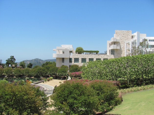
Rowe: When heaven showed up, it was pretty much unanimous right away that they wanted to shoot at the Getty [Center, an art museum in Los Angeles]. There was a lot of discussion that happened to help the Getty get on board, because obviously they have a brand they want to protect. The location manager went and said, “It’s a show about heaven, and we’re showing the Getty as a place of paradise.”
We actually didn’t do that many things there, because the architecture speaks for itself. People breeze through that museum, and you can ask them, “Oh, did you see any paintings?” And they’re like, “Yeah, I kinda saw the modern stuff upstairs, but I was basically outside the whole time.”
The Getty Center is indeed a unique building and it connects modern architecture, gardens, and a view overlooking Los Angeles. As an oasis set apart from the Los Angeles bustle, I could see how it would be compared to heaven:

Comparing depictions of heaven across time and cultures could prove to be a fun exercise. How much do the depictions reflect contemporary tastes or standards? If the architects of today or those with architectural knowledge generally like mid-century modern, this is what they might prefer heaven to look like. Would Christians throughout the United States agree? There have been too many depictions of clouds for that not to show up somewhere and ancient Greek architecture – familiar to Americans in a number of important buildings including government structures – might be popular. Would heaven look more like the nondescript suburban megachurches of today or more like a Gothic cathedral? Or, would Americans prefer heaven to look like mansions in a well-kept suburb or prefer it to be more about nature? And global depictions would likely differ significantly from these options.
