From outlier to outlier in unemployment data

With the responses to COVID-19, unemployment is expected to approach or hit a record high among recorded data:

April’s employment report, to be released Friday, will almost certainly show that the coronavirus pandemic inflicted the largest one-month blow to the U.S. labor market on record.

Economists surveyed by The Wall Street Journal forecast the new report will show that unemployment rose to 16.1% in April and that employers shed 22 million nonfarm payroll jobs—the equivalent of eliminating every job created in the past decade.

The losses in jobs would produce the highest unemployment rate since records began in 1948, eclipsing the 10.8% rate touched in late 1982 at the end of the double-dip recession early in President Reagan’s first term. The monthly number of jobs lost would be the biggest in records going back to 1939—far steeper than the 1.96 million jobs eliminated in September 1945, at the end of World War II.

But, also noteworthy is what these rapid changes follow:

Combined with the rise in unemployment and the loss of jobs in March, the new figures will underscore the labor market’s sharp reversal since February, when joblessness was at a half-century low of 3.5% and the country notched a record 113 straight months of job creation.

In other words, the United States has experienced both a record low in unemployment and a record high within three months. A few thoughts connected to this:

1. Either outlier is noteworthy; having them occur so close to each other is more unusual.

2. Their close occurrence makes it more difficult to ascertain what is “normal” unemployment for this period of history. The fallout of COVID-19 is unusual. But the 3.5% unemployment can also be considered unusual compared to historical data.

3. Given these two outliers, it might be relatively easy to dismiss either as aberrations. Yet, while people are living through the situations and the fallout, they cannot simply be dismissed. If unemployment now is around 16%, this requires attention even if historically this is a very unusual period.

4. With these two outliers, predicting the future regarding unemployment (and other social measures) is very difficult. Will the economy quickly restart in the United States and around the world? Will COVID-19 be largely under control within a few months or will there be new outbreaks for a longer period of time (and will governments and people react in the same ways)?

In sum, dealing with extreme data – outliers – is a difficult task for everyone.

Interpreting data: the COVID-19 deaths in the United States roughly match the population of my mid-sized suburb

Understanding big numbers can be difficult. This is particularly true in a large country like the United States – over 330,000,000 residents – with a variety of contexts. Debates over COVID-19 numbers have been sharp as different approaches appeal to different numbers. To some degree, many potential social problems or public issues face this issue: how to use numbers (and other evidence) to convince people that action needs to be taken.

This week, the number of deaths in the United States due to COVID-19 approached the population of my suburban community of just over 53,000 residents. We are a mid-sized suburb; this is the second largest community in our county, the most populous suburban county in the Chicago region outside of Cook County. The community covers just over 11 square miles. Imagining an entire mid-sized suburb of COVID-19 deaths gives one pause. I had heard the comparison a week or two ago to the deaths matching the size of a good-sized indoor arena; thinking of an entire sizable community helps make sense of the number of deaths across the country.

Of course, there are other numbers to cite. Our community has relatively few cases – less than hundred as of a few days ago. Considering the Chicago suburbs: “If the Chicago suburbs were a state, it would have the 11th-highest COVID-19 death toll in the nation.” The COVID-19 cases and deaths are scattered throughout the United States, with clear hotspots in some places like New York City and fewer cases in other places. And so on.

Perhaps all of this means that we need medical experts alongside data experts in times like these. We need people well-versed in statistics and their implications to help inform the public and policymakers. Numbers are interpreted and used as part of arguments. Having a handle on the broad range of data, the different ways it can be interpreted (including what comparisons are useful to make), connecting the numbers to particular actions and policies, and communicating all of this clearly is a valuable skill set that can serve communities well.


More on modeling uncertainty and approaching model results

People around the world want answers about the spread of COVID-19. Models offer data-driven certainties, right?

The only problem with this bit of relatively good news? It’s almost certainly wrong. All models are wrong. Some are just less wrong than others — and those are the ones that public health officials rely on…

The latest calculations are based on better data on how the virus acts, more information on how people act and more cities as examples. For example, new data from Italy and Spain suggest social distancing is working even better than expected to stop the spread of the virus…

Squeeze all those thousands of data points into incredibly complex mathematical equations and voila, here’s what’s going to happen next with the pandemic. Except, remember, there’s a huge margin of error: For the prediction of U.S. deaths, the range is larger than the population of Wilmington, Delaware.

“No model is perfect, but most models are somewhat useful,” said John Allen Paulos, a professor of math at Temple University and author of several books about math and everyday life. “But we can’t confuse the model with reality.”…

Because of the large fudge factor, it’s smart not to look at one single number — the minimum number of deaths, or the maximum for that matter — but instead at the range of confidence, where there’s a 95% chance reality will fall, mathematician Paulos said. For the University of Washington model, that’s from 50,000 to 136,000 deaths.

Models depend on the data available, the assumptions made by researchers, the equations utilized, and then there is a social component where people (ranging from academics to residents to leaders to the media) interact with the results of the model.

This reminds me of sociologist Joel Best’s argument regarding how people should view statistics and data. One option is to be cynical about all data. The models are rarely right on so why trust any numbers? Better to go with other kinds of evidence. Another option is to naively accept models and numbers. They have the weight of math, science, and research. They are complicated and should simply be trusted. Best proposes a third option between these two extremes: a critical approach. Armed with some good questions (what data are the researchers working with? what assumptions did they make? what do the statistics/model actually say?), a reader of models and data analysis can start to evaluate the results. Models cannot do everything – but they can do something.

(Also see a post last week about models and what they can offer during a pandemic.)

Models are models, not perfect predictions

One academic summarizes how we should read and interpret COVID-19 models:

Every time the White House releases a COVID-19 model, we will be tempted to drown ourselves in endless discussions about the error bars, the clarity around the parameters, the wide range of outcomes, and the applicability of the underlying data. And the media might be tempted to cover those discussions, as this fits their horse-race, he-said-she-said scripts. Let’s not. We should instead look at the calamitous branches of our decision tree and chop them all off, and then chop them off again.

Sometimes, when we succeed in chopping off the end of the pessimistic tail, it looks like we overreacted. A near miss can make a model look false. But that’s not always what happened. It just means we won. And that’s why we model.

Five quick thoughts in response:

  1. I would be tempted to say that the perilous times of COVID-19 lead more people to see models as certainty but I have seen this issue plenty of times in more “normal” periods.
  2. It would help if the media had less innumeracy and more knowledge of how science, natural and social, works. I know the media leans towards answers and sure headlines but science is often messier and takes time to reach consensus.
  3. Making models that include social behavior is difficult. This particular phenomena has both a physical and social component. Viruses act in certain ways. Humans act in somewhat predictable ways. Both can change.
  4. Models involve data and assumptions. Sometimes, the model might fit reality. At other times, models do not fit. Either way, researchers are looking to refine their models so that we better understand how the world works. In this case, perhaps models can become better on the fly as more data comes in and/or certain patterns are established.
  5. Predictions or proof can be difficult to come by with models. The language of “proof” is one we often use in regular conversation but is unrealistic in numerous academic settings. Instead, we might talk about higher or lower likelihoods or provide the best possible estimate and the margins of error.

Using and interpreting alternative data sources to examine COVID-19 impact

In a world full of data, businesses, investors, and others have access to newer sources of information that can provide insights into responses to COVID-19:

For instance, Angus says that monitoring China’s internet throughout the pandemic showed how industrial plants in the worst-affected regions—which operate servers and computers—shut down during the outbreak. In the last few weeks, as the emergency abated, things have started crawling back to normalcy, even if we are still far from pre-Covid-19 levels, and the evidence might be polluted by plants being restarted just to hit government-imposed power consumption targets. “China is not normal yet,” Angus says. The country’s internet latency suggests that “recovery is happening in China, but there are still a lot of people who must be facing at-home-life for their activities.”…

Combining data from vessel transponders with satellite images, he has periodically checked how many oil tankers are in anchorage in China, unable to deliver their cargo—an intimation both of how well China’s ports are functioning amid the pandemic, and of how well industrial production is keeping up.

Madani also relies on TomTom’s road traffic data for various Chinese and Italian cities to understand how they are affected by quarantines and movement restrictions. “What we’ve seen over the past two weeks is a big revival in congestion,” he says. “There’s more traffic going on now in China, in the big cities, apart from Wuhan.”…

Pollution data is another valuable source of information. Over the past weeks, people on Twitter have been sharing satellite images of various countries, showing that pollution levels are dropping across the industrialised world as a result of coronavirus-induced lockdowns. But where working-from-home twitteratis see a poetic silver lining, Madani sees cold facts about oil consumption.

Three quick thoughts:

1. Even with all of this data, interpreting it is still an important task. People could look at similar data and come to similar conclusions. Or, they might have access to one set of data and not another piece and then draw different conclusions. This becomes critical when people today want data-driven responses or want to back up their position with data. Simply having data is not enough.

2. There is publicly available data – with lots of charts and graphs going around in the United States about cases – and then there is data that requires subscriptions, connections, insider information. Who has access to what data still matters.

3. We have more data than ever before and yet this does not necessarily translate into less anxiety or more preparation regarding certain occurrences. Indeed, more information might make things worse for some.

In sum, we can know more about the world than ever before but we are still working on ways to utilize and comprehend that information that might have been unthinkable decades ago.

Changing the Y-axis scale across graphs – to good effect

In a look at COVID-19 cases across countries, the New York Times changed the Y-axis on the different graphs:

COVID19CurvesAcrossCountries

Typically, readers of graphs should beware when someone changes the scale on the Y-axis; this leads to issues when interpreting the data and can make it look like trends are present when they are not. See two earlier posts – misleading charts of 2015, State of the Union data presented in 2013 – for examples.

But, in this case, adjusting the scale makes some sense. The goal is to show exponential curves, the type of change when a disease spreads throughout a population, and then hopefully a peak and decline on the right side. Some countries have very few cases – such as toward the bottom like in Morocco or Hungary or Mexico – and some have many more – like Italy or South Korea – but the general shape can be similar. Once the rise starts, it is expected to continue until something stops it. And the pattern can look similar across countries.

Also, it is helpful that the creators of this point out at the top that “Scales are adjusted in each country to make the curve more readable.” It is not always reported when Y-axes are altered – and this lack of communication could be intentional – and then readers might not pick up on the issue.

A (real) pie chart to effectively illustrate wealth inequality

Pie graphs can be great at showing relative differences between a small number of categories. A recent example of this comes from CBS:

CBS This Morning co-host Tony Dokoupil set up a table at a mall in West Nyack, New York, with a pie that represented $98 trillion of household wealth in the United States. The pie was sliced into 10 pieces and Dokoupil asked people to divide up those pieces onto five plates representing the poorest, the lower middle class, middle class, upper middle class, and wealthiest Americans. No one got it right. And, in fact, no one was even kind of close to estimating the real ratio, which involves giving nine pieces to the top 20 percent of Americans while the upper middle class and the middle class share one piece between the two of them. The lower middle class would effectively get crumbs considering they only have 0.3 percent of the pie. What about the poorest Americans? They wouldn’t get any pie at all, and in fact would get a bill, considering they are, on average, around $6,000 in debt…

To illustrate just how concentrated wealth is in the country, Dokoupil went on to note that if just the top 1 percent are taken into account, they would get four of the nine pieces of pie that go to the wealthiest Americans.

A pie chart sounds like a great device for this situation because of several features of the data and the presentation:

1. There are five categories of social class. Not too many for a pie chart.

2. One of those categories, the top 20 of Americans, clearly has a bigger portion of the pie than the other groups. A pie chart is well-suited to show one dominant category compared to the others.

3. Visitors to a shopping mall can easily understand a pie chart. They understand how it works and what it says (particularly with #1 and #2 above).

Together, a pie chart works in ways that other graphs and charts would not.

(Side note: it is hard to know whether the use of food in the pie chart helped or hurt the presentation. Do people work better with data when feeling hungry?)

“98 opioid-related deaths last year in DuPage” and local decisions

As Itasca leaders and residents debate a proposal for a drug-treatment facility in the suburb, an update on the story included this statistic:

There were 98 opioid-related deaths last year in DuPage.

Illinois appeared to be in the middle of states with its rate of opioid deaths in 2017 (see the data here). DuPage County has a lot of residents – over 928,000 according to 2018 estimates – and the Coroner has all the statistics on deaths in 2018.

In the debates over whether suburbs should be home to drug treatment facilities, such statistics could matter. Are 98 deaths enough to (a) declare that this is an issue worth addressing and (b) suburbs should welcome facilities that could help address the problems. Both issues could be up for debate though I suspect the real issue is the second one: even if suburbanites recognize that opioid-related deaths are a social problem, that does not necessarily mean they are willing to live near such a facility.

Does this mean that statistics are worthless in such a public discussion? Not necessarily, though statistics alone may not be enough to convince a suburban resident one way or another about supporting change in their community. If residents believe strongly that such a medical facility is detrimental to their suburb, often invoking the character of the community, local resources, and property values, no combination of numbers and narratives might overwhelm what is perceived as a big threat. On the other hand, public discussions of land use and zoning can evolve and opposition or support can shift.

17% of millennial homebuyers regret the purchase (but perhaps 83% do not??)

A recent headline: “17% of young homebuyers regret their purchase, Zillow survey shows.” And two opening paragraphs:

Seventeen percent of millennial and Generation Z homebuyers from ages 18-34  regret purchasing a home instead of renting, according to a Zillow survey.

Speculating as to why, Josh Lehr, industry development at Zillow-owned Mortech, said getting the wrong mortgage may have driven that disappointment. For example, the Zillow survey showed 22% of young buyers had regrets about their type of mortgage and 27-30% said their rates and payments are too high.

The rest of the short article then goes on to talk about the difficulties millennials might face in going through the mortgage process. Indeed, it seems consumer generally dislike obtaining a mortgage.

But, the headline is an odd one. Why focus on the 17% that have some regret about their purchase? Is that number high or low compared to regret after other major purchases (such as taking on a car loan)?

If the number is accurate, why not discuss the 83% of millennials who did not regret their purchase? Are there different reasons for choosing which number to highlight (even when both numbers are true)?

And is the number what the headline makes it out to be? The paragraph cited above suggests the question from Zillow might be less about regret in purchasing a home versus regret about owning rather than renting. Then, perhaps this is less about the specific home or mortgage and more about having the flexibility of renting or other amenities renting provides.

In sum, this headline could be better. Interpreting the original Zillow data could be better. Just another reminder that statistics do not interpret themselves…

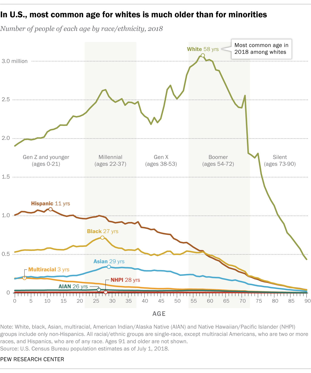
The modal age of racial/ethnic groups in the United States

There is a big age difference in the most common age among racial and ethnic groups in the United States – particularly compared to the median.

In U.S., most common age for whites is much older than for minorities


There were more 27-year-olds in the United States than people of any other age in 2018. But for white Americans, the most common age was 58, according to a Pew Research Center analysis of Census Bureau data.

In the histogram above, which shows the total number of Americans of each age last year, non-Hispanic whites tend to skew toward the older end of the spectrum (more to the right), while racial and ethnic minority groups – who include everyone except single-race non-Hispanic whites – skew younger (more to the left).

The most common age was 11 for Hispanics, 27 for blacks and 29 for Asians as of last July, the latest estimates available. Americans of two or more races were by far the youngest racial or ethnic group in the Census Bureau data, with a most common age of just 3 years old. Among all racial and ethnic minorities, the most common age was 27…

Non-Hispanic whites constituted a majority (60%) of the U.S. population in 2018, and they were also the oldest of any racial or ethnic group as measured by median age – a different statistic than most common age (mode). Whites had a median age of 44, meaning that if you lined up all whites in the U.S. from youngest to oldest, the person in the middle would be 44 years old. This compares with a median age of just 31 for minorities and 38 for the U.S. population overall.

The paragraphs above provide multiple pieces of information that explain the distribution displayed above:

-The different groups have different skews, suggesting these are not even distributions.

-The mode is much higher for whites.

-The median agrees with the conclusion from the mode – whites are on average older – but the gap between whites and other groups drops.

All three pieces of information could inform the headline but Pew chose to go with the mode. Is this with the intent of suggesting large age differences among the groups?