The Internet and social media mean our reference group is everyone and not just family and friends

Related to the post yesterday about the power of statistics on college campuses, here is a similar matter: how much do we compare our behavior today to “everyone” or “larger patterns” rather than just family and friends around us?

Photo by fauxels on Pexels.com

The connection is not just the Internet and social media and the way they connect us to more people and narratives. This is a change in statistics: we think we can see larger patterns and we can access more information.

Whether what we see on social media is a real pattern might not matter. (A reminder: relatively few people are active on Twitter.) We see more online and we can see what people are highlighting. This might appear as a pattern.

Not too long ago, we were more limited in our ability to compare our actions to others. The mass media existed but in more packaged forms (television, radio, music, films, newspapers, etc.) rather than the user-driven content of social media. The comparisons to that mass media still mattered – I remember sociologist Juliet Schor’s argument in The Overspent American of how increased TV watching was related to increased consumption – but people’s ties to their family and friends in geographic proximity were likely stronger. Or, in Robert Putnam’s Bowling Alone world, people spent a lot more time in local organizations and groups rather than in the broad realms of the Internet and social media.

Now, we can easily see how our choices or circumstances compare to others. Even odd situations we find ourselves in quickly be matched across a vast set of platforms for similarities and differences. Whether our tastes are mainstream or unusual, we can see how they stack up. If I am on college campus X on one side of the country, I can easily see what is happening on college campuses around the world.

Even as the Internet and social media is not fully representative of people and society, it does offer a sample regarding what other people are doing. We may care less about what the people directly near us are doing and we can quickly see what broader groups are doing. We can live our everyday lives with a statistical approach: look at the big N sample and adjust accordingly.

Does a “medium sized suburb” have 20,000 residents?

I recently saw a headline comparing a group of people to the population size of a suburb:

Photo by Ingo Joseph on Pexels.com

Nearly 20,000 Cook County residents holding revoked FOID cards — enough to populate a medium-sized suburb

More population comparisons from later in the story:

Arthur Jackson, first deputy chief of police for the Cook County Sheriff’s Police Department, told legislators over the years, 33,000 Cook County residents’ firearm owner’s identification cards have been revoked because of violent felony convictions, domestic violence charges or serious mental health issues.

That’s more than the entire population of Highland Park in Lake County.

Of that total, “nearly 20,000” have not turned in their cards — more than the population of north suburban Deerfield.

“Medium” is between “small” and “large.” The smallest suburbs can be just a few hundred or a few thousand people while the largest suburbs can have several hundred thousand residents. Is nearly 20,000 in the middle?

The comparisons to specific suburbs might be more helpful, particularly if people know something about Highland Park or Deerfield. They can picture these communities and then make the connection to the number of people with revoked FOID cards.

Other comparisons that might be better: the number of people in a basketball arena, the number of students at a college, the number of people at a concert.

I am not sure that a “medium-sized suburb” is clear enough to help people understand the number at question here.

Interpreting a 50% chance of rain

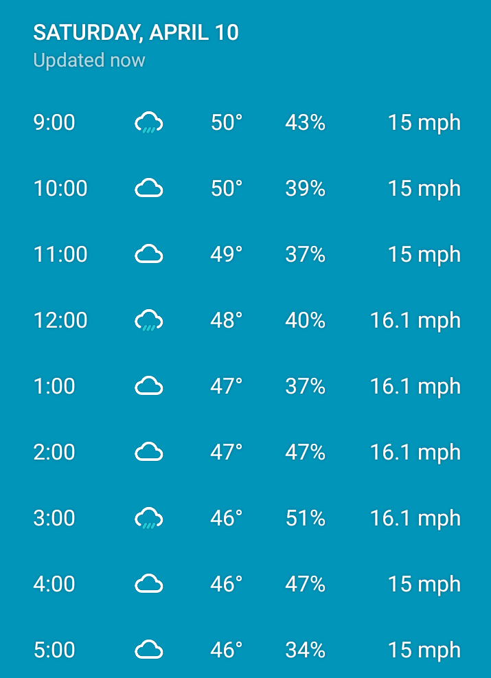
We have had multiple days recently where there is a threat of rain all day. The hourly forecast from yesterday was not unusual:

One of my first thoughts in seeing such a forecast is to say that there is a 50/50 chance of rain. Flip a coin. With this in mind, I would not necessarily stay inside but I would be prepared when going outside.

The idea of a meteorologist flipping a coin when predicting rain is tempting. This could lead to thinking that the meteorologists do not really know so they are just guessing.

However, this is not exactly how this information works. If I look at the hourly forecast and see 0% chance of rain or even anything under 20-30%, I am not going to worry about rain. The probability is low. In contrast, if I see 70% and above I might alter my behavior as the probability is high.

The 50/50 information is still very useful even if it leaves a reader unsure if there will be rain or not. It is not conclusive information but it is not no information or just a guess. With rain at 50%, bring an umbrella, have a coat, or do not stay too far away from shelter but do not just stay inside.

Trying to use statistics in a post-evidence political world

Ahead of the presidential debate last night, my Statistics class came up with a short list of guidelines for making sense of the statistics that were sure to be deployed in the discussion. Here is my memory of those strategies:

Photo by Pixabay on Pexels.com
  1. What is the source of the data?
  2. How was the statistic obtained (sample, questions asked, etc.)?
  3. Is the number unreasonable or too good/too bad to be true?
  4. How is the statistic utilized in an argument or what are the implications of the statistic?

These are good general tips for approaching any statistic utilized in the public realm. Asking good questions about data helps us move beyond accepting all numbers because they are numbers or rejecting all numbers because they can be manipulated. Some statistics are better than others and some are deployed more effectively than others.

But, after watching the debate, I wonder if these strategies make much sense in our particular political situation. Numbers were indeed used by both candidates. This suggests they still have some value. But, it would be easy for a viewer to leave thinking that statistics are not trustworthy. If every number can be debated – methods, actual figures, implications – depending on political view or if every number can be answered with another number that may or may not be related, what numbers can be trusted? President Trump throws out unverified numbers, challenges other numbers, and looks for numbers that boost him.

When Stephen Colbert coined the term “truthiness” in 2005, he hinted at this attitude toward statistics:

Truthiness is tearing apart our country, and I don’t mean the argument over who came up with the word …

It used to be, everyone was entitled to their own opinion, but not their own facts. But that’s not the case anymore. Facts matter not at all. Perception is everything. It’s certainty. People love the President [George W. Bush] because he’s certain of his choices as a leader, even if the facts that back him up don’t seem to exist. It’s the fact that he’s certain that is very appealing to a certain section of the country. I really feel a dichotomy in the American populace. What is important? What you want to be true, or what is true? …

Truthiness is ‘What I say is right, and [nothing] anyone else says could possibly be true.’ It’s not only that I feel it to be true, but that I feel it to be true. There’s not only an emotional quality, but there’s a selfish quality.

Combine numbers with ideology and what statistics mean can change dramatically.

This does not necessarily mean a debate based solely on numbers would lead to clearer answers. I recall some debate exchanges in previous years where candidates argued they each had studies to back up their side. In that instance, what is a viewer to decide (probably not having read any of the studies)? Or, if science is politicized, where do numbers fit? Or, there might be instances where a good portion of the electorate thinks statistics based arguments are not appropriate compared to other lines of reasoning. And the issue may not be that people or candidates are innumerate; indeed, they may know numbers all too well and seek to exploit how they are used.

Disproportionately more Illinois COVID-19 cases and deaths in the Chicago suburbs

The Daily Herald reports on COVID-19 cases in the Chicago suburbs as a whole:

IDPHdashboardJul2320

Since the outbreak began, there have been 83,563 cases in the suburbs as of Thursday, 50% of the state’s total, according to the Illinois Department of Public Health. There have been 3,750 deaths in the suburbs, representing almost 50.9% of all deaths in Illinois.

The data presented suggest the Chicago suburbs account for roughly half of cases and deaths in Illinois. But, how does this compare to the percent of Illinois residents living in the Chicago suburbs?

The subsequent numbers of COVID-19 cases by community suggest these are the counties in the Daily Herald analysis: suburban Cook County, DuPage County, Kane County, Will County, McHenry County, and Lake County. If you add up these populations (using the U.S. Census QuickFacts 2019 population estimates), the suburban population is roughly 5,610,000. With the total population of Illinois at 12,671,821, the residents of the Chicago suburbs account for a little over 44% of the state’s population.

Thus, the Chicago suburbs have slightly more of their share of COVID-19 cases and deaths within the state of Illinois. Is this expected or unexpected? If we hold to images of wealthier, whiter suburbs, perhaps this is surprising: can’t many suburbanites work from home and/or shelter in place in large homes? Or, is suburbia more complex?

The disparities across suburban communities are not just limited to DuPage County. Take two large municipalities in suburban Cook County: even though Schaumburg has 13,000 more residents than Des Plaines, it has 1,200 cases than Des Plaines. Or, in Kane County, St. Charles has 4,500 fewer residents than Carpentersville (population of just over 37,000) but has just a little more than half of the cases.

While much attention regarding COVID-19 has focused on cities – and for some good reasons – this data from the Chicago suburbs suggests it is a issue for many suburbs as well.

(It is unclear how this data might change if the analysis extended to more counties in the Chicago metropolitan region, which include additional counties in Illinois, northwest Indiana, and southeastern Wisconsin.)

Ascertaining the popularity of the tiny house movement via Twitter

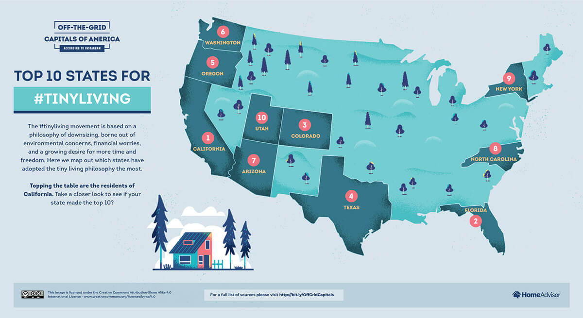
HomeAdvisor looked at tweets about tiny houses and examined geographic patterns:

Top 10 States for Tiny Living

The best states for #tinyliving living – https://www.homeadvisor.com/r/off-the-grid-capitals/

The methodology:

To create these visualizations, we collected data by “scraping” it. Scraping is a technique that gathers large amounts of data from websites. In this case, we wrote a custom script in Python to get the data for each hashtag. The script collected information including the number of likes, number of comments, location, etc. for posts with each of the three lifestyle hashtags. The python script also collects data that human users can‘t see, like specific location information about where the post was published from.

We didn’t include posts without location information. We also didn’t include posts outside of the United States. We then standardized the city and state data. Then, we grouped the posts by city and by state, tallying the number of posts for each hashtag. This gave us our top locations.

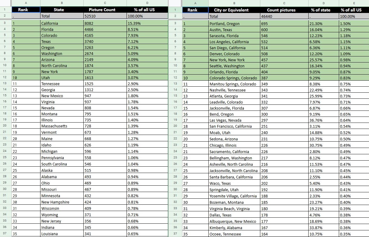
And more details on the state and city level data:

TinyLivingHomeAdvisorJun20

On one hand, this is interesting data. California, in particular, stands out though this may not be that surprising given its size, good weather, and high housing prices. The rest of the top ten seem to match similar characteristics including scenic areas and good weather (New York and possibly Colorado winters excluded). The city level data compared to the state numbers provides some insights – major cities can account for a large percentage of tweets for a whole state –  but there are not many cases in any particular city.

On the other hand, it is hard to know what exactly this Twitter data means. There are multiple issues: how many Americans are on Twitter or are active on Twitter and does this overlap with those who like and have tiny houses? Some of the tweets about tiny houses did not have location data – is the data missing at random or does it intersect with the patterns above? Does the #tinyliving hashtag capture the tiny house movement or a part of it?

Because of these issues, I still do not have a better idea of whether the tiny house movement is sizable or not. Having some denominator would help; of the California tweets, how does this compare to the number of single-family homes or apartments in the state? Portland, Oregon leads the way with 695 cases but over 650,000 people live in the city. How do these tweet numbers compare to people tweeting about HGTV shows or single-family homes?

There is a lot that can be done here and making use of data publicly available on websites and social media is smart. Figuring out which questions can be asked and answered with such data and then collecting good data is a challenging and possibly rewarding task.

Maps, distortions, and realities

Maps do not just reflect reality; a new online exhibit at the Boston Public Library looks at how they help shape reality:

desk globe on shallow focus lens

Photo by NastyaSensei on Pexels.com

The original topic was to do an exhibition of a classic category of maps called persuasive cartography, which tends to refer to propaganda maps, ads, political campaign maps, maps that obviously you can tell have an agenda. We have those materials in our collections of about a quarter million flat maps, atlases, globes and other cartographic materials. But we decided in recognition of what’s going on now to expand into a bigger theme about how maps produce truth, and how trust in maps and other visual data is produced in media and civil society. So rather than thinking about just about maps which are obviously treacherous, distorting, and deceptive, we wanted to think about how every map goes about presenting the world and how they can all reflect biases and absences or incorrect classifications of data. We also wanted to think about this as a way to promote data literacy, which is a critical attitude towards media and data visualizations, to bring together this long history of how maps produce our sense of reality…

We commissioned a special set of maps where we compiled geographic data about the state of Massachusetts across a few different categories, like demographics, infrastructure, and the environment. We gave the data to a handful of cartographers and asked them to make a pair of maps that show different conclusions that disagree with each other. One person made two maps from environmental data from toxic waste sites: One map argues that cities are most impacted by pollution, and the other says it’s more rural towns that have a bigger impact. So this project was really meant to say, we’d like to think that numbers speak for themselves, but whenever we’re using data there’s a crucial role for the interpreter, and the way people make those maps can really reflect the assumptions they’ve brought into the assignment…

In one section of the show called “How the Lines Get Bent,” we talk about some of the most common cartographic techniques that deserve our scrutiny: whether the data is or isn’t normalized to population size, for example, will produce really different outcomes. We also look at how data is produced by people in the world by looking at how census classifications change over time, not because people themselves change but because of racist attitudes about demographic categorizations that were encoded into census data tables. So you have to ask: What assumptions can data itself hold on to? Throughout the show we look at historic examples as well as more modern pieces to give people questions about how to look at a map, whether it’s simple media criticism, like: Who made this and when? Do they show sources? What are their methods, and what kinds of rhetorical framing like titles and captions do they use? We also hit on geographic analysis, like data normalization and the modifiable area unit problem…

So rather than think about maps as simply being true or false, we want to think about them as trustworthy or untrustworthy and to think about social and political context in which they circulate. A lot of our evidence of parts of the world we’ve never seen is based on maps: For example, most of us accept that New Zealand is off the Australian coast because we see maps and assume they’re trustworthy. So how do societies and institutions produce that trust, what can be trusted and what happens when that trust frays? The conclusion shouldn’t be that we can’t trust anything but that we have to read things in an informed skeptical manner and decide where to place our trust.

Another reminder that data does not interpret itself. Ordering reality – which we could argue that maps do regarding spatial information – is not a neutral process. People look at the evidence, draw conclusions, and then make arguments with the data. This extends across all kinds of evidence or data, ranging from statistical evidence to personal experiences to qualitative data to maps.

Educating the readers of maps (and other evidence) is important: as sociologist Joel Best argues regarding statistics, people should not be naive (completely trusting) or cynical (completely rejecting) but rather should be critical (questioning, skeptical). But, there is another side to this: how many cartographers and others that produce maps are aware of the possibilities of biased or skewed representations? If they know this, how do they then combat it? There would be a range of cartographers to consider, from people who make road atlases to world maps to those working in media who make maps for the public regarding current events. What guides their processes and how often do they interrogate their own presentation? Similarly, are people more trusting of maps than they might be of statistics or qualitative data or people’s stories (or personal maps)?

Finally, the interview hints at the growing use of maps with additional data. I feel like I read about John Snow’s famous 1854 map of cholera cases in London everywhere but this has really picked up in recent decades. As we know more about spatial patterns as well as have the tools (like GIS) to overlay data, maps with data are everywhere. But, finding and communicating the patterns is not necessarily easy nor is the full story of the analysis and presentation given. Instead, we might just see a map. As someone who has published an article using maps as key evidence, I know that collecting the data, putting it into a map, and presenting the data required multiple decisions.

Looking for data reporting and presentation standards for COVID-19

As the world responds to COVID-19, having standardized data could go a long ways:

All in all, information made available by state health departments has been more timely and complete than information coming from the CDC, especially from a testing perspective, for which the CDC only offers a national aggregate not counting private labs. However, there is no overall standard when it comes to the information that has to be made public at the state level, which has led to a large variation in data quality across the country…

The COVID Tracking Project has assembled what the “ideal” Covid-19 dataset should look like. It includes the number of total tests conducted (including commercial tests), the number of people hospitalized (in cumulative and daily increments), the number of people in the ICU, and the race and ethnicity information of every case and death. Few states check all the boxes, but the situation is improving…

Some kind of standard as how to present the data to the public would be helpful. Health departments do not all have the resources to put together custom elaborate data visualizations of the Covid-19 pandemic. Most health departments have adopted geographic information system mapping programs from companies like Tableau and Esri — similar to the John Hopkins University dashboard — but there is no standard and no guidance explaining what should be put in place.

Organizing actions in a variety of sectors – from healthcare to the economy to social interaction to political interventions – relies heavily on statistics about the problem at hand. Without good data, actors are reacting to anecdotal evidence or acting without any basis at all; this is not what you want when time is of the essence. Of course, you can also have good data and then actors can choose to ignore it or draw the wrong conclusions. At the same time, we tend to argue “knowledge is power” and having good information could lead to better decisions.

Hopefully this means that all of the various actors will be better prepared next time with a process in place that will help everyone be on the same page and have the same capabilities sooner.


Reminder: do not get carried away making fancy charts and graphs

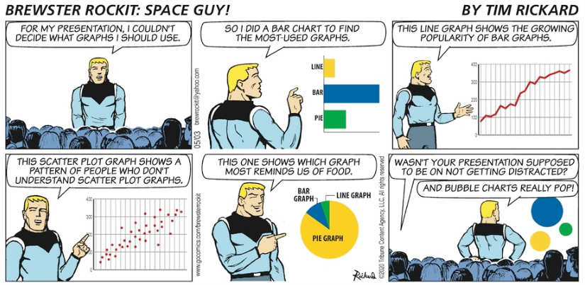
The Brewster Rockit: Space Guy! comic strip from last Sunday makes an important point about designing charts and graphs: don’t get carried away.

https://www.gocomics.com/brewsterrockit/2020/05/03

Brewster Rockit May 3, 2020

The goal of using a chart or graph is to distill the information behind it into an easy-to-read format for making a quick point. A reader’s eye is drawn to a chart or graph and it should be easy to figure out the point the graphic is making.

If the graph or chart is too complicated, it loses its potency. If it looks great or clever but cannot help the reader interpret the data correctly, it is not very useful. If the researcher spends a lot of time tweaking the graphic to really make it eye-popping, it may not be worth it compared to simply getting the point across.

In sum: graphs and charts can be fun. They can break up long text and data tables. They can focus attention on an important data point or relationship. At the same time, they can get too complicated and become a time suck both for the producer of the graphic and those trying to figure them out.

From outlier to outlier in unemployment data

With the responses to COVID-19, unemployment is expected to approach or hit a record high among recorded data:

April’s employment report, to be released Friday, will almost certainly show that the coronavirus pandemic inflicted the largest one-month blow to the U.S. labor market on record.

Economists surveyed by The Wall Street Journal forecast the new report will show that unemployment rose to 16.1% in April and that employers shed 22 million nonfarm payroll jobs—the equivalent of eliminating every job created in the past decade.

The losses in jobs would produce the highest unemployment rate since records began in 1948, eclipsing the 10.8% rate touched in late 1982 at the end of the double-dip recession early in President Reagan’s first term. The monthly number of jobs lost would be the biggest in records going back to 1939—far steeper than the 1.96 million jobs eliminated in September 1945, at the end of World War II.

But, also noteworthy is what these rapid changes follow:

Combined with the rise in unemployment and the loss of jobs in March, the new figures will underscore the labor market’s sharp reversal since February, when joblessness was at a half-century low of 3.5% and the country notched a record 113 straight months of job creation.

In other words, the United States has experienced both a record low in unemployment and a record high within three months. A few thoughts connected to this:

1. Either outlier is noteworthy; having them occur so close to each other is more unusual.

2. Their close occurrence makes it more difficult to ascertain what is “normal” unemployment for this period of history. The fallout of COVID-19 is unusual. But the 3.5% unemployment can also be considered unusual compared to historical data.

3. Given these two outliers, it might be relatively easy to dismiss either as aberrations. Yet, while people are living through the situations and the fallout, they cannot simply be dismissed. If unemployment now is around 16%, this requires attention even if historically this is a very unusual period.

4. With these two outliers, predicting the future regarding unemployment (and other social measures) is very difficult. Will the economy quickly restart in the United States and around the world? Will COVID-19 be largely under control within a few months or will there be new outbreaks for a longer period of time (and will governments and people react in the same ways)?

In sum, dealing with extreme data – outliers – is a difficult task for everyone.