I appreciate the effort at CityLab to take all of the data regarding where Americans moved during the COVID-19 pandemic and put it into graphs and charts. Good graphs and charts should help illustrate relationships between variables and help readers see patterns. Here are several choices that I thought succeeded.
First, start with patterns in metro areas across the United States.
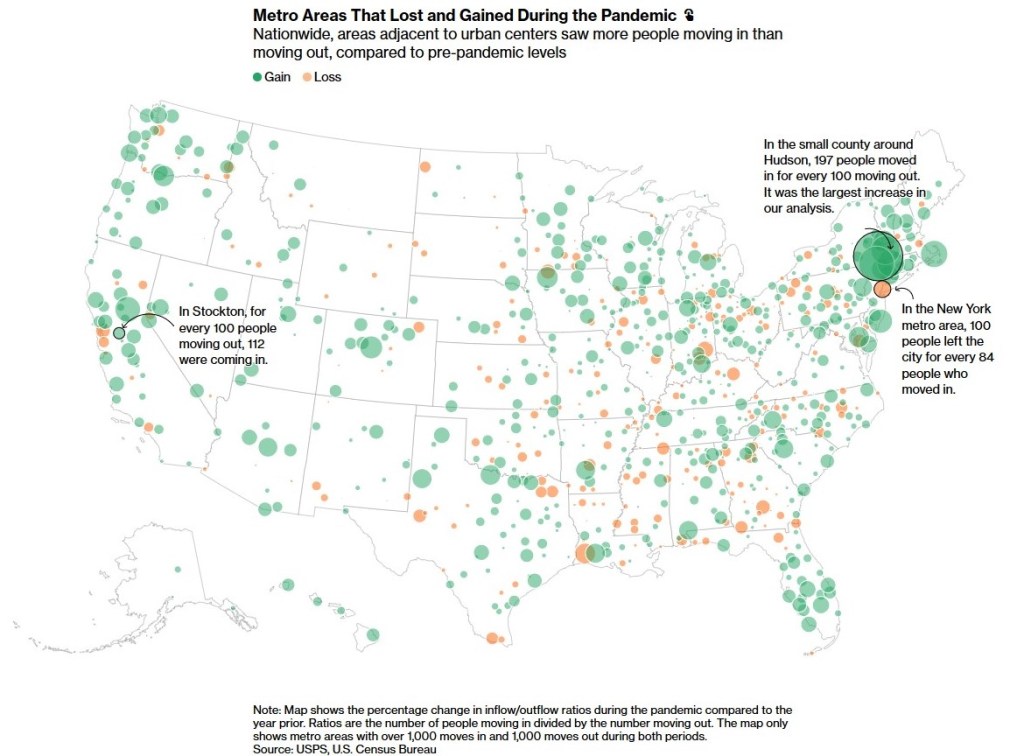
The two colors plus the size of the circle show the percentage change in population. The percentage is a nice touch yet the comparison to the previous year might slip past some viewers.
Second, another way to look at metro areas on the whole regarding population changes.
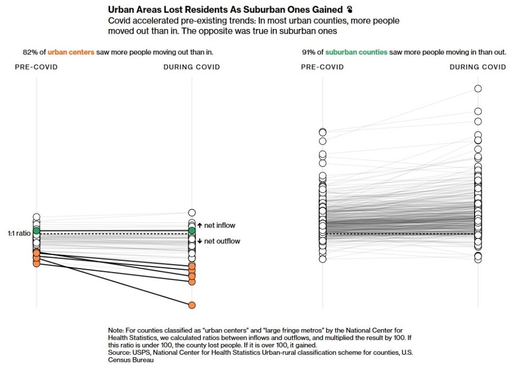
The side-by-side of central cities and suburbs quickly shows several differences: lower ratios for cities, more variability among suburban counties, more losses for cities during COVID. The patterns among suburban counties are a little hard to pick up; there are a number of counties that lost people even as the general trend might have been up.
Third, where did all those people moving from New York City, specifically Manhattan go?
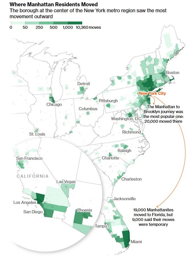
In absolute numbers, there are patterns this map displays nicely: a lot of moves in New York City and in the region plus moves to other metro areas (including Miami, Los Angeles, Chicago, and more). The inset of the Southwest at the bottom left is a nice touch…presumably New Yorkers did not move in large numbers to anywhere roughly between Nashville and Seattle.
Fourth, which New Yorkers moved?
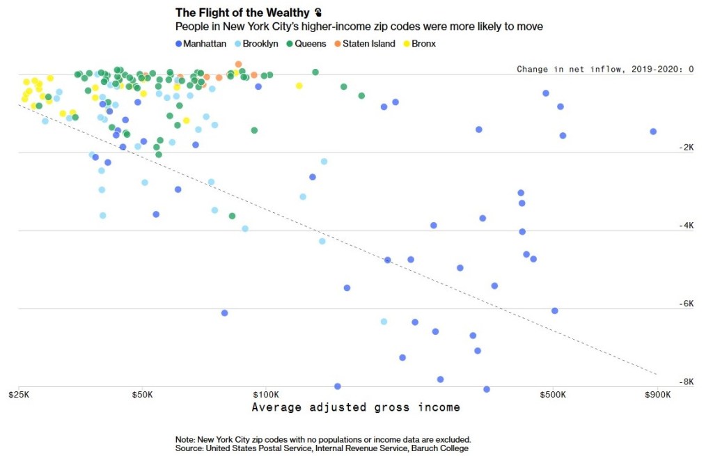
Looking at zip codes, neighborhoods with higher incomes had more people moving while the numerous neighborhoods with lower incomes had smaller changes in inflow.
All together, this is more than just a series of pretty graphics. These choices – first about what data to use and second about how to present one variable in light of another – help clarify what happened in the last year. Each choice could have been a little different; emphasize a different part of the data or another variable, choose another graphic option. Yet, while there is certainly more to untangle about mobility, cities and suburbs, and COVID-19, these images help us start making sense of complex phenomena.