Pew Research calculator to determine your location-controlled social class

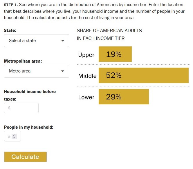
This calculator offered by the Pew Research Center factors in your location to determine which social class you belong in:

On how the calculator considers location:

The calculator takes your household income and adjusts it for the size of your household. The income is revised upward for households that are below average in size and downward for those of above average size. This way, each household’s income is made equivalent to the income of a three-person household (the whole number nearest to the average size of a U.S. household, which was 2.5 in 2018)…

Your size-adjusted household income and the cost of living in your area are the factors we use to determine your income tier. Middle-income households – those with an income that is two-thirds to double the U.S. median household income – had incomes ranging from about $48,500 to $145,500 in 2018. Lower-income households had incomes less than $48,500 and upper-income households had incomes greater than $145,500 (all figures computed for three-person households, adjusted for the cost of living in a metropolitan area, and expressed in 2018 dollars).

The following example illustrates how cost-of-living adjustment for a given area was calculated: Jackson, Tennessee, is a relatively inexpensive area, with a price level in 2018 that was 19.0% less than the national average. The San Francisco-Oakland-Hayward metropolitan area in California is one of the most expensive areas, with a price level that was 31.6% higher than the national average. Thus, to step over the national middle-class threshold of $48,500, a household in Jackson needs an income of only about $39,300, or 19.0% less than the national standard. But a household in the San Francisco area needs a reported income of about $63,800, or 31.6% more than the U.S. norm, to join the middle class.

Key here is the idea that incomes go further in some places and have less purchasing power elsewhere. By itself, income may not be that great of a measure for determining social class. Including location helps get at local variations in class.

Of course, there are other factors that go into assessing social class. This includes education, wealth, social networks, and more.

(Note: this calculator is based on 2018 data so there could be some important changes here in 2023.)

The modal age of racial/ethnic groups in the United States

There is a big age difference in the most common age among racial and ethnic groups in the United States – particularly compared to the median.

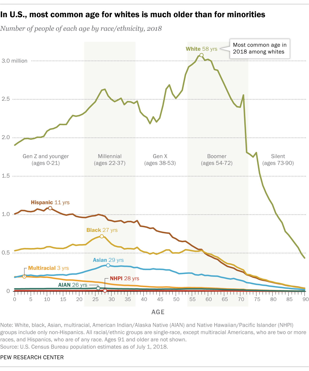
In U.S., most common age for whites is much older than for minorities


There were more 27-year-olds in the United States than people of any other age in 2018. But for white Americans, the most common age was 58, according to a Pew Research Center analysis of Census Bureau data.

In the histogram above, which shows the total number of Americans of each age last year, non-Hispanic whites tend to skew toward the older end of the spectrum (more to the right), while racial and ethnic minority groups – who include everyone except single-race non-Hispanic whites – skew younger (more to the left).

The most common age was 11 for Hispanics, 27 for blacks and 29 for Asians as of last July, the latest estimates available. Americans of two or more races were by far the youngest racial or ethnic group in the Census Bureau data, with a most common age of just 3 years old. Among all racial and ethnic minorities, the most common age was 27…

Non-Hispanic whites constituted a majority (60%) of the U.S. population in 2018, and they were also the oldest of any racial or ethnic group as measured by median age – a different statistic than most common age (mode). Whites had a median age of 44, meaning that if you lined up all whites in the U.S. from youngest to oldest, the person in the middle would be 44 years old. This compares with a median age of just 31 for minorities and 38 for the U.S. population overall.

The paragraphs above provide multiple pieces of information that explain the distribution displayed above:

-The different groups have different skews, suggesting these are not even distributions.

-The mode is much higher for whites.

-The median agrees with the conclusion from the mode – whites are on average older – but the gap between whites and other groups drops.

All three pieces of information could inform the headline but Pew chose to go with the mode. Is this with the intent of suggesting large age differences among the groups?

The United States in its second prolonged period of immigration?

Many know that the decades at the end of the nineteenth century and early twentieth century were a period of significant immigration to the United States. This is regularly taught in history classes and often celebrated. While it can be difficult to understand larger patterns as they are happening, a recent Pew report provides evidence that a second long immigration period is happening now in the United States:

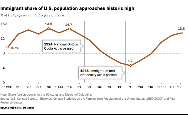
Nearly 14% of the U.S. population was born in another country, numbering more than 44 million people in 2017, according to a Pew Research Center analysis of the U.S. Census Bureau’s American Community Survey.

Pew_19.01.31_ForeignBornShare_ImmigrantshareofUS_2

This was the highest share of foreign-born people in the United States since 1910, when immigrants accounted for 14.7% of the American population. The record share was 14.8% in 1890, when 9.2 million immigrants lived in the United States.

Whether the trend line goes up, down, or plateaus remains to be seen (and immigration is a controversial topic at the moment). Still, even if it dropped in the coming years, now would still be part of a longer trend that people and scholars will look back at.

Putting the figures in international context might prove helpful as well:

Even though the U.S. has more immigrants than any other country, the foreign-born share of its population is far from the highest in the world. In 2017, 25 countries and territories had higher shares of foreign-born people than the U.S., according to United Nations data

Worldwide, most people do not move across international borders. In all, only 3.4% of the world’s population lives in a country they were not born in, according to data from the UN. This share has ticked up over time, but marginally so: In 1990, 2.9% of the world’s population did not live in their country of birth.

A number of countries could claim to be a “nation of immigrants” – a common refrain in the United States – though how all of that came to be would certainly differ as would how the immigrants were and are understood.

26% of adult Americans online “almost constantly,” 43% “several times a day”

New data from Pew reveal how often Americans are online:

Not surprisingly, more use was related to more use of mobile devices, youth, more education, and more money.

Two additional thoughts:

  1. The difference between “almost constantly” and “several times a day” is worth considering. I would be a good example of someone who works in an office for much of the day and is online there but also has significant amounts of time when I am not online (at home as well as longer periods at work). I would say more than “several times a day” but “almost constantly” isn’t quite true either. This is where some observational data or tracking people through their device use would be particularly helpful.
  2. Only 11% of Americans say they are online less than daily. This means that those who are online – the vast majority of American adults (89%) – are online quite a lot. The Internet truly is part of everyday life.

Now, we will see how long before the majority of Americans fall into the “almost constantly” category. It may not be very long at all.

Multiple measures and small trends: American birthrates down, births per woman up

A new Pew report explains this statistical oddity: the annual birthrate in the US is down but women are having more children.

How can fertility be down even as the number of women who are having children is going up? There are complex statistical reasons for this, but the main cause of this confusing discrepancy is the age at which women are having children. Women are having children later in life — the median age for having a first baby is 26 now, up from 23 in 1994 — and this delay causes annual birth rates to go down, even as the cumulative number of babies per woman has risen…


Another factor, Livingston said, is the drop in teen birth rates, with black women seeing the biggest drop in that category.

See the Pew report here. An additional part of the explanation is that there are multiple measures at play here. A Pew report from earlier in 2018 explains:

But aside from this debate, the question remains: Is this really a record low? The short answer is: It’s complicated.

That’s because there are different ways to measure fertility. Three of the most commonly used indicators of fertility are the general fertility rate (GFR); completed fertility; and the total fertility rate (TFR). All three reflect fertility behavior in slightly different ways – respectively, in terms of the annual rate at which women are presently having kids; the number of kids they ultimately have; or the hypothetical number they would likely have based on present fertility patterns.

None of these indicators is “right” or “wrong,” but each tells a different story about when fertility bottomed out.

Measurement matters and the different measures can fit different social and political views.

I wonder if part of the issue is also that there is a clear drop in births from the earlier era – roughly 1950 to 1970 which we often associate with Baby Boomers – but the last 3+ decades have been relatively flat. This plateau of recent decades means researchers and commentators may be more prone to jump on small changes in the data. Many people would love to predict the next big significant rise or fall in numbers but a significant change may not be there, particularly when looking at multiple measures.

The state of reading books in America in 2016

Pew Research has recently put out several reports on book reading in America. First, the broad overview:

Yet even as the number of ways people spend their time has expanded, a Pew Research Center survey finds that the share of Americans who have read a book in the last 12 months (73%) has remained largely unchanged since 2012…

Americans read an average (mean) of 12 books per year, while the typical (median) American has read 4 books in the last 12 months.

Second, those who do read still do so in print most of the time:

Readers today can access books in several common digital formats, but print books remain substantially more popular than either e-books or audio books. Roughly two-thirds of Americans (65%) have read a print book in the last year, which is identical to the share of Americans who reported doing so in 2012 (although down slightly from the 71% who reported reading a print book in 2011).

By contrast, 28% of Americans have read an e-book – and 14% have listened to an audio book – in the last year. In addition to being less popular than print books overall, the share of Americans who read e-books or listen to audio books has remained fairly stable in recent years…

Nearly four-in-ten Americans read print books exclusively; just 6% are digital-only book readers.

Third, on why people read:

Among all American adults:

  • 84% ever read to research specific topics of interest (29% do so nearly every day).
  • 82% read to keep up with current events (47% nearly every day).
  • 80% read for pleasure (35% nearly every day).
  • 57% read for work or school (31% do so nearly every day).

Fourth, who isn’t reading:

Several demographic traits correlate with non-book reading, Pew Research Center surveys have found. For instance, adults with a high school degree or less are about three times as likely as college graduates (40% vs. 13%) to report not reading books in any format in the past year. A 2015 Pew Research Center survey shows that these less-educated adults are also the least likely to own smartphones or tablets, two devices that have seen a substantial increase in usage for reading e-books since 2011. (College-educated adults are more likely to own these devices and use them to read e-books.)

Adults with an annual household income of less than $30,000 are about twice as likely as the most affluent adults to be non-book readers (33% vs. 17%). Hispanic adults are also about twice as likely as whites (40% vs. 23%) to report not having read a book in the past 12 months.

Older Americans are a bit more likely than their younger counterparts not to have read a book. Some 29% of adults ages 50 and older have not read a book in the past year, compared with 23% of adults under 50. In addition, men are less likely than women to have read a book, as are adults in rural areas compared with those in urban areas.

Fifth, the book reading trends haven’t changed too much in recent years:

The share of Americans who report not reading any books in the past 12 months is largely unchanged since 2012, but is slightly higher than in 2011, when the Center first began conducting surveys of book-reading habits. That year, 19% of adults reported not reading any books.

While Internet use (with the included possibilities of streaming audio and video) is taking up more and more time in daily life, it may take quite a while for reading books to becoming an activity for a small minority. And how could is disappear completely from certain settings such as schools and colleges?

The seven American counties where there is no black-white income gap

Pew looks at the seven places in the United States where black residents have higher median incomes than whites:

Yet, a tiny number of places exist where black household income is greater than that of whites. Of the 364 large U.S. counties whose populations are at least 5 percent black, there are seven, according to a Stateline analysis of U.S. Census Bureau American Community Survey data for 2010-14…

The greatest similarities may be their proximity to core urban areas and high-paying corporate or government jobs, as well as their supply of affordable, albeit expensive, homes and good schools.

Valerie Wilson of EPI said affluent black families may have had to move farther from cities to find the good housing and schools they seek because the black middle class, with less net worth, cannot afford rising housing prices in the cities or private schools.

The article stresses that there are no lessons to be learned here even as there might be some patterns. The seven places do raise a number of interesting questions worth exploring:

  1. The emphasis here is on the movement of black households to these counties. At the same time, what traits do the white residents of these counties have (that they are not living in areas with more inequality)?
  2. Did the counties or local governments do anything to help promote these trends? I’m guessing these are largely the result of the “free market.” Yet, just because it happened in seven counties suggests this is a pretty rare outcome of the this free market.
  3. What are the levels of residential segregation in these counties? Simply suggesting that blacks and whites have similar incomes doesn’t necessarily mean that the two groups regularly interact.
  4. That this kind of equality can only be found in suburban areas likely would not please many suburban critics. However, many large cities and closer suburbs have a range of issues – from concentrated poverty to a lack of affordable housing – that can limit the opportunities for non-whites to succeed.

These places would be worth watching in the coming years.

“We’re at peak multigenerational” housing?

Pew recently reported on the increase of Americans living in multigenerational households:

In 2014, more young people were living with their parents than with a romantic partner. And a lot of these millennials’ parents were cohabiting with their own parents.

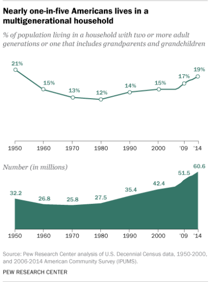
A new Pew Research Center analysis finds that a record-high number of Americans—60.6 million, to be exact—were living with with grandma and grandpa that year. In terms of share of the U.S. population, these people made up 19 percent in 2014. That’s almost as high as back in 1950, when 21 percent of the population, or 32 million people, lived in such an arrangement.

Money—or lack thereof—helps explain why this housing arrangement is back in style. The economic woes of the late-2000s brought millions of young adults boomeranging back to their childhood homes. But the trend also has to do with immigration and diversification of the U.S. population.

Two quick thoughts:

  1. If indeed money is a motivating factor, we might expect these numbers to drop when the economy improves or when younger adults do better in the job market and move out of such arrangements. Or, does this uptick herald a long-term interest in living in multigenerational settings regardless of financial imperatives?
  2. As noted later in the article, whites are the least likely (15%) to live in such settings. Will such differences persist in the future or will such arrangements decline in non-white groups as (1) their financial prospects increase and (2) more recent immigrants spend more time in the United States?

In other words, how exactly do we know that this is a peak? There is certainly a trend upward of more households with multiple generations and a higher percentage of such households overall. If the discussed causal factors remain fairly static – sluggish economy, high levels of immigration – then the rise may continue. However, circumstances could change and the trend line in the next few years could rise, plateau, or fall. And, these factors don’t account for changing cultural values where multigenerational or communal living may just become more popular regardless of those two factors. (In other words, perhaps we could see a reaction to the long-term trend from the 1950s to the early 2000s of wanting to get away and own one’s own single-family home.)

Stay tuned for another peak that may not be one.

Middle class declines in the majority of US metropolitan areas

A new study from Pew shows that the middle class did not do well in many metro areas between 2000 and 2014:

The report by Pew Research Center found that the share of the middle class fell in 203 of the 229 U.S. metropolitan areas examined from 2000 to 2014, including major cities such as New York, Los Angeles and Chicago, which saw a relatively sharp drop in its middle class.

For many areas, a big culprit in the declining middle was the falloff in manufacturing jobs during that 14-year period, when factories shed about 5 million workers from their payrolls nationally…

The news was not all downcast, especially for metro areas in coastal and border regions that have benefited from the boom in technology, trade and resources…

Among the 229 metro areas, which constitute about 76% of the U.S. population in 2014, there were slightly more areas that saw a bigger increase in the share of upper-income population than lower-income adults. Still, Pew’s Kochhar did not view that as a big win for the American economy. The median incomes of the lower, middle and upper tiers all shrank between 2000 and 2014, he said.

Three quick thoughts:

  1. The continued effect of losing manufacturing jobs cannot be overstated: this has hurt numerous cities for decades. It is not easy for any large city to transition from such jobs to opportunities in new sectors.
  2. Looking at this data at the level of a metropolitan region is helpful because it hints at broad patterns within regions that are often segregated by social class and race. The phenomenon of the rich and poor living right next to each other as well as trendy and wealthy communities getting a lot of attention is not exclusive to cities; similar patterns can be found in suburban areas.
  3. Connected to the second point is that solutions to income issues could come at the level of the entire region rather than within individual communities. How might entire regions help the middle class? Why don’t more large cities and surrounding suburbs work together on these issues? (I know why they don’t but that doesn’t mean that it wouldn’t benefit many local residents.)

The influential 1965 Immigration Act

The current position of the United States regarding immigrants was heavily influenced by the 1965 Immigration Act:

A new Pew Research Center report finds that the 1965 Immigration Act was largely responsible for bringing 59 million immigrants into the American population between then and 2015. These new arrivals, their kids, and their grandkids make up over half of the total U.S. population growth during this period. Looking ahead to 2065, immigrants that came to America as a result of this law, plus their families, will account for almost 90 percent of the nation’s population increase from now to then…

The Immigration Act of 1924 clamped down on immigration from Asia, Africa, the Middle East, and Western and Southern Europe. Here’s Stephen Klineberg, a sociologist at Rice University, commenting on the explicit racism of the policy, via NPR:

“It declared that Northern Europeans are a superior subspecies of the white race. The Nordics were superior to the Alpines, who in turn were superior to the Mediterraneans, and all of them were superior to the Jews and the Asians.”

The 1965 law re-wrote that policy, and since then America’s white population share has declined from 84 percent at the time to 62 percent in 2015. Meanwhile, the Hispanic population share grew from 4 to 18 percent, and Asians rose from less than 1 percent to 6 percent (below, left). If President Johnson hadn’t signed the 1965 law, America would be 75 percent white today…

Quite a long-lasting impact for a piece of legislation that still doesn’t seem to get much attention today. And, as the article notes, it may not have been easy to know the impact of the Act at the time even as its effect from the vantage point of today looks significant. If supporters or opponents of immigration want to support or change policy, this is a place to start (though there have been changes made since then).

Also noted: much of the population increase in the United States in recent decades is due to immigration. Otherwise, the fate of the country looks more like many other industrialized nations with low birth rates and an aging population.