
NBA teams in recent years have come up with some unique basketball floor designs. Here is what I saw last night when watching the Chicago Bulls play the Milwaukee Bucks in Milwaukee:
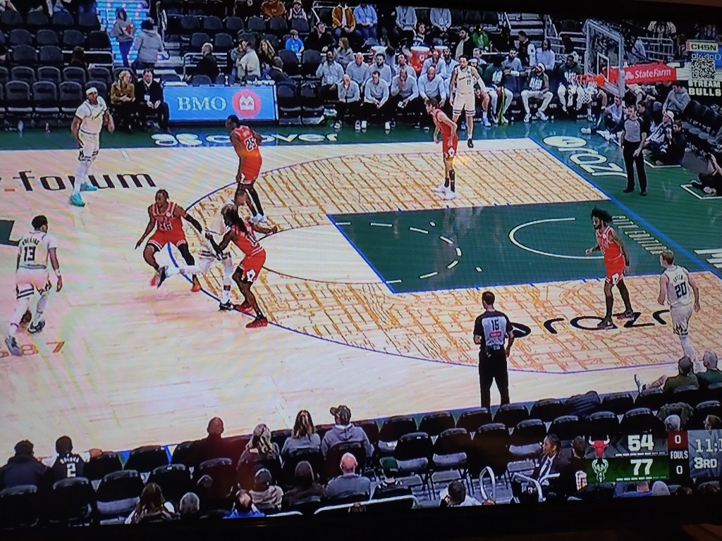
The area inside the three-point line and outside the lane is a map of Milwaukee streets. I do not know the city well enough to immediately know what part of Milwaukee displayed. But, I might be be able to figure it out with a little time. A Midwest grid is visible with some slight variations.
What if every NBA team put a map on their floor? Some of the might be more recognizable than others. Perhaps the maps could be bigger; imagine the map being outside the three-point lines and spanning most of the court. Or the map could emphasize a particular neighborhood or city feature.
I generally like seeing maps. I want to figure out what they are showing and consider what we can learn it. This map might be more of a decorative element than anything else but I am in favor to adding more maps to sports settings.


