One TV show had a higher rating – so change the ratings

Nielsen will change how they measure TV viewing as ratings continue to drop:

Despite the May axing of 19 first-year series and such surprise dumpings as ABC’s Castle and Nashville, cancellations are proving rarer, even as linear ratings shrink. That’s because, of the 60 returning scripted series to air on the five main broadcast networks this season, only one finished with improved ratings from the previous year. And that show premiered in the ’90s. Law & Order: SVU‘s modest gain, up an incremental 4 percent during its 17th cycle, is a case study in how the industry standard week of DVR and on-demand views doesn’t provide the most complete narrative any longer — or at least not one that the networks are eager to tell.

“We have found that audiences continue to grow beyond seven days in every instance, some by 58 percent among adults 18-to-49,” says Nielsen audience insights senior vp Glenn Enoch. “Growth after seven days is consistent, but the rate of growth varies by genre. Some programs need to be viewed in the week they air, while consumers use on-demand libraries to view others over time, like animated comedies and episodic dramas.”

To that end, on Aug. 29, Nielsen will up the turnaround on live-plus-7-day reporting (no more 15-day wait time), offering daily rolling on time-shifting, and it will start extending the tail past the long-established extra week of views. The measurement giant announced in March that the window for regularly reported on-demand and DVR data now will extend to 35 days after the original airdate.

The extra draw between weeks two and five is not minor for many scripted series. Grey’s Anatomy, again ABC’s highest-rated drama in its 12th season, saw its live-plus-7 average in the key demographic drop 3 percent from the previous season. But the 35-day trail of VOD (with online streams) adds another 1.5 rating points among 18-to-49, making for a 6 percent improvement from the show’s 11th season. (Of note: 1.5 is the complete live-plus-7-day rating for Thursday neighbor and surprise renewal The Catch.)

Certainly viewing habits have changed in recent years as viewing options proliferate. But, it is hard also not to see this as an attempt to chase numbers to provide advertisers (which leads to more money). If only one show showed an improvement from the past season (and a Law & Order in its 17th season), change the system of measurement. Perhaps this is the true acknowledgment that television will never be the same: the best solution to declining ratings is not to put together better content or to put together a new consolidated model but rather to chase viewers to all ends of the earth.

The first wave of big data – in the early 1800s

Big data may appear to be a recent phenomena but the big data of the 1800s allowed for new questions and discoveries:

Fortunately for Quetelet, his decision to study social behavior came during a propitious moment in history. Europe was awash in the first wave of “big data” in history. As nations started developing large-scale bureaucracies and militaries in the early 19th century, they began tabulating and publishing huge amounts of data about their citizenry, such as the number of births and deaths each month, the number of criminals incarcerated each year, and the number of incidences of disease in each city. This was the inception of modern data collection, but nobody knew how to usefully interpret this hodgepodge of numbers. Most scientists of the time believed that human data was far too messy to analyze—until Quetelet decided to apply the mathematics of astronomy…

In the early 1840s, Quetelet analyzed a data set published in an Edinburgh medical journal that listed the chest circumference, in inches, of 5,738 Scottish soldiers. This was one of the most important, if uncelebrated, studies of human beings in the annals of science. Quetelet added together each of the measurements, then divided the sum by the total number of soldiers. The result came out to just over 39 ¾ inches—the average chest circumference of a Scottish soldier. This number represented one of the very first times a scientist had calculated the average of any human feature. But it was not Quetelet’s arithmetic that was history-making—it was his answer to a rather simple-seeming question: What, precisely, did this average actually mean?

Scholars and thinkers in every field hailed Quetelet as a genius for uncovering the hidden laws governing society. Florence Nightingale adopted his ideas in nursing, declaring that the Average Man embodied “God’s Will.” Karl Marx drew on Quetelet’s ideas to develop his theory of Communism, announcing that the Average Man proved the existence of historical determinism. The physicist James Maxwell was inspired by Quetelet’s mathematics to formulate the classical theory of gas mechanics. The physician John Snow used Quetelet’s ideas to fight cholera in London, marking the start of the field of public health. Wilhelm Wundt, the father of experimental psychology, read Quetelet and proclaimed, “It can be stated without exaggeration that more psychology can be learned from statistical averages than from all philosophers, except Aristotle.”

Is it a surprise then that sociology emerges in the same time period with greater access to data on societies in Europe and around the globe? Many are so used to having data and information at our fingertips that the revolution that this must have been – large-scale data within stable nation-states – opened up all sorts of possibilities.

New data collection tool: the ever-on smartphone microphone

One company is using the microphone in smartphones to figure out what people are watching on TV:

TV news was abuzz Thursday morning after Variety reported on a presentation by Alan Wurtzel, a president at NBCUniversal, who said that streaming shows weren’t cutting into broadcast television viewership to the degree that much of the press seems to believe. Mr. Wurtzel used numbers that estimated viewership using data gathered by mobile devices that listened to what people were watching and extrapolating viewership across the country…

The company behind the technology is called Symphony Advanced Media. The Observer spoke to its CEO Charles Buchwalter, about how it works, via phone. “Our entire focus is to add insights and perspectives on an entire new paradigm around how consumers are consuming media across  platforms,” he told the Observer…

Symphony asks those who opt in to load Symphony-branded apps onto their personal devices, apps that use microphones to listen to what’s going on in the background. With technology from Gracenote, the app can hear the show playing and identify it using its unique sound signature (the same way Shazam identifies a song playing over someone else’s speakers). Doing it that way allows the company to gather data on viewing of sites like Netflix and Hulu, whether the companies like it or not. (Netflix likes data)

It uses specific marketing to recruit “media insiders” into its system, who then download its app (there’s no way for consumers to get it without going through this process). In exchange, it pays consumers $5 in gift cards (and up) per month, depending on the number of devices he or she authorizes.

The undertone of this reporting is that there are privacy concerns lurking around the corner. Like the video camera now built into most laptops, tablets, and smartphones that might be turned on by nefarious people, most of these devices also have microphones that could be utilized by others.

Yet, as noted here, there is potential to gather data through opt-in programs. Imagine a mix between survey and ethnographic data where an opt-in program can get an audio sense of where the user is. Or record conversations to examine both content and interaction patterns. Or to look at the noise levels people are surrounded by. Or to simply capture voice responses to survey questions that might allow respondents to provide more details (because they are able to interact with the question more as well as because their voice patterns might also provide insights).

The FBI doesn’t collect every piece of data about crime

The FBI released the 2014 Uniform Crime Report Monday but it doesn’t have every piece of information we might wish to have:

As I noted in May, much statistical information about the U.S. criminal-justice system simply isn’t collected. The number of people kept in solitary confinement in the U.S., for example, is unknown. (A recent estimate suggested that it might be as many as 80,000 and 100,000 people.) Basic data on prison conditions is rarely gathered; even federal statistics about prison rape are generally unreliable. Statistics from prosecutors’ offices on plea bargains, sentencing rates, or racial disparities, for example, are virtually nonexistent.

Without reliable data on crime and justice, anecdotal evidence dominates the conversation. There may be no better example than the so-called “Ferguson effect,” first proposed by the Manhattan Institute’s Heather MacDonald in May. She suggested a rise in urban violence in recent months could be attributed to the Black Lives Matter movement and police-reform advocates…

Gathering even this basic data on homicides—the least malleable crime statistic—in major U.S. cities was an uphill task. Bialik called police departments individually and combed local media reports to find the raw numbers because no reliable, centralized data was available. The UCR is released on a one-year delay, so official numbers on crime in 2015 won’t be available until most of 2016 is over.

These delays, gaps, and weaknesses seem exclusive to federal criminal-justice statistics. The U.S. Department of Labor produces monthly unemployment reports with relative ease. NASA has battalions of satellites devoted to tracking climate change and global temperature variations. The U.S. Department of Transportation even monitors how often airlines are on time. But if you want to know how many people were murdered in American cities last month, good luck.

There could be several issues at play including:

  1. A lack of measurement ability. Perhaps we have some major disagreements about how to count certain things.
  2. Local law enforcement jurisdictions want some flexibility in working with the data.
  3. A lack of political will to get all this information.

My guess is that the most important issue is #3. If we wanted this data we could get this data. Yet, it may require concerted efforts by individuals or groups to make the issues enough of a social problem to ask that we collect good data. This means that the government and/or public needs a compelling enough reason to get uniformity in measurement and consistency in reporting.

How about this reason: having consistent and timely reporting on such data would help cut down on anecdotes and instead correctly keep the American public up to date. They could then make more informed political and civic choices. Right now, many Americans don’t quite know what is happening with crime rates as their primary sources are anecdotes or mass media reports (which can be quite sensationalistic).

Census Bureau releases supplemental poverty figure

There is the official poverty rate from the Census Bureau – and now also a supplemental measure.

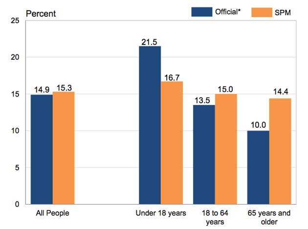
That’s why for the first time, the bureau released a supplemental poverty measure along with its official figures. According to the supplemental data, the poverty rate in the U.S. was about 15.3 percent—0.4 percentage points higher than the report’s official rate. But the additional measure shows differences in age groups. For instance, those under the age of 18 have a poverty rate of 16.7 percent—quite a bit lower than the 21.5 percent reported in the main findings. For older Americans, the tweaked metrics paint a grimmer picture, with the share of seniors living in poverty reported as nearly 5 percentage points higher than the official measure.


Poverty Rates: Official Versus Supplemental

Census

The more inclusive measures might  help monitor the effectiveness of programs meant to increase the well-being of specific populations, such as children or the elderly. Still, the use of an official, blanket income level remains a crude means of identifying families that are having a difficult time putting roofs over their heads or food on the table, especially considering the vast differences in cost of living around the country. To better understand the persistent poverty problem requires greater attention to nuanced and localized data that can better illustrate areas where the cost of essentials are outstripping income and benefits, and where families continue to suffer.

An interesting development. Now the vetting of the new measurement tool can begin and I’m guessing that this won’t satisfy too many people.

A political question: would any administration allow the official government definition of poverty to change if it meant that the rate would increase during their time in office? This isn’t just about measurement; there are political considerations as well.

Call for changing sex and gender questions on major surveys

Two sociologists argue that survey questions about sex and gender don’t actually tell us much:

Traditional understandings of sex and gender found in social surveys – such as only allowing people to check one box when asked “male” or “female” – reflect neither academic theories about the difference between sex and gender nor how a growing number of people prefer to identify, Saperstein argues in a study she coauthored with Grand Valley State University sociology professor Laurel Westbrook.

In their analysis of four of the largest and longest-running social surveys in the United States, the sociologists found that the surveys not only used answer options that were binary and static, but also conflated sex and gender. These practices changed very little over the 60 years of surveys they examined.

“Beliefs about the world shape how surveys are designed and data are collected,” they wrote. “Survey research findings, in turn, shape beliefs about the world, and the cycle repeats.”…

“Characteristics from race to political affiliation are no longer counted as binary distinctions, and possible responses often include the category ‘other’ to acknowledge the difficulty of creating a preset list of survey responses,” they wrote…The researchers suggest the following changes to social surveys:

  • Surveys must consistently distinguish between sex and gender.
  • Surveys should rethink binary categories.
  • Surveys need to incorporate self-identified gender and acknowledge it can change over time.

Surveys have to change as social understandings change. Measurement of race and ethnicity has changed quite a bit in recent decades with the Census considering changes for 2020.

It sounds like the next step would be to do a pilot study of alternatives – have a major survey include standard questions as well as new options – and then (1) compare results and (2) see how the new information is related to other information collected by the survey.

The ongoing mystery of counting website visitors

The headline says it all: “It’s 2015 – You’d Think We’d Have Figured Out How to Measure Web Traffic By Now.”

ComScore was one of the first businesses to take the approach Nielsen uses for TV and apply it to the Web. Nielsen comes up with TV ratings by tracking the viewing habits of its panel — those Nielsen families — and taking them as stand-ins for the population at large. Sometimes they track people with boxes that report what people watch; sometimes they mail them TV-watching diaries to fill out. ComScore gets people to install the comScore tracker onto their computers and then does the same thing.

Nielsen gets by with a panel of about 50,000 people as stand-ins for the entire American TV market. ComScore uses a panel of about 225,000 people4 to create their monthly Media Metrix numbers, Chasin said — the numbers have to be much higher because Internet usage is so much more particular to each user. The results are just estimates, but at least comScore knows basic demographic data about the people on its panel, and, crucial in the cookie economy, knows that they are actually people.5

As Chasin noted, though, the game has changed. Mobile users are more difficult to wrangle into statistically significant panels for a basic technical reason: Mobile apps don’t continue running at full capacity in the background when not in use, so comScore can’t collect the constant usage data that it relies on for its PC panel. So when more and more users started going mobile, comScore decided to mix things up…

Each measurement company comes up with different numbers each month, because they all have different proprietary models, and the data gets more tenuous when they start to break it out into age brackets or household income or spending habits, almost all of which is user-reported. (And I can’t be the only person who intentionally lies, extravagantly, on every online survey that I come across.)…

And that’s assuming that real people are even visiting your site in the first place. A study published this year by a Web security company found that bots make up 56 percent of all traffic for larger websites, and up to 80 percent of all traffic for the mom-and-pop blogs out there. More than half of those bots are “good” bots, like the crawlers that Google uses to generate its search rankings, and are discounted from traffic number reports. But the rest are “bad” bots, many of which are designed to register as human users — that same report found that 22 percent of Web traffic was made up of these “impersonator” bots.

This is an interesting data problem to solve with multiple interested parties from measurement firms, website owners, people who create search engines, and perhaps, most important of all, advertisers who want to quantify exactly which advertisements are seen and by whom. And the goalposts keep moving: new technologies like mobile devices change how visits are tracked and measured.

How long until we get an official number from the reputable organization? Could some of these measurement groups and techniques merge – consolidation to cut costs seems to be popular in the business world these days. In the end, it might not be good measurement that wins out but rather which companies can throw their weight around most effectively to eliminate their competition.

The declining “McMansion to Multi-Millionaire ratio”

One analysis looks at the popularity of McMansions (amidst articles claiming they have returned) via a ratio of McMansions to multi-millionaires in the United States:

We can get a good contemporaneous gauge of the popularity of McMansions by dividing the number of new 4,000 plus square foot homes sold by the number of households with a net worth of $5 million or more: call it the McMansion/Multi-Millionaire ratio. (There’s no universally accepted definition of McMansion, but since the Census Bureau reports the number of newly completed single-family homes of 4,000 square feet or larger, most researchers take this as a proxy for these over-sized homes.)

The McMansion to Multi-Millionaire ratio started at about 12.5 in 2001 (the oldest year in the current Census home size series)—meaning that the market built 12 new 4,000 square foot-plus homes for every 1,000 households with a net worth of $5 million or more. The ratio fluctuated over the following few years, and was at 12.0 in 2006—the height of the housing bubble. The ratio declined sharply thereafter as housing and financial markets crashed.

McMansiontoMultiMillionaireRatioEven though the number of high-net-worth households has been increasing briskly in recent years (it’s now at a new high), the rebound in McMansions has been tepid (still down 59 percent from the peak, as noted earlier). The result is that the McMansion/Multi-Millionaire ratio is still at 4.5–very near its lowest point. Relative to the number of high-net-worth households, we’re building only about a third as many McMansions as we did 5 or 10 years ago. These data suggest that even among the top one or two percent, there’s a much-reduced interest in super-large houses.

An interesting measure that tries to put together how many wealthy people there are (the ones who can build and purchase McMansions) with how many new large homes were constructed (with the rough proxy of square footage – not all homes over 4,000 square feet would be considered McMansions). The conclusion is interesting: the number of McMansions being built today is quite lower than the peak ten years ago or so. So, when journalists write that the McMansion is back (usually with a negative tone – our wild spending and consumeristic days of the early 2000s are set to return!), it is not at the same scale as we are still in the middle of a depressed housing market.

The artificial constructs of the French Republican Calendar and the metric system

The first French Republic introduced two new ideas – a new calendar and the metric system – but only one of them stuck.

The Republican Calendar lasted a meager twelve years before Napoleon reinstated the Gregorian on January 1, 1805. It was, in a way, perhaps a victim of its own success, as Eviatar Zerubavel suggests. “One of the most remarkable accomplishments of the calendar reformers was exposing people to the naked truth, that their traditional calendar, whose absolute validity they had probably taken for granted, was a mere social artifact and by no means unalterable,” Zerubavel writes. However, this truth works both ways, and what the French reformers found was that “it was impossible to expose the conventionality and artificiality of the traditional calendar without exposing those of any other calendar, including the new one, at the same time.” While the Earth’s orbit is not a fiction, any attempt to organize that orbit’s movement into a rigid order is as arbitrary as any other.

It’s not entirely a fluke that the Republican Calendar failed while another of the Revolutionaries’ great projects — the Metric system — was a wild success. Unlike Metric-standard conversions, or, for that matter, Gregorian-Julian conversions, there was no way to translate the days of the Republican Calendar to the Gregorian calendar, which meant that France found itself isolated from other nations. But more importantly, the Metric system did not, in itself, threaten social order, and the natural diurnal rhythms of human lived experience that have evolved over millennia. By suddenly asserting a ten-day work week, with one day of rest for nine days’ work, the Republicans completely up-ended the ergonomics of the day, and this — more so than the religious function of the old calendar — was what was irreplaceable. The Metric system of weights and measurements marks a triumph of sense over tradition — it’s just plain easier to work with multiples of tens than the odd figures of the Standard measurement system. But in the case of calendars and time, convention wins out over sense.

Pretty fascinating to think how parts of social life that we often take for granted – the calendar and time, measurement – have complicated social histories. It didn’t necessarily have to turn out this way, as the rest of the discussion of the calendar demonstrates. Yet, once we are socialized into a particular system and may even passionately defend the way it is constructed without really knowing the reasons behind it, it can be very hard to conceive of a different way of doing things.

Gallup CEO criticizes measurement of unemployment in the US

The CEO of Gallup says the current unemployment rate is “a Big Lie” because of how it is calculated:

None of them will tell you this: If you, a family member or anyone is unemployed and has subsequently given up on finding a job — if you are so hopelessly out of work that you’ve stopped looking over the past four weeks — the Department of Labor doesn’t count you as unemployed. That’s right. While you are as unemployed as one can possibly be, and tragically may never find work again, you are not counted in the figure we see relentlessly in the news — currently 5.6%. Right now, as many as 30 million Americans are either out of work or severely underemployed. Trust me, the vast majority of them aren’t throwing parties to toast “falling” unemployment.There’s another reason why the official rate is misleading. Say you’re an out-of-work engineer or healthcare worker or construction worker or retail manager: If you perform a minimum of one hour of work in a week and are paid at least $20 — maybe someone pays you to mow their lawn — you’re not officially counted as unemployed in the much-reported 5.6%. Few Americans know this.

Yet another figure of importance that doesn’t get much press: those working part time but wanting full-time work. If you have a degree in chemistry or math and are working 10 hours part time because it is all you can find — in other words, you are severely underemployed — the government doesn’t count you in the 5.6%. Few Americans know this…

Gallup defines a good job as 30+ hours per week for an organization that provides a regular paycheck. Right now, the U.S. is delivering at a staggeringly low rate of 44%, which is the number of full-time jobs as a percent of the adult population, 18 years and older. We need that to be 50% and a bare minimum of 10 million new, good jobs to replenish America’s middle class.

How an official statistic is measured may seem mundane but it can be quite consequential, as is noted here. What exactly does it take to get a government agency to measure and report data differently?

This critique may make some interesting political bedfellows. Conservatives might jump on this in order to show that the current administration hasn’t made the kind of economic progress they claim. Liberals might also like this because it suggests a lot of Americans still aren’t doing well even as big corporations and Wall Street seem to have profited. Neither political party really wants to take on Wall Street so they might support these numbers so stocks keep moving up.