Few Americans think “it is a good time to buy a house”

Since 1978, Gallup has asked Americans whether they think “it is a good time to buy a house.” The percentages of Americans agreeing with this in 2022 and 2023 are the lowest figures recorded:

Photo by Andrea Piacquadio on Pexels.com

Twenty-one percent of U.S. adults believe it is a good time to buy a house, down nine percentage points from the prior low recorded last year. The 2022 and 2023 readings are the only times that less than half of Americans have perceived the housing market as being good for buyers in Gallup’s trend since 1978…

Gallup first asked Americans about their perceptions of the housing market in 1978, when 53% thought it was a good time to buy a house. Thirteen years later, when the question was asked again, 67% held that view. The record high of 81% was recorded in 2003, at a time of growing homeownership rates and housing prices…

Opinions of the housing market are bleak and generally similar among all major subgroups, including by region, urbanicity, homeownership status, income, education and party identification. Subgroups in these categories range from 18% to 24% thinking it is a good time to buy a house.

Americans tend to like homeownership. Thus, this data could be interest if it goes toward the direction toward less interest in buying homes and less support for policies that privilege homeownership. If enough Americans are this pessimistic, perhaps they do not think they can pursue owning a home. Perhaps they want policies that provide help for renting or other housing options. Perhaps their inability to purchase a home at younger ages means they will not be able to catch up later.

However, I suspect the pessimism of 2022 and 2023 is tied to current conditions more than it signals a large shift in how Americans think about homeownership. The Gallup data suggests support went down a bit in the mid-2010s and then dropped off in the last two years. It might take another year or two to see if (1) housing conditions improve and (2) support rises. Of course, housing conditions may not improve much and a longer-term run of pessimism could lead to bigger changes.

The bigger question might be this: how many years of negative perceptions about owning a home will it take for patterns to change long-term?

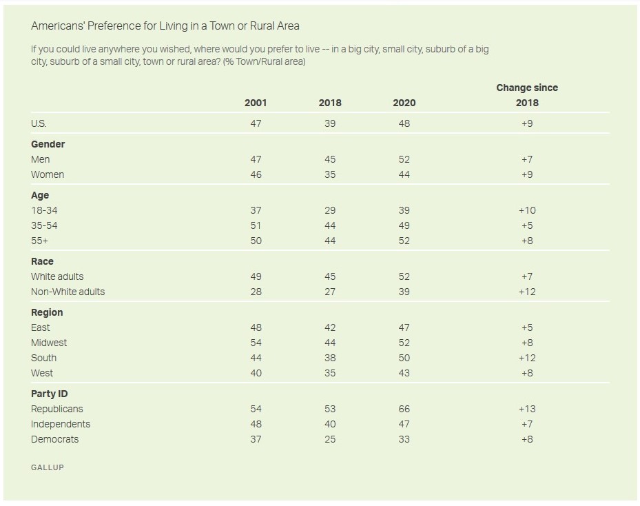
Slight uptick as nearly half of Americans say they would prefer to live in a small town or a rural area

New data from Gallup suggests a slight shift among Americans toward a preference for moving away from suburbs and cities:

About half of Americans (48%) at the end of 2020 said that, if able to live anywhere they wished, they would choose a town (17%) or rural area (31%) rather than a city or suburb. This is a shift from 2018, when 39% thought a town or rural area would be ideal.

The recent increase in Americans’ penchant for country living — those choosing a town or rural area — has been accompanied by a decline in those preferring to live in a suburb, down six percentage points to 25%. The percentage favoring cities has been steadier, with 27% today — close to the 29% in 2018 — saying they would prefer living in a big (11%) or small (16%) city.

Current attitudes are similar to those recorded in October 2001, the only other time Gallup has asked Americans this question. That reading, like today’s but unlike the 2018 one, was taken during a time of great national upheaval — shortly after the 9/11 terrorist attacks, when the public was still on edge about the potential for more terrorism occurring in densely populated areas…

The preference for cities is greatest among non-White Americans (34%), adults 18 to 34 (33%), residents of the West (32%) and Democrats (36%).

There is a lot to consider here and it is too bad Gallup has only asked this three times. Here are some thoughts as someone who studies suburbs, cities, and places:

  1. The shift from 2018 to 2020 is very interesting to consider in light of the shift in preferences away from small towns and rural locations between 2001 and 2018. What happened between 2018 and 2020? The analysis concludes by citing COVID-19 which likely plays a role. But, there could be other forces at work here including police brutality, protests, and depictions of particular locations or different factors could be at work with different groups who had larger shifts between 2018 and 2020.
  2. One reminder: this is about preferences, not about where people choose to live when they have options.
  3. Related to #2, Americans like the idea of small towns and there is a romantic ideal attached to such places. In contrast, there is a long history of anti-urbanism in the United States. But, people may not necessarily move to smaller communities when they have the opportunity.
  4. The distinction in the categories in the question – big city, small city, suburb of a big city, suburb of a small city, town, or rural area – may not be as clear-cut as implied. From a researcher’s point of view, these are mutually exclusive categories of places. On the ground, some of these might blend together, particularly the distinction between suburbs and small towns. More toward the edge of metropolitan regions, do people think they live in the suburbs or a small town? Or, how many residents and leaders describe their suburb as a small town or as having small town charm (I have heard this in a suburb of over 140,000 people)? Can a small but exclusive suburb with big lots and quiet streets (say less than 5,000 people and median household incomes over $120,000) think of itself as a small town rather than a suburb? I say more about this in a 2016 article looking at how surveys involving religion measure place and a July 2020 post looking at responses when people were asked what kind of community they lived in.

Slight uptick in Americans’ confidence in institutions

The latest results from Gallup suggest the slide in institutional confidence in America has ended:

Americans’ confidence in the nation’s major institutions has edged up in 2017, after registering historical lows over the past three years. Newspapers, public schools and organized labor, in particular, have improved in public esteem. The average percentage of Americans expressing “a great deal” or “quite a lot” of confidence in 14 institutions is at 35%, up from 31% in 2014 and 32% in 2015 and 2016…

First, the uptick in Republicans’ average confidence resulting from the election of President Trump was not offset by a decrease in confidence among Democrats, leaving the population, as a whole, more confident than in previous years.

Second, despite this increased confidence, Americans are still skeptical of most of the major institutions that make up U.S. society. Major institutions have an average 35% “great deal/quite a lot” confidence rating overall, and only three institutions garner a confidence rating above 50%. Major institutions such as big business, the criminal justice system and banks get high confidence ratings from less than one-third of the public.

Finally, the dismal level of public confidence in Congress — with 12% of Americans saying they have a great deal or quite a lot of confidence in the nation’s legislative body and 44% saying they have very little confidence — highlights what Americans themselves say is the nation’s most important problem: a dysfunctional government that has lost much of its legitimacy in the eyes of the people it serves.

While the numbers are slightly up in 2017, the summary suggests not a whole lot has changed outside of which party controls the presidency. Overall, Americans are pretty skeptical about most major institutions though their dissatisfaction might be the result of different reasons. At the least, this data may suggest confidence has bottomed out.

This is also another example of why longitudinal data is so helpful. If this was data from a single time point, it is hard to know what it means: is this more or less confidence than normal? How do certain events change the responses? But, with data regarding confidence in 14 institutions since 1993, we can see patterns: upward and downward swings over years, shifts due to social changes like a burst housing bubble, comparisons across very different institutions.

Gallup: most Americans are proud to be American

In time for July 4th, Gallup has numbers on how many and which Americans feel “extremely proud” of the United States:

Proud to Be an American

In addition to the 54% who are extremely proud to be an American, 27% say they are “very proud,” 14% say they are “moderately proud,” 4% are “only a little proud” and 1% state that they are “not at all proud.”…

While most Americans are proud to be an American, certain groups are especially likely to say they are extremely proud. “Extreme pride” rises for each succeeding age group, from a low of 43% among those under 30 to a high of 64% among senior citizens.

Extreme pride also varies regionally, from a high of 61% in the South to a low of 46% in the West…

How proud are you to be an American --

None of these findings should be too surprising. Yet, one takeaway I have that I haven’t seen noted in the articles about these data is that almost all Americans have some pride in their country. Only 1% were “not at all proud” and then another 4% were “only a little proud.” This may be a product of the categories as well as a patriotic culture. Can you really distinguish between “very proud” and “moderately proud”? If you are “very proud,” what holds people back from being “extremely proud”? Perhaps the best way to get a handle on this would be to compare it to international data.

Gallup CEO criticizes measurement of unemployment in the US

The CEO of Gallup says the current unemployment rate is “a Big Lie” because of how it is calculated:

None of them will tell you this: If you, a family member or anyone is unemployed and has subsequently given up on finding a job — if you are so hopelessly out of work that you’ve stopped looking over the past four weeks — the Department of Labor doesn’t count you as unemployed. That’s right. While you are as unemployed as one can possibly be, and tragically may never find work again, you are not counted in the figure we see relentlessly in the news — currently 5.6%. Right now, as many as 30 million Americans are either out of work or severely underemployed. Trust me, the vast majority of them aren’t throwing parties to toast “falling” unemployment.There’s another reason why the official rate is misleading. Say you’re an out-of-work engineer or healthcare worker or construction worker or retail manager: If you perform a minimum of one hour of work in a week and are paid at least $20 — maybe someone pays you to mow their lawn — you’re not officially counted as unemployed in the much-reported 5.6%. Few Americans know this.

Yet another figure of importance that doesn’t get much press: those working part time but wanting full-time work. If you have a degree in chemistry or math and are working 10 hours part time because it is all you can find — in other words, you are severely underemployed — the government doesn’t count you in the 5.6%. Few Americans know this…

Gallup defines a good job as 30+ hours per week for an organization that provides a regular paycheck. Right now, the U.S. is delivering at a staggeringly low rate of 44%, which is the number of full-time jobs as a percent of the adult population, 18 years and older. We need that to be 50% and a bare minimum of 10 million new, good jobs to replenish America’s middle class.

How an official statistic is measured may seem mundane but it can be quite consequential, as is noted here. What exactly does it take to get a government agency to measure and report data differently?

This critique may make some interesting political bedfellows. Conservatives might jump on this in order to show that the current administration hasn’t made the kind of economic progress they claim. Liberals might also like this because it suggests a lot of Americans still aren’t doing well even as big corporations and Wall Street seem to have profited. Neither political party really wants to take on Wall Street so they might support these numbers so stocks keep moving up.

Average full-time work week is 47 hours; median is around 40 hours

A number of headlines have screamed about a recent Gallup finding that the average American full-time worker works 47 hours a week. Yet, the median appears to conform to the typical 40-hour work week:

Adults employed full time in the U.S. report working an average of 47 hours per week, almost a full workday longer than what a standard five-day, 9-to-5 schedule entails. In fact, half of all full-time workers indicate they typically work more than 40 hours, and nearly four in 10 say they work at least 50 hours.

Average Hours Worked by Full-Time U.S. Workers, Aged 18+


The 40-hour workweek is widely regarded as the standard for full-time employment, and many federal employment laws — including the Affordable Care Act, or “Obamacare” — use this threshold to define what a full-time employee is. However, barely four in 10 full-time workers in the U.S. indicate they work precisely this much. The hefty proportion who tell Gallup they typically log more than 40 hours each week push the average number of hours worked up to 47. Only 8% of full-time employees claim to work less than 40 hours.

These findings are based on data from Gallup’s annual Work and Education Survey. The combined sample for 2013 and 2014 includes 1,271 adults, aged 18 and older, who are employed full time.

Is the average the best measure here? This is a classic case where the median and mean give you different conclusions. The median tells you that not much has changed from the standard: half of full-time workers work 40 hours or less. The average, on the other hand, is pulled up by those people working 50+ hours. As the Gallup analysis goes on, it notes that there is a difference between salaried and hourly employees with salaried workers working more of those 40+ hour weeks. These salaried workers are likely white-collar and professional workers, people who may be working more but likely have more credentials, are getting paid more, and have higher-status jobs.

So, perhaps the headlines might be more accurate by saying “Salaried full-time workers have higher [47? 50?] hour work week.”

Gallup to start surveying college graduates to find if their college degree led to “a great life”

Gallup is working on a new initiative to measure a wider range of life outcomes for college graduates:

As the old saying goes, money can’t buy happiness. And yet, in measuring alumni success and satisfaction, colleges – often prodded by those seeking to hold them accountable – typically look at two things: whether their former students are gainfully employed, and whether they’re making a decent salary.

A new project announced today, led by Gallup and debuting at Purdue University, aims to change that. Focusing on a set of factors that are shown to correlate with “a great life,” the survey of 30,000 graduates annually will provide data on how alumni of groups of colleges (public or private institutions in certain states, for instance, or athletic conferences) are faring and how they compare to national averages. The final product will be a benchmark for student success against which any campus can measure its own graduates, if it works with Gallup individually…

The survey’s line of questioning goes beyond job placement and salary, also inquiring about work place and community engagement, personal relationships, physical fitness, sense of purpose and happiness, and economic management and stress…

“No one is going to suggest that colleges and universities are responsible for 100 percent of your great job and great life,” Busteed admitted, “but obviously, if you go to college and you get a degree, the odds are you increase the probability of having a good outcome.”

Given the arguments about the cost of college, I’m not surprised efforts like this are quickly moving forward. And, as the article notes, there are lots of methodological questions in play: what exactly is “a great life”? How many years after college should people be asked these questions? How can the effects of college be separated out from other life experiences (though people’s perceptions about whether college mattered is important as well)?

At the same time, I’m not opposed to trying to get at these life outcomes after college. Colleges often make the argument they improve the lives of their graduates from earning more to training for careers to giving students room to start living to critical thinking to a broader understanding of the world. Is some of the concern about measuring these things that colleges might not be able to live up to lofty claims? For example, given the findings of Academically Adrift from a few years ago, not all college students are benefiting. Once findings start trickling out, it will then be imperative to see what gets counted as “success” for colleges.

Lincoln, Nebraska #1 city in well-being

A new survey from Gallup and Healthways puts Lincoln, Nebraska as the number one city in the U.S. for well-being:

Lincoln, Neb., had the highest Well-Being Index score (72.8) in the U.S. across the 189 metropolitan areas that Gallup and Healthways surveyed in 2012. Also in the top 10 are Boulder, Colo.; Provo-Orem, Utah; Ann Arbor, Mich.; Honolulu, Hawaii; Fort Collins-Loveland, Colo.; and Burlington-South Burlington, Vt…

At 60.8, Charleston, W.Va., had the lowest Well-Being Index score, displacing Huntington-Ashland, W.Va.-Ky.-Ohio, which held this position the two previous years. Huntington-Ashland’s score of 61.2 is up from 58.1 in 2010, which is the lowest score on record for any metro area across five years of data collection. Mobile, Ala.; Utica-Rome, N.Y.; Hickory-Lenoir-Morganton, N.C.; and Fort Smith, Ark.-Okla.; join Charleston and Huntington-Ashland as frequent occupants of the bottom 10 list each year…

Washington, D.C.-Arlington-Alexandria, Va.-Md.-W.Va., residents reported the highest wellbeing among the nation’s 52 largest metropolitan areas, defined as those with 1 million residents or more, followed by San Francisco-Oakland-Fremont, Calif. These two metros have been in the top five among large metro areas in each of the past five years…

The Gallup-Healthways Well-Being Index score is an average of six sub-indexes, which individually examine life evaluation, emotional health, work environment, physical health, healthy behaviors, and access to basic necessities. The overall score and each of the six sub-index scores are calculated on a scale from 0 to 100, where a score of 100 represents the ideal. Gallup and Healthways have been tracking these measures daily since January 2008.

Interesting as there are more cities from the Great Plains and Midwest than I expected.

A few thoughts about the methodology:

1. After all is added up across these six measures, there isn’t much variation between the top and the bottom. Lincoln had the highest score at 72.8 and Charleston had the lowest at 60.8. So on a scale of 0 to 100, the range was just 12. This suggests there is not much variation in these measures and that this index may not tell us a whole lot. Are Americans simply generally optimistic about these topics or are they realistically not that different across cities?

2. What exactly does Gallup and Healthways do with this information that it requires daily polling? This is not a small sample:

Results are based on telephone interviews conducted as part of the Gallup-Healthways Well-Being Index survey Jan. 2-Dec. 29, 2012, with a random sample of 353,563 adults, aged 18 and older, living in all 50 U.S. states and the District of Columbia, selected using random-digit-dial sampling.

Perhaps there is some marketing edge to this surveying or it is related to some big research project.

Bonus well-being info: for occupations, doctors and then K-12 teachers lead the way and manufacturing-production workers and then transportation workers are at the bottom.

Cell phone users now comprise half of Gallup’s polling contacts

Even as Americans are less interested in participating in telephone surveys, polling firms are trying to keep up. Gallup has responded by making sure 50% of people contacted for polling samples are cell phone users:

Polling works only when it is truly representative of the population it seeks to understand. So, naturally, Gallup’s daily tracking political surveys include cellphone numbers, given how many Americans have given up on land lines altogether. But what’s kind of amazing is that it now makes sure that 50 percent of respondents in each poll are contacted via mobile numbers.

Gallup’s editor in chief, Frank Newport, wrote yesterday about the evolution of Gallup’s methods to remain “consistent with changes in the communication behavior and habits of those we are interviewing.” In the 1980s the company moved from door-to-door polling to phone calls. In 2008 it added cellphones. To reflect the growing number of Americans who have gone mobile-only, it has steadily increased the percentage of those numbers it contacts.

“If we were starting from scratch today,” Newport told Wired, “we would start with cellphones.”…

Although it may be a better reflection of society, mobile-phone polling is more expensive, says Newport. They have to call more numbers because the response rate is lower due to the nature of mobile communication.

As technology and social conventions change, researchers have to try and keep up. This is a difficult task, particularly if fewer people want to participate and technologies offer more and more options to screen out unknown requests. Where are we going next: polling by text? Utilizing well-used platforms like Facebook (where we know many people are turning every day)?

Two issues with Most Admired poll: a large gap between #1 and others, low numbers for #1

While it is interesting to note that sitting presidents tend to lead in Gallup’s “Most Admired Lists,” two other things immediately struck me when looking at the tables:

1. There is a relatively big gap between #1 for most admired man and woman and everyone else. This year, President Obama is at 17% and his next closest competitor is at 3% while Hillary Clinton is also at 17% and her next competitor is at 7%. Since Gallup asks this as an open-ended question (exact phrasing: “What man that you have heard or read about, living today in any part of the world, do you admire most? And who is your second choice?”), it suggests that people name famous people, particularly types who are likely to be in the news a lot and whose positions are notable. If this is the case, is this really a survey about who is most admired or more about who is most well-known?

2. The leaders in each category are only at 17% and their competitors are quite a ways back. This could lead to several suggestions. Perhaps Americans don’t think in these terms much. For men, 32% said none or had no opinion and for women, 29% said none or had no opinion. Additionally, when asked about men 9% said a friend or relative and 12% said the same when asked about women. Even the current President is only most admired by 17%, suggesting that Americans are not necessarily looking to admire their political leaders. Another possible explanation might be that there is a wide range of admirable famous people in the United States. For men, the top 10 only account for 31% of responses though the top 10 females account for 47% of responses. This might reflect the lesser number of women in positions of power or leadership so more attention is focused on a select few.

This leads me to think that this poll may not really not tell us much about anything. Those selected as admired have relatively low figures, certain positions in society lead to being selected, and there are clear leaders but then also a mass of closely-admired figures.

UPDATE 12/28/11 10:11 PM – There seems to be similar variability in a recent poll that asked Americans which celebrity they most wanted to live next door. Also:

The majority of surveyed adults (42 percent) said they did not want to live next to any celebrities. “As a voyeuristic culture that breathlessly tracks every celebrity movement, it’s extremely surprising to see so many Americans saying they wouldn’t like to live next to any celebrity at all,” said Zillow Chief Marketing Officer Amy Bohutinsky. “In fact, more people opted out of a celebrity neighbor in 2012 than in any of the past years we’ve run this poll.”

Perhaps Americans are more tired of famous people this year?