Why it can take months for rent prices to show up in official data

It will take time for current rent prices to contribute to measures of inflation:

Photo by Burak The Weekender on Pexels.com

To solve this conundrum, the best place to start is to understand that rents are different from almost any other price. When the price of oil or grain goes up, everybody pays more for that good, at the same time. But when listed rents for available apartments rise, only new renters pay those prices. At any given time, the majority of tenants surveyed by the government are paying rent at a price locked in earlier.

So when listed rents rise or fall, those changes can take months before they’re reflected in the national data. How long, exactly? “My gut feeling is that it takes six to eight months to work through the system,” Michael Simonsen, the founder of the housing research firm Altos, told me. That means we can predict two things for the next six months: first, that official measures of rent inflation are going to keep setting 21st-century records for several more months, and second, that rent CPI is likely to peak sometime this winter or early next year.

This creates a strange but important challenge for monetary policy. The Federal Reserve is supposed to be responding to real-time data in order to determine whether to keep raising interest rates to rein in demand. But a big part of rising core inflation in the next few months will be rental inflation, which is probably past its peak. The more the Fed raises rates, the more it discourages residential construction—which not only reduces overall growth but also takes new homes off the market. In the long run, scaled-back construction means fewer houses—which means higher rents for everybody.

To sum up: This is all quite confusing! The annual inflation rate for new rental listings has almost certainly peaked. But the official CPI rent-inflation rate is almost certainly going to keep going up for another quarter or more. This means that, several months from now, if you turn on the news or go online, somebody somewhere will be yelling that rental inflation is out of control. But this exclamation might be equivalent to that of a 17th-century citizen going crazy about something that happened six months earlier—the news simply took that long to cross land and sea.

This sounds like a research methods problem: how to get more up-to-date data into the current measures? A few quick ideas:

  1. Survey rent listings to see what landlords are asking for.
  2. Survey new renters to better track more recent rent prices.
  3. Survey landlords as to the prices of the recent units they rented.

Given how much rides on important economic measures such as the inflation rate, more up-to-date data would be helpful.

Americans overestimate the size of smaller groups, underestimate the size of larger groups

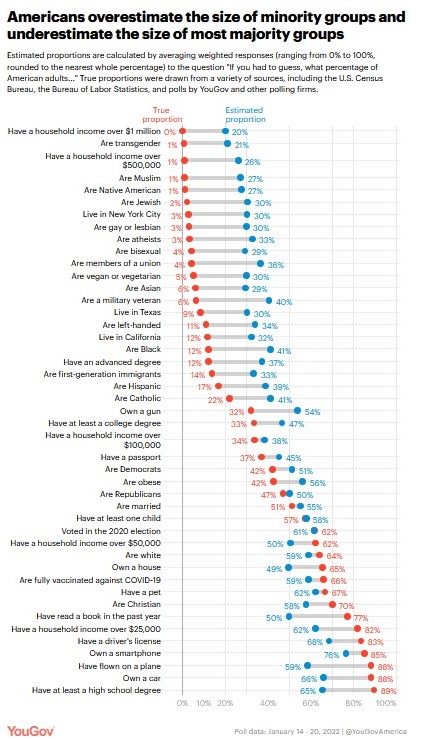
Recent YouGov survey data shows Americans have a hard time estimating the population of a number of groups:

When people’s average perceptions of group sizes are compared to actual population estimates, an intriguing pattern emerges: Americans tend to vastly overestimate the size of minority groups. This holds for sexual minorities, including the proportion of gays and lesbians (estimate: 30%, true: 3%), bisexuals (estimate: 29%, true: 4%), and people who are transgender (estimate: 21%, true: 0.6%).

It also applies to religious minorities, such as Muslim Americans (estimate: 27%, true: 1%) and Jewish Americans (estimate: 30%, true: 2%). And we find the same sorts of overestimates for racial and ethnic minorities, such as Native Americans (estimate: 27%, true: 1%), Asian Americans (estimate: 29%, true: 6%), and Black Americans (estimate: 41%, true: 12%)…

A parallel pattern emerges when we look at estimates of majority groups: People tend to underestimate rather than overestimate their size relative to their actual share of the adult population. For instance, we find that people underestimate the proportion of American adults who are Christian (estimate: 58%, true: 70%) and the proportion who have at least a high school degree (estimate: 65%, true: 89%)…

Misperceptions of the size of minority groups have been identified in prior surveys, which observers have often attributed to social causes: fear of out-groups, lack of personal exposure, or portrayals in the media. Yet consistent with prior research, we find that the tendency to misestimate the size of demographic groups is actually one instance of a broader tendency to overestimate small proportions and underestimate large ones, regardless of the topic. 

I wonder how much this might be connected to a general sense of innumeracy. Big numbers can be difficult to understand and the United States has over 330,000,000 residents. Percentages and absolute numbers regarding certain groups are not always provided. I am more familiar with some of these percentages and numbers because my work requires it but it does not come up in all fields or settings.

Additionally, where would this information be taught or regularly shared? Civics classes alongside information about government structures and national history? Math classes as examples of relevant information? On television programs or in print materials? At political events or sports games? I would be interesting in making all of this more publicly visible so not just those who read the Statistical Abstract of the United States or have Census.gov as a top bookmark know this information.

Researchers adjust as Americans say they are more religious when asked via phone versus responding online

Research findings suggest Americans answer questions about religiosity differently depending on the mode of the survey:

Photo by mentatdgt on Pexels.com

Researchers found the cause of the “noise” when they compared the cellphone results with the results of their online survey: social desirability bias. According to studies of polling methods, people answer questions differently when they’re speaking to another human. It turns out that sometimes people overstate their Bible reading if they suspect the people on the other end of the call will think more highly of them if they engaged the Scriptures more. Sometimes, they overstate it a lot…

Smith said that when Pew first launched the trend panel in 2014, there was no major difference between answers about religion online and over the telephone. But over time, he saw a growing split. Even when questions were worded exactly the same online and on the phone, Americans answered differently on the phone. When speaking to a human being, for example, they were much more likely to say they were religious. Online, more people were more comfortable saying they didn’t go to any kind of religious service or listing their religious affiliation as “none.”…

After re-weighting the online data set with better information about the American population from its National Public Opinion Reference Survey, Pew has decided to stop phone polling and rely completely on the online panels…

Pew’s analysis finds that, today, about 10 percent of Americans will say they go to church regularly if asked by a human but will say that they don’t if asked online. Social scientists and pollsters cannot say for sure whether that social desirability bias has increased, decreased, or stayed the same since Gallup first started asking religious questions 86 years ago.

This shift regarding studying religion highlights broader considerations about methodology that are always helpful to keep in mind:

  1. Both methods and people/social conditions change. More and more surveying (and other data collection) is done via the Internet and other technologies. This might change who responds, how people respond, and more. At the same time, actual religiosity changes and social scientists try to keep up. This is a dynamic process that should be expected to change over time to help researchers get better and better data.
  2. Social desirability bias is not the same as people lying to researchers or being dishonest with researchers. That implies an intentional false answer. This is more about context: the mode of the survey – phone or online – influences who the respondent is responding to. And with a human interaction, we might respond differently. In an interaction, we with impression management in mind where we want to be viewed in particular ways by the person with whom we are interacting.
  3. Studying any aspect of religiosity benefits from multiple methods and multiple approaches to the same phenomena under study. A single measure of church attendance can tell us something but getting multiple data points with multiple methods can help provide a more complete picture. Surveys have particular strengths but they are not great in other areas. Results from surveys should be put alongside other data drawn from interviews, ethnographies, focus groups, historical analysis, and more to see what consensus can be reached. All of this might be out of the reach of individual researchers or single research projects but the field as a whole can help find the broader patterns.

Slight uptick as nearly half of Americans say they would prefer to live in a small town or a rural area

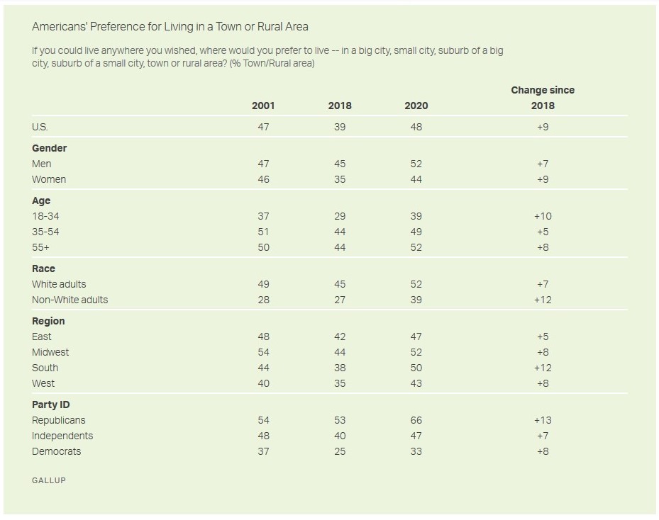
New data from Gallup suggests a slight shift among Americans toward a preference for moving away from suburbs and cities:

About half of Americans (48%) at the end of 2020 said that, if able to live anywhere they wished, they would choose a town (17%) or rural area (31%) rather than a city or suburb. This is a shift from 2018, when 39% thought a town or rural area would be ideal.

The recent increase in Americans’ penchant for country living — those choosing a town or rural area — has been accompanied by a decline in those preferring to live in a suburb, down six percentage points to 25%. The percentage favoring cities has been steadier, with 27% today — close to the 29% in 2018 — saying they would prefer living in a big (11%) or small (16%) city.

Current attitudes are similar to those recorded in October 2001, the only other time Gallup has asked Americans this question. That reading, like today’s but unlike the 2018 one, was taken during a time of great national upheaval — shortly after the 9/11 terrorist attacks, when the public was still on edge about the potential for more terrorism occurring in densely populated areas…

The preference for cities is greatest among non-White Americans (34%), adults 18 to 34 (33%), residents of the West (32%) and Democrats (36%).

There is a lot to consider here and it is too bad Gallup has only asked this three times. Here are some thoughts as someone who studies suburbs, cities, and places:

  1. The shift from 2018 to 2020 is very interesting to consider in light of the shift in preferences away from small towns and rural locations between 2001 and 2018. What happened between 2018 and 2020? The analysis concludes by citing COVID-19 which likely plays a role. But, there could be other forces at work here including police brutality, protests, and depictions of particular locations or different factors could be at work with different groups who had larger shifts between 2018 and 2020.
  2. One reminder: this is about preferences, not about where people choose to live when they have options.
  3. Related to #2, Americans like the idea of small towns and there is a romantic ideal attached to such places. In contrast, there is a long history of anti-urbanism in the United States. But, people may not necessarily move to smaller communities when they have the opportunity.
  4. The distinction in the categories in the question – big city, small city, suburb of a big city, suburb of a small city, town, or rural area – may not be as clear-cut as implied. From a researcher’s point of view, these are mutually exclusive categories of places. On the ground, some of these might blend together, particularly the distinction between suburbs and small towns. More toward the edge of metropolitan regions, do people think they live in the suburbs or a small town? Or, how many residents and leaders describe their suburb as a small town or as having small town charm (I have heard this in a suburb of over 140,000 people)? Can a small but exclusive suburb with big lots and quiet streets (say less than 5,000 people and median household incomes over $120,000) think of itself as a small town rather than a suburb? I say more about this in a 2016 article looking at how surveys involving religion measure place and a July 2020 post looking at responses when people were asked what kind of community they lived in.

The Census as national process yet works better with local census takers

Among other interesting tidbits about how data was collected for the 2020 census, here is why it is helpful for census takers to be from the community in which they collect data:

Photo by Sunyu Kim on Pexels.com

As it turns out, the mass mobilization of out-of-state enumerators is not just uncommon, but generally seen as a violation of the spirit of the census. “One of the foundational concepts of a successful door-knocking operation is that census takers will be knowledgeable about the community in which they’re working,” Lowenthal explained. “This is both so they can do a good job, because they’ll have to understand local culture and hopefully the language, but also so that the people who have to open their doors and talk to them have some confidence in them.”

Going door to door is a difficult task. Some connection to the community could help convince people to cooperate. And when cooperation equals higher response rates and more accurate data, local knowledge is good.

As the piece goes on to note, this does not mean that outside census takers could not help. Having more people going to every address could help boost response rates even if the census takers were from a different part of the country.

I wonder how much local knowledge influences the response rates from proxies, other people who can provide basic demographic information when people at the address do not respond:

According to Terri Ann Lowenthal, a former staff director for the House census oversight subcommittee, 22 percent of cases completed by census takers in 2010 were done so using data taken from proxies. And of those cases, roughly a quarter were deemed useless by the Census Bureau. As a result, millions of people get missed while others get counted twice. These inaccuracies tend to be more frequent in urban centers and tribal areas, but also, as I eventually learned, in rural sections of the country.

It is one thing to have the imprimatur of the Census when talking with a proxy; it would seem to be a bonus to also be a local.

More broadly, this is a reminder of how an important data collection process depends in part on local workers. With a little bit of inside knowledge and awareness, the Census can get better data and then that information can effectively serve many.

A short overview of recent survey questions about Holocaust knowledge in the US

Although this article leads with recent survey results about what Americans know and think about the Holocaust, I’ll start with the summary of earlier surveys and move forward in time to the recent results:

Whether or not the assumptions in the Claims Conference survey are fair, and how to tell, is at the core of a decades long debate over Holocaust knowledge surveys, which are notoriously difficult to design. In 1994, Roper Starch Worldwide, which conducted a poll for the American Jewish Committee, admitted that its widely publicized Holocaust denial question was “flawed.” Initially, it appeared that 1 in 5, or 22 percent, of Americans thought it was possible the Holocaust never happened. But pollsters later determined that the question—“Does it seem possible or does it seem impossible to you that the Nazi extermination of the Jews never happened?”—was confusing and biased the sample. In a subsequent Gallup poll, when asked to explain their views on the Holocaust in their own words, “only about 4 percent [of Americans] have real doubts about the Holocaust; the others are just insecure about their historical knowledge or won’t believe anything they have not experienced themselves,” according to an Associated Press report at the time. More recently, the Anti-Defamation League was criticized for a 2014 worldwide study that asked respondents to rate 11 statements—“People hate Jews because of the way they behave, for example”—as “probably true” or “probably false.” If respondents said “probably true” to six or more of the statements, they were considered to harbor anti-Semitic views, a line that many experts said could not adequately represent real beliefs…

Just two years ago, the Claims Conference released another survey of Americans that found “Two-Thirds of Millennials Don’t Know What Auschwitz Is,” as a Washington Post headline summarized it. The New York Times reported on the numbers at the time as proof that the “Holocaust is fading from memory.” Lest it appear the group is singling out Americans, the Claims Conference also released surveys with “stunning” results from Canada, France, and Austria.

But a deeper look at the Claims Conference data, which was collected by the firm Schoen Cooperman Research, reveals methodological choices that conflate specific terms (the ability to ID Auschwitz) and figures (that 6 million Jews were murdered) about the Holocaust with general knowledge of it, and knowledge with attitudes or beliefs toward Jews and Judaism. This is not to discount the real issues of anti-Semitism in the United States. But it is an important reminder that the Claims Conference, which seeks restitution for the victims of Nazi persecution and also to “ensure that future generations learn the lessons of the Holocaust,” is doing its job: generating data and headlines that it hopes will support its worthy cause.

The new Claims Conference survey is actually divided into two, with one set of data from a 1,000-person national survey and another set from 50 state-by-state surveys of 200 people each. In both iterations, the pollsters aimed to assess Holocaust knowledge according to three foundational criteria: the ability to recognize the term the Holocaust, name a concentration camp, and state the number of Jews murdered. The results weren’t great—fully 12 percent of national survey respondents had not or did not think they had heard the term Holocaust—but some of the questions weren’t necessarily written to help respondents succeed. Only 44 percent were “familiar with Auschwitz,” according to the executive summary of the data, but that statistic was determined by an open-ended question: “Can you name any concentration camps, death camps, or ghettos you have heard of?” This type of active, as opposed to passive, recall is not necessarily indicative of real knowledge. The Claims Conference also emphasized that 36 percent of respondents “believe” 2 million or fewer Jews were killed in the Holocaust (the correct answer is 6 million), but respondents were actually given a multiple-choice question with seven options—25,000, 100,000, 1 million, 2 million, 6 million, 20 million, and “not sure”—four of which were lowball figures. (Six million was by far the most common answer, at 37 percent, followed by “not sure.”)

The first example above has made it into research methods textbooks regarding the importance of how survey questions are worded. The ongoing discussion in this article also could illustrate these textbook dialogues: how questions are asked and how the results are interpreted by the researchers are very important.

There are other actors in this process that can help or harm the data interpretation:

  1. Funders/organizations behind the data. What do they do with the results?
  2. How the media reports the information. Do they accurately represent the data? Do they report on how the data was collected and analyzed?
  3. Does the public understand what the data means? Or, do they solely take their cues from the researchers and/or the media reports?
  4. Other researchers who look at the data. Would they measure the topics in the same way and, if not, what might be gained by alternatives?

This all may be boring details to many but going from choosing research topics and developing questions to sharing results with the public and interpretation from others can be a process. The hope is that all of the actors involved can help get as close to what is actually happening – in this case, accurately measuring and reporting attitudes and beliefs.

If one survey option receives the most votes (18%), can the item with the least votes (2%) be declared the least favorite?

The media can have difficulty interpreting survey results. Here is one recent example involving a YouGov survey that asked about the most attractive regional accents in the United States:

Internet-based data analytics and market research firm YouGov released a study earlier this month that asked 1,216 Americans over the age of 18 about their accent preferences. The firm provided nine options, ranging from regions to well-known dialects in cities. Among other questions, YouGov asked, “Which American region/city do you think has the most attractive accent?”

The winner was clear. The Southeastern accent, bless its heart, took the winning spot, with the dialect receiving 18 percent of the vote from the study’s participants. Texas wasn’t too far behind, nabbing the second-most attractive accent at 12 percent of the vote…

The least attractive? Chicago rolls in dead last, with just 2 percent of “da” vote.

John Kass did not like the results and consulted a linguist:

I called on an expert: the eminent theoretical linguist Jerry Sadock, professor emeritus of linguistics from the University of Chicago…

“The YouGov survey that CBS based this slander on does not support the conclusion. The survey asked only what the most attractive dialect was, the winner being — get this — Texan,” Sadock wrote in an email.

“Louie Gohmert? Really? The fact that very few respondents found the Chicago accent the most attractive, does not mean that it is the least attractive,” said Sadock. “I prefer to think that would have been rated as the second most attractive accent, if the survey had asked for rankings.”

In the original YouGov survey, respondents were asked: “Which American region/city do you think has the most attractive accent?” Respondents could select one option. The Chicago accent did receive the least number of selections.

However, Sadock has a point. Respondents could only select one option. If they had the opportunity to rank them, would the Chicago accent move up as a non-favorite but still-liked accent? It could happen.

Additionally, the responses were fairly diverse across the respondents. The original “winner” Southeastern accent was only selected by 18% of those surveyed. This means that over 80% of the respondents did not select the leading response. Is it fair to call this the favorite accent of Americans when fewer than one-fifth of respondents selected it?

Communicating the nuances of survey results can be difficult. Yet, journalists and other should resist the urge to immediately identify “favorites” and “losers” in such situations where the data does not show an overwhelming favorite respondents did not have the opportunity to rate all of the possible responses.

Measuring attitudes by search results rather than surveys?

An author suggests Google search result data gives us better indicators of attitudes toward insecurity, race, and sex than surveys:

I think there’s two. One is depressing and kind of horrifying. The book is called Everybody Lies, and I start the book with racism and how people were saying to surveys that they didn’t care that Barack Obama was black. But at the same time they were making horrible racist searches, and very clearly the data shows that many Americans were not voting for Obama precisely because he was black.

I started the book with that, because that is the ultimate lie. You might be saying that you don’t care that [someone is black or a woman], but that really is driving your behavior. People can say one thing and do something totally different. You see the darkness that is often hidden from polite society. That made me feel kind of worse about the world a little bit. It was a little bit frightening and horrifying.

But, I think the second thing that you see is a widespread insecurity, and that made me feel a little bit better. I think people put on a front, whether it’s to friends or on social media, of having things together and being sure of themselves and confident and polished. But we’re all anxious. We’re all neurotic.

That made me feel less alone, and it also made me more compassionate to people. I now assume that people are going through some sort of struggle, even if you wouldn’t know that from their Facebook posts.

We know surveys have flaws and there are multiple ways – from sampling, to bad questions, to nonresponse, to social desirability bias (the issue at hand here) – they can be skewed.

But, these flaws wouldn’t lead me to these options:

  1. Thinking that search results data provides better information. Who is doing the searching? Are they a representative population? How clear are the patterns? (It is common to see stories based on the data but that provide no numbers. “Illinois” might be the most misspelled word in the state, for example, but by a one search margin and with 486 to 485 searches).
  2. Thinking that surveys are worthless on the whole. They still tell us something, particularly if we know the responses to some questions might be skewed. In the example above, why would Americans tell pollsters they have more progressive racial attitudes that they do? They have indeed internalized something about race.
  3. That attitudes need to be measured as accurately as possible. People’s attitudes often don’t line up with their actions. Perhaps we need more measures of attitudes and behaviors rather than a single good one. The search result data cited above could supplement survey data and voting data to better inform us about how Americans think about race.

Biggest European youth survey to conclude with two documentaries

Several researchers are embarking on what they say will be the biggest survey of young adults in Europe but what the results will lead to is different:

RTÉ is seeking 18-34-year-olds to take part in a pan-European online survey that it hopes will produce the “most comprehensive sociological study” of the age group ever presented…

Processing the data will involve a three pronged approach. There will be a quantitative side based on the questionnaire results, a qualitative approach based on documentary videos of groups of people and individuals filling out the survey, and a comparative approach looking at how the answers compare with other European societies…

“We’re ultimately going to produce two one-hour documentaries later this year, which will be the sociological analysis of the survey, and which we hope will provide a very valuable window into contemporary Ireland today.

If there is so much good data to be collected here, the choice to conclude with a documentary is an interesting one. On one hand, the typical sociology approach would be to publish at least a journal article if not a book. On the other hand, if the researchers are trying to reach a broader audience, a documentary that is widely available might get a lot more attention. At least in the United States, documentaries might be seen as nice efforts at public sociology but they are unlikely to win many points toward good research (perhaps even if they are used regularly in sociology courses).

Why doesn’t the American Sociological Association have an arm that puts together documentaries based on sociological work? Or, is there some money to be made here for a production company to regularly put out sociological material? Imagine Gang Leader For a Day or Unequal Childhoods as an 80 minute documentary.

Census 2020 to go digital and online

The Census Bureau is developing plans to go digital in 2020:

The bureau’s goal is that 55% of the U.S. population will respond online using computers, mobile phones or other devices. It will mark the first time (apart from a small share of households in 2000) that any Americans will file their own census responses online. This shift toward online response is one of a number of technological innovations planned for the 2020 census, according to the agency’s recently released operational plan. The plan reflects the results of testing so far, but it could be changed based on future research, congressional reaction or other developments…

The Census Bureau innovations are driven by the same forces afflicting all organizations that do survey research. People are increasingly reluctant to answer surveys, and the cost of collecting their data is rising. From 1970 to 2010, the bureau’s cost to count each household quintupled, to $98 per household in 2010 dollars, according to the GAO. The Census Bureau estimates that its innovations would save $5.2 billion compared with repeating the 2010 census design, so the 2020 census would cost a total of $12.5 billion, close to 2010’s $12.3 billion price tag (both in projected 2020 dollars)…

The only households receiving paper forms under the bureau’s plan would be those in neighborhoods with low internet usage and large older-adult populations, as well as those that do not respond online.

To maximize online participation, the Census Bureau is promoting the idea that answering the census is quick and easy. The 2010 census was advertised as “10 questions, 10 minutes.” In 2020, bureau officials will encourage Americans to respond anytime and anywhere – for example, on a mobile device while watching TV or waiting for a bus. Respondents wouldn’t even need their unique security codes at hand, just their addresses and personal data. The bureau would then match most addresses to valid security codes while the respondent is online and match the rest later, though it has left the door open to restrict use of this option or require follow-up contact with a census taker if concerns of fraud arise.

Perhaps the marketing slogan could be: “Do the Census online to save your own taxpayer dollars!”

It will be interesting to see how this plays out. I’m sure there will be plenty of tests to (1) make sure the people responding are matched correctly to their address (and that fraud can’t be committed); (2) the data collected is as accurate as going door to door and mailing out forms; and (3) the technological infrastructure is there to handle all the traffic. Even after going digital, the costs will be high and I’m guessing more people will ask why all the expense is necessary. Internet response rates to surveys are notoriously low so it may take a lot of marketing and reminders to get a significant percentage of online respondents.

But, if the Census Bureau can pull this off, it could represent a significant change for the Census as well as other survey organizations.

(The full 192 page PDF file of the plan is here.)