
An article discussing changes in American household arrangements includes this graph:
A summary of the data:
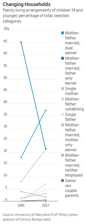
It all represents an increasing distance from the nuclear-family structure considered traditional for decades. The changes solidify shifts that have been mounting since then, erasing the notion of one dominant family type. In the early 1960s, two-thirds of children were raised in male-breadwinner, married-couple families. By contrast, today there is no one family-and-work arrangement that encompasses the majority of children, demographers say.
“That dominant model declined, but it’s not like it was replaced by one thing,” says Philip Cohen, professor of sociology at the University of Maryland. “It was replaced by a peacock’s tail, a plethora of different arrangements.”
The graph is most effective at showing the biggest change: the decline of the “mother-father married, father only earner” group over nearly six decades. Two other categories have significant increases – married and dual earners, single mother – while the five categories at the bottom involve relatively fewer households.
The graph is unusually skinny from left to right and this helps emphasize the straight lines up or down over time. Would a wider x-axis show some more variation over time or are the trends always pretty consistent?
The colors are a little hard to distinguish. I am not usually in favor of dotted lines and so on but this might be an opportunity to differentiate between trend lines.
Just thinking about other graph options, a pie chart for each time period might also communicate the big change well (though the smaller categories might not show up as well) or a clustered bar graph with the two years side to side could show the relative changes for each group.
In sum, graphing significant social change is not necessarily easy and this format clearly communicates a big change.

If you follow the link to where I posted the original graph, you can see my approach https://familyinequality.wordpress.com/2019/11/23/family-diversity-new-normal/
LikeLike
Thanks – that’s helpful to see.
LikeLike
Pingback: The top 5 posts of 2019: the suburbs (on TV and the development of), changing households, and potholes | Legally Sociable