What does it mean that India’s population will pass China’s population?

India will soon have more people than China. What does that mean?

Photo by Still Pixels on Pexels.com

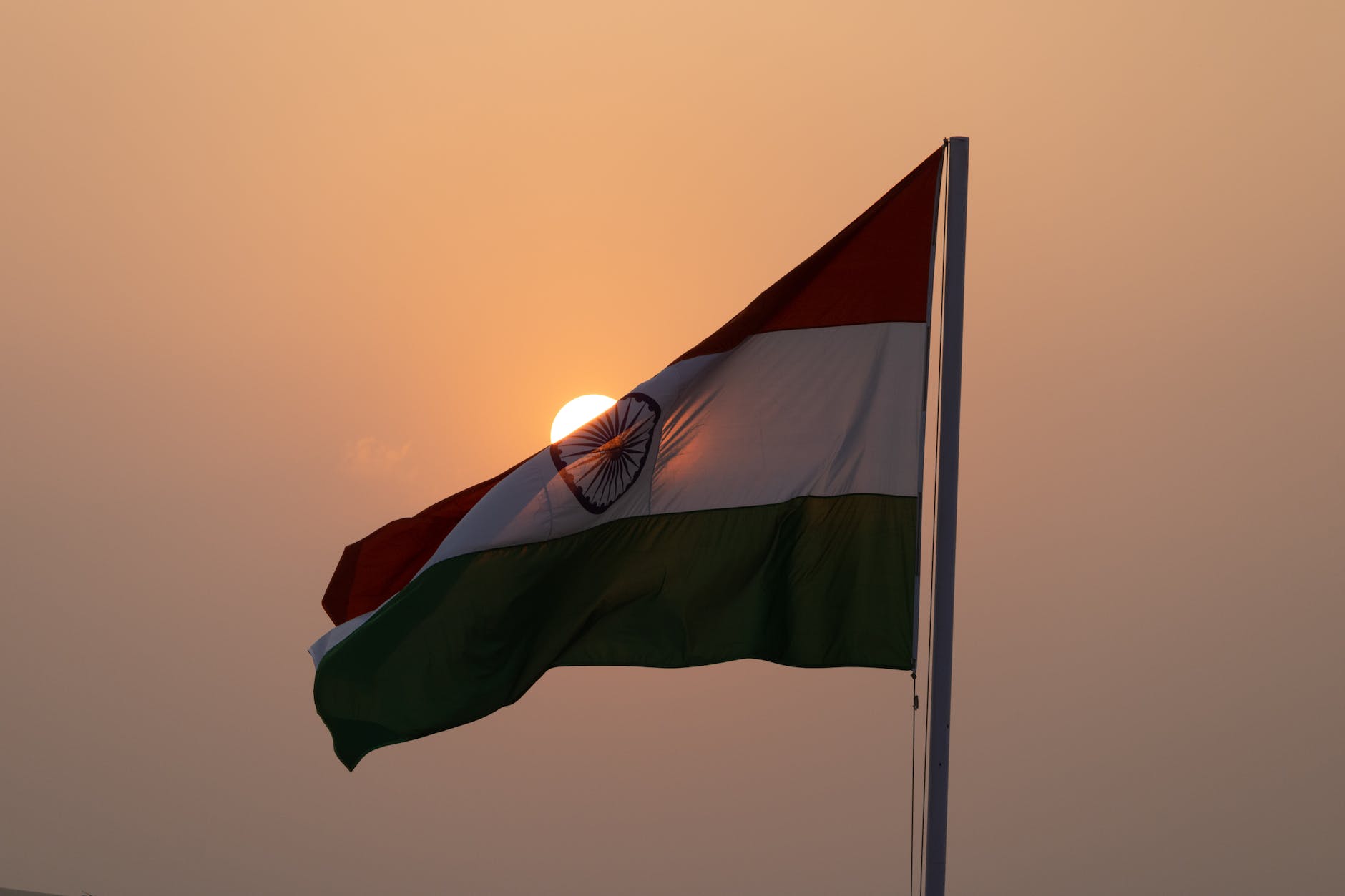
The United Nations has said India’s population is projected to surpass China’s sometime this year. Many demographers estimate it could happen this month, if it hasn’t already. India’s population is expected to reach 1.429 billion by the end of the year, according to the U.N. China will fall to second place, with 1.426 billion people. Both dwarf the U.S. at a projected 340 million.

India’s rising population means it’s likely to keep its economy growing, buy more of the world’s goods and play a bigger role in global affairs, even as it grapples with poverty and a lack of jobs. 

China’s demographic headwinds will make it harder for the country to achieve its economic ambitions, or to supplant the U.S. as the world’s biggest economy, despite its rising wealth and military power…

India’s population is expected to keep growing for the next four decades, peaking at nearly 1.7 billion in 2063. China’s population, which declined last year for the first time since famines in the 1960s, according to government data, is projected to shrink rapidly. By the start of the next century, India’s population is expected to be double that of China’s.    

Numbers are just numbers; we give them significance. Is this just about large numbers and their ability to impress people? Here, two countries have nearly a billion and half people each. That is a lot of people and far ahead of the next most populous countries.

It could also be about being the country with the most people. This has been China for a while but will soon be India. Does having the most people provide an exalted status?

Or, is it about economic activity and growth. A large and growing population means economic opportunities internally and externally.

Yet, it could be more about growth than absolute numbers. Yes, it is important to be first in population but this is also about expected growth for India and a declining population in China. Not only will India be #1 in residents, it could be far ahead of China in population soon.

What this all adds up to is hard to say. India will be the most populous nation, China will be second. The population arrows will be headed in different directions. Does it mean a significant change in status and economic status? The number of people in each country may just play a role in this.

More Protestant churches closing than opening – and understanding the bigger patterns

One source suggests more Protestant churches are closing than are opening:

Photo by Luis Quintero on Pexels.com

About 4,500 Protestant churches closed in 2019, the last year data is available, with about 3,000 new churches opening, according to Lifeway Research. It was the first time the number of churches in the US hadn’t grown since the evangelical firm started studying the topic. With the pandemic speeding up a broader trend of Americans turning away from Christianity, researchers say the closures will only have accelerated…

“In the last three years, all signs are pointing to a continued pace of closures probably similar to 2019 or possibly higher, as there’s been a really rapid rise in American individuals who say they’re not religious.”

The rest of the article deals with why this is happening and what happens to these buildings.

For this post, I am more interested in putting the cited numbers in context. Here are different aspects of this:

  1. As cross-sectional numbers (first sentence above), it is hard to know what do with these figures. In 2019, more Protestant churches closed than opened. This is a one year figure.
  2. Looking at trends over time is useful. The next sentence above says this is the first time that more congregations have closed than opened since Lifeway started tracking this. So this is a reversal or change to a larger trend? How long has anyone tracked this? Is it assumed that it is good or normal that more churches open than close each year?
  3. As noted above, there are fewer people claiming religious affiliation. Are there additional factors involved, such as a shift of attendees toward larger congregations?
  4. Are there other data sources for the number of churches and what does their data show?

With the attention that is paid to the declining number of religious Americans, it would be helpful to continue to look at the corresponding organizational changes including changes in the number of congregations.

Putting together statistical data and experiences, Right Turn on Red edition

A discussion of Red Turn on Red (ROTR) pits statistical evidence and experiential data:

Photo by Jack Gittoes on Pexels.com

Critics of the D.C. bill have pointed out the lack of data showing the dangers of RTOR, but many people who don’t use cars know instinctively how dangerous turning vehicles can be. “Our current safety studies fail to capture the reality of the constant near misses and confrontations that result between these motorists and pedestrians, which can be observed daily just by observing a typical busy intersection with RTOR,” Schultheiss says.

When teaching a research methods class, I can often come back to this observation about how sociologists approach data and evidence: we want both “facts” and “interpretations” to get the complete story of what is going on. In this particular situation, here is what that might mean: even if the statistical data suggests ROTR is not very dangerous, it matters that people still fear cars turning right on red. The experiences of pedestrians, bicyclists, and others on sidewalks and streets is part of the larger picture of understanding turning right on red. This would go alongside the data and experiences of vehicles and drivers.

Once this full set of data is collected, making policy decisions is another matter. If leaders want to prioritize vehicles, that is one choice. Or, as the piece suggests, some cities want to rethink streets and transportation, and they can end ROTR. But, it would be advisable to have all of the evidence before acting.

Helping readers see patterns and the bigger picture in new housing price data

The headline reads:

Photo by Kindel Media on Pexels.com

Home prices fell for the first time in 3 years last month – and it was the biggest decline since 2011

This quickly relays information about recent trends – prices went down for the first time in a while – as well as longer patterns – biggest drop in over a decade.

Next are some figures on housing affordability:

Now, housing affordability is at its lowest level in 30 years. It requires 32.7% of the median household income to purchase the average home using a 20% down payment on a 30-year mortgage, according to Black Knight. That is about 13 percentage points more than it did entering the pandemic and significantly more than both the years before and after the Great Recession. The 25-year average is 23.5%.

The housing affordability statistic is put into terms accessible to a broad audience: nearly 33% of the median household income is needed to buy the average house with common mortgage terms. Additionally, this percentage is higher than recent years and a longer 25 year stretch.

Some housing markets are seeing bigger price declines than others:

Some local markets are seeing even steeper declines over the last few months. San Jose, California, saw the largest, with home prices now down 10% in recent months, followed by Seattle (-7.7%), San Francisco (-7.4%), San Diego (-5.6%), Los Angeles (-4.3%) and Denver (-4.2%).

It could be noted that these are expensive and hot real estate markets. Yes, they had larger drops but they had been pushed higher in recent years than many other markets.

And the article ends with information on mortgage rates:

The average rate on the popular 30-year fixed mortgage began this year right around 3%, according to Mortgage News Daily. It climbed slowly month to month, pulling back slightly in May but then shot more dramatically to just over 6% in June. It is now hovering around 5.75%.

This highlights the rise in mortgage rates this year. Some broader context might be helpful; what was the average rate before COVID-19 or over the last 10 years?

This article provides numerous statistics and often puts the figures in context. Yet, it does lead one lingering question: what is the state of housing prices overall? One answer might be change after a period of trends during COVID-19. Another might be to focus on different actors involved: how does this affect the housing industry or what about the difficulty of some to get into the housing market or it could be a story about higher housing values for many homeowners.

Statistics are not just facts thrown into a void; they require interpretation and are often applied to particular concerns or issues.

Evaluating population loss figures for California and its cities

Since growth is good in the United States, news that California populations are decreasing is a newsworthy item. But, how bad are the numbers? Let’s start with the absolute numbers:

Photo by Roberto Nickson on Pexels.com

Citing changes in work-life balance, opportunities for remote work and more people deciding to quit their jobs, the report found that droves of Californians are leaving for states like Texas, Virginia, Washington and Florida. California lost more than 352,000 residents between April 2020 and January 2022, according to California Department of Finance statistics.

San Francisco and Los Angeles rank first and second in the country, respectively, for outbound moves as the cost of living and housing prices continue to balloon and homeowners flee to less expensive cities, according to a report from Redfin released this month.

Angelenos, in particular, are flocking to places like Phoenix, Las Vegas, San Diego, San Antonio and Dallas. The number of Los Angeles residents leaving the city jumped from around 33,000 in the second quarter of 2021 to nearly 41,000 in the same span of 2022, according to the report.

The American Community Survey estimates California’s population at 39,237,836 at July 1, 2021. If the state lost 352,000 residents in nearly two years, that is less than a 1% population loss. Not much.

If Los Angeles lost roughly 120,000 to 160,000 residents in a year out of a population of 3,849,297 (ACS estimates) that is a 3.1-4.2% population loss. A bit more.

Perhaps the real question is how the population growth in California compares to other places. Here are the numbers:

While California experienced a major population boom in the late 20th century — reaching 37 million people by 2000 — it’s been losing residents since, with new growth lagging behind the rest of the country, according to the Public Policy Institute of California. The state’s population increased by 5.8% from 2010 to 2020, below the national growth rate of 6.8%, and resulting in the loss of a congressional seat in 2021 for the first time in the state’s history.

No population loss for the state over a decade. In fact, 5.8% growth, 1% less growth than the country as whole. Not much. The more interesting comparison might be to the state’s own population growth rate, which prior to 2020 was over 10% for every decade since it joined the United States.

In sum: the pandemic might provided several unique years for population in particular places and the state is still growing overall even as it lags slightly behind the whole country and lags more compared to its historical percentage growth. So the real problems here are (1) that there might be any population loss at all in populated parts of California and (2) the state is not experiencing a population boom like it did for much of its history. Are these truly huge causes for concern?

The US county with the longest life expectancy – and a big error margin

A recent ranking of US counties by life expectancy at birth now found Aleutians East Borough at the top of the list:

This is one of three counties with a life expectancy of “100+.” Out of these three, it is also the one with the largest error margin. If I am interpreting this correctly, the list compilers are 95% confident that the life expectancy of this county is between 67.9 and 100+.

This is most likely due to the relatively small number of people in the county. This is not uncommon in these rankings: of the top 16 counties in life expectancy, the highest population is over 55,000 and several counties have fewer people than the one ranking #1. When there are fewer cases (residents, for this analysis) to consider, it is harder to be confident in the calculated life expectancy. My guess is that this county had the highest expected life expectancy in the statistical model so even with the large confidence interval it ended up at the top of the list.

With fewer people in a number of these counties, the year-to-year predictions could shift more given conditions. Does this mean the rankings should be disregarded? Not necessarily but the confidence interval does provide insight into how the life spans of a small number of residents can change these rankings.

How much land or how many homes should one actor be allowed to own?

A recent fact check highlighted how much property several American actors owned:

Photo by Jahoo Clouseau on Pexels.com

“Bill Gates is buying up the majority of American farmland and BlackRock is buying the majority of single family houses but I’m supposed to believe the biggest threat to us is Elon Musk buying Twitter?,” read a Twitter post that was liked or shared more than 250,000 times.

But Gates doesn’t own more than 50% of U.S. farmland, according to The Associated Press. Even with recent purchases, he owns less than 1% of the nation’s farmland.

Gates, with 269,000 acres, is considered the largest private owner of farmland in the country. But his share is a small percentage of the nearly 900 million acres of U.S. farmland, according to the Department of Agriculture

Also, BlackRock does not own a majority of U.S. single-family homes, the AP said.

How much property ownership is too much? Putting the amount of land or property into percentages is one way to think about it. Gates owns less than 1% of the farmland, BlackRock owns under 50% of the homes. The first figure suggests Gates barely owns anything while the second number is not a great one to note since I suspect owning 49% would not assuage those who retweeted this (and the likely figure is way under 10%).

Putting the ownership in absolute numbers might make a different argument. Gates owns 269,000 acres. That sounds like a lot, even in a big country in the United States. Or, if someone said BlackRock owns 60,000 homes, that would sound like a lot, even in a country with many more homes than that.

But, before we decide what numbers to use, we have to know what the concern is: should someone own 1% of the farmland? Should a company own tens of thousands of homes? The numbers can help illuminate the situation but they cannot answer the moral and ethical questions of just how much should one person or organization own? Using big or shocking numbers (even if they are incorrect) to suggest people should pay attention to a particular social problem is not new.

The difficulty of collecting, interpreting, and acting on data quickly in today’s world

I do not think the issue is just limited to the problems with data during COVID-19:

Photo by Artem Saranin on Pexels.com

If, after reading this, your reaction is to say, “Well, duh, predictions are difficult. I’d like to see you try it”—I agree. Predictions are difficult. Even experts are really bad at making them, and doing so in a fast-moving crisis is bound to lead to some monumental errors. But we can learn from past failures. And even if only some of these miscalculations were avoidable, all of them are instructive.

Here are four reasons I see for the failed economic forecasting of the pandemic era. Not all of these causes speak to every failure, but they do overlap…

In a crisis, credibility is extremely important to garnering policy change. And failed predictions may contribute to an unhealthy skepticism that much of the population has developed toward expertise. Panfil, the housing researcher, worries about exactly that: “We have this entire narrative from one side of the country that’s very anti-science and anti-data … These sorts of things play right into that narrative, and that is damaging long-term.”

My sense as a sociologist is that the world is in a weird position: people expect relatively quick solutions to complex problems, there is plenty of data to think about (even as the quality of the data varies widely), and there are a lot of actors interpreting and acting on data or evidence. Put this all together and it is can be difficult to collect good data, make sound interpretations of data, and make good choices regarding acting on those interpretations.

In addition, making predictions about the future is already difficult even with good information, interpretation, and policy options.

So, what should social scientists take from this? I would hope we can continue to improve our abilities to respond quickly and well to changing conditions. Typical research cycles take years but this is not possible in certain situations. There are newer methodological options that allow for quicker data collection and new kinds of data; all of this needs to be evaluated and tested. We need better processes of reaching consensus at quicker rates.

Will we ever be at a point where society is predictable? This might be the ultimate dream of social science if only we had enough data and the correct models. I am skeptical but certainly our methods and interpretation of data can always be improved.

Graphic options for illustrating where Americans moved during COVID-19

I appreciate the effort at CityLab to take all of the data regarding where Americans moved during the COVID-19 pandemic and put it into graphs and charts. Good graphs and charts should help illustrate relationships between variables and help readers see patterns. Here are several choices that I thought succeeded.

First, start with patterns in metro areas across the United States.

The two colors plus the size of the circle show the percentage change in population. The percentage is a nice touch yet the comparison to the previous year might slip past some viewers.

Second, another way to look at metro areas on the whole regarding population changes.

The side-by-side of central cities and suburbs quickly shows several differences: lower ratios for cities, more variability among suburban counties, more losses for cities during COVID. The patterns among suburban counties are a little hard to pick up; there are a number of counties that lost people even as the general trend might have been up.

Third, where did all those people moving from New York City, specifically Manhattan go?

In absolute numbers, there are patterns this map displays nicely: a lot of moves in New York City and in the region plus moves to other metro areas (including Miami, Los Angeles, Chicago, and more). The inset of the Southwest at the bottom left is a nice touch…presumably New Yorkers did not move in large numbers to anywhere roughly between Nashville and Seattle.

Fourth, which New Yorkers moved?

Looking at zip codes, neighborhoods with higher incomes had more people moving while the numerous neighborhoods with lower incomes had smaller changes in inflow.

All together, this is more than just a series of pretty graphics. These choices – first about what data to use and second about how to present one variable in light of another – help clarify what happened in the last year. Each choice could have been a little different; emphasize a different part of the data or another variable, choose another graphic option. Yet, while there is certainly more to untangle about mobility, cities and suburbs, and COVID-19, these images help us start making sense of complex phenomena.

Still looking for helpful numerical comparisons to make sense of COVID-19 deaths

A list of the most deaths on a single day has been making the social media rounds. Titled “The Deadliest Days in American History,” spots #4-7 are recent days with COVID-19 deaths following the Galveston Hurricane, the battle of Antietam, and September 11, 2001. But, the numbers on the list are not what they seem:

An infographic listing the "Deadliest Days in American History."
I first saw the image on Facebook.

For one thing, a list of the “deadliest days” in American history would include days with the most deaths, not the most deaths from one discrete event. On all of the days included, more people in the United States died than the numbers listed. According to Reuters, 2,861 COVID-19 deaths were indeed reported last Thursday. But that doesn’t account for the number of people who died from heart disease (last week’s daily average was 1,532 deaths), lung and tracheal cancer (last week’s daily average was about 560 deaths), or chronic kidney disease (last week’s daily average was about 290 deaths). Deaths from drug overdoses have also been reaching record highs this year, a trend that may have been worsened by the pandemic. (Obviously, more people died on the days of the Galveston hurricane, the Battle of Antietam, 9/11, and Pearl Harbor, too.)

By its own rules, the list is also incomplete. More than 3,000 people died in the 1906 San Francisco earthquake, which isn’t mentioned, nor is the 1899 San Ciriaco hurricane, which killed more than 3,300 people in Puerto Rico over the course of six to nine hours. While we’re at it, the population of the United States is much larger now. The U.S. was home to about one-tenth of the current population during the Battle of Antietam. Losing 3,600 people back then would be like losing 36,000 people now.

But yes, the general idea behind this list—and other attempts to communicate the horrors of the pandemic as a set of digestible facts—is worthwhile. It can be helpful to compare the number of deaths specifically from the coronavirus to other historical events in which there were huge losses of American life. More than 286,000 people in the U.S. have died from COVID-19 thus far. Compare that to the 116,000 Americans who died in World War I; 405,000 Americans who died in World War II; 37,000 Americans who died in the Korean War; and 58,000 Americans who died in the Vietnam War. The 1918 flu pandemic killed 675,000 Americans, the 1968 influenza A pandemic killed 100,000 Americans, and the 2009 H1N1 pandemic killed 12,469 Americans.

The general idea may be a good one: similar numbers reported day after day lose their power. It can be hard for the general public to interpret large numbers in the abstract, as this earlier post about comparing an earlier death figure from COVID-19 to my community’s population. The list tries to place the daily death totals in historical context by noting that these are not just normal numbers; they are high numbers for any day in American history.

Yet, as noted above, the numbers do not quite work out. Perhaps the list should have a new title like “Days with the most deaths directly attributable to unusual causes” since it ignores all causes of death on particular days. And even then, other natural disasters are ignored and putting the numbers in a different context – as a percent of the population as a whole – also changes the list.

The list might still spur people to action, even if the list has flaws. And this was probably the goal of the list in the first place: it is not meant to be an academic study on the topic but a call to action. Like many statistics, these numbers are used in a way intended to nudge people toward different behavior.