Black Mirror portrays a future in sleek, modernist structures

In watching episodes of Black Mirror, I noticed a pattern in the buildings and streetscapes depicted on the show: they are often modernist. There could be multiple factors behind this:

  1. This is how Western society often portrays the future: in contemporary structures comprised of glass and steel and with sharp lines and minimalist decor. This trend goes back decades with modernist architects and culture producers from the early 1900s to today exercising a significant influence on what we think the future should look like.
  2. This particular vision of a future in modernist buildings also allows the show to hint at the problems with future technologies. While everything may look impressive, these modernist spaces can be perceived as cold and unwelcoming. When discussing the show’s title, creator Charlie Brooker said, “The “black mirror” of the title is the one you’ll find on every wall, on every desk, in the palm of every hand: the cold, shiny screen of a TV, a monitor, a smartphone.”
  3. Many of the episodes are set in England. Perhaps the architecture there is indeed different than what is found in many American locales. Perhaps local residents and organizations are more open to modernist architecture. I’ve argued several times before in this blog – here is one example – that average Americans tend not to like modernist architecture for their own dwellings.
  4. The plot lines for the episodes tend to involve futuristic technology created by tech companies. Tech companies in modernist buildings seems to make sense. The campuses of Silicon Valley, such as the new Apple headquarters, as well as their retail locations, such as the new Apple store on the riverfront in Chicago, reflect these design choices.

Could you have a show about futuristic technology that takes place in older homes and buildings? Would this seem too anachronistic? For better or worse, much of the near future (think at least the next few decades) will take place in structures built decades before the Internet, smartphones, and driverless vehicles. Indeed, some people may want to live and work in these older structures because of their character and history even as they also enthusiastically embrace the modernist dictates of new technologies to be thin, sleek, and modernist.

Defining a McMansion, Trait #3: Architecture and design

When I tell people that I have published about McMansions, the same question almost always arises: “What exactly is a McMansion?” My paper defining the McMansion answers this but in a series of posts here, I want to update the definition based on what I have seen in the last five years.
The size of the McMansion – whether absolute or relative – is important but not all large houses are McMansions. Another key trait is the architecture and design of the home. At the least, McMansions are considered to have a mish-mash of architectural styles, an architectural incongruence where the individual pieces don’t seem to go together. One guide to American houses described this as an eclectic style. More negatively, this may be described as garish or buffonish or unrefined. The particular design may have a purpose – to impress viewers – but the architectural purity is dubious or just plain wrong.
The recent Tumblr McMansionHell has great visuals explaining the architectural difficulties McMansions pose. I won’t repeat what is there (see a 2014 post about possibly the ugliest new build McMansion) but considering the design of McMansions leads me to several different areas of thought:
1. If McMansions are not acceptable architecture, what exactly is? American homes display a variety of styles involving historical periods as well as regional designs. (See some of these on one handy poster.) Of course, one of the oddities of McMansion designs is that they tend to colonize both older and regional designs into some new combination. Take, as one example, the ranch home of the postwar era. Are such homes beautiful or functional? Are they the result of mass production processes after World War Two? And yet, with the passage of time, some now find them worth celebrating and preserving.
2. Many Americans may not mind the architecture and design of McMansions. This could be for multiple reasons: Americans prefer other features of homes (such as their size or their location) over the architecture; Americans aren’t well educated in architecture (where exactly is this subject taught?); Americans don’t mind novelty and bricolage. As one Australian architect suggested, perhaps more residents would reject McMansions if their architectural awareness increased.
3. For good reason, including that it is easy to view from the street (whether from passing vehicles or Google Street View), the exterior (particularly the facade) of McMansions gets a lot of attention. Yet, the interior is a bit neglected. I’ve asked in earlier posts whether a home could be not bad by exterior McMansion standards but the interior is McMansion-like (see here and here).
4. I’m fairly convinced that if given a choice between modernist homes (a favorite of some architects and designers) and McMansions, more Americans would choose the McMansion. See earlier posts here and here.
5. I would guess that much of the architectural critique of McMansions is related to education levels. People with more money tend to live in nicer places regardless but think about the stereotypical image of who lives in McMansions or who you have seen or heard criticize McMansions. Additionally, if architects criticize McMansions, are they doing so partly due to self interest? A relatively small percent of American homes are designed by architects and criticizing bad designs could lead to more business.
6. Finally, I’m still waiting to find the builders and architects who would admit to designing and constructing McMansions. There are a variety of ways to get around the term (think “executive home” or “estate homes“) even if the architecture and design of the home clearly signals a McMansion.

Asking again: who buys McMansions?

Given the negative connotations of the term McMansion, who exactly purchases such homes? The A.V. Club takes a quick shot:

It doesn’t seem likely that McMansion Hell will make these kinds of houses disappear from the landscape. Not as long as there are orthodontists and hedge-fund managers with money to burn.

This is a standard claim: the people who move into McMansions are the nouveau riche and they want the home to impress others. They are not concerned with architectural purity; they just want neighbors and people to drive by and be wowed by the grandiosity and features. But, is this actually true? We don’t know some fairly basic information, such as who lives in McMansions or what they actually think about domestic architecture.

For me, the basic question is this: if McMansions are so unquestionably bad, whether due to architecture or excessive consumption or contributing to suburban sprawl, why do people continue to move into them or live in them? There is something in the McMansion that appeals to a good number of Americans with the means to afford them (and before the housing bubble burst, more of those who maybe couldn’t afford them). And if you oppose McMansions, I’m guessing the architecture criticism simply doesn’t register with many Americans. The postwar era is littered with bad housing (I know ranch homes get some love today but they aren’t special) and aesthetics may not matter much compared to other factors (like the quest for more space or being in certain desirable locations) when purchasing a home.

A fortified skyscraper to house telecommunications hub, shield NSA spying

AT&T owns a unique skyscraper in Manhattan that may also serve as a key node in the government’s snooping into phone calls:

They called it Project X. It was an unusually audacious, highly sensitive assignment: to build a massive skyscraper, capable of withstanding an atomic blast, in the middle of New York City. It would have no windows, 29 floors with three basement levels, and enough food to last 1,500 people two weeks in the event of a catastrophe.

But the building’s primary purpose would not be to protect humans from toxic radiation amid nuclear war. Rather, the fortified skyscraper would safeguard powerful computers, cables, and switchboards. It would house one of the most important telecommunications hubs in the United States — the world’s largest center for processing long-distance phone calls, operated by the New York Telephone Company, a subsidiary of AT&T.

The building was designed by the architectural firm John Carl Warnecke & Associates, whose grand vision was to create a communication nerve center like a “20th century fortress, with spears and arrows replaced by protons and neutrons laying quiet siege to an army of machines within.”…

It is not uncommon to keep the public in the dark about a site containing vital telecommunications equipment. But 33 Thomas Street is different: An investigation by The Intercept indicates that the skyscraper is more than a mere nerve center for long-distance phone calls. It also appears to be one of the most important National Security Agency surveillance sites on U.S. soil — a covert monitoring hub that is used to tap into phone calls, faxes, and internet data.

Three quick thoughts:

  1. Telecommunications equipment and other vital infrastructure has to go somewhere in major cities. It is often covered up in a variety of ways. But, a 500+ foot building is difficult to disguise completely.
  2. Americans tend not to spend much time thinking about how many features of modern life happen. That such a large building is needed to house a “large international ‘gateway switch'” hints at what is needed behind the scenes when people use a phone to dial people outside the country.
  3. The article may be suggesting that the architecture of the building matches its sinister use. This sounds like post hoc theorizing. When construction started in 1969, the architecture fit what was needed: a protected building. I don’t know if it is possible to make such structures more beautiful or appealing. On the other hand, perhaps some can see past the functional approach used in the design of many infrastructure housings and admire such particular designs. Chic infrastructure?

Architecture based comedy: “McMansions have taken all of the Australianness out of the burbs”

An Australian comedian has several complaints about the McMansions of his country:

“They don’t work with the site, they’re too big on the block of land so you lose all your outdoor space. They’re too close to the neighbours and the real sadness is they’re also not great from an energy point of view,” Ross explains.

Ross says McMansions have taken all of the Australianness out of the burbs — “you could be driving down the streets of America” — and that the fashion for driving into the carport and walking into the house disconnects people from their neighbourhoods…

You might consider a comedian telling people how to live is some sort of joke. But Ross has corned a gap in the entertainment market — architecture based comedy — and it’s taken him around the world from London to Venice…

Ross’s two part series Streets of Your Town is about the contrast between the classic, well designed mid-century modernist homes and the not-so-great McMansions of today.

The TV series is coming up in a few days. As I’ve discussed before (see the most recent example here), I’m skeptical of the claim that modernist homes would entice more buyers or admirers in the United States. They may please the architectural community but not necessarily homeowners.

I am, however, very intrigued by the idea of “architecture based comedy.” I don’t know if this will be present much on the TV show – it sounds more documentary like – but seeing a standup routine based around architecture would be fascinating. For my money, one of the better architecture and urban planning based routines I have seen is James Howard Kunstler’s TED talk “The Ghastly Tragedy of the Suburbs.” On the other hand, another attempt at this – the film Radiant City – didn’t quite work as well.

Would homeowners prefer a McMansion or a home with quirky angles?

A New York City architecture firm recently designed a home intended to be “a rejoinder to the McMansion.” However, the new home is itself unusual:

Instead of building today’s typical “McMansion” of several thousand square feet, a single house of 918 ft2 is placed in the center of the site. A compressed form intersected by three spherical voids, the house has a kitchen at its center and is realized as one large room on three levels.

Instead of fossil fuel, the house is heated geothermally.

Instead of grid power, the house has electricity from the sun.

Two pictures help provide a sense of the home’s uniqueness:

I still contend that more Americans would choose the McMansion over the modernist design. Even with the McMansion’s complicated to garish architecture, it reminds more people of home. In contrast, the modernist designs seem clean but foreign, interesting but unwelcoming.

Interestingly, even the architecture firm seems to think this design is a ways from reaching the masses:

To gradually form an architecture / sculpture landscape as a nonprofit extension of “T” Space art gallery in Rhinebeck

At this point, it has a different purpose.

Watching the planes in style at SeaTac

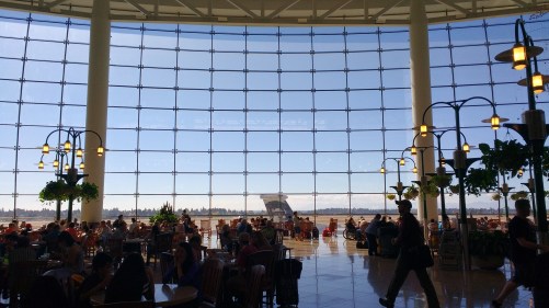
After walking through security at SeaTac, I entered the central food court and shopping area. I was greeted with this view:

IMG_20160823_155444200

From this gallery, you can watch the main runways as planes takeoff and land and you can do so seated in wooden rocking chairs (close to the windows). I assume many airports are designed with providing sufficient gates and access to planes in mind. Think of O’Hare or Atlanta where the concourses are long. Yet, this view took the mall court airport plan – common across many newer airports including ones I’ve seen in Tampa, Orlando, and Las Vegas – to another level: providing a large view of the most interesting work of the airport as planes travel at high speed.

An overview of the airport feature from when it opened in 2005:

The feature attraction, however, is the 60-by-350-foot glass wall that overlooks the runways and, in amenable weather, the Olympic Mountains. It’s more than just a big picture window. The panes are wrenched into a compound curve, convex in the vertical plane and concave in the horizontal. It looks more like a portal to a space warp than a mere window. The web of steel cables, struts and attachment spiders that allow the curtain wall to flex up to 11 inches in a worst-case windstorm or earthquake is all exposed to view, a celebration of virtuoso building technology…

Architect Curtis Fentress, the terminal’s principal designer, is convinced that people want to feel the excitement of travel again, and that it touches a deeper place than momentarily marveling at the apparent miracle of 400-ton cigars storming into the sky. He recalls a boyhood visit to the airport to see his uncle off to the Korean War. “We watched him wave to us from the plane,” Fentress recalls — an impression half a century old, burned indelibly into his mind.

Bonus: this area seemed to particularly fascinate small children. This is no small feat in the harried realm of traveling.

Adding to the design lesson: “What makes a McMansion bad architecture?”

Mcmansionhell on Tumblr begins with a well-illustrated post: “McMansions 101: What makes a McMansion bad architecture?

We could add several additional dimensions to the negative design of McMansions:

  1. A lack of consistency around the entire home. (This post address the front.) Critics suggest McMansions are intended to impress others with their facades but the rest of the home gets little attention.
  2. Poor quality or a mish-mash of architectural materials. (Think fake stone siding.)
  3. Mixing a variety of architectural styles such as putting together English Tudor and Mediterranean.
  4. An oversized emphasis on the garage. (Hence the nicknames “Snout Houses” or “Garage Mahals.”) Critics suggest this emphasizes the private nature of large homes rather than having architectural elements that interact with the streetscape.
  5. A lack of proportions to the size of the lot, whether it is a large lot or a teardown McMansion sitting on a small lot and near smaller homes.

I look forward to the coming Tumblr posts on McMansions and it some of these design issues listed above will be covered.

Quick Review: A Burglar’s Guide to the City

Joining the subjects of crime and architecture, A Burglar’s Guide to the City by Geoff Manaugh is an interesting if not repetitive read. Some thoughts about a book that would intrigue many general readers:

  1. Manaugh’s main argument is that criminals – burglars in particular – see buildings and cities in very different ways compared to architects. While architects assume people will use the correct entrances and the rest of the building as it is intended, burglars are always looking for unique ways in and out of buildings which leads to going through walls, roofs, and floors. Additionally, the locations of buildings can significantly affect burglary – such as the banks right next to highway on and off ramps in the Los Angeles area. In other words, these criminals are hackers of the built landscape.
  2. Manaugh talks to a number of law enforcement people and records some interesting insights. The best people he talks to are from Los Angeles as he travels with the helicopter crews and tries to see the city from above as well as spot criminal activity from this vantage points.
  3. Oddly, Manaugh doesn’t spend much time talking to architects. Do they think they should pay more attention to possible criminal behavior? Do they need to change how they think about buildings? He does talk to one creator of safe rooms.
  4. Overall, Manaugh seems a bit in awe of the burglars who can see the landscape in the ways that no one else can. He basically admits this at the beginning of the last chapter – he likes heist films – and admits at a few points that the vast majority of burglaries are connected to drugs.

This is an interesting read and those who like examples of daring criminals – such as those bank robbers who build tunnels under bank vaults, emerge from the floor, and escape through water tunnels on 4x4s – will find plenty to like. Yet, Manaugh doesn’t go far enough to connecting of how architects and city planners should respond or even if they should – perhaps this is just collateral damage of living in American cities today.

Japan has its own shapes for some traffic signs but perhaps not for long

Japanese officials are considering changing the shape of their traffic signs to better match the design of signs elsewhere in the world:

Japan is considering a revamp of its stop signs to suit easily confused tourists, The Japan Times reported recently. Japan’s current signs are fun and different, but they’re also red triangles that look suspiciously like the yield signs in the U.S. and other nations…

The stop-sign makeover would not come cheap. The government estimates the bill for replacing every sign in Japan with a more “global” design would total 25 billion yen, or $214 million.

The triangular stop signs are one of the last vestiges of unique Japanese signage. In 2013, Tokyo began to switch from signs using “romaji”—English transliterations of Japanese words—to signs with straight-up English translations. The Geospatial Information Authority of Japan announced earlier this month that it would change the symbols on foreign maps to reflect representations used throughout the globe: an envelope for a post office, a stick figure in a bed for hotel, and a peaked white box with a cross in the middle for a hospital, among others.

Japan has historically gone against convention when it comes to signage. It’s not among the 64 countries party to the United Nations 1968 Convention on Road Signs and Signals, which lays out global rules on, well, traffic signs. According to the guidelines, a “stop” sign is either circular, “with a white or yellow ground and a red border,” or octagonal, “with a red ground bearing the word ‘STOP’ in white in English or in the language of the State concerned.”

I suppose I shouldn’t be surprised but I am still fascinated: there are international conventions on road signs? Given the importance of driving around the world, this makes sense but it seems to be an odd signal of globalization: the exchange of goods and information is aided by the infrastructure of common road signs.

The only thing that might make this story even more fascinating would be some data on the consequences of having different road signs in Japan. How many accidents has this caused? Have their been prominent cases where tourists misinterpreted the signs?