The cultural bubbles of popular TV shows tell us what exactly?

This is a cool set of maps of the popularity of 50 different TV shows across zip codes in the United States. But, what is the data and what exactly can it tell us? Here is the brief explanation:

When we looked at how many active Facebook users in a given ZIP code “liked” certain TV shows, we found that the 50 most-liked shows clustered into three groups with distinct geographic distributions. Together they reveal a national culture split among three regions: cities and their suburbs; rural areas; and what we’re calling the extended Black Belt — a swath that extends from the Mississippi River along the Eastern Seaboard up to Washington, but also including city centers and other places with large nonwhite populations.

Some quick thoughts:

  1. Can we assume that Facebook likes are an accurate measure? How many people are represented per zip code? Who tends to report their TV show preferences on Facebook? Why not use Nielsen data which likely has a much smaller sample but could be considered more reliable and valid?
  2. How exactly does television watching influence everyday beliefs and actions? Or, does it work the other way: people have certain beliefs and behaviors and they watch what confirms what they already like? Sociologists and others that study the effects of television don’t always have data on the direct connections between viewing and other parts of life. (I’m not suggesting television has no influence. Given that the average American still watches several hours a day, it is still a powerful medium even with the rise of
  3. The opening to the article both suggests TV viewing and the related cultures fall along an urban/rural divide but then also split across three groups. The maps display three main groups – metro areas, rural areas, and areas with higher concentrations of African Americans. I would want to know more about two areas. First, political data – and this article wants to make the link between TV watching and the 2016 election – suggests the final divide is really in the suburbs between areas further out from the big city and those closer. Can we get finer grained data between exurbs and inner-ring suburbs? Second, does this mean that Latinos and Asian Americans aren’t differentiated enough to be their own TV watching cultures?
  4. The introduction to this article also repeats a common line among those that study television:

In the 1960s and ’70s, even if you didn’t watch a show, you at least probably would have heard of it. Now television, once the great unifier, amplifies our divisions.

We certainly are way into the cable era of television (and probably beyond with all of the options now available through the Internet and streaming) but could we argue instead that the earlier era of fewer channels and viewing options simply papered over differences? As numerous historians and other scholars have argued, the 1950s might have appeared to be a golden era but most of the benefits went to white, middle class, suburban families.

In other words, I would be hesitant to state that these TV patterns are strong evidence of three clearly different cultures in the United States. Could these television viewing patterns fit in with other cultural tastes differentiating various groups based on class and race and ethnicity? Yes, though I’d much rather see serious academic work on this developing Bourdieu’s ideas and encompassing all sorts of consumption items treasured by Americans (homes, vehicles, sports fandom, making those hard choices like Coke and Pepsi or McDonald’s and Burger King or Walmart and Target). Also, limiting ourselves to geography may not work as well – this approach has been tried by many including in books like The Big Sort or Our Patchwork Nation – as it did in the past.

“A Century of American Garbage” mapped

A map visualization of American landfills shows their spread and growth:

Widely considered to be the first sanitary landfill in the U.S., the Fresno garbage dump, which opened in 1937, has the dubious distinction of being named to both the U.S. National Register of Historic Places and the nation’s list of Superfund sites. That’s a funny pair of categories to straddle, but it illustrates an important point: Trash is a starring character in the American story, even as we continue to wrestle with its consequences…

The map really starts to blaze toward the middle of the century. That’s when landfills started to proliferate around the U.S., thanks in part to the Solid Waste Disposal Act of 1965, which created a federal office tasked with managing trash. By the mid-1970s, states were mandated to put some regulations in place. Landfills became more numerous, and they got larger, too. On the map, the larger circles denote more sprawling landfills. The largest dumps approach 1,620 acres.

At the end of the visualization, the landfill map looks similar to a population map. Most of the landfills are located near major cities. This makes sense: you don’t want big landfills in population centers but you don’t want to pay too much to send it far away.

Yet, I imagine this view at the national level obscures where exactly these landfills are located. If I was guessing, I would say the majority of landfills are located in two locations:

(1) the former edges of metropolitan regions – a landfill that opened in the 1950s might have been outside the suburban radius then but now is well within the boundaries of the metropolitan area

(2) the current edges of metropolitan regions – somewhere in the exurbs or within  an hour drive of the boundaries

NIMBY means that landfills in recent decades could probably get nowhere close to residential developments.

Street views of NYC going back to the 1800s

Google Street View is impressive enough but how about linking old photographs to current maps? See the results for New York City here.

Having spent some time in suburban archives, there are plenty of old photographs ready to be matched to current maps. However, I imagine there are at least two major hurdles: (1) finding the hours to collect the photos and do the work (the photos exist in in numerous locations) and (2) how the work could pay off (New York City is a place of interest but what about every Main Street in America)

Google Maps has now added areas of interest

Check out the redesigned Google Maps and you’ll see areas of interest:

Instead of promoting a handful of dots representing restaurants or shops at the city-view level, the new interface displays orange-colored “areas of interest,” which the company describes simply as “places where there’s a lot of activities and things to do.” In Los Angeles, for example, there’s a big T of orange blocks around Wilshire Boulevard and Vermont Avenue in Koreatown, and again on Wilshire’s Miracle Mile, stretching up La Brea Avenue*. In L.A., areas of interest tend to cling to the big boulevards and avenues like the bunching sheath of an old shoelace. In Boston, on the other hand, they tend to be more like blocks than strips. In Paris, whole neighborhoods are blotted orange.

Roads and highways, meanwhile, take on a new, muted color in the interface. This marks a departure from Google’s old design, which often literally showed roads over places—especially in contrast to Apple Maps, as the cartographer Justin O’Beirne hasshown. The new map is less about how to get around than about where to go.

“Areas of interest,” the company’s statement explains, are derived with an algorithm to show the “highest concentration of restaurants, bars, and shops.” In high-density areas, Google candidly explains that it is using humans to develop these zones. Algorithms, of course, are tuned by human engineers. But like Facebook with its News Feed, Google has decided that some attributes of the digital world need a human touch firsthand…

Even with its sliding scales, Google Maps can’t fit every shop in Tokyo in a two-dimensional map. So who gets a spot? It’s not an obvious choice: Analyzing Apple and Google’s maps of New York and London, O’Beirne found that the two companies’ maps had just 10 and 12 percent of their place labels in common. (Likewise, different people will have different businesses pop at them—try it with a friend.)

The title of the article is “All Maps Are Biased. Google Maps’ Redesign Doesn’t Hide It.” This bias could be toward certain businesses or certain areas of the city. When certain businesses or areas are displayed, others are not. But, we could also ask about the commercial imperatives of this mapping: what happens when areas of interest are primarily commercial areas and businesses? Are these always the most interesting spots in cities? When sociologists and others discuss thriving public spaces – whether the mixed use areas of Jane Jacobs or the spots of Cosmopolitan Canopies as noted by Elijah Anderson – they often do include businesses including stores and restaurants. Yet, at the same time, aren’t these spots interesting not only because they offer consumable goods and experiences but because they have a mix of people? Do the people make the spaces or do the businesses?

Particularly if Google Maps is used while driving, people can swoop in and out of these areas of interest. Or, it might alert them to specific areas and encourage a vibrant social scene. We’ll see if areas of interest lead to changing social patterns.

First project mapping cities of the last 6,000 years

Since their rise thousands of years ago, cities have transformed social life and societies. Here they are in map form:

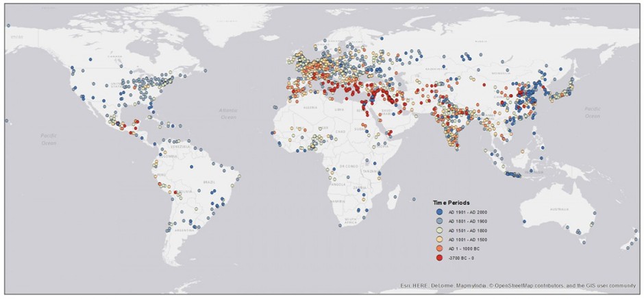
A new paper published in Scientific Data takes a stab at mapping the information Chandler and Modelski gathered. Yale University researcher Meredith Reba and her colleagues digitized, transcribed, and geocoded over 6,000 years of urban data. She and her colleagues write in their paper about the significance of their effort:

Whether it is for timely response to catastrophes, the delivery of disaster relief, assessing human impacts on the environment, or estimating populations vulnerable to hazards, it is essential to know where people and cities are geographically distributed. Additionally, the ability to geolocate the size and location of human populations over time helps us understand the evolving characteristics of the human species, especially human interactions with the environment.

Their map, pictured below, plots the first recorded populations for all urban settlements between 3700 B.C. and 2000 A.D. The earliest records available are in the warmest colors, and are clustered around Ancient Mesopotamia. The latest ones on record are in blue. (To be clear, the map shows when the populations of cities started being documented, not when and where these cities were actually “born.”):

This has been oft-studied – the cradles of civilization and all – but it is still helpful to see the spread from these areas to other centers. It is remarkable how many newer cities there are on this map, particularly in the Americas and east Asia. In other words, some parts of the world have had cities for millennia longer than other areas. At the same time, the recent rise of megacities is a relatively recent phenomenon since the Industrial Revolution and many of these cities are in places where cities are relatively new.

Visualizing immigration to the United States

Here are three interesting visualization options – an animated map and two infographics – to see immigration to the United States. Three quick thoughts:

  1. The map really does help illustrate the various stages of immigration. It starts from Western Europe, moves significantly to Eastern Europe in the late 1800s, and then opens to Mexico, east Asia, and other parts of the globe in the 1960s.
  2. It is unfortunate that the arrivals from Asia have to go over the “break” in the map since it has the Atlantic in the center. At first, I couldn’t figure out where the dots coming into the United States from the left were coming from.
  3. The second infographic provides some proportional context: even with the jump in migrants from Mexico, they represent a smaller proportion of the total U.S. population than the immigration spikes in the 1800s.

The results of primary voting in DuPage County

The Daily Herald has an analysis of primary voting for president by Chicago area county. Here are the results for DuPage County:

The heart of this traditional Republican stronghold is bright red, with the central areas of the county and south through much of Naperville full of precincts that turned out big for the GOP primary. The same goes for the southeastern part of the county, including Downers Grove,

Overall, more than 17,000 more Republicans than Democrats turned out in DuPage, bucking the statewide trend.

But there’s Democratic blue in the DuPage County part of Aurora, as well as in Addison Township. That kind of Democratic turnout could hint at why Obama was able to pull off wins in DuPage County in the last two presidential elections.

Two quick thoughts:

  1. Displaying the data in a map like this is very helpful as you can quickly see the different bases of support for the two political parties. Additionally, showing the size of the margin of victory for the leading party is much better than just showing who won.
  2. The voting patterns show some correlations with demographic patters: more Republican areas are whiter and wealthier while more Democratic areas are less wealthy and more diverse. Again, seeing this on a map helps make those connections – as long as you know a few things about the spatial dimensions of the county.

Dot maps of American jobs

A researcher shows the geographic dispersion of American jobs through an interactive dot map:

This visualization plots one dot for every job in the United States, according to the Census Bureau’s Longitudinal Employer-Household Dynamics data. The LEHD data is based on state unemployment insurance records, and tabulates the count of jobs by census block. Here, jobs are colored by type, allowing us to see how different industries and sectors exhibit different spatial patterns–some clustering in downtowns, others spreading across city and suburbs alike.

This project was inspired by the Racial Dot Map, as implemented most recently by the Cooper Center at the University of Virginia. I’m grateful to them for hosting such a stunning visualization, and especially for their extensive methodology section, which I drew on heavily to create the map here.

Not surprisingly, jobs are concentrated in different areas. Geographic dispersion is not unusual in the United States as it includes racial and ethnic groups (ongoing patterns of residential segregation), spatial mismatches between where people live and work, and grouping by social class and other categories (like religion or cultural groups – see the books The Big Sort or Our Patchwork Nation).

Why jobs are so grouped could involve a variety of factors including zoning (communities wanting to place certain firms in certain places), economies of scale and innovation (it could make sense to concentrate large numbers of workers and/or organizations near each other), and historic patterns of businesses locating near each other.

Another issue is whether these patterns are generally good for organizations, workers, and communities.

Detailed map of population changes in Europe, 2001-2011

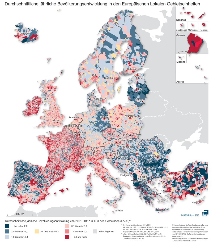
A new map shows the population trends at work in Europe between 2001 and 2011:

Look at the Eastern section of the map and you’ll see that many cities, including Prague, Bucharest, and the Polish cities of Pozna? and Wroc?aw, are ringed with a deep red circle that shows a particularly high rise in average annual population of 2 percent or more. As this paper from Krakow’s Jagiellonian University’s Institute of Geography notes, Eastern cities began to spread out in the new millennium because it was their first chance to do so in decades…

We already know from other available data that Europe is experiencing a migration to the northwest, but the BBSR map adds complexity to this picture and reveals some interesting micro-trends. The dark blue coloring of the map’s Eastern section shows that the lean years for Eastern states are by no means over. Residents have continued to leave Albania, Bulgaria and Latvia in particular in search of jobs, while even relatively wealthy eastern Germany has been hollowed out almost everywhere except the Berlin region.

Population growth in the Northwest, meanwhile, is far from even. While large sections of Northern Scandinavia’s inland are losing people, there’s still modest growth on the Arctic coasts. And while the Scottish Highlands contain some the least peopled lands in all of Europe, Scotland’s Northeast shows remarkable population gains, a likely result of the North Sea oil industry concentrated in Aberdeen…

Spain’s trends look a little different from those of Europe as a whole. It’s actually in the country’s Northwest where the population has dropped most sharply, notably in the provinces of Galicia and León, which have long been known to produce many of Spain’s migrants.

But other previously impoverished regions, such as Southwestern Murcia, have grown, a trend continuing along the Mediterranean coast where population levels have risen sharply.

All of this may help explain reactions to migrants – population pressure is high in some places, particularly wealthier regions, while population loss is occurring in more economically depressed areas. It is also a helpful reminder of how relatively free people are to move between places. I don’t know how exactly this lines up with historic migration rates – particularly before the rise of nation-states which presumably allowed more of an ability to control population flows – but the industrialized world (and much of the rest of the world as well) is quite a mobile one.

Midwest has the world’s straighest roads

One man set out to find the world’s straightest roads and he found them in the Midwest of the United States:

McCann writes:

“Using OpenStreetMap (OSM) data, I was able to see how bendy or straight the roads are all over the world. One theory I had was that Europe, where current roads are based on older roads that predate cars, would have more bends and curves than the USA, where current roads were (in many places) only put in in the last 150 ? 100 years, and probably put in directly and dead straight.

“The Mid-west USA and Canadian prairies have the most straight roads. Nearly all of the roads there are straight. This broadly matches my theory.”

For anyone questioning McCann’s methods, rest assured he used an actual “bendyness ratio” defined as the “length of the road divided by the straight line difference between [its] end points.” He didn’t think to abbreviate this ratio with a mathematical symbol, but I would suggest ||/?.

The project, which McCann launched some time ago but is now featured at Maps Mania, has its shortcomings. One is potentially incomplete road data in OpenStreetMap, another a technical issue with split “ways” that McCann delves into on his site. Still, it appears to paint an accurate picture of the Midwest, land of unbending, endless-feeling roads (red-orange areas mark hotbeds of straightness):

A lot of this is due to the fact that it is possible to have straight roads on flat land. Yet, these straight roads may be helpful in other ways. Back in graduate school, I wrote a paper about cognition in cities and some have argued that having a grid system – often aided by having flat land (see San Francisco for an interesting application of a grid on numerous hills) – is helpful for navigation (it is easy to tell directions) and better for traffic (multiple options in a grid rather than having some roads that are used more heavily). Think the Manhattan grid. Having this grid may even allow city dwellers to use the landscape as extended cognition where they don’t have to cram so much into their brains because they can offload information onto the grid. In contrast, I was recently in the western Philadelphia suburbs where the roads tend to follow the topography. It took me a number of visits before I knew which roads went where as they tend to twist and turn in ways that make sense. Of course, the Midwest roads may not be as scenic as those dipping and turning around hills, forests, water features and other natural phenomena. Some of the early wealthy suburbs like Riverside, Illinois intentionally had such curved roads on the flat landscape in order to highlight the landscape. Such curved roads in neighborhoods can also slow down drivers who have to be a bit more wary.