
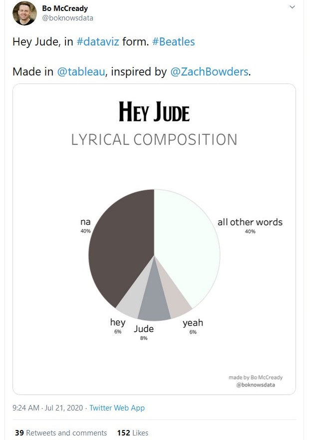
Pie charts are very effective when you want to show the readers that a large percentage of what you are examining is made of one or two categories. In contrast, too many categories or not a clear larger category can render a pie chart less useful. In this case, the word/lyrics “na” makes up 40% of the song “Hey Jude.” In contrast, the words in the song’s title – “hey” and “Jude” – comprise 14% of the song and “all other words” – the song has three verses (the fourth one repeats the first verse) and two bridges – account for 40%.
This should lead to questions about what made this song such a hit. Singing “na” over and over again leads to a number one hit and a song played countless time on radio? The lyrics Paul McCartney wrote out in the studio sold for over $900,000 though there are no written “na”s on that piece of paper. Of course, the song was written and performed by the Beatles, a musical and sociological phenomena if there ever was one, and the song is a hopeful as Paul aimed to reassure John Lennon’s son Julian. Could the song stand on its own as a 3 minute single (and these first minutes contain few “na”s)? These words are still hopeful and the way the Beatles stack instruments and harmonies from a relatively quiet first verse through the second bridge is interesting. Yet, the “na”s at the end make the song unique, not just for the number of them (roughly minutes before fading out) but the spirit in which they are offered (big sound plus Paul improvising over the top).
Thus, the pie graph above does a good job. It points out the lyrical peculiarities of this hit song and hints at deeper questions about the Beatles, music, and what makes songs and cultural products popular.

