I regularly drive past a sign at the beginning of a residential neighborhood that says: “Through trucks over 5000 lbs GVW prohibited.”
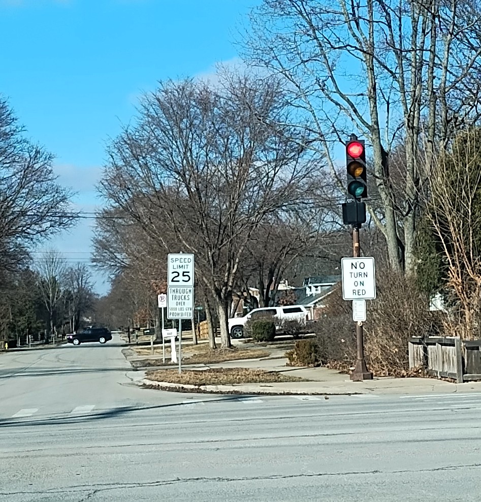
I would guess the primary purpose of the sign is to limit trucks from cutting through this residential area. A driver might want to avoid a busy intersection about a half mile from this sign and driving through the neighborhood could be a shortcut. Residents do not want to hear trucks, breath their exhaust, or have to maneuver around them while out and about their neighborhood.
At the same time, the vehicle weight might matter as well. Heavier vehicles put more stress on roads. Having heavy trucks regularly travel on a road will damage the surface more quickly. These are residential roads, not heavy-duty roads that handle tens of thousands of vehicles each day. The roads are meant to funnel drivers from single-family homes to the major roadways that can handle more traffic.
It is hard to get an exact figure quickly but there appears to be plenty of passenger vehicles that are over 5,000 pounds. Pickup trucks and large SUVs can exceed this weight regularly. Suburbanites drive plenty of these vehicles. Some of the homeowners in this neighborhood may have them.
So even as this sign likely is trying to keep trucks off neighborhood streets, it also hints at the increasing weight of passenger vehicles sold in the United States. They have gotten heavier over time. All roadways could be strained more, not just because of trucks.