Creative speed limits might help catch the attention of drivers:
In a post on social media, officials with the Outagamie County Recycling and Solid Waste said they decided on a posted speed limit of 17.3 mph because it makes drivers pause and look twice, breaking up that “autopilot” feeling that can be experienced when driving on familiar roads…
Such a precise speed limit is unusual, but the Wisconsin waste facility is not the first to try it out. Another example can be found in Colorado Springs, Colorado, where the posted speed limit at a shopping center is 8.2 mph. The decimal point has confounded Redditors for years.
Transportation planners may be turning to these more creative methods as they seek to slow drivers down. One recent study found that simply lowering the speed limit doesn’t usually work.
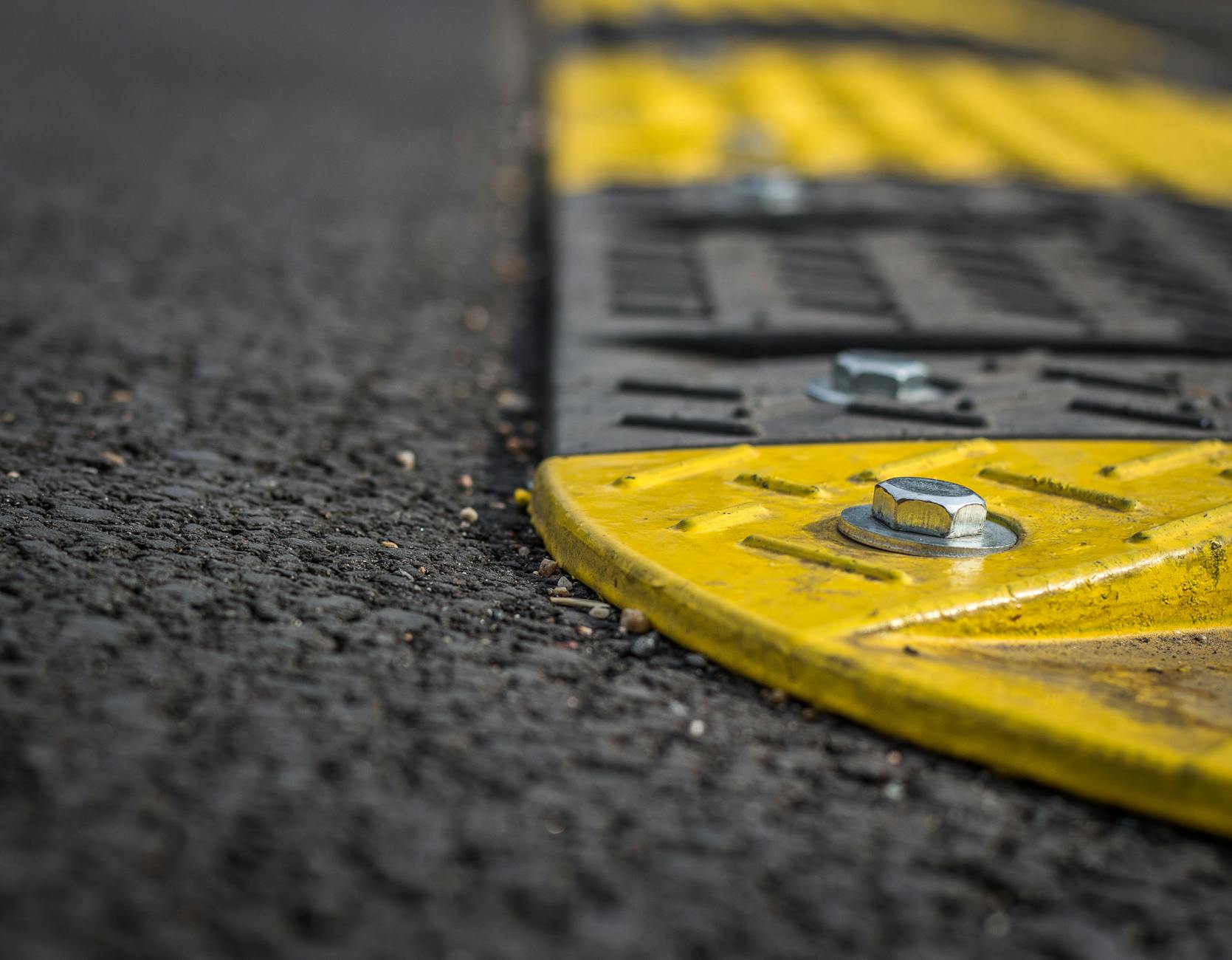
Changes in road design, like speed bumps, roundabouts, or curb bulb-outs, are usually more effective than changing signage.
It would be great to hear back in a few months about how the 17.3 mph sign has affected driving. How many noticed it while driving versus the number of people who heard about it online?
More broadly, provide a wide, straight road with few to no barriers and drivers will tend to want to go fast. It feels safe. They feel like they can go fast.
Design and signs might help them go a slower speed. In my area, the primary road remedies seem to involve intersections – making new intersections, turn arrows, diamond interchanges, roundabouts, etc. Plenty of people speed on a relatively wide and straight roads and speed bumps or hump are relatively unusual outside of HOAs.