
In searching for housing data this week, I came across a small animated widget on the Census website:
I like this presentation for three reasons.
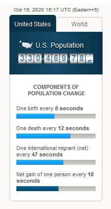
First, a static image does not do this graphic justice. The different bars, all four of them, moved in time with the passage of time. It is one thing to read that something happens every few seconds or minutes; it is another to see it count down or up next to other markers.
Second, while a larger presentation might help display the gravity of the population changes – imagine a map filling with new people – this is a pint-sized graphic with lots of information going into it. Population losses and gains can be complicated with lots of different inputs. This graphic boils it down to three major demographic factors: births, deaths, and immigration.
Third, this highlights the large American population and its growth. Given all the social, cultural, and political issues of recent years, I have wondered what role the size of the US population plays. Addressing any major issue might be more difficult given all of the people groups and experiences, regional differences, and more.
Of course, any graphic aims to simplify and this graphic does as well. At the same time, in a world awash in information, simple yet well-design presentations can go a long way to conveying helpful information.
