What does it mean that India’s population will pass China’s population?

India will soon have more people than China. What does that mean?

Photo by Still Pixels on Pexels.com

The United Nations has said India’s population is projected to surpass China’s sometime this year. Many demographers estimate it could happen this month, if it hasn’t already. India’s population is expected to reach 1.429 billion by the end of the year, according to the U.N. China will fall to second place, with 1.426 billion people. Both dwarf the U.S. at a projected 340 million.

India’s rising population means it’s likely to keep its economy growing, buy more of the world’s goods and play a bigger role in global affairs, even as it grapples with poverty and a lack of jobs. 

China’s demographic headwinds will make it harder for the country to achieve its economic ambitions, or to supplant the U.S. as the world’s biggest economy, despite its rising wealth and military power…

India’s population is expected to keep growing for the next four decades, peaking at nearly 1.7 billion in 2063. China’s population, which declined last year for the first time since famines in the 1960s, according to government data, is projected to shrink rapidly. By the start of the next century, India’s population is expected to be double that of China’s.    

Numbers are just numbers; we give them significance. Is this just about large numbers and their ability to impress people? Here, two countries have nearly a billion and half people each. That is a lot of people and far ahead of the next most populous countries.

It could also be about being the country with the most people. This has been China for a while but will soon be India. Does having the most people provide an exalted status?

Or, is it about economic activity and growth. A large and growing population means economic opportunities internally and externally.

Yet, it could be more about growth than absolute numbers. Yes, it is important to be first in population but this is also about expected growth for India and a declining population in China. Not only will India be #1 in residents, it could be far ahead of China in population soon.

What this all adds up to is hard to say. India will be the most populous nation, China will be second. The population arrows will be headed in different directions. Does it mean a significant change in status and economic status? The number of people in each country may just play a role in this.

Life expectancy in the US drops again

Certain demographic trends are worth noting. That the life expectancy in the United States dropped again is one:

Photo by Pixabay on Pexels.com

Just before Christmas, federal health officials confirmed life expectancy in America had dropped for a nearly unprecedented second year in a row – down to 76 years. While countries all over the world saw life expectancy rebound during the second year of the pandemic after the arrival of vaccines, the U.S. did not

The researchers catalog what they call the “U.S. health disadvantage” – the fact that living in America is worse for your health and makes you more likely to die younger than if you lived in another rich country like the U.K., Switzerland or Japan…

“We were very systematic and thorough about how we thought about this,” says Woolf. The panel looked at American life and death in terms of the public health and medical care system, individual behaviors like diet and tobacco use, social factors like poverty and inequality, the physical environment, and public policies and values. “In every one of those five buckets, we found problems that distinguish the United States from other countries.”…

The answer is varied. A big part of the difference between life and death in the U.S. and its peer countries is people dying or being killed before age 50. The “Shorter Lives” report specifically points to factors like teen pregnancy, drug overdoses, HIV, fatal car crashes, injuries, and violence.

This reminds me of a Hans Rosling video where he shows the rapid rise in life expectancy around the world in the last century or so.

If this is happening in the United States and not in other developed nations, does this mean the country is significantly in decline? Why does life expectancy not get the same kind of attention as other public matters, such as economic indicators or political fates? The ability to have a long life seems like a baseline matter that undergirds a lot of others

The US county with the longest life expectancy – and a big error margin

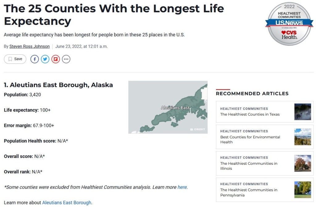
A recent ranking of US counties by life expectancy at birth now found Aleutians East Borough at the top of the list:

This is one of three counties with a life expectancy of “100+.” Out of these three, it is also the one with the largest error margin. If I am interpreting this correctly, the list compilers are 95% confident that the life expectancy of this county is between 67.9 and 100+.

This is most likely due to the relatively small number of people in the county. This is not uncommon in these rankings: of the top 16 counties in life expectancy, the highest population is over 55,000 and several counties have fewer people than the one ranking #1. When there are fewer cases (residents, for this analysis) to consider, it is harder to be confident in the calculated life expectancy. My guess is that this county had the highest expected life expectancy in the statistical model so even with the large confidence interval it ended up at the top of the list.

With fewer people in a number of these counties, the year-to-year predictions could shift more given conditions. Does this mean the rankings should be disregarded? Not necessarily but the confidence interval does provide insight into how the life spans of a small number of residents can change these rankings.

Populations – national or local – can grow or decline through births, deaths, and immigration

While the focus here is on the United States as a whole, this is also worth considering at the community level:

Photo by Skitterphoto on Pexels.com

A country grows or shrinks in three ways: immigration, deaths, and births. America’s declining fertility rate often gets the headline treatment. Journalists are obsessed with the question of why Americans aren’t having more babies. And because I’m a journalist, be assured that we’ll do the baby thing in a moment. But it’s the other two factors—death and immigration—that are overwhelmingly responsible for the collapse in U.S. population growth…

As recently as 2016, net immigration to the United States exceeded 1 million people. But immigration has since collapsed by about 75 percent, falling below 250,000 last year. Immigration fell by more than half in almost all of the hot spots for foreign-born migrants, including New York, Miami, Los Angeles, and San Francisco…

The implications of permanently slumped population growth are wide-ranging. Shrinking populations produce stagnant economies. Stagnant economies create wonky cultural knock-on effects, like a zero-sum mentality that ironically makes it harder to pursue pro-growth policies. (For example, people in slow-growth regions might be fearful of immigrants because they seem to represent a threat to scarce business opportunities, even though immigration represents these places’ best chance to grow their population and economy.) The sector-by-sector implications of declining population would also get very wonky very fast. Higher education is already fighting for its life in the age of remote school and rising tuition costs. Imagine what happens if, following the historically large Millennial cohort, every subsequent U.S. generation gets smaller and smaller until the end of time, slowly starving many colleges of the revenue they’ve come to expect.

Even if you’re of the dubious opinion that the U.S. would be better off with a smaller population, American demographic policy is bad for Americans who are alive right now. We are a nation where families have fewer kids than they want; where Americans die of violence, drugs, accidents, and illness at higher rates than similarly rich countries; and where geniuses who want to found new job-creating companies are forced to do so in other countries, which get all the benefits of higher productivity, higher tax revenue, and better jobs.

This matters for communities and cities in at least a few ways:

  1. The “growth is good” model in the United States assumes continued population growth. This is good for status as well as for other things (see #2).
  2. When populations are growing, the incoming revenues help pay for existing infrastructure and services as well as suggest money will be there in the future. In contrast, stagnant or declining populations can require cuts or reductions.
  3. The role of immigration cannot be understated and it affects population as well as demographics and local economics. For example, Chicago would have likely had more population loss over recent decades without immigrants coming to the city.

It will be particularly interesting to see what happens if more major population centers experience relatively little or no population growth while a few continue to grow rapidly. Does this change the balance of power and status among places?

American population change by the second

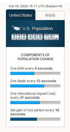
In searching for housing data this week, I came across a small animated widget on the Census website:

I like this presentation for three reasons.

First, a static image does not do this graphic justice. The different bars, all four of them, moved in time with the passage of time. It is one thing to read that something happens every few seconds or minutes; it is another to see it count down or up next to other markers.

Second, while a larger presentation might help display the gravity of the population changes – imagine a map filling with new people – this is a pint-sized graphic with lots of information going into it. Population losses and gains can be complicated with lots of different inputs. This graphic boils it down to three major demographic factors: births, deaths, and immigration.

Third, this highlights the large American population and its growth. Given all the social, cultural, and political issues of recent years, I have wondered what role the size of the US population plays. Addressing any major issue might be more difficult given all of the people groups and experiences, regional differences, and more.

Of course, any graphic aims to simplify and this graphic does as well. At the same time, in a world awash in information, simple yet well-design presentations can go a long way to conveying helpful information.

Estimate that 8.3% of Americans changed racial or ethnic identity between the 2000 and 2010 Census

A new study provides a reminder of the fluidity of racial and ethnic identities as a number of Americans reported different identities on the 2000 and 2010 Census:

The report showed that 1 in 16 people — or approximately 9.8 million of 162 million — who responded to both the 2000 and 2010 censuses gave different answers when it came to race and ethnicity.If extrapolated across the entire population, that would mean that 8.3 percent of people in the United States would have made a change in their racial or ethnic identity in that decade, according to the paper authored by Sonya Rastogi, Leticia E. Fernandez, James M. Noon and Sharon R. Ennis of the U.S. Census Bureau and Carolyn A. Liebler of the University of Minnesota.

The largest change was from Hispanic (some other race) to Hispanic white, with 2.38 million people making that change on their census forms. But the next greatest change was from Hispanic white to Hispanic (some other race), with 1.2 million people deciding that designation fit them better. Put together, these two changes make up more than a third (37 percent) of the race/ethnicity changes in the report…

The groups most likely to change were people who were children and/or living in the West in 2000. That region also had a higher rate of interracial marriage, and multiple race reporting, the report said. The census defines the West as being Alaska, Arizona, California, Colorado, Hawaii, Idaho, Montana, Nevada, New Mexico, Oregon, Utah, Washington and Wyoming.

The most stable groups were single-race, non-Hispanic whites, blacks and Asians, with those who checked those boxes staying with them in both censuses. People were also consistent with their Hispanic/non-Hispanic choices.

Those who make strong predictions about the demography of the United States in the coming decades have to contend with changes like this. It isn’t as easy as suggesting that the proportion of whites will continue to decline. What if more Hispanics see themselves as white? White as a category changed quite a bit in the past to include new immigrant groups and will likely continue to change in the future. All of this introduces uncertainty in thinking about how this could play out with contemporary debates, like with immigration.

It would also be interesting to compare the responses provided to the Census versus an everyday understanding of one’s racial and/or ethnic identity. The Census categories have their own history and may not always match lived realities.

The continued rise of the Sunbelt: Florida’s population to pass New York’s

One of the largest demographic shifts in American history continues: Florida’s population will soon surpass that of New York.

When the 2013 census results are revealed on Monday, Florida is expected to edge out New York as the third most populous state. The population gap between New York and Florida has been closing quickly over the past few years, but the ranking swap could still signify changes ahead for both states.

According to The New York Times, the new census figures reflect the trend of migrants born outside the U.S. making their way toward sunnier states, like California, Texas — the top two most populous states — and Florida. The Times reports that roughly 50,000 New Yorkers move to Florida each year, compared with only 25,000 Floridians who come to New York. Though New York state’s population is still growing, it is far outpaced by Florida growth. And upstate New York is largely economically stagnant, while cities like Tampa and Jacksonville flourish…

A larger population can dictate a state’s future, in addition to simply reflecting its current circumstance. It means a larger chunk of the federal government’s money and more political representation. The New York Times explains:

The changing population pattern could have many practical and political implications, including diminished congressional delegations, a setback New York already suffered in 2010 — the year of the last decennial census count — when the state lost two districts, while Florida gained two seats. Census data also inform how billions of dollars in federal funding and grants are divvied up among the states, for things like highway planning and construction, public aid for housing and health care and education programs.

It is interesting to see the attention these estimates are getting. This population shift to the Sunbelt has been happening for decades now, spurred on by being closer to immigration sources (the 1965 Immigration Act helped increase immigration from Mexico and Latin America), warmer weather, more affordable housing, and economic growth. But, I suspect there are some other reasons in particular to point out the closeness in population of New York and Florida:

1. New York, particularly New York City, is seen as an American center of power (economic, political, cultural, social). Florida is seen as a place where people go on vacation or to retire. Yet, the population shift suggests Florida might be able to grow in power and influence while a relative population decline suggests New York has already peaked.

2. A conservative-liberal divide between the two states. For example, the New York Times article cited above mentions the stand your ground law in Florida as well as the implications for Congress. The horrors that might ensue if the people of Florida get to help dictate policy for the people of New York City…

3. It is more difficult to understand larger population trends without having these kinds of comparisons. In other words, we could say the Sunbelt population has grown 15% over 10 years while the population in the Northeast has grown 4% over the same period but these are big areas and vague numbers. Being able to pit two states against each other makes the data more understandable and produces a better news story.

Hispanics will be largest group in California by 2020

New demographic projections for California suggest Hispanics will pass whites to be the largest group by 2020:

Population projections released Thursday by the state Department of Finance show that Hispanics will become the dominant ethnic group in California for the first time.

By 2020, demographers say Hispanics will be about 41 percent of California’s population, with whites less than 37 percent.

The white population will fall to about 30 percent by 2060 from the current 39 percent, affecting politics and public policy in the nation’s most populous state. Whites currently lack a majority in only Hawaii and New Mexico.

It will be worth watching to see what changes this brings to California’s society, economy, and politics. Another issue to consider is whether the trend in California will extend to other states or whether California is uniquely positioned to experience this sort of demographic change. While we have been reading about these projected demographic changes in California for years, I don’t recall seeing similar projections for states like Texas. This, of course, could suggest demographic change is taking place more slowly in other states.

Call for more social science modeling for Social Security

An op-ed in the New York Times explains how poorly financial forecasts for Social Security are made and suggests social scientists can help:

Remarkably, since Social Security was created in 1935, the government’s forecasting methods have barely changed, even as a revolution in big data and statistics has transformed everything from baseball to retailing.

This omission can be explained by the fact that the Office of the Chief Actuary, the branch of the Social Security Administration that is responsible for the forecasts, is almost exclusively composed of, well, actuaries — without any serious representation of statisticians or social science methodologists. While these actuaries are highly responsible and careful and do excellent work curating and describing the data that go into the forecasts, their job is not to make statistical predictions. Yet the agency badly needs such expertise.

With considerable help from the actuaries and other officials at the Social Security Administration, we unearthed how the agency makes mortality forecasts and uses them to predict the program’s solvency. We learned that the methods are antiquated, subjective and needlessly complicated — and, as a result, are prone to error and to potential interference from political appointees. This may explain why the agency’s forecasts have, at times, changed significantly from year to year, even when there was little change in the underlying data.

We have made our methods, calculations and software available online at j.mp/SSecurity so that others can replicate or improve our forecasts. The implications of our findings go beyond social science. As the wave of retirement by the baby boomers continues, doing nothing to shore up Social Security’s solvency is irresponsible. If the amount of money coming in through payroll taxes does not increase and if the amount of money going out as benefits remains the same, the trust funds will become insolvent less than 20 years from now.

Sociologists seem to be looking for ways to get involved in major policy issues so perhaps this is one way to do that. It is also interesting to note this op-ed is based on a 2012 article in Demography titled “Statistical Security for Social Security.” Not too many articles can make such a claim…

Also, I’m sure this doesn’t inspire confidence among some for the government’s ability to keep track of all of its data. Does the federal government have the ability to hire and train the kind of people it needs? Can it compete with the private sector or political campaigns (think of what the lauded 2012 Obama campaign big data workers might be able to do)?

“The era of great Mexican migration is probably over”

A long profile of a Mexican family who moved to Chicago and then recently moved back to Mexico contains some consequential big-picture information on migration: the flood of Mexican immigrants into the United States in recent decades is “probably over.”

With opportunities limited by a still-struggling economy, the historic wave of Mexican immigration appears to have reversed after decades of growth that transformed the U.S., according to the Pew Hispanic Center, a nonprofit research group.

With the change of direction that may again reshape communities in both countries, about 1.4 million Mexican immigrants in the U.S. returned home from 2005 to 2010, most voluntarily, the center reported last spring. That number, which also includes deportations, is roughly double the number of Mexicans who left the U.S. between 1995 and 2000.

“I believe the era of great Mexican migration is probably over,” said Allert Brown-Gort, a fellow at Notre Dame University’s Kellogg Institute for International Studies who has written extensively about Latin American immigration in the Midwest.

With jobs lacking, “slowly but surely your options start getting cut down,” Brown-Gort said. “What’s going to happen in Chicago if these workers go back, to the extent that they’re younger workers, is that it will be taking a wedge out of certain areas of the economy.”

This is a trend that has long-term implications for the United States. From the mid-1960s until the late 2000s, the United States experienced a large influx of immigrants. One way to measure this is to look at the foreign-born population in the United States which increased from 9.6 million in 1970 (4.7% of the total population) to almost 40 million in 2010 (12.9% of the total population). This flood of immigrants from Mexico and other countries led to opportunities, like new workers and population growth in cities and states that would not have had much otherwise, and new concerns. As suggested, we may look back at recent decades and see it as “the era of great Mexican migration.” Not having as many immigrants in the coming years will certainly lead to changes.

This also reminds me of the final pages of a recent book I just read: The Revenge of Geography by Robert Kaplan. After spending most of the book looking at pivotal regions of the world where a variety of civilizations and cultures have and will meet (Eastern Europe, the steppes of Russia, central China, northern India, Iran, etc.), Kaplan turns to the United States which has generally avoided such interaction by virtue of being across two oceans. Yet, Kaplan suggests while the United States has spent much of recent decades working on foreign policy concerns in Europe, the Middle East, and Asia, it should pay more attention to its relationship with Mexico. In particular, Kaplan argues the American Southwest and northern Mexico could have a very productive relationship moving forward as they share a number of economic, social, and cultural concerns.