Reporting the average credit card debt by household tells us something – but the median might be better

Headlines yesterday reported on a rising average credit card debt among American households:

Is the average the best measure? With credit card debt possibly ranging from $0 to who knows how much, is the average a good measure of what is typical?

Previous data I have seen suggest the average might not be very helpful. A July 2023 story based on survey data reported this:

A recent GOBankingRates survey found that 30% of Americans have between $1,001 and $5,000 in credit card debt, 15% have $5,001 or more in credit card debt and about 6% have more than $10,000 in credit card debt.

From 2022 data:

Unfortunately, most people with an active credit card account don’t always pay their bills in full. A November 2022 LendingTree survey found that just 35% of cardholders say they always pay their credit card balance in full every month, while 65% say they carry a balance at least some of the time. Nearly half (46%) of those cardholders who have card debt say it would take them at least a year to pay it off.

And tables on this site based on 2019 Federal Reserve survey data suggest the median credit card debt is quite a bit lower than the average.

I am guessing the median credit card debt is a better measure of the typical debt as it better accounts for all the households without any credit card debt. There is a place for the average or the total amount of credit card debt, particularly if one wants to emphasize the growing amount of debt.

Median age of housing by state and county

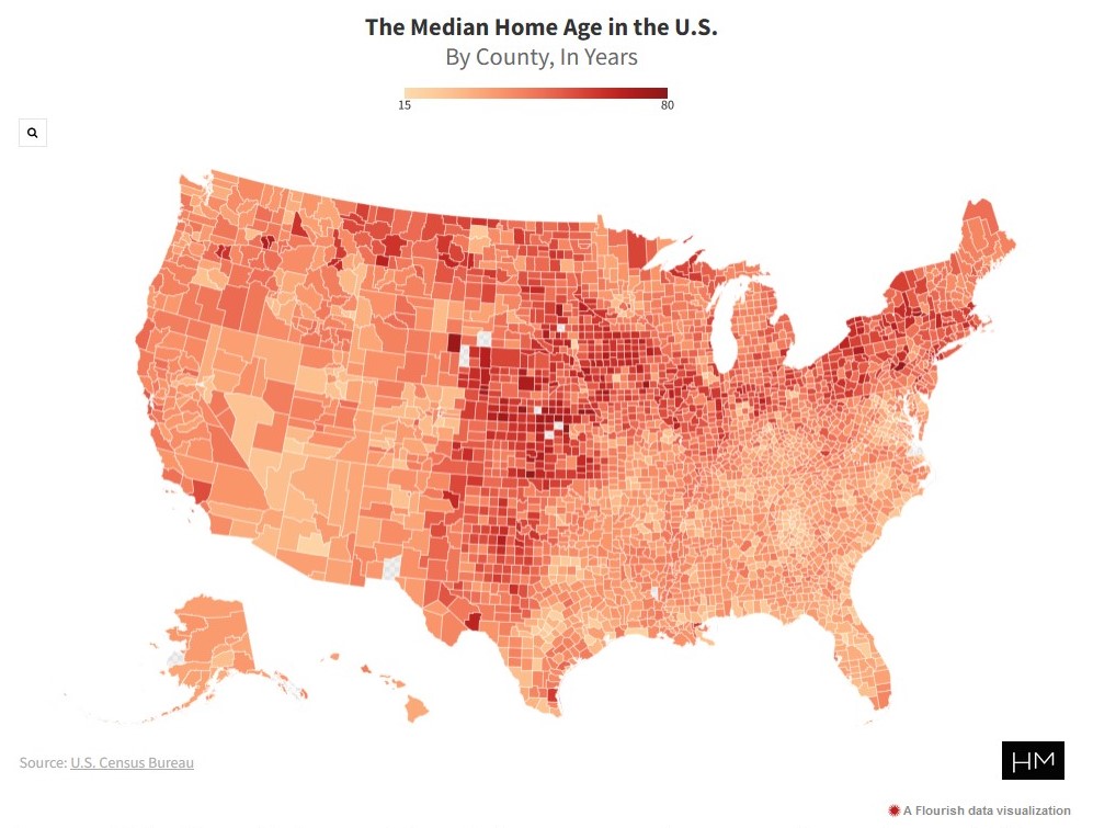
Using Census data, HouseMethod looked at the median age of homes across different geographies in the United States:

Age may just be a number, but when it comes to the age of a home, it can be an indicator of its style, features, or condition. It can even help tell a story about where it’s located. Home construction, especially in modern building, comes in waves in areas with new developments springing up as a city grows…

New York came in as the state with the oldest median home age in the U.S. at 63 years. Rhode Island was a few years younger at 60, followed closely by Massachusetts (59), Pennsylvania (57), and Connecticut (55). No surprise that the five states with the oldest median home age are all located in the northeast as they had some of the largest growth in early America. 

At the other end of the spectrum, the five states with the youngest median home age are Nevada (26), Arizona (30), Utah (31), Georgia (31), and North Carolina and South Carolina tied at 32 years old. Nevada has been the fastest-growing state for roughly five decades so it follows that the homes would be the newest. Likewise, the other ‘youngest’ states have seen large population increases and the housing being built to satisfy the demand…

The county with the oldest median home age in the U.S. is Clay County, Kansas. The county’s median year of structure build is 1941, bringing the county’s median home age to 79 years. The Sunshine State of Florida holds the ‘youngest’ county in the country, with Sumter County, Florida having a median home age of 17 years.

The median is helpful here: half of the homes were constructed before, half after. I do not know if the Census reports this data but it would also be interesting to know the 25th and 75th percentiles or other points along the data distribution. Are there also places that have more compressed or longer ranges of development?

Is it surprising that there a good number of older county medians in the center of country, roughly running from Texas to the Dakotas?

This reminds me of Dolores Hayden’s book Building Suburbia: Green Fields and Urban Growth, 1820-2000. She details waves of suburban development, dependent on factors like transportation technologies and ideas about what suburbs should be and include.

What happens to the housing in the locations with older housing overall? What percent ends up fixed up and restored or designated as part of a historic district? In contrast, what percent is undesirable and not brought into a more modern era?

Finding the mean, median, and modal Walmart shopper

An analytics firm describes the “typical” Walmart shopper:

Photo by Michael Burrows on Pexels.com

Numerator found that Walmart’s typical shopper in the US is a white woman between 55 and 64 years old, who is married and living in the suburbs of the Southeast. She typically has an undergraduate degree and earns about $80,000 per year.

She visits Walmart at least once per week — about 63 trips per year — and picks up 13 products for a total cost of about $54 per trip. 13.5% of her spending takes place at Walmart, while she spends about 11% at Amazon.

Her primary shopping categories in-store are groceries, including chicken, fruit, snacks and sweets, but she also gets a lot of fast food. Her favorite five brands at Walmart are Turkey Knob, Cheetos, Betty Crocker, Dole, and Tyson.

I am always looking for examples to help illustrate the differences between the three primary measures of central tendency: mean, median, and mode. When an article or report says something is “typical,” what exactly do they mean? Here is my guess at which data above is which measure of central tendency:

-mean: age, education level, visits to Walmart, money spent per trip

-median: income

-mode: race/ethnicity, marital status, place of residence, what is purchased

Some of these are harder to guess or do not fit these three options well. For example, is the $54 per visit a mean or median? Or, the five favorite brands are not a singular mode and they may lead the list of brands but not actually comprise that much of the total percent of purchases.

Additionally, it would be interesting to add measures of variability. How much variation is there in the age and education level of Walmart shoppers? I would guess the company wants to know more about the $54 spent per trip; how many spend more and what could be done to increase the number of people who spend more? Throw in a standard deviation or some other measure of dispersion and the numbers above become much more interesting.

In the end, the report above does not mean that someone visiting a Walmart will find most shoppers fit that profile. The measures of central tendency here tell us something but using multiple measures plus some measures of variability would provide more in terms of revealing who is at Walmart.

The modal age of racial/ethnic groups in the United States

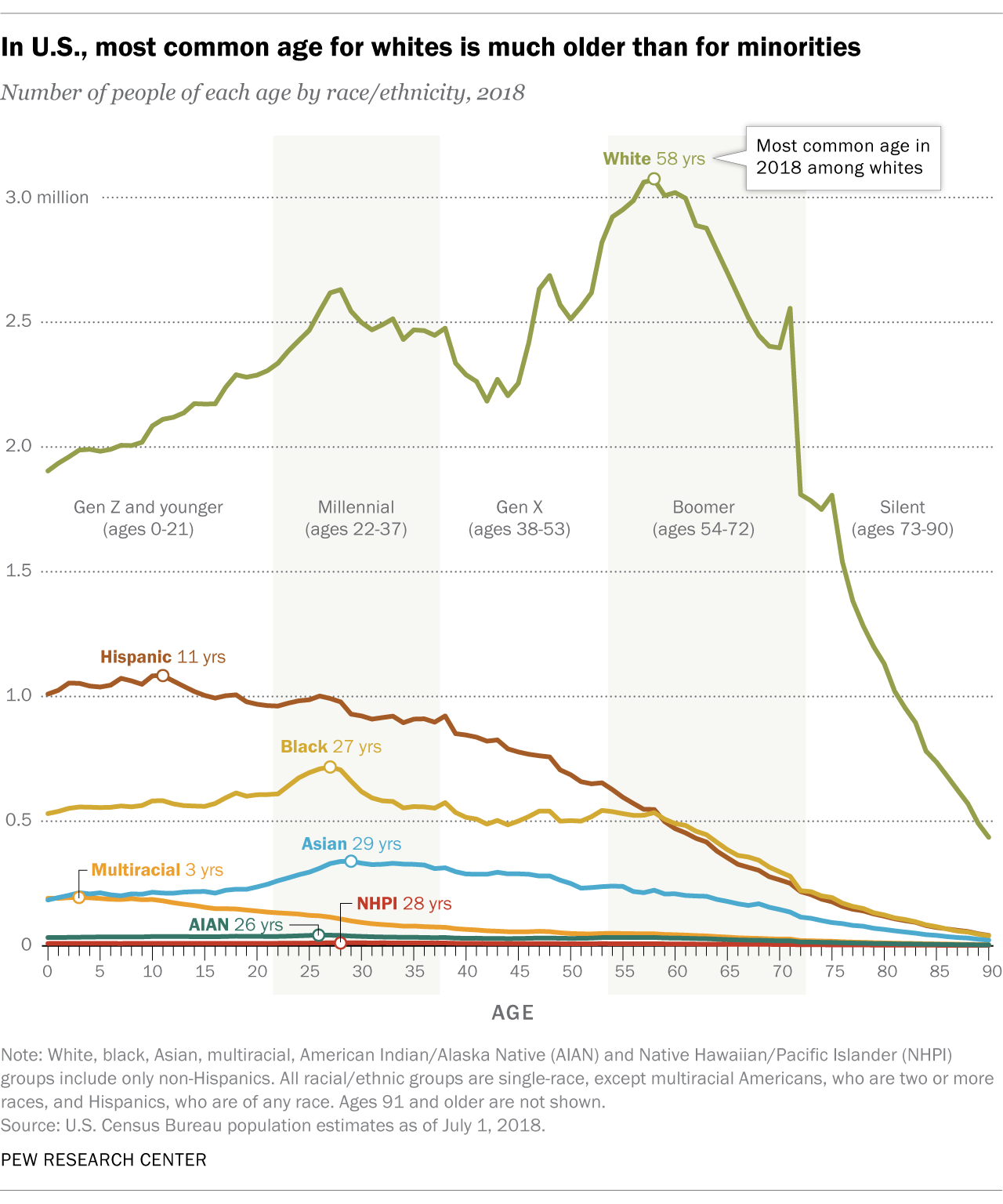
There is a big age difference in the most common age among racial and ethnic groups in the United States – particularly compared to the median.

In U.S., most common age for whites is much older than for minorities


There were more 27-year-olds in the United States than people of any other age in 2018. But for white Americans, the most common age was 58, according to a Pew Research Center analysis of Census Bureau data.

In the histogram above, which shows the total number of Americans of each age last year, non-Hispanic whites tend to skew toward the older end of the spectrum (more to the right), while racial and ethnic minority groups – who include everyone except single-race non-Hispanic whites – skew younger (more to the left).

The most common age was 11 for Hispanics, 27 for blacks and 29 for Asians as of last July, the latest estimates available. Americans of two or more races were by far the youngest racial or ethnic group in the Census Bureau data, with a most common age of just 3 years old. Among all racial and ethnic minorities, the most common age was 27…

Non-Hispanic whites constituted a majority (60%) of the U.S. population in 2018, and they were also the oldest of any racial or ethnic group as measured by median age – a different statistic than most common age (mode). Whites had a median age of 44, meaning that if you lined up all whites in the U.S. from youngest to oldest, the person in the middle would be 44 years old. This compares with a median age of just 31 for minorities and 38 for the U.S. population overall.

The paragraphs above provide multiple pieces of information that explain the distribution displayed above:

-The different groups have different skews, suggesting these are not even distributions.

-The mode is much higher for whites.

-The median agrees with the conclusion from the mode – whites are on average older – but the gap between whites and other groups drops.

All three pieces of information could inform the headline but Pew chose to go with the mode. Is this with the intent of suggesting large age differences among the groups?

Median college debt under $17k

While college debt as a whole hits record levels – over $1.3 trillion – the median debt is much more reasonable:

The median amount was nearly $17,000, but nearly 20 percent of those households owed more than $50,000.

I would suggest a disproportionate amount of media attention goes to college students at highly ranked or high status institutions that amass a lot of debt while most college students have more manageable amounts of debt. Of course, any debt may be difficult to pay back but there is a big difference between the median – $15k – versus the 80th percentile – $50k.

If debt was such an issue, why do Americans keep going to the more expensive institutions? Are too many students and families unnecessarily striving for “the best” when a cheaper yet good education would likely do?

Average full-time work week is 47 hours; median is around 40 hours

A number of headlines have screamed about a recent Gallup finding that the average American full-time worker works 47 hours a week. Yet, the median appears to conform to the typical 40-hour work week:

Adults employed full time in the U.S. report working an average of 47 hours per week, almost a full workday longer than what a standard five-day, 9-to-5 schedule entails. In fact, half of all full-time workers indicate they typically work more than 40 hours, and nearly four in 10 say they work at least 50 hours.

Average Hours Worked by Full-Time U.S. Workers, Aged 18+


The 40-hour workweek is widely regarded as the standard for full-time employment, and many federal employment laws — including the Affordable Care Act, or “Obamacare” — use this threshold to define what a full-time employee is. However, barely four in 10 full-time workers in the U.S. indicate they work precisely this much. The hefty proportion who tell Gallup they typically log more than 40 hours each week push the average number of hours worked up to 47. Only 8% of full-time employees claim to work less than 40 hours.

These findings are based on data from Gallup’s annual Work and Education Survey. The combined sample for 2013 and 2014 includes 1,271 adults, aged 18 and older, who are employed full time.

Is the average the best measure here? This is a classic case where the median and mean give you different conclusions. The median tells you that not much has changed from the standard: half of full-time workers work 40 hours or less. The average, on the other hand, is pulled up by those people working 50+ hours. As the Gallup analysis goes on, it notes that there is a difference between salaried and hourly employees with salaried workers working more of those 40+ hour weeks. These salaried workers are likely white-collar and professional workers, people who may be working more but likely have more credentials, are getting paid more, and have higher-status jobs.

So, perhaps the headlines might be more accurate by saying “Salaried full-time workers have higher [47? 50?] hour work week.”

Average American net worth #4 in the world; median net worth #19

In another case of mean versus median, looking at the average or median net worth of Americans leads to different conclusions:

Americans’ average wealth tops $301,000 per adult, enough to rank us fourth on the latest Credit Suisse Global Wealth report.

But that figure doesn’t tell you how the middle class American is doing.

Americans’ median wealth is a mere $44,900 per adult — half have more, half have less. That’s only good enough for 19th place, below Japan, Canada, Australia and much of Western Europe…

Super rich Americans skew average wealth upwards. The U.S. has 42% of the world’s millionaires, and 49% of those with more than $50 million in assets.

Both figures are true but they tell very different stories. America at #4 or #19?

Some other interesting tidbits later in the article:

1. Homeownership helps other countries pass the U.S. in median wealth since some have higher rates of homeownership (like Ireland and Spain) and their housing markets didn’t experience such a bubble.

2. Americans can borrow money more easily than some. This means we might be able to get our hands on more but leads to more debt which subtracts from our net worth.

Methodological issues with the “average” American wedding costing $27,000

Recent news reports suggest the average American wedding costs $27,000. But, there may be some important methodological issues with this figure: selection bias and using an average rather than a median.

The first problem with the figure is what statisticians call selection bias. One of the most extensive surveys, and perhaps the most widely cited, is the “Real Weddings Study” conducted each year by TheKnot.com and WeddingChannel.com. (It’s the sole source for the Reuters and CNN Money stories, among others.) They survey some 20,000 brides per annum, an impressive figure. But all of them are drawn from the sites’ own online membership, surely a more gung-ho group than the brides who don’t sign up for wedding websites, let alone those who lack regular Internet access. Similarly, Brides magazine’s “American Wedding Study” draws solely from that glossy Condé Nast publication’s subscribers and website visitors. So before they do a single calculation, the big wedding studies have excluded the poorest and the most low-key couples from their samples. This isn’t intentional, but it skews the results nonetheless.

But an even bigger problem with the average wedding cost is right there in the phrase itself: the word “average.” You calculate an average, also known as a mean, by adding up all the figures in your sample and dividing by the number of respondents. So if you have 99 couples who spend $10,000 apiece, and just one ultra-wealthy couple splashes $1 million on a lavish Big Sur affair, your average wedding cost is almost $20,000—even though virtually everyone spent far less than that. What you want, if you’re trying to get an idea of what the typical couple spends, is not the average but the median. That’s the amount spent by the couple that’s right smack in the middle of all couples in terms of its spending. In the example above, the median is $10,000—a much better yardstick for any normal couple trying to figure out what they might need to spend.

Apologies to those for whom this is basic knowledge, but the distinction apparently eludes not only the media but some of the people responsible for the surveys. I asked Rebecca Dolgin, editor in chief of TheKnot.com, via email why the Real Weddings Study publishes the average cost but never the median. She began by making a valid point, which is that the study is not intended to give couples a barometer for how much they should spend but rather to give the industry a sense of how much couples are spending. More on that in a moment. But then she added, “If the average cost in a given area is, let’s say, $35,000, that’s just it—an average. Half of couples spend less than the average and half spend more.” No, no, no. Half of couples spend less than the median and half spend more.

When I pressed TheKnot.com on why they don’t just publish both figures, they told me they didn’t want to confuse people. To their credit, they did disclose the figure to me when I asked, but this number gets very little attention. Are you ready? In 2012, when the average wedding cost was $27,427, the median was $18,086. In 2011, when the average was $27,021, the median was $16,886. In Manhattan, where the widely reported average is $76,687, the median is $55,104. And in Alaska, where the average is $15,504, the median is a mere $8,440. In all cases, the proportion of couples who spent the “average” or more was actually a minority. And remember, we’re still talking only about the subset of couples who sign up for wedding websites and respond to their online surveys. The actual median is probably even lower.

These are common issues with figures reported in the media. Indeed, these are two questions the average reader should ask when seeing a statistic like the average cost of the wedding:

1. How was the data collected? If this journalist is correct about these wedding cost studies, then this data is likely very skewed. What we would want to see is a more representative sample of weddings rather than having subscribers or readers volunteer how much their wedding cost.

2. What statistic is reported? Confusing the mean and median is a big program and pops up with issues as varied as the average vs. median college debtthe average vs. median credit card debt, and the average vs. median square footage of new homes. This journalist is correct to point out that the media should know better and shouldn’t get the two confused. However, reporting a higher average with skewed data tends to make the number more sensationalistic. It also wouldn’t hurt to have more media consumers know the difference and adjust accordingly.

It sounds like the median wedding cost would likely be significantly lower than the $27,000 bandied about in the media if some basic methodological questions were asked.

Assessing “The Return of McMansions” in the NYT

Following up on the same data behind the CNN story on the McMansion comeback, the NYT looks more closely at the characteristics of new houses in 2012. Here is my summary:

-Housing starts were still down in 2012. Looking at the graph with housing start data since 1973 shows that the last few years have been quite different.

-The homes built in 2012 were bigger: the highest median square footage ever of 2,306 square feet, 41% of the houses were four or more bedrooms (a new record), and 30% of new houses had 3 or more bathrooms (also a new record).

My thoughts on this data:

1. This is not a big surprise. While housing starts are way down, wealthier Americans and others have still been able to buy large new homes. Again, Toll Brothers is doing just fine. On the other hand, the lower ends of the housing market are not doing well.

2. It is interesting again for people to pick up on the highest-ever median square footage for new houses. For years, journalists and others have looked at the average square footage which is bit down from its high several years ago. Perhaps the median is now alluring because it is at its highest point and therefore can be linked to McMansions and American excess?

3. More houses have more bedrooms and yet the average family size in the United States has decreased in recent decades and more Americans are now living alone. So what are these bedrooms being used for?


CNN says “McMansions are making a comeback” but the data is limited

CNN reports that McMansions just may be on the way back:

During the past three years, the average size of new homes has grown significantly, according to a Census Bureau report released Monday. In 2012, the median home in the U.S. hit an all-time record of 2,306 square feet, up 8% from 2009.

During the recession, Americans downsized and the average new home shrunk in size by 6% over two years to 2,135 square feet. At the time, many industry experts said the days of the McMansion were over.

The shrinkage was supposed to indicate that a new era had begun, with young buyers seeking to live closer to urban cores and settling for smaller places and baby boomers downsizing after their kids had flown the nest.

But it wasn’t that consumers wanted less space, many just couldn’t afford more, said Jeffry Roos, a regional president for home builder Lennar. And now that the economy is improving, they’re demanding bigger homes again, he said.

This is what I suspected might happen: once the housing market picked up again, some Americans would go back to buying bigger houses. But, this article has a few problems as it relies on (1) the median home size and (2) talking to several large builders.

Regarding home size: the figures cited more often is the average home size. The average size for new houses went from roughly 900 square feet in 1950 to nearly 2,500 in the mid-2000s. The median home size might be more accurate as the extra big homes can’t skew the data as much but the average is used more often. Also, the median hasn’t changed all that much in the last few years – this is only a difference of 150 square feet, a 12×12 room. Why can’t we see figure about the number of big homes that have or have not been built rather than relying on these overall figures that are a snapshot of a varied housing industry?

Relying on just a few large builders also does not reveal the big picture. The builders cited, particularly Toll Brothers, are big players but the housing market has a lot of different builders and developers. Overall, how are lots of different builders feeling about big houses? Are they actually building these bigger houses? What do real estate experts say? The news for Toll Brothers has looked good recently but there is more to the big house market than just Toll Brothers.

This seems like an article that would benefit from better data and also may not really be able to be written until some more time has passed and the trend is more clear. In the meantime, simply invoking the term McMansion and discussing a possible trend is apparently enough…

UPDATE 6/5/13: As the CNN story is repeated across the web, there is some confusion. For example, look at how this retelling mixes the idea of an average or median:

A new Census Bureau report says the average size of a new home has grown eight percent in the last three years, up to a record 2,300 sq. ft. in 2012…

According to the National Association of Homebuilders, buyers prefer a median home size of just over 2,200 feet, in line with the Census average.

Two different figures for the “middle” size mean two different things…