Looking at data on where millennials are moving includes an evaluation of those places:

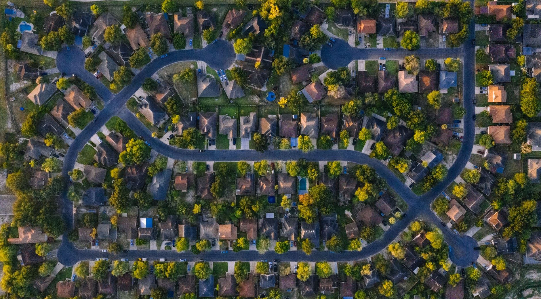
To Lee and his colleagues’ surprise, millennials aren’t moving to nearby dense, walkable exurbs. They’re getting way out to peripheral suburbs.
“It turned out that millennials are moving to the most boring places in the world,” says Lee, who’s now a professor at Seoul National University. “They’re moving to really single-family-dominated areas with very few urban amenities.”
What might make these places less boring?
It’s expensive to live in the places millennials prefer: walkable communities with lots of shops, restaurants, and public space. An analysis published last year found that homebuyers in the 35 biggest American metropolitan areas paid 34% more to live in walkable neighborhoods, while renters paid 41% more. Paul Stout, a millennial landscape-architecture student with a popular urbanist TikTok account called Talking Cities, says he constantly hears from followers who wish they could afford a home within walking distance of places like coffee shops…
But while millennials wallow over the choice between a tiny apartment in a dense city and a lonely, sidewalk-less subdivision, urbanists insist any place can be dense and walkable as long as land-use laws allow it and people want to live there.
“There’s a lot of places in the suburbs that could be really lovely to live if you could only put a grocery store or a coffee shop on the corner,” Stout says. “I’m optimistic that you could actually make living walkable almost anywhere in the US, given the right package of zoning reform.”
America is not known for its walkability (see the dangers to pedestrians) or its third places. Instead, Americans often promote and move to suburbs built around single-family homes and driving.
Does this mean suburbs further out from the city are really “the most boring places in the world”? Or are millennials and many others pushed into binary choices where they prioritize cheaper and larger housing and thus give up other community features? In many American communities, they cannot have both cosmopolitan street life and ample affordable housing they can own.
And I would venture to guess that at least a few of American suburbanites do not find them to be boring places. (One could argue they were pushed into this option rather than chose it but that is a different argument.) Millennials and Gen Z may find them more boring than older adults and this would be interesting data to compare.