A more interactive and informational street sign

A new kind of street sign is in downtown Arlington Heights:

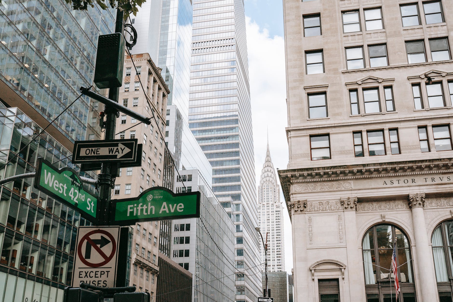
Photo by Jens Johnsson on Pexels.com

With three movable LED signs atop the 10-foot pole, the panels display real-time messages pertinent to their surroundings, from how many tables are available at a nearby restaurant, to Metra train timetables. Any governmental emergency alerts, like weather and Amber Alerts, get precedence.

“The sign would orient itself and say, at Salsa 17 starting at 6 o’clock, there’s $7 margaritas or something. And then later it would spin around and say there’s a band playing at Peggy Kinnane’s. There’s a lot of different inputs on this,” said Arlington Heights Village Manager Randy Recklaus. “It’s a thing that people would be drawn to, and it would be yet another thing that would kind of set our downtown experience apart because it’s not something that anyone’s seen before.”

The village would have control of the sign and approve all messages — done through a secure portal on a tablet, PC or Mac as part of a cloud-based system. And the cost of the sign would be recouped by selling advertisements to local business who want their messages on the street panels, under a lease-to-own arrangement that’s part of the Points Sign’s business model.

Pedestrians also will be able to search for things like local events and shopping and dining locales by turning and pushing a streetside dial.

The sign is customizable; some municipalities in talks with Optimal Design want to put a camera atop the pole for public safety purposes. And while the sign has sensors to know how many people are at a given intersection at one time, it doesn’t have facial recognition technology, Patel and Ottoman said.

The two keys to this sign seem to be that it is interactive and it pushes out information rather than standing passively. It does not necessarily replace static street signs, but it can help point people to opportunities. People can approach it and find something new. Such a sign could work well in locations with plenty of foot traffic and lots of local activity.

This reminds me of what I saw on my most recent trip to a shopping mall. The mall appeared to have fewer directory signs and instead I saw multiple recommendations to download the app for the mall. When I did use the interactive directory sign, I could search within certain categories and then it offered directions to the selected retailer.

Are we any closer to a more immersive sign experience that can provide an overlay of information on a 3D view of a landscape? Imagine going up to an interactive sign, searching for something or selecting something presented to you, and then seeing a 3D image of the landscape with paths and information.

Or, are we close to a time when signs are not necessary as everyone with a smartphone or smart glasses or similar devices interacts through the world through that?

Removing ineffective “Children at Play” signs in Naperville

Naperville is removing “Children at Play” signs that have stood along roads for decades:

City crews are preparing this month to take down all 400 of the signs featuring a black silhouette of a child about to dart into traffic, said Jennifer Louden, deputy director of Naperville’s transportation, engineering and development department. Where appropriate, they will be replaced with signs that read “Neighborhood Speed Limit 25.”

“A lot of the ‘Children at Play’ signs were so prominent back in the ’80s,” Louden said. “They’re in almost any neighborhood in Naperville.”

But transportation standards have changed, she said, citing reports that the signs could give parents and children a false sense of security, don’t provide a safe driving speed and are unenforceable…

Zegeer said he recommends towns install new speed limit signs that are accompanied by speed bumps, strategic street painting or a number of other traffic calming measures.

I’m guessing there will be some negative reactions to this move as the signs seem to make sense: drivers will see a sign that kids might be playing nearby and they will slow down. Yet, that is not what the research finds. Drivers don’t respond much to such signs. Road signs in general might not be terribly effective as there is a lot for drivers to take in. As noted above, design and “traffic calming measures” can be much more effective in slowing drivers. You can’t exactly blow past a speed bump the same way you can ignore a road sign.

Thinking more broadly, this hints at one of the common downsides of suburban neighborhoods. On one hand, they are often viewed as preferable for children: bigger spaces, more green space, no noxious land uses nearby. On the other hand, the spatial design of suburbs regularly emphasize driving over the safety of pedestrians. Those bigger yards contain houses that emphasize the garage and driveway and feed unto wide streets where drivers try to operate as efficiently as possible (meaning they want to go as fast as they can).

Highway sign fonts and other fixes for American roads

The use of Clearview font on highway signs is ending:

In a notice posted in the Federal Register on Monday, the U.S. Federal Highway Administration announced a small change that has huge implications for the nation. The agency terminated an order it had issued back in 2004 approving the use of a new font in highway signs. Now those signs are going to change. Again…

Clearview was made to improve upon its predecessor, a 1940s font called Highway Gothic, at a time when an aging Baby Boomer generation meant lots of older drivers on the road. Certain letters appeared to pose visibility problems, especially those with tight interstices (or internal spacing)—namely lowercase e, a, and s. At night, any of these reflective letters might appear to be a lowercase o in the glare of headlights…

Officials in Canada and Indonesia have promoted Clearview as a standard. Transport, which was designed for U.K. roads by Jock Kinneir and Margaret Calvert, is the most famous example of a systemic transportation font standard. Clearview evolved as an outside recommendation, a best-practices approach from the private sphere, not as a regulatory shift. In the U.S., Meeker says, institutional interest in better standardization is tepid.“Traffic design is the greatest public manifestation of government on any given day,” Meeker says, “and yet it’s the most dreadful, tired, unresearched, undesigned part of the public interface with government.”

For a country that emphasizes driving, Americans can be oddly disinterested in best practices for road design. Perhaps that love of the freedom that driving offers carries over to thinking about roads: every driver for themselves. Beyond this story about moving away from an easier-to-read font, here are some other ways American roads could be improved:

Road diets – limiting or taking away lanes – would actually help limit traffic and can improve safety.

-Encouraging mass transit use (though often difficult) can help reduce congestion.

Zipper merges are more efficient for drivers.

-Paying for road maintenance now may not be thrilling or seem as pressing as other concerns but it can pay off down the road.

Synchronizing traffic signals can reduce congestion and save time.

-Certain road signs, such as those asking drivers to slow down for children, do not necessarily help. In fact, they may be ignored or even distract.

Experimental no parking signs in LA replace text with graphics

Instead of relying on text to delineate times of no parking, a new design has emerged in Los Angeles:

LA's new proposed parking sign design, inspired by the work of Nikki

Nearly two years later, LA is rolling out a pilot program of signs that may do exactly that. Over the next six months, the city will install 100 new signs around downtown to test a design that condenses a hodgepodge of regulations into one easy-to-read grid.

You might recognize the design. The original concept is the work of Nikki Sylianteng, a Brooklyn designer whose day planner layout blew up on the Internet last year. Her design made the rounds on blogs, garnering attention from commiserating drivers and, evidently, city officials. She’s now working with transportation officials in Vancouver to create new parking signs. She’s also heard from officials in Columbus, Ohio, and some cities overseas. And she heard from Los Angeles councilman Paul Krekorian…

Husting thought Sylianteng’s design was a good concept to run with (Sylianteng wasn’t paid for the project). It smartly transformed a handful of text-heavy restrictions into a color-coded blocks of time that tell you exactly what you need to know: Can I park here? Green means yes, red means no. Subtle diagonal striping helps those who are color blind differentiate between the colors. It was strikingly simple. “I didn’t even consider it would get to this level of the city,” Sylianteng says. “I figured if it ever did someone would say, ‘This is such a naive idea and these are all the reasons why this can’t happen.’”…

As a technological backstop of sorts, the city has been attaching Bluetooth beacons to every new sign erected with the hope developers eventually create an app that makes parking signs irrelevant. Husting calls this “phase two” of LA’s parking overhaul. Imagine pulling up to a parking spot and having your phone simply say “yes” or “no.” Or better yet, having your car tell you. “What we ultimately hope to do—and I know this is still far out in the future—is we want to be able to go ahead and connect with your vehicle,”Husting says. Until then, signs based on Sylianteng’s design would be a big improvement.

It is interesting to think about why certain kinds of road signs do or don’t change much over time. Some become so recognizable that to change them might create all sorts of difficulty. (Imagine redoing the basic stop sign or traffic light.) But, many others could be up for reinterpretation. Here, the shift is away from text to visuals – does this only work now because the visual reigns supreme in American society?

As the final paragraph above suggests, perhaps this is just the last gasp of the parking sign until autonomous vehicles simply communicate with the parking indicators and refuse to let you park in certain places.

Defacing/correcting a LA highway sign for the public good

Defacing an interstate highway sign would not be seen favorably by many municipalities but what if a resident changed the sign for the better to help people get where they want to go?

In the early morning of Aug. 5, 2001, the artist and a group of friends assembled on the Fourth Street bridge over the 110 freeway in Los Angeles. They had gathered to commit a crime—one Ankrom had plotted for years.

Twenty years earlier while living in Orange County, Ankrom found himself driving north on the 110 freeway. As he passed through downtown Los Angeles, he was going to merge onto another freeway, Interstate 5 North. But he missed the exit and got lost. And for some reason, this stuck with him…

Since he was an artist and sign painter, Ankrom decided to make the I-5 North shield himself. He also decided that he would take it upon himself to install it above the 110 freeway…

Ankrom wanted his sign to be built to Caltrans’ exact specifications, which included designs able to be read by motorists traveling at high speeds. He copied the height and thickness of existing interstate shields, copied their exact typeface, and even sprayed his sign with a thin glaze overspray of gray house paint so that it wouldn’t look too new…

The whole installation took less than 30 minutes. As soon as the sign was up, Ankrom packed up his ladder, rushed back to his truck, and blended back into the city.

Sounds like there were no repercussions. Even so, wouldn’t the situation have been better if he had contacted Caltrans or local officials to get this done? I suppose that would not have been so thrilling. While this might be sold as doing public good, the riskiness sounds like it had its own attraction compared to just helping out California drivers.

First shared street – devoid of street markings, signs – coming soon to Chicago

This has been tried elsewhere (see this example in England) but the first shared street will be in place next year in Chicago:

The New York Times editorial board recently called the concept of shared streets a “radical experiment” for the city of Chicago, which plans to start construction on its first one on Argyle Street early next year. Yet the philosophy behind them–that by removing common street control features, street users will actually act less recklessly and negotiate space through eye-contact—is actually not all that new. Shared streets have been built and shown to be effective in reducing accidents in London already. In the U.S., shared streets exist in Seattle, Washington and Buffalo, New York.

The Chicago project came about as the city was looking to implement a normal street improvement project for Argyle Street, an active block with businesses and restaurants in a diverse neighborhood where many Vietnamese immigrants settled in the 1970s. The street had also shut down for the city’s first night market for the last two summers, and Alderman Harry Osterman, whose ward includes the area, says officials wanted to continue spurring the revitalization of the area. The lakefront bicycle path is only two blocks away…

The $3.5 million street renovation will feature a design with no curbs or lanes, and minimal signage, though there will be stop signs, so as not to descend too far into chaos. Different colors and pavers will indicate where the sidewalk would normally end and where the street begins; the speed limit will be 15 miles per hour. Overall, the goal is to change the mood of the street: “Psychologically for drivers, they will know that they can’t just shoot from stop sign to stop sign.”

Osterman hopes that as a result of the improvement project, more visitors will come to businesses in the area, and that the open space will make it easier to encourage more sidewalk cafes and temporary events. The city is now nudging existing business to spruce up their facades.

It will be fascinating to see how this plays out in Chicago. Several of the interesting features here:

1. Such designs deemphasize the role of cars. Chicago drivers tend to like to go fast when they can so I suspect they will not like this change.

2. Pedestrians and businesses will probably like this a lot as it can enhance street life, leading to more people hanging around and frequenting the businesses.

3. In looking at the design, I did wonder about parking. If someone wants to drive to this stretch, this change might lead to more parking issues on adjacent blocks.

4. Even if this is successful, will it catch on more widely in Chicago? As noted above, while walkers and businesses will probably like this, you can’t have too many of these street or drivers will be really upset about their limited options.
“Testing a No-Cellphone Sidewalk Lane”

I’ve always been interested in the walking patterns of people along sidewalks, in public places, or in hallways so this TV test of cellphone lanes on sidewalks looks fascinating:

Sidewalk collisions involving pedestrians engrossed in their electronic devices have become an irritating (and sometimes dangerous) fact of city life. To prevent them, what about just creating a “no cellphones” lane on the sidewalk? Would people follow the signs? That’s what a TV crew decided to find out on a Washington, D.C., street last week as part of a behavioral science experiment for a new National Geographic TV series.

As might be expected, some pedestrians ignored the chalk markings designating a no-cellphones lane and a lane that warned pedestrians to walk “at your own risk.” Others didn’t even see them because they were too busy staring at their phones. But others stopped, took pictures and posted them—from their phones, of course.

Of course, you have to watch the show to find out the complete outcome. But, I would guess most people didn’t pay much attention to the markings. While the experiment targets cell phones, there are lots of ways pedestrians can create problems on sidewalks. Cell phones may be particularly dangerous because people keep moving while not paying attention but other issues abound including people who suddenly stop right in the middle of walking people or others who walk at least three people across and force others to move out of the way.

There are places where such signs or markings do seem to work. It is common in Europe to see signs telling people on escalators or moving walkways to stand to one side to let others pass on the other side. In contrast, Americans tend to clog up such pathways. Similarly, the BART in San Fransisco has markings indicating where to line up for train cars while waiting. This works with a system where the train always stops at the same place but it does create a more orderly system than the free-for-all that is often common around train car doors.

It would be interesting to know why people might or might not follow such directions. Are they not paying attention while walking (this is common amongst drivers who can tune out all of the signs)? Is there a lack of enforcement? Are sidewalks and other walkways seen as more democratic settings (they are public property after all) where people should be able to do what they want?

Why American road sign lettering will change: better readability

The Infrastructurist sums up the research behind the change to federal policies about road sign lettering. Road signs in coming years will need to be changed to move away from all CAPS in order to improve readability, particularly at night:

The shift reflects years of research into how drivers—particularly the elderly—react to road signs. In the late 1990s researchers at Penn State’s Pennsylvania Transportation Institute compared traditional highway signs to those with mixed-case Clearview lettering. They sat people age 65 to 83 in the front seat of a Ford Probe and approached a sign until the person could read it, repeating the tests with various fonts in both daytime and night.

The results, as the name Clearview suggests, were clear. Mixed-font Clearview was readable from roughly 440 feet away, whereas typical all-cap lettering was readable only at a distance of 384 feet. By expanding the interior spaces of certain letters, Clearview also reduced halanation—the process by which letters blur together late at night. In darkness Clearview became readable at 387 feet, against 331 for the standard highway font style.

All told the researchers found a 16 percent increase in readability with Clearview. On a typical 55 m.p.h. highway this translates into “two more seconds to read and respond to a sign,” they concluded in a 1998 report.

While this will cost money in the short term, it should lead to an improved driving experience. But it is also interesting how an issue like this can become fodder for political debates about how much money the government should be spending.