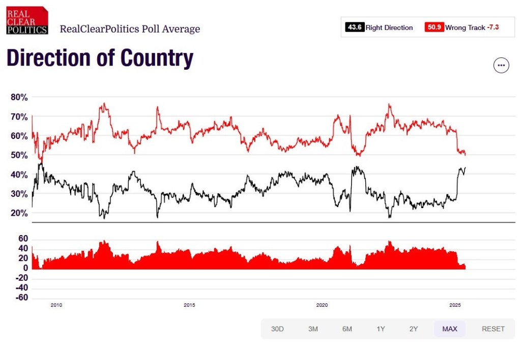
Granted, the polling average does move a decent amount at some points. It is over 45% just before 2010 and it is over 40% again around 2022. And it is down under 20% at a few points, including around 2012, 2014, and 2023.
What does long-term pessimism or concern do to a country? These patterns span multiple leaders, election cycles, events, and social movements. Are the same people down on the direction of the country or does this change depending on conditions? Are people responding more to the current moment or thinking about the near- or long-term future that they think the country is headed towards?
Put it another way: what might it take for a majority of Americans to say the country is on the right track?
The MMA would have three directors appointed by the governor, five by Chicago’s mayor, five by the Cook County Board president and five by the chairs of the DuPage, Kane, Lake, McHenry and Will county boards.
Republican Rep. Dan Ugaste of Geneva said, “what’s very important to us in the collar counties and probably in some suburban Cook, as well, is how is this going to work? If we’re talking simple majorities, once we get to the voting structure — that’s going to effectively allow all these five other collar counties to be silenced if Cook and Chicago work together.”
Democratic state Rep. Eva-Dina Delgado of Chicago, who is sponsoring the MMA bill, countered that “for a long time it has been city versus suburbs. We have to change our mindset around that, as well, and see this as a regional issue.”
There could be many different ways to figure out the formula for the number of votes from each part of the region. Some options:
Equal number of suburban and city votes, meaning an equal number from Chicago and equal number from the suburbs (with some way of figuring out which suburban areas are represented).
More votes from Chicago compared to the suburbs. City residents may use transit more.
More votes from the suburbs compared to Chicago. There are many more residents overall in the suburbs compared to the city.
Wild card: more appointees at the state level than either local interests such that the governor or state leaders retain control over which way votes might go.
Beyond the complications of local Illinois politics, the broader issue is that American cities and the suburbs around them do not always see eye to eye on transit and other regional issues. If either side feels that they have to “win” this portion of the negotiations, does this limit what can be accomplished? Or if one side does not really want to participate but also may not want to be locked out of the political process, where does that lead?
The Chicago Tribune made its endorsement for mayor in Aurora, Illinois. This is not a small city or a recently-developed place; Aurora is the second largest community in Illinois with over 175,000 residents and it has nearly two centuries of history. The current mayor ran in the 2022 Republican primary for governor. Lots of people would be interested in voting, right?
All of this means that a relatively small portion of communities elect local officials. If turnout is under 15%, then a mayor can be elected by less than 10% of a suburb’s population. These elected officials then help make important decisions about local ordinances, land use, infrastructure, and more. They represent the community to residents and outsiders.
Does this low turnout in local elections help explain why it is difficult for mayors to make the jump to higher levels of government? They may be known in their communities – also think of Pete Buttigieg, former mayor of South Bend, Indiana – but they do not necessarily need large voting blocs to support them and help them get into office. Running for higher offices, like Congress or governor, then requires amassing many more votes.
Demsas: How does this compare to the level of partisan segregation that we observe in other places? We know, for instance, that there’s partisan segregation happening in schools or in dating markets and churches and stuff like that. Is the workplace the most segregated based on party in America, or is this in line with other places?
Chinoy: Yeah, so it’s hard to answer this directly for every other social environment or every other group of people. I can tell you a couple things. So one is: I think a natural comparison is residential partisan segregation. This is something that people study a lot, right—the extent to which Democrats live on the same block as Democrats, and Republicans live next to other Republicans. And so we can sort of compare what I told you—that 10 percent number, that overexposure ratio—against partisan segregation across neighborhoods.
And you can define neighborhoods in different ways. One way to do it is a zip code. And when we do that, we find that partisan segregation at work is pretty similar. So, like, a little bit less than but overall pretty similar to partisan segregation across zip codes. We can go one step further and say, you know, maybe the zip code is a little bit bigger than what you have in mind when you think of neighborhood-level sorting. And so we have individual addresses in our data, and so we can say, you know, You have 15 co-workers. Let me figure out how many of them share your party affiliation, and let me look at our sample of the 15 people who live closest to you and figure out how many of those people share your party affiliation.
And when we do that, we find that workplace-level segregation, workplace-level overexposure ratio is a little bit less pronounced than that sort of nearest neighbor level of segregation, but still pretty similar, not so different. It’s not orders of magnitude different. So that’s kind of why we say that it’s a little less pronounced than residential segregation as a whole but still pretty sizable.
It sounds like the levels of political sorting are similar: what people tend to experience where they live is similar to what they experience at work.
I wonder how much it is experienced differently at work compared to a neighborhood. Where are politics more visible? In a neighborhood, a resident may have different indicators of political affiliation. It could come through conversation or yard signs or particular behaviors. At work, people might interact with each other or be in physical proximity more. Would political ties then be more apparent through conversation? Or are people sharing other signs of political leanings (things at a desk/cubicle/office, etc.)? Across both settings, are political views most visible on social media or online activity? Are people more comfortable with partisan sorting with neighbors or coworkers?
Map lines are inherently political. After all, they’re representations of the places that are important to human beings — and those priorities can be delicate and contentious, even more so in a globalized world where multiple nations often share the same maps.
Numerous examples follow:
The water bordered by the Southern United States, Mexico and Cuba will be critical to shipping lanes and vacationers whether it’s called the Gulf of Mexico, as it has been for four centuries, or the Gulf of America, as President Donald Trump ordered this week. North America’s highest mountain peak will still loom above Alaska whether it’s called Denali, as ordered by former President Barack Obama in 2015, or changed back to Mt. McKinley as Trump also decreed…
The Persian Gulf has been widely known by that name since the 16th century, although usage of “Gulf” and “Arabian Gulf” is dominant in many countries in the Middle East. The government of Iran — formerly Persia — threatened to sue Google in 2012 over the company’s decision not to label the body of water at all on its maps. Many Arab countries don’t recognize Israel and instead call it Palestine. And in many official releases, Israel calls the occupied West Bank by its biblical name, “Judea and Samaria.”…
The Associated Press, which disseminates news around the world to multiple audiences, will refer to the Gulf of Mexico by its original name while acknowledging the name Gulf of America. AP will, however, use the name Mount McKinley instead of Denali; the area lies solely in the United States and as president, Trump has the authority to change federal geographical names within the country.
Humans make meaning of the world around them and maps capture some of that meaning. And because meaning is sometimes agreed upon and sometimes contested, maps reflect these realities.
What are innovative ways to include multiple names or meanings on a map? Or layer changes in a map over time? I have seen some interesting displays online that attempt to do this. How can maps be more dynamic and flexible?
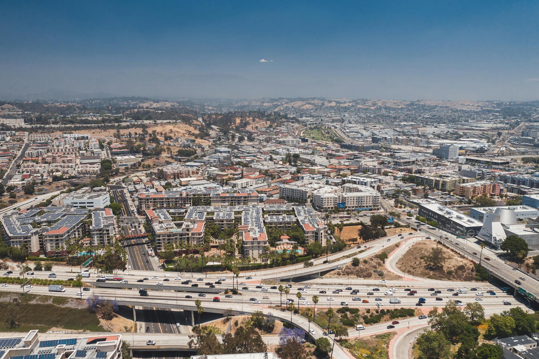
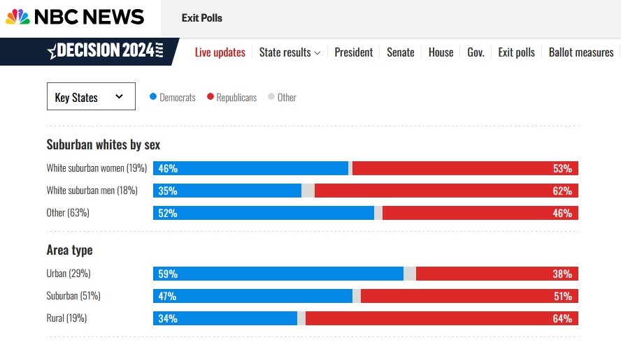
The suburbs have become increasingly diverse and populous. More than half of voters in 2024 were in suburban areas, according to exit polls. They have become swing areas, home to some of the most closely targeted House seats, and a good barometer of who will win the presidential election.
The winner in the suburbs has won 11 of the last 12 presidential elections, dating back to 1980. And this year that was Trump, 51%-47%, according to exit polls.
Vice President Harris was hoping she could turn out women in the suburbs in key swing states to get her across the finish line. But that didn’t happen. Trump, for example, won white suburban women by 7 points, as well as white suburban men — by 27. So there were some split kitchen tables, but not enough to help Harris win.
In multiple swing states, there were significant shifts in Trump’s direction in the suburbs, based on nearly final vote totals. That includes a net swing of almost 60,000 votes in the four counties that make up the Philadelphia suburbs and the two major ones north of Detroit, more than 10,000 in the “WOW” counties around Milwaukee (Waukesha, Ozaukee and Washington) and in the counties touching Fulton County, Ga., where Atlanta is.
This is the strongest declaration I have seen thus far about suburban voters in the 2024 election.
Two graphics in the story add to the text above:
A national map of counties shows many suburban counties shifted toward more raw votes for Trump between 2020 and 2024. Relatively few suburban counties shifted toward Harris.
There is an interactive graphic that shows shifts in suburban counties from 2016 to 2020 to 2024 and some suburban counties did move toward Harris in that span. This graphic shows there is significant variation in voting patterns across suburban counties.
On the whole, one candidate garnered more votes from the suburbs. Did that determine the election? This analysis does not say; it suggests suburban voters contributed to the outcome.
Based on these results, it looks like the Democratic candidate won large percentages in urban areas, the Republican candidate won a majority in rural areas, and suburban voters went slightly for the winning candidate.
If this pattern roughly held across the United States, it would be similar to patterns from previous presidential election cycles. If a candidate wants to win, they need to appeal to enough suburban voters.
What appealed to suburbanites specifically in 2024? If economic conditions was a top concern of voters, is this what drove suburban voters? The top table above suggests white suburbanites in these 10 states voted for the winning candidate. Were they driven by economic concerns or other issues?
And as attention turns to the next election cycle, how will parties and candidates seek to appeal to suburbanites? In addition to those thinking of presidential office, how will House districts involving suburbs speak to suburban residents?
Pittsburgh viewers tuning into Monday Night Football this week watched their Steelers beat the New York Giants — and 26 political ads.
That’s just a small slice of the roughly 2,300 political ads the typical Pittsburgh household has seen on television this year, according to AdImpact, more than any other market in the country.
The nonstop political onslaught for viewers, however, means a windfall for the stations. The local ABC affiliate broadcasting Monday’s game charged as much $150,000 for a single 30-second ad, an astronomical sum for the market.
Pittsburgh is the most extreme example of a phenomenon happening in swing states across the country: Campaigns and their allies are buying so many political ads that local businesses — the personal injury lawyers, car dealers and furniture stores that are usually staples of local news commercial breaks — often can’t reserve any airtime even if they could afford the inflated rates.
While political ads are likely airing almost everywhere due to local and state races, the presidential race depends on a few select states and big markets within them. Which party can turn out the most voters in the key suburban districts?
It would be interesting to see data after the election about how Pittsburgh area residents responded to these ads. How many people did they convince? What did it cost roughly to pickup each vote? How did these big ad buys perform compared to social media campaigns that can target specific individuals? Money was spent…but how effective was it.
Similarly, how might these ad seasons boost local media organizations? Is this like Christmas season for media where the money that comes in during political ad season covers budgets for a much longer time? If political ad season was reduced in length or in spending, how might these media organizations do with less money?
Over the past decade and a half, however, the dynamic has dramatically shifted. In 2008, the top fifth of earners favored Democrats by just a few percentage points; by 2020, they were the group most likely to vote for Democrats and did so by a nearly 15-point margin. (Democrats won the poorest fifth of voters by a similarly large margin.) Democrats now represent 24 of the 25 highest-income congressional districts and 43 of the top 50 counties by economic output. A similarly stark shift has occurred if you look at college education rather than income. Perhaps most dramatic of all has been the change among wealthy white people. Among white voters, in every presidential election from 1948 until 2012, the richest 5 percent were the group most likely to vote Republican, according to analysis by the political scientist Thomas Wood. In 2016 and 2020, this dynamic reversed itself: The top 5 percent became the group most likely to vote Democratic…
That realignment leaves both parties in a strange place heading into November. Voters consistently say that the economy is the most important issue of the 2024 election. And yet the affluent overwhelmingly support Kamala Harris, whose administration favored bold redistribution and big government spending, while a critical mass of working-class voters favor Donald Trump, whose economic agenda consisted largely of cutting taxes for the rich and trying to kill the Affordable Care Act.
This is not the only political shift in recent years but an interesting one nonetheless. Are these political shifts enduring? Such a shift disrupts short-term activity but there could also be long-term consequences. With the resources and connections elites have, does a shift like this lead to other consequential changes?
While the article focuses on whether these voters are voting in their material best interests, another part is intriguing: how then does this fit with the American obsession on the middle-class and the political rhetoric and activity that goes along with this? Does the composition of who comprises the electorate for a political party than affect how much the party talks about the middle-class or pursues policy aimed to help that group?
And since I think about the suburbs a lot, how does this affect how the two parties view suburbs in the United States? Traditionally viewed as middle-class places with powerful local control, does this shift with new political bases at play?
There are so many units of government in Illinois that people can’t even agree on the total because of differences over what technically qualifies as a government body. The U.S. Census Bureau says 6,930, while the Illinois Department of Revenue, which tracks governments authorized to levy property taxes, reports 6,042. The state comptroller’s office lists 8,529, and a study by the Civic Federation tallied the number at 8,923 as of 2019.
Regardless of the exact answer, the number of governments in Illinois outpaces that seen in bigger states, including Texas (which has 5,533, according to the Census Bureau), Pennsylvania (4,851) and California, a state with a population three times the size of Illinois but half as many local government units…
Today the state has more than 5,700 special-purpose governments, including 851 school districts, 861 drainage districts, 838 fire protection districts, 376 library districts, 348 park districts and 320 multi-township tax assessment districts, according to the state comptroller’s office. Many of the state’s nearly 1,400 districts dedicated to roads and bridges have boundaries overlapping its 1,425 townships.
Most of these governments are outside the Chicago region and represent only a sliver of the state’s population. Nearly two-thirds of Illinois residents live in the six-county Chicago metropolitan area. Meanwhile, 51 of Illinois’ 102 counties have fewer than 25,000 residents, and 15 of those have a population under 10,000, according to a 2021 Civic Federation report. About two-thirds of Illinois’ school districts have fewer than 1,000 students enrolled, and there are 26 school districts with fewer than 100 students.
Two figures stand out:
How do the different counters get to numbers so far apart? The difference is roughly 2,000 bodies of government – what exactly is the scope or taxing ability of these bodies? On the national level, who is considered to have an official count in these area?
Americans tend to like local government that responds to local needs. On one hand, all these government bodies are exerting the will of the people to control local activity. On the other hand, this could be viewed as micromanaging. Certainly there are merges that could happen in some of these categories to take advantage of economies of scale and more efficiently serve a slightly larger population? (I have discussed townships before.)
So is one way to interpret the number of government bodies in Illinois is to suggest that the price of corruption is not enough to convince residents and/or local leaders to give up local control?