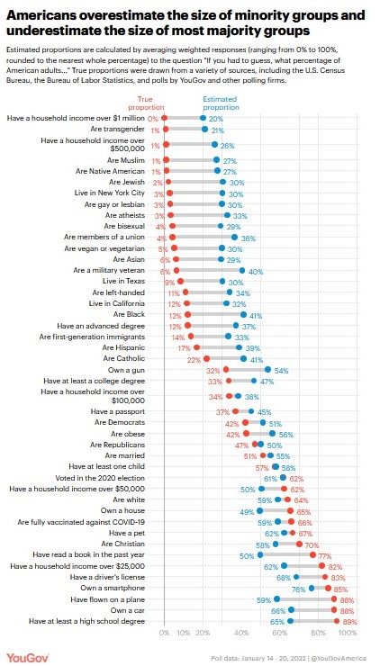
Americans overestimate the size of smaller groups, underestimate the size of larger groups

Recent YouGov survey data shows Americans have a hard time estimating the population of a number of groups:

When people’s average perceptions of group sizes are compared to actual population estimates, an intriguing pattern emerges: Americans tend to vastly overestimate the size of minority groups. This holds for sexual minorities, including the proportion of gays and lesbians (estimate: 30%, true: 3%), bisexuals (estimate: 29%, true: 4%), and people who are transgender (estimate: 21%, true: 0.6%).

It also applies to religious minorities, such as Muslim Americans (estimate: 27%, true: 1%) and Jewish Americans (estimate: 30%, true: 2%). And we find the same sorts of overestimates for racial and ethnic minorities, such as Native Americans (estimate: 27%, true: 1%), Asian Americans (estimate: 29%, true: 6%), and Black Americans (estimate: 41%, true: 12%)…

A parallel pattern emerges when we look at estimates of majority groups: People tend to underestimate rather than overestimate their size relative to their actual share of the adult population. For instance, we find that people underestimate the proportion of American adults who are Christian (estimate: 58%, true: 70%) and the proportion who have at least a high school degree (estimate: 65%, true: 89%)…

Misperceptions of the size of minority groups have been identified in prior surveys, which observers have often attributed to social causes: fear of out-groups, lack of personal exposure, or portrayals in the media. Yet consistent with prior research, we find that the tendency to misestimate the size of demographic groups is actually one instance of a broader tendency to overestimate small proportions and underestimate large ones, regardless of the topic. 

I wonder how much this might be connected to a general sense of innumeracy. Big numbers can be difficult to understand and the United States has over 330,000,000 residents. Percentages and absolute numbers regarding certain groups are not always provided. I am more familiar with some of these percentages and numbers because my work requires it but it does not come up in all fields or settings.

Additionally, where would this information be taught or regularly shared? Civics classes alongside information about government structures and national history? Math classes as examples of relevant information? On television programs or in print materials? At political events or sports games? I would be interesting in making all of this more publicly visible so not just those who read the Statistical Abstract of the United States or have Census.gov as a top bookmark know this information.

Estimating the undercounts and overcounts of the 2020 Census

The decennial census is a big undertaking. And the work continues: the Census Bureau just released their estimates of how well the 2020 counts reflect the population of the United States.

Photo by Kaboompics .com on Pexels.com

“Today’s results show statistical evidence that the quality of the 2020 Census total population count is consistent with that of recent censuses. This is notable, given the unprecedented challenges of 2020,” said Director Robert L. Santos. “But the results also include some limitations — the 2020 Census undercounted many of the same population groups we have historically undercounted, and it overcounted others.”

The two analyses are from the Post-Enumeration Survey (PES) and Demographic Analysis Estimates (DA) and estimate how well the 2020 Census counted everyone in the nation and in certain demographic groups. They estimate the size of the U.S. population and then compare those estimates to the census counts…

The results show that the 2020 Census undercounted the Black or African American population, the American Indian or Alaska Native population living on a reservation, the Hispanic or Latino population, and people who reported being of Some Other Race.

On the other hand, the 2020 Census overcounted the Non-Hispanic White population and the Asian population. The Native Hawaiian or Other Pacific Islander population was neither overcounted nor undercounted according to the findings.

Among age groups, the 2020 Census undercounted children 0 to 17 years old, particularly young children 0 to 4 years old. Young children are persistently undercounted in the decennial census.

I can imagine how some might read this story: the Census uses estimates and additional data to make claims about what is supposed to be a comprehensive count? Here are some quick thoughts in response:

  1. The numbers might sound like a lot: an undercount of the total population of 18.8 million? Yet, the error rates for separate groups are reported often between 1-4% and the total is off less than 6%.
  2. If the official numbers are known to be overcounts or undercounts, how might researchers take that into account when using the data?
  3. The Census is using multiple data sources to try to both get the most accurate statistics and improve its methodology. Explaining this publicly hopefully helps builds trust in the process and the numbers.
  4. It will be interesting to see how all of this informs future data gathering efforts. If there are consistent undercounts with certain groups, what changes in the coming years? If other data sources provide useful information, such as vital records, can these be incorporated into the data? And so on.

Collecting data about the population of a large country is no easy task and is a work in progress.

Skepticism of 5 million fans for Cubs parade, rally

Even though the 5 million attendees estimate for the Cubs parade and rally was widely shared after being made by city officials, there is good reason for reconsidering the figure:

“The guesstimates are almost always vast exaggerations,” said Clark McPhail, a sociology professor emeritus at the University of Illinois at Urbana-Champaign.

Politics often play a factor in overblown crowd counts. Runaway enthusiasm also could pump up the final tally, McPhail said.

There is a science to calculating crowds. The most common method is to draw a grid and make an estimate based on the average number of people that would fit into each section.

Another way to gauge crowds, particularly in a city such as Chicago, would be to analyze the capacity of buses or trains to deliver millions of people downtown or along the parade route, according to Steve Doig, the Knight Chair in Journalism at Arizona State University.

It doesn’t seem like it would take too much to draw a better estimate: there are plenty of aerial shots of the parade route and rally and groups like Metra and CTA could share figures.

Perhaps it isn’t a matter of examining the data: perhaps few people want to. Chicago could use some good news these days and making such a lofty estimate – supposedly making this the seventh largest peaceful gathering of people in human history – can boost the city’s image (both internally and externally). The team probably doesn’t mind the figure: it illustrates how dedicated the fans are (though there are plenty of other ways to do this) and might help increase the value of the franchise. The fans like such a figure because they can say they were part of something so much bigger than themselves.

If a revised lower figure gets released, I suspect it will not reach much of an audience.

Sociologists with their interests in social movements have been at the forefront in estimating crowd size. See earlier posts about counting crowds here and here.

The methodology of quantifying the cost of sprawl

A new analysis says sprawl costs over $107 billion each year – and here is how they arrived at that figure:

To get to those rather staggering numbers, Hertz developed a unique methodology: He took the average commute length, in miles, for America’s 50 largest metros (as determined by the Brookings Institution), and looked at how much shorter those commutes would be if each metro were more compact. He did this by setting different commute benchmarks for clusters of comparably populated metros: six miles for areas with populations of 2.5 million or below, and 7.5 miles for those with more than 2.5 million people. These benchmarks were just below the commute length of the metro with the shortest average commute length in each category, but still 0.5 miles within the real average of the overall category.

He multiplied the difference between the benchmark and each metro’s average commute length by an estimated cost-per-mile for a mid-sized sedan, then doubled that number to represent a daily roundtrip “sprawl tax” per worker, and then multiplied that by the number of workers within a metro region to get the area’s daily “sprawl tax.” After multiplying that by the annual number of workdays, and adding up each metro, he had a rough estimate of how much sprawl costs American commuters every year.

Then Hertz calculated the time lost by all this excessive commuting, “applying average travel speed for each metropolitan area to its benchmark commute distance, as opposed to its actual commute distance,” he explains in a blog post…

Hertz’s methodology may not be perfect. It might have served his analysis to have grouped these metros into narrower buckets, or by average commute distance rather than population. While it’s true that large cities tend to have longer commutes, there are exceptions. New Orleans and Louisville are non-dense, fairly sprawling cities, but their highways are built up enough that commute distances are fairly short. To really accurately assess the “sprawl tax” in cities like those, you’d have to include the other costs of spread-out development mentioned previously—the health impacts, the pollution, the car crashes, and so on. Hertz only addresses commute lengths and time.

In other words, a number of important conceptual decisions had to be made in order to arrive at this final figure. What might be more important in this situation is to know how different the final figure would be if certain calculations along the way were changed. Is it a relatively small shift or does this new methodology lead to figures much different than other studies? If they are really different, that doesn’t necessarily mean they are wrong but it might suggest more scrutiny for the methodology.

Another thought: it is difficult to put the $107 trillion into context. It is hard to understand really big numbers. Also, how does it compare to other activities? How much do Americans lose by watching TV? Or by using their smartphones? Or by eating meals? The number sounds impressive and is likely geared toward reducing sprawl but the figure doesn’t interpret itself.

Chicago’s loss of nearly 3,000 residents in 2015 is an estimate

Chicago media were all over the story this week that Chicago was the only major American city to lose residents in 2015. The Chicago Tribune summed it up this way:

This city has distinguished itself as the only one among the nation’s 20 largest to actually lose population in the 12-month stretch that ended June 30.

Almost 3,000 fewer people live here compared with a year earlier, according to new figures from the U.S. Census Bureau, while there’s been a decline of more than 6,000 residents across the larger metropolitan area.

Chicago’s decline is a mere 0.1 percent, which is practically flat. But cities are like corporations in that even slow growth wins more investor confidence than no growth, and losses are no good at all.

The last paragraph cited above is a good one; 3,000 people either way is not very many and this is all about perceptions.

But, there is a larger issue at stake. These population figures are estimates. Estimates. They are not exact. In other words, the Census Bureau doesn’t measure every person moving in or leaving for good. They do the best the can with the data they have to work with.

For example, on May 19 the Census released the list of the fastest growing cities in America. Here is what they say about the population figures:

To produce population estimates for cities and towns, the Census Bureau first generates county population estimates using a component of population change method, which updates the latest census population using data on births, deaths, and domestic and international migration. This yields a county-level total of the population living in households. Next, updated housing unit estimates and rates of overall occupancy are used to distribute county household population into geographic areas within the county. Then, estimates of the population living in group quarters, such as college dormitories and prisons, are added to create estimates of the total resident population.

If you want to read the methodology behind producing the 2015 city population figures, read the two page document here.

So why doesn’t the Census and the media report the margin of error? What exactly is the margin of error? For a city of Chicago’s size – just over 2.7 million – couldn’t a loss of 3,000 residents actually be a small gain in population or a loss double the size? New York’s gain of 55,000 people in 2015 seems pretty sure to be positive regardless of the margin of error. But, small declines – as published here in USA Today – seem a bit misleading:

I know the media and others want hard numbers to work with but it should be made clear that these are the best estimates we can come up with and they may not be exact. I trust the Census Bureau is doing all it can to make such projections – but they are not perfect.

All the world’s people could fit in NYC

The world’s population may be at record levels but everyone could fit in New York City if they all stood really close together:

Urban’s core assumption is that 10 humans can fit in a square meter. If you watch this video of nine journalists squeezing themselves into a square meter, you can see that while this would be cozy, it’s definitely possible. This especially true given that about a quarter of the world’s population is under 15.

At 10 people per square meter, that means we can fit 1,000 people in a 10-by-10-meter square. 54,000 people can fit in an American football field, and 26 million people – about the population of Scandinavia – can fit into one square mile, Urban writes. Central Park, which is 1.3 square miles or 3.4 square kilometers, could hold the population of Australia or Saudi Arabia. All 320 million Americans could huddle together into a square that is 3.5 miles or 5.7 kilometers on each side.

And what if we found a piece of land for everyone on Earth – all 7.3 billion of the world’s people? Urban calculates that we would need a square that is 27 km, or 16.8 miles, on each side – an area smaller than Bahrain and, yes, New York City.

Urban calculates that we could fit 590 million people in Manhattan — that takes care of North America. We could fit 1.38 billion people in Brooklyn, equivalent to the population of Africa, South America and Oceania. Queens could hold 2.83 billion — roughly the equivalent of India + China + Japan. 1.09 billion could fit in the Bronx, taking care of Europe, while 1.51 billion could fit Staten Island, making room for the rest of Asia ex-China, Japan and India.

Of course, this isn’t a long-term possibility. But, it does lead me to a few thoughts:

1. This suggests there is a lot of land where few people live. Some of this land is simply uninhabitable. But, there still must be more land where population densities are really low.

2. This reminds me of the sorts of calculations done by those who observe rallies and protests. Calculations of crowds on the National Mall utilize estimates of how close people can stand together for such events.

3. A more abstract question is what is the highest level of population density that can still support decent lives? If technology allowed people to live closer together in the future, would people choose this?

Zillow off a median of 8% on home prices; is this a big problem?

Zillow’s CEO recently discussed the error rate of his company’s estimates for home values:

Back to the question posed by O’Donnell: Are Zestimates accurate? And if they’re off the mark, how far off? Zillow CEO Spencer Rascoff answered that they’re “a good starting point” but that nationwide Zestimates have a “median error rate” of about 8%.

Whoa. That sounds high. On a $500,000 house, that would be a $40,000 disparity — a lot of money on the table — and could create problems. But here’s something Rascoff was not asked about: Localized median error rates on Zestimates sometimes far exceed the national median, which raises the odds that sellers and buyers will have conflicts over pricing. Though it’s not prominently featured on the website, at the bottom of Zillow’s home page in small type is the word “Zestimates.” This section provides helpful background information along with valuation error rates by state and county — some of which are stunners.

For example, in New York County — Manhattan — the median valuation error rate is 19.9%. In Brooklyn, it’s 12.9%. In Somerset County, Md., the rate is an astounding 42%. In some rural counties in California, error rates range as high as 26%. In San Francisco it’s 11.6%. With a median home value of $1,000,800 in San Francisco, according to Zillow estimates as of December, a median error rate at this level translates into a price disparity of $116,093.

Thinking from a probabilistic perspective, 8% does not sound bad at all. Consider that the typical scientific study works with a 5% error rate. An eight percent error rate suggests the estimate is right 92% of the time. As the article notes, this error rates differs across regions but each of those have different conditions including more or less sales and different kinds of housing. Thus, in dynamic real estate markets with lots of moving parts including comparables as well as the actions of homeowners and homebuyers, 8% sounds good.

Perhaps the bigger issue is what people do with estimates; they are not 100% guarantees:

So what do you do now that you’ve got the scoop on Zestimate accuracy? Most important, take Rascoff’s advice: Look at them as no more than starting points in pricing discussions with the real authorities on local real estate values — experienced agents and appraisers. Zestimates are hardly gospel — often far from it.

Zillow can be a useful tool but it is based on algorithms using available data.

Trying to count the people on the streets in Cairo

This is a problem that occasionally pops up in American marches or rallies: how exactly should one estimate the number of people in the crowd? This has actually been quite controversial at points as certain organizers of rallies have produced larger figures than official government or media estimates. And with the ongoing protests taking place in Cairo, the same question has arisen: just how many Egyptians have taken to the streets in Cairo? There is a more scientific process to this beyond a journalist simply making a guess:

To fact-check varying claims of Cairo crowd sizes, Clark McPhail, a sociologist at the University of Illinois and a veteran crowd counter, started by figuring out the area of Tahrir Square. McPhail used Google Earth’s satellite imagery, taken before the protest, and came up with a maximum area of 380,000 square feet that could hold protesters. He used a technique of area and density pioneered in the 1960s by Herbert A. Jacobs, a former newspaper reporter who later in his career lectured at the University of California, Berkeley, as chronicled in a Time Magazine article noting that “If the crowd is largely coeducational, he adds, it is conceivable that people might press closer together just for the fun of it.”

Such calculations of capacity say more about the size of potential gathering places than they do about the intensity of the political movements giving rise to the rallies. A government that wants to limit reported crowd sizes could cut off access to its cities’ biggest open areas.

From what I have read in the past on this topic, this is the common approach: calculate how much space is available to protesters or marchers, calculate how much space an individual needs, and then look at photos to see how much of that total space is used. The estimates can then vary quite a bit depending on how much space it is estimated each person wants or needs. These days, the quest to count is aided by better photographs and satellite images:

That is because to ensure an accurate count, some computerized systems require multiple cameras, to get high-resolution images of many parts of the crowd, in case density varies. “I don’t know of real technological solutions for this problem,” said Nuno Vasconcelos, associate professor of electrical and computer engineering at the University of California, San Diego. “You will have to go with the ‘photograph and ruler’ gurus right now. Interestingly, this stuff seems to be mostly of interest to journalists. The funding agencies for example, don’t seem to think that this problem is very important. For example, our project is more or less on stand-by right now, for lack of funding.”

Without any such camera setup, many have turned to some of the companies that collect terrestrial images using satellites, but these companies have collected images mostly before and after the peak of protests this week. “GeoEye and its regional affiliate e-GEOS tasked its GeoEye-1 satellite on Jan. 29, 2011 to collect half-meter resolution imagery showing central Cairo, Egypt,” GeoEye’s senior vice president of marketing, Tony Frazier, said in a written statement. “We provided the imagery to several customers, including Google Earth. GeoEye normally relies on our partners to provide their expert analysis of our imagery, such as counting the number of people in these protests.” This image was taken before the big midweek protests. DigitalGlobe, another satellite-imagery company, also didn’t capture images of the protests, according to a spokeswoman, but did take images later in the week.

Because these images are difficult to come by in Egypt, it is then difficult to make an estimate. As the article notes, this is why you will get vague estimates for crowd sizes in news stories like “thousands” or “tens of thousands.”

Since this is a problem that does come up now and then, can’t someone put together a better method for making crowd estimates? If certain kinds of images could be obtained, it seems like an algorithm could be developed that would scan the image and somehow differentiate between people.