Americans overestimate the size of smaller groups, underestimate the size of larger groups

Recent YouGov survey data shows Americans have a hard time estimating the population of a number of groups:

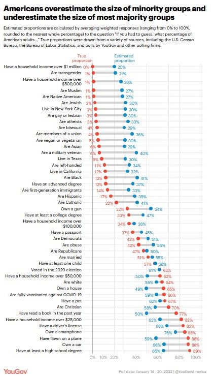
When people’s average perceptions of group sizes are compared to actual population estimates, an intriguing pattern emerges: Americans tend to vastly overestimate the size of minority groups. This holds for sexual minorities, including the proportion of gays and lesbians (estimate: 30%, true: 3%), bisexuals (estimate: 29%, true: 4%), and people who are transgender (estimate: 21%, true: 0.6%).

It also applies to religious minorities, such as Muslim Americans (estimate: 27%, true: 1%) and Jewish Americans (estimate: 30%, true: 2%). And we find the same sorts of overestimates for racial and ethnic minorities, such as Native Americans (estimate: 27%, true: 1%), Asian Americans (estimate: 29%, true: 6%), and Black Americans (estimate: 41%, true: 12%)…

A parallel pattern emerges when we look at estimates of majority groups: People tend to underestimate rather than overestimate their size relative to their actual share of the adult population. For instance, we find that people underestimate the proportion of American adults who are Christian (estimate: 58%, true: 70%) and the proportion who have at least a high school degree (estimate: 65%, true: 89%)…

Misperceptions of the size of minority groups have been identified in prior surveys, which observers have often attributed to social causes: fear of out-groups, lack of personal exposure, or portrayals in the media. Yet consistent with prior research, we find that the tendency to misestimate the size of demographic groups is actually one instance of a broader tendency to overestimate small proportions and underestimate large ones, regardless of the topic. 

I wonder how much this might be connected to a general sense of innumeracy. Big numbers can be difficult to understand and the United States has over 330,000,000 residents. Percentages and absolute numbers regarding certain groups are not always provided. I am more familiar with some of these percentages and numbers because my work requires it but it does not come up in all fields or settings.

Additionally, where would this information be taught or regularly shared? Civics classes alongside information about government structures and national history? Math classes as examples of relevant information? On television programs or in print materials? At political events or sports games? I would be interesting in making all of this more publicly visible so not just those who read the Statistical Abstract of the United States or have Census.gov as a top bookmark know this information.

“America’s Ugly Mansions”

As this Forbes piece notes, “Money, after all, doesn’t buy taste.” See some of America’s ugliest mansions here:

“Everyone has opinions on other people’s houses,” says Sarah A. Leavitt, a curator with the National Building Museum in Washington, D.C., which recently unveiled the exhibition House and Home, surveying how the American hearth, from two story colonials to row houses, has changed over the last 200 years. For some, their nightmarish take on someone else’s dream home may be “because they would have done it differently.” For others, the critique may be “because they can’t afford it.”

Most homes, after all–colonials, capes, ranches and splits, follow the same boxy patterns. Developers “have to appeal to the common denominator,” Leavitt says, leaving only those with deep pockets to tailor their own palaces.

One thing seems to unite these ugly homes: they have features or portions that are out of proportion with the rest of the house or with what people typically expect in homes. Take the Gas Station home. A portico is not necessarily a problem but one that extends over the driveway at a two-story height looks cartoonish. Or the Concrete Blocks house. Concrete can be effectively used in modern architecture but an elongated concrete garage looks like too much. Thus, if you have money and want a big house, try to have a design that has some moderation.

If you want to vote for which home you think if the worst, go here.

“Ugliest new build McMansion ever”?

Take a look at this McMansion in Vienna, Virginia:

A quick analysis of the home based on the four traits of McMansions:

1. Absolute size. This home seems to have at least 3,000 square feet.

2. Relative size. Quite a difference between this home and the mid-20th century ranch home next door. It is hard to know for sure from the picture but this new home could be a teardown.

3. Poor architectural design and quality. The home has some interesting proportions, ranging from the relatively bland sided area above the front doorway to the popping-out balconies at each corner of the front. It is bulging in all the wrong places. (I would be interested to know whether these two second-story corners mean that these are separate suites, each with their own balcony.)

4. Tied to other social issues like consumption and sprawl. The suburban aspect is clearly implied by this picture, particularly with the looming water tower in the background. (The water tower is reminiscent of this famous photo from Plano, Texas.) Compared to the home next door, this new McMansion does look excessive. Sadly, the same angle that helps invite comparison to the home next door and the water tower also blocks our view of the likely large garage in the back.

Is this the worst designed McMansion ever? There are a good number of contenders for this crown. Just look at these 10 McMansions from New Jersey

Linking the Ace Hardware home and Wisteria Lane

Following up on a post regarding an odd-looking home in recent Ace Hardware commercials and a comment on the post that the Ace home was located on Wisteria Lane in the TV show Desperate Housewives, here is another look at the home courtesy of Wikipedia:

File:KathrynsHouse.JPG

While the Ace commercial made the house gave the house even more odd proportions in order to fit an Ace sign on the front, the house is still odd. Too many gables that stick out too far plus a really odd second story window that barely fits between the two gables.

Here is more about Wisteria Lane:

In preparing for the pilot, the Desperate Housewives production team searched a 30-minute radius of Hollywood for a suburb in which to film the show, but nothing was quite right. The production team initially looked into purchasing a block of actual houses for filming, however they felt the houses looked too similar and lacked character. So they went with Plan B – a studio backlot.

Only two studios in Hollywood have significant backlots, Warner Brothers and Universal. Warner Brothers had half a street, with houses on one side and a park on the other, but there was no sense of community, but Universal had Colonial Street – a collection of rundown house fronts that lined both sides of the street, and were close enough together to look good on camera.

The only problem was that the houses are only three-quarter scale. The team had to deal with the challenges of the unnatural – the houses being too small and too close and the sidewalks not as wide as the real thing, but the show is a parable and a slightly less-than-real look became an advantage, and added to the suburban perfection on film…

At first, the houses were just facades, with interiors built on a sound stage, but once Housewives was picked up, something unique was done for the show, interiors were created, including Susan’s kitchen and Mary Alice’s living room, and Gabrielle could go in the front door and into the main floor of her house. This created a unique filming style which allowed viewers to watch a scene inside a house and look out through the windows into the street – creating a real sense of community.

To help audiences identify the different characters quickly, the team devised a colour palette system based on the characters personality and traits. They looked for colours that were intriguing, and then matched them up, these colour palettes are carried out in each character’s house exterior and interior. For example Gabrielle Solis was set with warm orange-yellow tones to hint at her spicy Latino nature. Whereas Susan Mayer’s character has more feminine sensibilities, demonstrated by the use of pastel colours.

So perhaps the real problem with the poorly proportioned house was that it was a 3/4 scale. Still, even a full scale version of the house might look at little busy in the front.

The new Ace Hardware home is badly proportioned

Ace Hardware has a new set of television commercials where they argue going to their neighborhood stores is like visiting your neighbor. However, there is one big problem (beyond the fact that many people don’t know their neighbors): the house is badly proportioned. Take a look:

AceHardwareHouse

The bottom portion of the house doesn’t look too bad: a porch, front door, and a two car garage. But, then look above. My best guess is that the Ace sign displaced the actual window which then got squeezed in between the roof line and the garage. Overall, it doesn’t look good. The neighbors would not be happy if the house next door looked like this.

Despite the odd looking house, I like the sales pitch. I was at Home Depot to get five items related to gardening this weekend. Due to the size of the store and my infrequent visits (perhaps once a month or so), I had to ask where three of the five items were because they were very difficult to locate otherwise.

A word cloud as an accurate information graphic

There are many ways to visually present data or statistics. One issue can arise when parts of graphs or images are not displayed in the correct proportions. Does using a word cloud fall into these difficulties?

Gallup has put together a word cloud of American’s perceptions about the federal government. Some phrases, such as “too big” and “corrupt” are much bigger. Some words are on their sides such as “good” and “terrible.”

Overall, I would say the word cloud is probably not the best choice in this situation. It is hard to judge the most popular responses and the relative proportions of each response. While one can quickly pick up that the majority of responses were negative, it is not a very precise graphic.