It’s just an arbitrary number, and it doesn’t mean things are much better than when the Dow was at 29,999. What’s more impactful is that the Dow has finally clawed back all its losses from the pandemic and is once again reaching new heights. It is up 61.5% since dropping below 18,600 on March 23.
It took just over nine months for the Dow to surpass the record it had set in February, before panic about the coronavirus triggered the market’s breathtaking sell-off.
I like this explanation for two reasons. First, it downplays hitting 30,000 just because it is a large round number. Why should 30,000 be more important than 29,000 or 29,852? Because round numbers seem more meaningful to us, especially one that is a change from the 20,000s to the 30,000s. Second, it provides a longer context for the rise to 30,000. That particular number is meaningful in part because of the record in February, the drop in March, and then the steady rise. Arguably, this rise since March is much more important than getting past a particular number.
In addition to these steps, a few more could help people interpret the 30,000 figure. Instead of focusing on a particular number, how about discussing the percentage change? This is done regularly with other financial figures. Such a story is ripe for a visual showing the change over time. And a final option would be to downplay such milestone numbers in this story and in future reporting and instead focus on other markers of financial patterns rather than emphasizing outliers (peaks and valleys).
The season-opening NFL broadcast included a word cloud of descriptions of Chief’s quarterback Patrick Mahomes from his teammates:
On the broadcast, they noted that “leader” was mentioned the most times and several people mentioned “smart” and “competitive.” And, since this came right after a conversation of Mahomes’ record contract, it was noted that no teammate said “rich.”
A few thoughts on this graphic:
It highlights the popularity and/or spread of word clouds. If it makes it to a football broadcast, it is all throughout the United States.
It remains a way to highlight words or themes across a series of interviews or texts. It can take time to relay thoughts from multiple interactions; the word cloud tries to summarize the concepts. But…
The size of the words do not easily convey their frequency in this particular graphic. Leader is clearly the biggest, competitive and smart are somewhere in the middle, and then there are a lot of other words. Yet, the length of certain words – “courageous” or “extraordinary” – take up a lot of space even if they were just mentioned once.
The colors of the word cloud are tied to the Chiefs’ colors. But with the background changing a bit behind the words (“add a dynamic background to that boring word cloud!”), it can be hard to read some of the words in red (see “smart” above).
Without knowing the number of interviews or how many total descriptors were given, it is hard to know how many words stand out.
An interesting choice of graphic and still some work to do to make this even a better presentation of data.
When I teach Statistics and Research Methods, we talk a little about how researchers make decisions about creating and using categories for data they have. As this example of recommendations about fertility notes, creating categories can be a tricky process:
Being 35 or older is labeled by the medical community as “advanced maternal age.” In diagnosis code speak, these patients are “elderly,” or in some parts of the world, “geriatric.” In addition to being offensive to most, these terms—so jarringly at odds with what is otherwise considered a young age—instill a sense that one’s reproductive identity is predominantly negative as soon as one reaches age 35. But the number 35 itself, not to mention the conclusions we draw from it, has spun out of our collective control…
The 35-year-old threshold is not only known by patients, it is embraced by doctors as a tool that guides the care of their patients. It’s used bimodally: If you’re under 35, you’re fine; if you’re 35 or older, you have a new host of problems. This interpretation treats the issue at hand as what is known as a “threshold effect.” Cross the threshold of age 35, it implies, and the intrinsic nature of a woman’s body has changed; she falls off a cliff from one category into another. (Indeed, many of my patients speak of crossing age 35 as exactly this kind of fall, with their fertility “plummeting” suddenly.) As I’ve already stated, though, the age-related concerns are gradual and exist along a continuum. Even if the rate of those risks accelerates at a certain point, it’s still not a quantum leap from one risk category to another.
This issue comes up frequently in science and medicine. In order to categorize things that fall along a continuum, things that nature itself doesn’t necessarily distinguish as being separable into discrete groups, we have to create cutoffs. Those work very well when comparing large groups of patients, because that’s what the studies were designed to do, but to apply those to individual patients is more difficult. To a degree, they can be useful. For example, when we are operating far from those cutoffs—counseling a 25-year-old versus a 45-year-old—the conclusions to draw from that cutoff are more applicable. But operate close to it—counseling a 34-year-old trying to imagine her future 36-year-old self—and the distinction is so subtle as to be almost superfluous.
The trade-offs seem clear. A single point where the data turns from one category to another, an age of 35, simplifies the research findings (though the article suggests they may not actually point to 35) and allows doctors and others to offer clear guidance. The number is easy to remember.
A continuum, on the other hand, might better fit the data where there is not a clear drop-off at an age near 35. The range offers more flexibility for doctors and patients to develop an individualized approach.
Deciding which is better requires thinking about the advantages of each, the purpose of the categories, and who wants what information. The “easy” answer is that both sets of categories can exist; people could keep in mind a rough estimate of 35 while doctors and researchers could have conversations where they discuss why that particular age may or may not matter for a person.
More broadly, learning more about continuums and considering when they are worth deploying could benefit our society. I realize I am comfortable with them; sociologists suggest many social phenomena fall along a continuum with many cases falling in between. But, this tendency toward continuums or spectrums or more nuanced or complex results may not always be helpful. We can decry black and white thinking and yet we all need to regularly make quick decisions based on a limited number of categories (I am thinking of System 1 thinking described by behavioral economists and others). Even as we strive to collect good data, we also need to pay attention to how we organize and communicate that data.
This is not what the headline or the story says. More details from the story:
Rosenfeld, a lead author on the research and a professor of sociology in the School of Humanities and Sciences, drew on a nationally representative 2017 survey of American adults and found that about 39 percent of heterosexual couples reported meeting their partner online, compared to 22 percent in 2009.
Traditional ways of meeting partners (through family, in church, in the neighborhood) have all been declining since World War II.
The 39% figure meets the definition of both the mode and a plurality, respectively (both definitions from Google):
the value that occurs most frequently in a given set of data.
the number of votes cast for a candidate who receives more than any other but does not receive an absolute majority.
Still, I suspect there might be some confusion. Online dating brings more Americans together than any other method but it is only responsible for a little less than forty percent of couples.
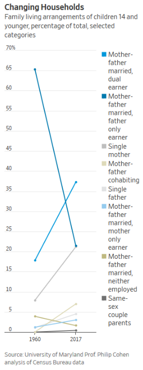
It all represents an increasing distance from the nuclear-family structure considered traditional for decades. The changes solidify shifts that have been mounting since then, erasing the notion of one dominant family type. In the early 1960s, two-thirds of children were raised in male-breadwinner, married-couple families. By contrast, today there is no one family-and-work arrangement that encompasses the majority of children, demographers say.
“That dominant model declined, but it’s not like it was replaced by one thing,” says Philip Cohen, professor of sociology at the University of Maryland. “It was replaced by a peacock’s tail, a plethora of different arrangements.”
The graph is most effective at showing the biggest change: the decline of the “mother-father married, father only earner” group over nearly six decades. Two other categories have significant increases – married and dual earners, single mother – while the five categories at the bottom involve relatively fewer households.
The graph is unusually skinny from left to right and this helps emphasize the straight lines up or down over time. Would a wider x-axis show some more variation over time or are the trends always pretty consistent?
The colors are a little hard to distinguish. I am not usually in favor of dotted lines and so on but this might be an opportunity to differentiate between trend lines.
Just thinking about other graph options, a pie chart for each time period might also communicate the big change well (though the smaller categories might not show up as well) or a clustered bar graph with the two years side to side could show the relative changes for each group.
In sum, graphing significant social change is not necessarily easy and this format clearly communicates a big change.