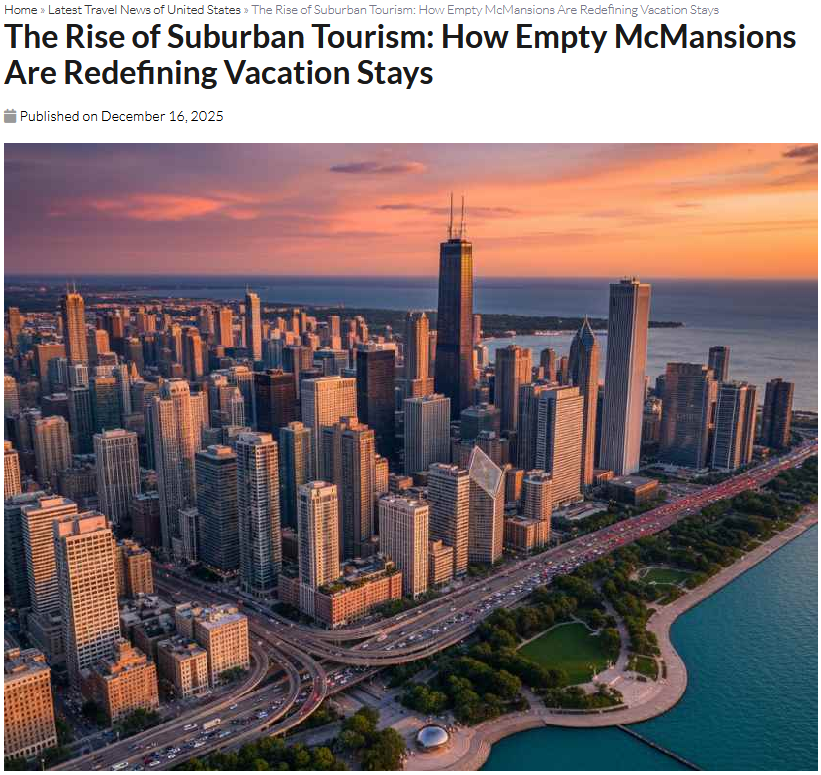
I am familiar with the Chicago skyline and lakefront. This image is…interesting. It has elements of the Chicago lakefront. A big body of water. Some iconic buildings. The Bean. Jean Baptiste Pointe du Sable Lake Shore Drive and parks along the water.
But it is also clearly wrong. The buildings are not where they should be. The lakefront is not in the right pattern. The Bean is not located on a pedestal next to the water. The local highway does not empty onto the lakefront road in that manner. And so on.
So is the McMansion story true? The summary/conclusion:
Empty McMansions in the suburbs of the United States are reshaping tourism patterns, with many tourists now seeking more dynamic urban destinations. However, these empty homes also present new opportunities for suburban areas to adjust and offer new experiences for visitors. Through creative uses of space, a focus on sustainable tourism, and rebranding efforts, suburban regions can continue to evolve as attractive destinations for a new generation of travelers.
Are more McMansions being rented out? Is this changing tourism patterns in metropolitan regions? is there any evidence of this happening? There is little in the story to provide evidence for the argument.
I will keep my eyes open for similar news but the fake image of Chicago does not inspire confidence.
Humans are social. People need connections to others. This is how they learn, grow, and accomplish things both as individuals and groups. We understand ourselves in part by knowing about people and the world around us. Is there a limit to how much social activity and information people can take in and still live a good life?
Much of the debate over social media seems to focus on either the content of the information or the time spent with it that could be better used elsewhere. Both are concerns but they only hint at this question: can we handle all the information and social interactions?
For much of human history, people lived in relatively small communities. They lived in close proximity to family, often extended family and people of similar people groups. Traditions were important and technological progress was slower. There are examples in history of large urban centers but these are rare; small villages and towns were the more common social space.
The modern era and all that came with it – rationalism, industrialism, growing populations, urbanization, liberal democracies, pushing back against tradition, new technologies – expanded the number of social connections people could have. Big cities – 1 million-plus people – became common. People had more mobility. Access to other people and information expanded rapidly.
The Internet and social media is layered on top of these processes already underway and ongoing. Through these technologies, humans can connect with many more people and can access much more information. Something happens far away and we can know about it in minutes or seconds. Rather than relying on proximity for many of our social connections, we can interact with people and groups all over the place.
Perhaps humans can figure out how to deal with this all. How many would say they would want to go back to times where people primarily relied on people around them for relationships and information? People might figure out ways to shift their focus to all the options in front of them or better compartmentalize the big picture options and the world immediately around them. Or maybe not. We have options now that most humans never had – we can find out a lot and we can interact with or find out about almost anyone we would like – and we will see how we come to grips with them.
Media stories and/or reports can be counted in multiple ways. Count articles, headlines, the number of words written, social media posts, time spent on it during television broadcasts. Look at where and when stories are reported or not; does it lead the news or come later? Is it buried on a webpage or a newspaper page? How many resources are devoted to the topic could involve looking at how many reporters are on a story or the length of stories and reports.
But, this measurement question is complicated by the issue of knowing when the coverage is enough or not. My sense of most of the Internet arguments about this is that one political side feels for one reason or another that a story is not getting sufficient attention. Would an accurate count or measurement of coverage be convincing? What is an appropriate level of coverage depends on who is asking.
Additionally, the media has its own logics and pressures regarding what stories it covers and how it displays them. Not everything can be the top headline. Resources for covering the news are limited.
This might just be a perfect kind of argument for our politicized and fragmented current age. For those who really care about an issue, no level of media coverage might be enough. For those who are less interested or less aware, they might not care or know what they are missing. Media sources will provide information but not so do necessarily evenly across all news stories. And social media, the Internet, and politics provides space to express concern or outrage about the coverage or lack thereof.
The bad news seems to keep rolling in. A pandemic. The earthquake in Haiti. Afghanistan. Tropical storms. Tyranny. And so on. This raises a question I have asked myself many times in recent years: is the world actually worse off or do we just know more about global affairs and smaller events?
Here are just some of the ways this question could be answered:
-In some macro trends, this is a great time to be alive. I’m thinking of Steven Pinker’s The Better Angels of Our Nature or Hans Rosling’s Factfulness where they argue that by multiple measures, whether the percent of deaths by warfare or indicators of public health, we are better off.
-The scale of both mass media and social media means we can know more about the world and daily occurrences than ever before. With relatively little effort, we can see the bad in the world on a small and grand scale every minute (and find commentary on it). We are flooded with information.
-The world has changed so rapidly in the last few centuries that we collectively are still trying to catch up to the new challenges and/or the new ways that challenges manifest themselves. For example, pandemics are not new in human history but the way people respond to them in the particular conditions of 2020 and 2021 is.
-We now see the world differently or expect different things compared to people of the past. The social changes of recent centuries mean more individualism and agency, the rise of the self and the diminishing of some traditional forms of authority, and expectations about standards of living.
-Certain groups might lean in to the distressing news. For example, American evangelicals for decades have played up the connection between the apocalypse and current events. Or, political actors might use negative news to criticize others or promote particular policies.
-Humans can feel losses more than equal wins. It is hard to know whether we take in more positive or negative news overall but we might feel the negative news more.
-There really is more bad than good happening in the world.
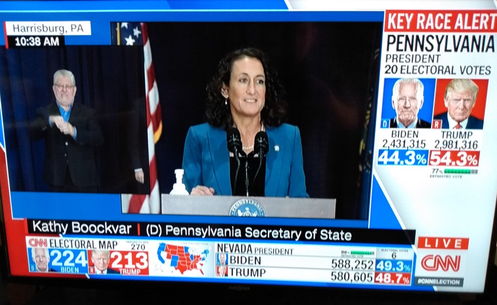
I watched briefly a number of election night broadcasts last night. One conclusion I came to: there is way too much data to fit on a television screen. And if you want more of the data, you need the Internet, not television.
The different broadcasts tried similar variations: flipping back and forth between a set of anchors and pundits at desks and analysts at a smart board showing election results from different states and locations. They have done this for enough election nights that the process is pretty established.
While they do this, there is often a lot of data on the screen. This could include: a map of the United States with states shaded; a chryon at the bottom with scrolling news; another panel at the bottom flipping through results from different races; and people talking, sometimes in connection to the data on the screen and sometimes. If the analyst at the smart board is on the screen, there is another set of maps to consider.
CNN broadcast, November 4, 2020
This is a lot to take in and it might not be enough. The broadcasts try to balance all of the levels of government – from the presidential race to congressional districts – and are flipping back and forth. I appreciated seeing the more simple approach of PBS which went with a lot less data on the screen, bigger images of the talking heads, and simple summary graphics of the winners.
But, if you want the data, the television broadcast does not cut it. Numerous websites offered single pages where one could monitor all of the major races in real-time. Want to keep up on both local and national races? Have two pages open. Want reaction? Add social media in a third window. Use multiple Internet-connected devices including smartphones, tablets, and computers (and maybe Internet-enabled televisions).
On one page, readers could see multiple presentations of data plus explanations. Want to scroll through in 10 seconds and see the headlines? Fine. Want to spend 5 minutes analyzing the various graphics? That works. Want to click on all the links for the metholodogy and commentary? A reader could do that too.
The one big advantage television offers is that it offers commentary and faces in real-time plus the potential for live coverage from the scene (such as images of gatherings for candidates) and feeling like the viewer is present when major announcements are made. The Internet has approximations of this – lively social media accounts, live blogs – but it is not the same feeling. (Of course, when you have more than ten live election night broadcasts available on your television, the audience will be pretty split there as well.) Elections are not just about data for many; they also include emotions, presence, and the potential for important memories.
Given these differences in media, I did what I am guessing many did last night: I consumed both television and Internet/social media coverage. Neither are perfect for the task. I had to go to sleep eventually. And whoever can figure out how to combine the best elements of both for election nights may do very well for themselves.
This fixation on community interaction is part of the site’s DNA. As city newspapers inexorably decline, a smattering of new “hyperlocal” news outlets have sprung up, from Aol’s Patch network to bootstrap start-ups. But the Source has an unusual ingredient: more than a decade of research by University of Southern California communications expert Sandra Ball-Rokeach and her team…
Ball-Rokeach studies what she calls “communication ecologies”—the web of ways in which different communities get and spread information, from Facebook to the grocery-store bulletin board, from the local tabloid to chatting with neighbors. She’s found that these networks can differ dramatically from community to community, ethnic group to ethnic group…
Understanding those differences is crucial for anyone, be they advertisers or political parties, trying to reach specific communities. Ball-Rokeach believes it’s also important for civic engagement. Strong cities with plugged-in citizens tend to have dense “neighborhood storytelling networks”—crisscrossing lines of media outlets, community groups, and other institutions that hold a running conversation about what it means to live there…
Instead of simply sketching out the usual beats—city council, business, sports—they sent out a team of USC researchers who interviewed and held focus groups with residents in all three local languages. Their exploration showed that residents wanted to know more about education, local businesses, dining and entertainment deals, crime, and traffic and parking. “Many of them just said, ‘We don’t know what’s happening in Alhambra,’” says Ball-Rokeach…
Still, even if the Alhambra Source goes the same way, there’s an intriguing idea in this relationship between newspaper and university. What could embattled major dailies from The Boston Globe to the Los Angeles Times learn about their readers by teaming with sociology grad students? Tailoring a news outlet to reflect its community might not always produce the most in-depth journalism—but it might at least help the news business survive.
It sounds like what sociology and social science bring to the table in this combination is the ability to collect and analyze data. However, it still sounds like this social science research is more about marketing or targeting an audience than anything else. In an era of difficulty for newspapers and other news sources, this is not to be underestimated. But, this still puts the social science in more of a marketing role: what do we need to address in order to attract readers? At the same time, I could envision a stronger combination of these two disciplines where the journalism is much more informed and shaped by research and data rather than anecdotes and single cases and the sociologists then have another outlet to share their findings and explanations about the social world.
But a new report from the Pew Research Center (pdf) suggests that, when it comes to reading the news on mobile devices, young people aren’t so different. First, they use their tablets and smartphones to read the news at nearly identical rates to 30- and 40-somethings. According to Pew, between 30 and 50 percent of practically every demographic, except seniors, uses mobile phones and tablets to read news — whether it’s men or women, college-educated or not, making less than $30,000 per year or more than $75,000. All told: Thirtysomethings and fortysomethings are just as likely as teens and twentysomethings to use their smartphones and tablets for news…
Here’s another surprise. Young mobile readers don’t want apps and mobile browsers that look like the future. They want apps that look like the past: 58% of those under 50, and 60% of Millennials, prefer a “print-like experience” over tech features like audio, video, and complex graphics. That preference toward plain text “tends to hold up across age, gender and other groups.” Pew reports: “Those under 40 prefer the print-like experience to the same degree as those 40 and over.”
While this report suggests different age groups consume news in similar ways, even with differences in video watching and how much news they share, I wonder if they get the same things out of their reading. Are they reading different kinds of stories? On different websites? Are they reading the same volume of news stories? Physically reading the screen in the same way? Reading the news with the same purposes? Retaining the same information? Wanting to read “print-like” news with similar devices means something but I suspect there could still be some major differences between these groups.
Did this sharing of genres simply come about because ESPN has been successful? Or have ESPN staffers made a name with sports and then branched out into other areas?
It’s in no sense odd to find American academe wrangling over journalism. Dean Starkman of the Columbia Journalism Review and Clay Shirky of New York University have recently been hammering away at each other, seeking to determine whether investigative journalism can only be conducted by highly resourced news machines (like the Guardian’s) or by a more individual, digital-first approach (like… um… the Guardian’s). But what’s sociology got to contribute here?
Plenty, Klinenberg says, outlining the fundamental bargain that underpins newspaper life. You, the reader, want crosswords and cartoons, recipes and TV programme guides. You want all the stuff that journalists serve up with a sigh (because, well, it’s not exactly journalism, is it?). And, in return, as part of the deal, journalism is allowed to have a civic purpose – to report and analyse the workings and frailties of democracy – beyond quick ways to whip up a cottage pie.
That bargain, sealed in print, means you can’t have one without the other. Put your cash on the newsagent’s counter and you get some things you desire and other things, from Cardiff or Chad, that you didn’t know had happened until you turned to page five.
Of course, like any other neat thesis, there are readers and editors who don’t quite fit. But the nature of print – flipping from column to column, noticing stories that intrigue you, naturally expanding your spheres of interest – isn’t “versioning” at all – it’s more eclectic. An iPad or Kindle version works within narrower bounds. A Facebook version is even more selective, tailored to your most immediate demands. And the logical version at the end of this line is utterly simple: no deals, no bargains – just what you want, electronically provided on the basis of past predilection.
This is part of a larger question about the consequences of people only being exposed to certain points of view. Only selecting news that we want to read can be self-reinforcing as then we only seek out certain kinds of stories, limiting our view of the world.
I wonder, though, about blaming this issue on the medium. How much does having a newspaper in hand really increase the odds that someone will read something that didn’t plan to? Can’t people simply pick out parts of the newspaper that they want to read as well? Further, was there ever really a “golden age” where average citizens always tried to engage with alternative points of view? I would guess not though that doesn’t mean it isn’t a worthwhile ideal. We need citizens (and journalists) who can understand our complex world which transcends simply “left” or “right” understandings. Perhaps the Internet makes this easier in some ways but I would guess the Internet could be changed to meet these challenges or people’s behaviors could be altered.
This reminds of an argument I was reading last night. People could argue, rightly, that all media viewpoints are biased in some way. However, this doesn’t mean that we can just throw out all news sources and say they don’t have something of value. What should be consistent across different sources are facts and then there can be disagreement about the interpretation of these facts. Of course, what is considered “fact” may be up for grabs as well – see the recent debate over Politifact’s “Lie of the Year.”
Before you start quoting statistics, then, it’s always worth (a) knowing where exactly they come from; (b) verifying them independently if you were fed them by some pressure group; and (c) making sure that they say what you say that they say. Otherwise, you just end up looking credulous and silly.