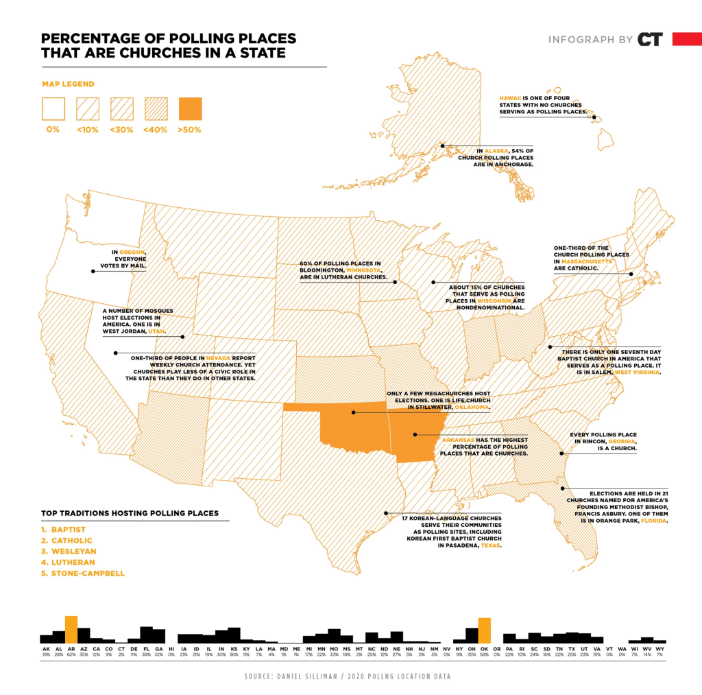
The % of polling places in churches by state

An infographic in Christianity Today highlights how many polling places are in churches:

If I am reading this correctly, here are two patterns:

  1. The percent of polling places that are churches can differ quite a bit from state to state. Generally, some of the Northwest and Northeast are less likely to have churches as polling place. The highest percentages are in more “heartland” states with some interesting exceptions (Arizona, Florida).
  2. Which religious groups host the most polling places can differ as well. It would be interesting to see more fine-grained data/ do these patterns of particular traditions hold up across states or is it because certain states have higher concentrations of certain traditions?

I imagine there might be all sorts of additional factors to consider when examining this.

Given the current political sentiments regarding the role or involvement of religious groups in politics, do these figures go up or down significantly in the coming years? And among which groups and locations?

The states and cities with restricted activity with other states and cities

I recently found a description of the states and cities limiting their activity with other governments/places within the United States:

Photo by cottonbro on Pexels.com

At least six states and the District of Colombia over the last six years have prohibited their employees from taking work trips to states with laws that, in their view, discriminate against lesbian, gay, bisexual, and transgender people. California’s prohibition is by far the most sweeping, barring state-funded travel to nearly half the country: 22 states, including four additions – Arizona, Indiana, Louisiana, and Utah –last week.

California, Connecticut, Minnesota, New York, Vermont, Washington, and the District of Columbia all have sought to financially pressure several other states in some form or another – creating a confusing patchwork of bans, with some states lifting previous travel bans on other states, such as Indiana, that revise laws applying to the LGBTQ community after a national or statewide uproar…

After witnessing the impact on Indianapolis, several mayors of liberal cities, including New York, the District of Columbia, San Francisco, Seattle, Minneapolis, and others sprang into action. They announced bans on city-funded travel to North Carolina amid a national backlash over House Bill 2, which prevented transgender people in the state from using bathrooms aligned with their gender identity. North Carolina lawmakers quickly devised a compromise that helped convince collegiate sporting events to return to the state. Still, several big-city mayors kept a ban on employees traveling there.

Add this to the actions of private actors and you have interesting geographic conflicts across the United States.

It is less clear what these travel restrictions lead to in the long run. Does this connect to lower levels of geographic mobility among American residents as a whole? Is it part of “the big sort” by political affiliations and commitments? Does it lead to social networks that skip over some geographies and not others? How does it fit with the urban/rural divide in politics and each spaces sense of place and country?

States that are losing Congressional seats did not necessarily lose population

With new Census data, the United States House of Representatives is going through reapportionment. Here is the breakdown of who is gaining and losing seats:

This could be an easy narrative to follow with the absolute number of seats: there are winners and losers and there are patterns to which states are winning or losing (Sun Belt and West versus Midwest and Northeast). This would fit with a prevalent American narrative that growth is good and states with growing populations are rewarded with more political representation.

But, there is a more complicated story behind these numbers. States did not necessarily lose population to lose a House seat. They might have just grown more slowly than other states. The overall growth rate for the United States over the decade was 7.4%:

At a Monday press conference, census officials said the U.S. population increased to nearly 331.5 million, a 7.4% growth rate over the past decade and the second-slowest pace since 1790. The growth rate dropped from the previous decade of 9.7% between 2000 and 2010.

More details from the Census:

The state that gained the most numerically since the 2010 Census was Texas (up 3,999,944 to 29,145,505).

The fastest-growing state since the 2010 Census was Utah (up 18.4% to 3,271,616).

For nearly 2 million more residents, Texas gets two more seats. Utah’s population was up over 18% but get no more seats. The apportioning of seats is based on relative populations between states:

The distribution must be rejiggered after every census to account for expansion or shrinkage of each state relative to the others. Even states that grow in population may still lose seats if their growth is less robust than that of other states.

The case of New York is illustrative. Yes, it is interesting that is was 89 seats short of holding on to that House seat but it is also interesting that the state’s population increased.

Census officials said that New York had a “negative net domestic migration,” but that its population grew overall because of immigration.

Population loss is a tricky topic in the United States. No city or state wants to admit that people are leaving or that population losses outweigh gains. Similarly, few would want to address a loss of political power. All of this adds to the competition for residents where more people is seen as a plus and population loss or not enough population growth compared to others is seen as failure.

The factors leading to the states with the largest homes

New American single-family homes are the largest in the world. Here is how they rank in size by state, starting with the largest:

Utah has the highest average home size in the United States, at 2,305 square feet. Utah also boasts a whopping median of four bedrooms for the typical real estate listing. Despite the impressive average home size, the median home price in the state is a reasonable $219,900…

Near the top of the crop, Colorado has an average house size of 2,126 square feet, among the largest in the nation. From 1910 to 2020, the size of the average home in Colorado grew 67 percent. Several factors have contributed to the trend toward bigger homes across the nation, the foremost of which may be 20th century government policies that fueled the growth of suburbs…

The average home size in Wyoming is 2,052 square feet, the third largest average in the nation. The ample home sizes may well have something to do with the fact that Wyoming is the least populated state in the nation, which gives people plenty of room to spread out. As in most states, however, the median number of bedrooms is three…

The median size for homes within Bozeman city limits is about 1,790 square feet, just a bit over the national average, and a typical home includes three bedrooms and 2.5 baths. The statewide average, however, is much larger, reaching 2,040 square feet, which means Montana comes in fourth in home size among U.S. states. The median price for a Montana home is around $250,000.

Based on the rankings here and the states at the top, here are factors that likely influence home size across states:

1. The era of development. States in the West and Sunbelt have more recent development compared to the Northeast and Midwest.

2. Prices in local housing markets. People can build and buy bigger homes when prices are lower.

3. The size of land allows for bigger houses. Places with more open land for development have an edge compared to regions and communities that are already built up.

4. A local ethos that emphasizes home and lot size as opposed to other desirable traits (living in a denser neighborhood, access to mass transit and other amenities, etc.). This could come through buying preferences and local regulations.

Not surprisingly, Hawaii has the smallest homes. But, there are a bunch of states in the middle. Additionally, as is noted in the description for each state, the average home size can vary widely between contexts within states.

Suburban municipalities to take own actions regarding COVID-19?

As different government bodies look to act in response to the spread of COVID-19, I was struck by the number of large cities and states that are acting (including the state in which I live). At the same time, I wonder: how are suburban communities responding?

A few thoughts:

-Many suburban communities have limited capabilities and cannot do a whole lot. They may have limited budgets, a relatively small number of employees, and not much power to compel action. Still, decisions to close public spaces – such as libraries, city/village/town halls, community centers – matter to the everyday lives of lots of people.

-Yet, some bigger suburbs in the United States are as large as small big cities. Their actions can be very consequential and they have more budget room to address issues. At this point, the news has primarily focused on the biggest cities in the United States but this matters for numerous other communities over 100,000 people (to use an arbitrary cut-off point for a larger community).

Americans tend to like local control and government but at the speed that a virus can spread and across political boundaries, individual actions across hundreds of American suburbs might not add up to much. Hence, people look to the state and federal level to mobilize resources and direct action.

-What is the role of metropolitan regions in all of this? The City of Chicago can act and affect millions of residents and workers but there are roughly seven million more people in the region. Counties can act and affect more residents. But, then the next level of action regarding COVID-19 seems to be at the state level. Are metropolitan regions working together or is the general lack of metropolitan cooperation revealed again in a time of crisis?

States with highest, lowest levels of homeownership

24/7 Wall St. ranked the states by homeownership. Here are the top and bottom of the list:

50. New York: 53.7%

49. California: 54.8%

48. Nevada: 56.8%

47. Hawaii: 58.3%

46. Texas: 61.7%

5. Iowa: 71.3%

4. New Hampshire: 71.3%

3. Minnesota: 71.5%

2. Vermont: 72.2%

1. West Virginia: 72.5%

The two states with the lowest levels of homeownership are not surprising given their housing prices and large urban areas though I would guess many people would not pick Nevada and Texas to be there. On the other end, the five states with the highest homeownership rates tend to be less dense and more affordable. If, as the article before the rankings suggest, homeownership is indeed a marker of the American Dream, does that mean the people in these five states with the most homeownership are more likely to be living the American Dream? I’m guessing there would be some debate about that.


Argument: solve Interstate issues by handing them back to the states

One writer suggests it is time for the federal government to get out of the business of funding interstate highways:

Assuming time travel is off the table, let’s learn from our mistakes. First, let’s get the federal government completely out of the business of maintaining the interstate highways crisscrossing our big metropolitan areas. Hand these roads over to state governments as soon as possible, and free state governments to finance these roads in any way they see fit, from higher state gas taxes to variable tolls they could use to reduce traffic congestion. Second, for interstate highways that connect cities across deserts and cornfields, let’s replace the federal gasoline tax with per-mile tolls. One of the many problems with the gas tax is that as gas mileage improves, and as a small but growing number of drivers turn to electric vehicles, gas tax revenue is not keeping up with the needs of the highway system. Per-mile tolls can solve that problem by charging drivers according to how much they actually use the highway system, regardless of the kind of vehicle they’re driving. And as Robert W. Poole Jr. explains, they can be pegged to the cost of each road and bridge, which will help ensure that roads and bridges are adequately financed.

After adopting this approach, we will see states investing in the infrastructure projects that best meet their needs, with some states, like California and New York, choosing to invest more heavily in urban mass transit while others, like Texas and Utah, build bigger and better highways. What remains of the federal highway system, meanwhile, will evolve over time, as the routes that attract the most traffic will grow in line with their per-mile toll revenue while those that attract the least will stay the same size, or perhaps even shrink. We’ll have an infrastructure worthy of a bigger, denser, more decentralized America—the kind of infrastructure that Ike, in his infinite wisdom, would be proud of.

An interesting argument that might have appeal for both liberals and conservatives. For conservatives, having more local control is generally good and states could innovate in a way that a larger bureaucracy might not. (At the same time, corporate interests cross state and national lines and they might not like a decentralized highway network.) For liberals, highways have often been used in redevelopment projects harming poorer neighborhoods and state control would theoretically give neighborhoods and communities more say over the fate of highways. Additionally, interstates encourage sprawl and liberals might want to reign in highway building and maintenance in many places.

I could also imagine several objections to this argument:

1. How many states would be willing to take this on right now given budget issues? This would have to be phased in over time. Which government officials want to take responsibility for raising tolls for driving?

2. Uniformity in the system could be a good thing ranging from common road signs to expectations regarding levels of maintenance and service across states.

Splitting America into equally proportioned states by population; options abound

Here is an interesting yet probably quite absurd set of maps that split the United States into various configurations of states with equal populations. Two of the maps:

140926_CBOX_Map4-EqualPopulation

140926_CBOX_MapCircles

I can see the logic behind this – more equal representation. However, the others are implausible. If anything, more equal populations might be accomplished by breaking states into smaller units that might be more equal in population to each other as pieces of the larger state. But, trying to imagine merging into megastates or different configurations of the 50 states is hard to imagine.

Statistics from the first “Community Association Fact Book”

Many Americans live in community associations and a new book discusses the broad patterns:

A new body of research, the “Community Association Fact Book,” tallies the numbers of associations, housing units, residents and property values for the country and each state. It was published by the Community Association Research Foundation, the research arm of the trade group Community Associations Institute in Falls Church, Va…

According to the study, 24 percent of American homes are in an association. Nationally, the number of associations increased to 328,500 in 2013 from 10,000 in 1970, the first year the foundation began keeping track. During that time, the number of housing units grew to 26.3 million from 701,000, as did the number of unit inhabitants to 65.7 million from 2.1 million. They pay about $65 billion annually assessments.

As for state data, Illinois has 17,900 associations, the fourth-highest after Florida, California and Texas.

The states with the fewest associations, less than 1,000 each, are Alaska, Arkansas, Mississippi, North and South Dakota, West Virginia and Wyoming.

That’s roughly 20% of Americans living within an association that provides oversight. Of course, these associations are often intended to protect homeowners from their neighbors within the community and outside of it. At the same time, it can lead to new sorts of issues in how to govern these associations, such as collecting and spending money in an association and operating as a board. The Chicago Tribune carries a weekly column featuring questions about associations and it often seems fairly complicated with neighbors disagreeing in a formalized setting.

There has to be an interesting story behind the disparities in the number of associations between states. It may have to do with laws in particular states that make it easier or harder to form an association. But, it all may be influenced by other factors like an urban/rural split (the states with the least number of associations are more rural) and cultural patterns (what do people think about neighborhoods, how important is protecting property values, etc.).

“Bewitching” look at state migration patterns is good when used interactively but not all together

The Atlantic Cities has a cool graphic about migration between states but there is one problem – it is hard to read unless you use the interactive element.

Here is an explanation of how to read the chart:
The graphic may look like spaghetti pie at first glance, but it really is beautifully simple once you learn how to navigate it. Here’s Walker explaining about that:

The visualization is a circle cut up into arcs, the light-colored pieces along the edge of the circle, each one representing a state. The arcs are connected to each other by links, and each link represents the flow of people between two states. States with longer arcs exchange people with more states (California and New York, for example, have larger arcs). Links are thicker when there are relatively more people moving between two states. The color of each link is determined by the state that contributes the most migrants, so for example, the link between California and Texas is blue rather than orange, because California sent over 62,000 people to Texas, while Texas only sent about 43,000 people to California. Note that, to keep the graphic clean, I only drew a link between two states if they exchanged at least 10,000 people.

Without the interactive element, you can’t quite figure out what is going on. All you can rely on is the relative width and length of the arcs as there are no numbers for the migration (and that would get cluttered really quickly). For example, you can quickly see that it seems like California sends Texas a lot of people. Or that quite a few New Yorkers go to California or Florida. The middle is kind of a jumbled mess and can be hard to follow thinner strands.

This seems to be a fun graphic element when it takes advantage of the capabilities of the Internet – you can click on your state, cut out all the clutter, and see the numbers. Otherwise, I’m not sure it adds much and still requires a good amount of text to sort things out.