The United States in its second prolonged period of immigration?

Many know that the decades at the end of the nineteenth century and early twentieth century were a period of significant immigration to the United States. This is regularly taught in history classes and often celebrated. While it can be difficult to understand larger patterns as they are happening, a recent Pew report provides evidence that a second long immigration period is happening now in the United States:

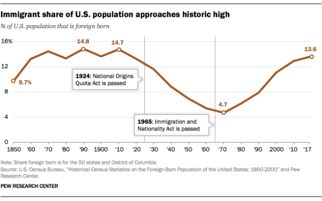
Nearly 14% of the U.S. population was born in another country, numbering more than 44 million people in 2017, according to a Pew Research Center analysis of the U.S. Census Bureau’s American Community Survey.

Pew_19.01.31_ForeignBornShare_ImmigrantshareofUS_2

This was the highest share of foreign-born people in the United States since 1910, when immigrants accounted for 14.7% of the American population. The record share was 14.8% in 1890, when 9.2 million immigrants lived in the United States.

Whether the trend line goes up, down, or plateaus remains to be seen (and immigration is a controversial topic at the moment). Still, even if it dropped in the coming years, now would still be part of a longer trend that people and scholars will look back at.

Putting the figures in international context might prove helpful as well:

Even though the U.S. has more immigrants than any other country, the foreign-born share of its population is far from the highest in the world. In 2017, 25 countries and territories had higher shares of foreign-born people than the U.S., according to United Nations data

Worldwide, most people do not move across international borders. In all, only 3.4% of the world’s population lives in a country they were not born in, according to data from the UN. This share has ticked up over time, but marginally so: In 1990, 2.9% of the world’s population did not live in their country of birth.

A number of countries could claim to be a “nation of immigrants” – a common refrain in the United States – though how all of that came to be would certainly differ as would how the immigrants were and are understood.

The changing concept of TV ratings

Recent report from Netflix about the number of viewers for certain movies and TV shows raises questions about what ratings actually are in today’s world:

These numbers were presumably the flashiest numbers that Netflix had to offer, but, hot damn, they are flashy—even if they should be treated with much skepticism. For one thing, of Netflix’s 139 million global subscribers, only about 59 million are American, something to bear in mind when comparing Netflix’s figures with the strictly domestic ratings of most linear channels. Another sticking point: What constitutes “watching”? According to Netflix, the numbers reflect households where someone watched at least 70 percent of one episode—given the Netflix model, it seems likely that most people started with Episode 1—but this doesn’t tell us how many people stuck with it, or what the average rating for the season was, which is, again, an important metric for linear channels…

Ratings are not just a reflection of how many people are watching a TV show. They are not just a piece of data about something that has already happened. They are also a piece of information that changes what happens, by defining whether we think of something as a hit, which has a knock-on effect on how much attention gets paid to that show, not just by other prospective viewers, but by the media. (Think how much more has been written on You now that we know 40 million people may have watched it.)

Consider, for example, how something like last year’s reboot of Roseanne might have played out if it had been a Netflix series. It would have been covered like crazy before its premiere and then, in the absence of any information about its ratings at all, would have become, like, what? The Ranch? So much of the early frenzy surrounding Roseanne had to do with its enormous-for-our-era ratings, and what those ratings meant. By the same token, years ago I heard—and this is pure rumor and scuttlebutt I am sharing because it’s a fun thought exercise—that at that time Narcos was Netflix’s most popular series. Where is Narcos in the cultural conversation? How would that position have changed if it was widely known that, say, 15 million people watch its every season?

Multiple factors are at play here including the decline of network television, the rise of cable television and streaming services, the general secrecy Netflix has about its ratings, and how today we define cultural hits. The last one seems the most interesting to me as a cultural sociologist: in a fragmented media world, how do we know what is a genuine cultural moment or touchstone compared to being a small fad or a trend isolated to a small group? Ratings were once a way to do this as we could assume big numbers meant it mattered to a lot of people.

Additionally, we today want quicker news about new trends and patterns. A rating can only tell us so much. It depends how it was measured. How does the rating compare to other ratings? Perhaps most importantly, the rating cannot tell us a lot about the lasting cultural contributions of the show or movie. Some products with big ratings will not stand the test of time while others will. Do we think people will be discussing You and talking about its impact on society in 30 years? We need time to discuss, analyze, and process what each cultural product is about. Cultural narratives involving cultural products need time to develop.

Decades-long trend: complex suburbia

A 2018 review of what we learned about American suburbs ends with this:

It all added up to a portrait of suburbia as a landscape of dynamic cultural and structural change, not sleepy stasis.

I would suggest this is a change that has been happening for decades. Here are the first four features of a more complex suburbia that come to mind. They each go back quite a while:

  1. Different kinds of suburban communities. The prototypical suburban community looks like Riverside, Illinois or Levittown, New York, places primarily for commuters, consisting of single-family homes., and attracting middle to upper-class residents. These communities had a limited numbers of jobs and local businesses and men were expected to commute to the big city (via train or automobile). The problem with this view, common to find since any book on the history of the suburbs mentions these two bedroom suburbs, is that different kinds of suburbs have been around for at least a century. Different kinds of suburbs included: working-class suburbs, suburbs of non-white residents, industrial suburbs, and suburbs with various levels of density of housing and commercial or industrial property (including edge cities).
  2. The move of industry and jobs to the suburbs. Even as a good number of early suburbs were bedroom suburbs, the suburbs also proved attractive to industry because of cheap land, access to transportation, and the ability to pollute away from millions of residents in the big city. East St. Louis, Illinois or Gary, Indiana grew as industrial suburbs. After World War Two, the number of jobs grew in suburbs as businesses moved to the suburbs to be closer to workers (or perhaps closer to their CEOs) and suburban residents desired more goods and shopping options (shopping malls, big box stores, restaurants, etc.). By more recent years, the most common commute in the United States was suburb to suburb, not the supposedly typical suburb to big city commute.
  3. Changing suburban populations. While most early suburbs were white (notwithstanding the occasional community of non-white suburbanites who could not live in white suburbs), suburbs in recent decades have become home to an increasing number of non-white residents. Additionally, poorer residents have made their way to the suburbs in recent decades. These non-white and poorer populations may have hit a certain critical mass in recent years but the trends go back at least a few decades.
  4. Growing cultural and entertainment options in the suburbs. This trend is more recent than the first three but is still relatively common across metropolitan areas: suburbanites do not need to go into the big city for entertainment and cultural options. The suburbs feature a number of restaurants, museums, parks, music venues, festivals, and other options that make it easier for suburbanites to rarely need to go into the big city for a night out. Certain cultural options may still be richer in the big cities but more regular cultural options are now often found just a few suburbs over.

All of these suburban features may be coming together in new ways or presenting challenges to more suburbs that never thought they would change dramatically from their character at founding. Additionally, thinking about these intertwined suburban traits could help us move past seeing cities and suburbs in a strict dichotomy and instead view metropolitan regions as more cohesive wholes with similar interests and problems to address.

News story suggests 40% is “Almost Half”

A Bloomberg story looks at the rise in birth in the United States outside of marriage and has this headline:

Almost Half of U.S. Births Happen Outside Marriage, Signaling Cultural Shift

And then the story quickly gets to the data:

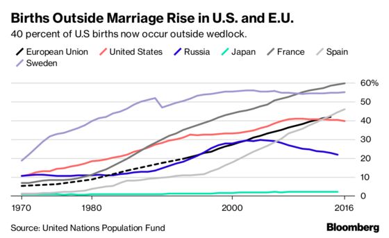
Forty percent of all births in the U.S. now occur outside of wedlock, up from 10 percent in 1970, according to an annual report released on Wednesday by the United Nations Population Fund (UNFPA), the largest international provider of sexual and reproductive health services. That number is even higher in the European Union.

Almost Half of U.S. Births Happen Outside Marriage, Signaling Cultural Shift

There is no doubt that this is significant trend over nearly 50 years. One expert sums this up toward the end of the story:

The traditional progression of Western life “has been reversed,” said John Santelli, a professor in population, family health and pediatrics at Columbia’s Mailman School of Public Health. “Cohabiting partners are having children before getting married. That’s a long-term trend across developing nations.”

Yet, the headline oversells the change. A move from 10% of births to 40% of births is large. But, is 40% nearly 50%? When I hear almost half, I would expect a number between 45% and 49.99%. Claiming 40% is nearly half is going a little too far.

I think the reading public would better served by either using the 40% figure or saying “Two-Fifths.” Or, perhaps the headline might speak to the 30% jump in nearly 50 years.

In the grand scheme of things, this is a minor issue. The rest of the story does a nice job presenting the data and discussing what is behind the change. But, this is a headline dominated age – you have to catch those eyes scrolling quickly on their phones – and this headline goes a bit too far.

Supercommuters up 15.4%, or 0.4 million, between 2005 and 2016

A small and rising number of Americans commute more than ninety minutes a day:

While super commuters still represent a small share of the overall workforce, their long commutes have become increasingly common over the past decade. In 2005, there were about 3.1 million super commuters, roughly 2.4 percent of all commuters. By 2016, that share had increased by 15.9 percent to 2.8 percent of all commuters, or about 4 million workers. In some parts of the country the problem is much worse; in Stockton, where James lives, 10 percent of commuters travel more than 90 minutes to work each day.

The rising number of super commuters underscores a general trend towards longer commutes. The share of commuters traveling 24 minutes or less to work each day has decreased to 55 percent of all commuters in 2016 from 59 percent in 2005. Meanwhile, the share of commuters traveling 25 minutes or more has increased to 45 percent in 2016, compared to 41 percent in 2005. The share of commuters traveling an hour or more to work each day increased 16.1 percent to 9.2 percent in 2016 from 7.9 percent in 2005.

I understand that this article is geared around showing differences in commuting over time. And the data can back that up: supercommuting is up and more Americans have longer commutes.

At the same time, this may be overselling the data:

  1. The changes over 11 years are relatively small. The article talks about percentage changes but the absolute numbers are small. This is the difference between supercommuting is up 15% versus saying it is up 0.4 million.
  2. Given that this data is based on samples of the US population, is a 4% change statistically significant? Is an increase from 2.4 million supercommuters to 2.8 supercommuters substantively significant?
  3. What are the trends between 2005 and 2016? Both of these measurement points are with a more robust economy. Driving was down after the housing bubble burst – was supercommuting affected by this? Is the trend line steady in an upward direction over the last 11 years or is it up and down?

From a broader view, this is not that much change. (There may still be shock value in reminding the public that 2.8% of all commuters are really willing to go far each day.)

Multiple measures and small trends: American birthrates down, births per woman up

A new Pew report explains this statistical oddity: the annual birthrate in the US is down but women are having more children.

How can fertility be down even as the number of women who are having children is going up? There are complex statistical reasons for this, but the main cause of this confusing discrepancy is the age at which women are having children. Women are having children later in life — the median age for having a first baby is 26 now, up from 23 in 1994 — and this delay causes annual birth rates to go down, even as the cumulative number of babies per woman has risen…


Another factor, Livingston said, is the drop in teen birth rates, with black women seeing the biggest drop in that category.

See the Pew report here. An additional part of the explanation is that there are multiple measures at play here. A Pew report from earlier in 2018 explains:

But aside from this debate, the question remains: Is this really a record low? The short answer is: It’s complicated.

That’s because there are different ways to measure fertility. Three of the most commonly used indicators of fertility are the general fertility rate (GFR); completed fertility; and the total fertility rate (TFR). All three reflect fertility behavior in slightly different ways – respectively, in terms of the annual rate at which women are presently having kids; the number of kids they ultimately have; or the hypothetical number they would likely have based on present fertility patterns.

None of these indicators is “right” or “wrong,” but each tells a different story about when fertility bottomed out.

Measurement matters and the different measures can fit different social and political views.

I wonder if part of the issue is also that there is a clear drop in births from the earlier era – roughly 1950 to 1970 which we often associate with Baby Boomers – but the last 3+ decades have been relatively flat. This plateau of recent decades means researchers and commentators may be more prone to jump on small changes in the data. Many people would love to predict the next big significant rise or fall in numbers but a significant change may not be there, particularly when looking at multiple measures.

The architecture of stars versus what emerges in cities

Ron Grossman contrasts Chicago’s architectural gems and the more organic ways that neighborhood buildings developed:

The architecture of affluence breeds anonymity.

Nearby sidewalks don’t play on my heartstrings like those in a blue-collar neighborhood. Walking a block in Pilsen is like looking at Chicago history through a kaleidoscope.

Narrow three-story structures are topped with elaborate false fronts and a bit of Baroque ornamentation reminiscent of the Czech homeland of its original owners. A side wall may be painted in the vibrant palette of Orozco or another of the celebrated muralists of the current occupants’ Mexican homeland.

In Bronzeville, construction crews can be seen pulling jury-rigged partitions out of brownstone mansions. Built in the 19th century for the city’s wealthy, they were divided into sleeping rooms for poor blacks during the Great Migration of the 20th century. Now the neighborhood is gentrifying.

In many American cities, the past – written into stone and other materials in the form of buildings – will disappear unless specific preservation efforts are made. And, if the new structure can be a showpiece, something designed by a noted architect or firm and offering an unusual take, so much the better.

Two quick responses in my own mind:

  1. What will future city residents, say a few decades or centuries down the road, think about the construction booms taking place in many wealthier neighborhoods? If those future residents continue to prize progress, perhaps the loss of more original structures won’t matter.
  2. Like many culture industries, trends come and go in architecture. Is a rejection of cold, impersonal modern architecture more about that trend or more about letting individual properties and neighborhoods develop on their own without intervention from starchitects or government leaders? These are two different issues: whether you like the latest trends and whether you think architectural decisions should be made on a small scale and under the control of local residents.

“Tiny Houses Are Big” – with 10,000 total in the United States

Tiny houses get a lot of attention – including this recent Parade story – but rarely are numbers provided about how big (or small) this trend really is. The Parade story did provide some data (though without any indication of how this was measured) on the number of tiny houses in the US. Ready for the figure?

10,000.

Without much context, it is hard to know what to do with this figure or how accurate it might be. Assuming the figure’s veracity, is that a lot of tiny houses? Not that many? Some comparisons might help:

Between February 2016 and March 2017, there were over 1,000,000 housing starts in each month. (National Association of Home Builders) Within data going back to 1959, the lowest point for housing starts after the 2000s housing bubble burst experienced about 500,000 new housing starts a month. (Census Bureau data at TradingEconomics.com)

The RV industry shipped over 430,000 units in 2016. This follows a low point of shipments in recent years back in 2009 where only 165,000 units were shipped. (Recreation Vehicle Industry Association)

The number of manufactured homes that have shipped in recent years – 2014 to 2016 – has surpassed 60,000 each year. (Census Bureau)

The percent of new homes that are under 1,400 square feet has actually dropped since 1999 to 7% in 2016. (Census Bureau)

Based on these comparisons, 10,000 units is not much at all. They are barely a drop in the bucket within all housing.

Perhaps the trend is sharply on the rise? There is a little evidence of this. I wrote my first post here on tiny houses back in 2010 and it involved how to measure the tiny house trend. The cited article in that post included measures like the number of visitors to a tiny house blog and sales figures from tiny house builders. Would the number of tiny house shows on HGTV and similar networks provide some data? All trends have to start somewhere – with a small number of occurrences – but it doesn’t seem like the tiny house movement is taking off in exponential form.

Ultimately, I would ask for more and better data on tiny houses. Clearly, there is some interest. Yet, calling this a major trend would be misleading.


Debating whether Detroit is on an upward trend

There is some disagreement about whether Detroit is on the rebound:

Michigan State political scientist Laura Reese and Wayne State urban affairs expert Gary Sands have written an essay “Detroit’s recovery: The glass is half-full at best,” for Conversation, which was reprinted at CityLab as “Is Detroit Really Making a Comeback?” The article is based on a longer academic treatment of this subject by Reese, Sanders and co-authors, entitled “It’s safe to come, we’ve got lattes,” in the journal Cities.  (This is one of those rare cases where the mass media version of an article is more measured and less snarky than the title of the companion academic piece, but I digress.)

Reese and Sands set about the apparently obligatory task of offering a contrarian view to stories in the popular press suggesting that Detroit has somehow turned the corner on its economic troubles and is starting to come back. We, too, are wary of glib claims that everything is fine in Detroit. It isn’t. The city still bears the deep scars of decades of industrial decline coupled with dramatic failure of urban governance. The nascent rebound is evident only in a few places.

And the opposite position:

It’s going to be a long, hard road ahead for Detroit. And that road will lead to a different and smaller Detroit than existed in, say, the 1950s. That road is made even harder by critics who damn the first few candles for shedding too little light.

While the debate is about Detroit’s fate, it hits on important larger questions: at what point can experts know whether a city is on the decline or on the way up? Who gets to make such pronouncements and with what data? While we are in the moment, when is a trend clearly a trend? Even a consensus of experts may not be good enough; they can all be wrong.

The more complicated answer is that it takes time and lots of data to know for sure what is happening. This is not comforting if things are going bad; there is often a lot of post-hoc analysis of what could have been done in the moment but such moments are difficult to handle. (Think about the public discussions regarding the economic crisis of the late 2000s and what lessons should be drawn from the Great Depression and similar events.) And if the situation has been bad for a long time, people do want to find hope and build on good happenings.

For those of us looking on from a distance, perhaps the best we can do is wait and hope for positive change in Detroit which likely includes both new activities as well as difficult decisions about moving on from past arrangements.

Claim: US undergoing secularization, just at a slower pace

Two sociologists argue that the United States is not that unusual regarding secularization trends in the industrialized world:

Most research that compares American religion with religion elsewhere emphasizes the high levels of participation in the United States, and treats those high levels as strong evidence that America is exceptional.

If we look at the trends, though, it appears that the US isn’t a counter-example to the idea that modernization causes problems for religion. On the contrary, religious change in the United States is very similar to what we see elsewhere: long-term decline produced mainly by generational replacement.

This process operates slowly, and it can be counteracted in the short term by short-lived revivals, but it is very difficult to reverse…

Figure 2 – Attendance monthly or more often by decade of birth, United States, 1973-2014

Voas Fig 2

Chaves has been making this argument for a few years now.

Two quick thoughts:

  1. As they note at the end, the interesting question then to ask is why the United States has been slower to follow the secularization trend than other nations. This is not a small question and at least several suggestions have already been made by researchers including World Wars in Europe and the rise of the welfare state.
  2. Researchers are in a unique position if they argue any trend is inevitable. Voas and Chaves may be shown correct if religiosity continues to decline in new generations but it could be decades before the conclusive evidence arises. Additionally, societal patterns can change – even if such changes seem improbable at one time. If a researcher is correct in calling out a trend, they can appear prophetic but if they are wrong, their status may be diminished.