Getting the categories right in continued urban/rural-plus-suburbs-and-exurbs-in-the-middle divide

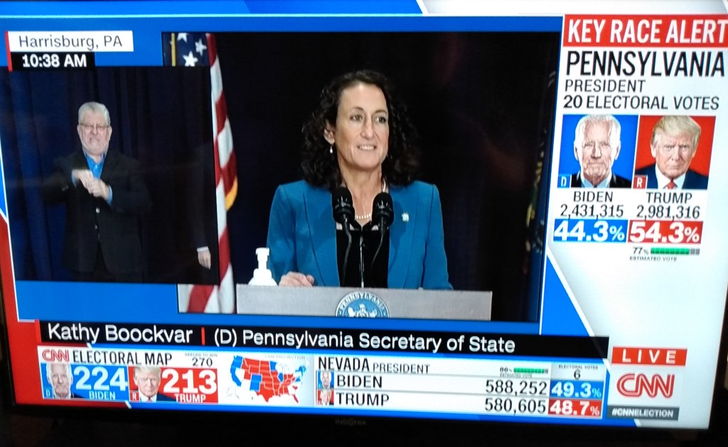
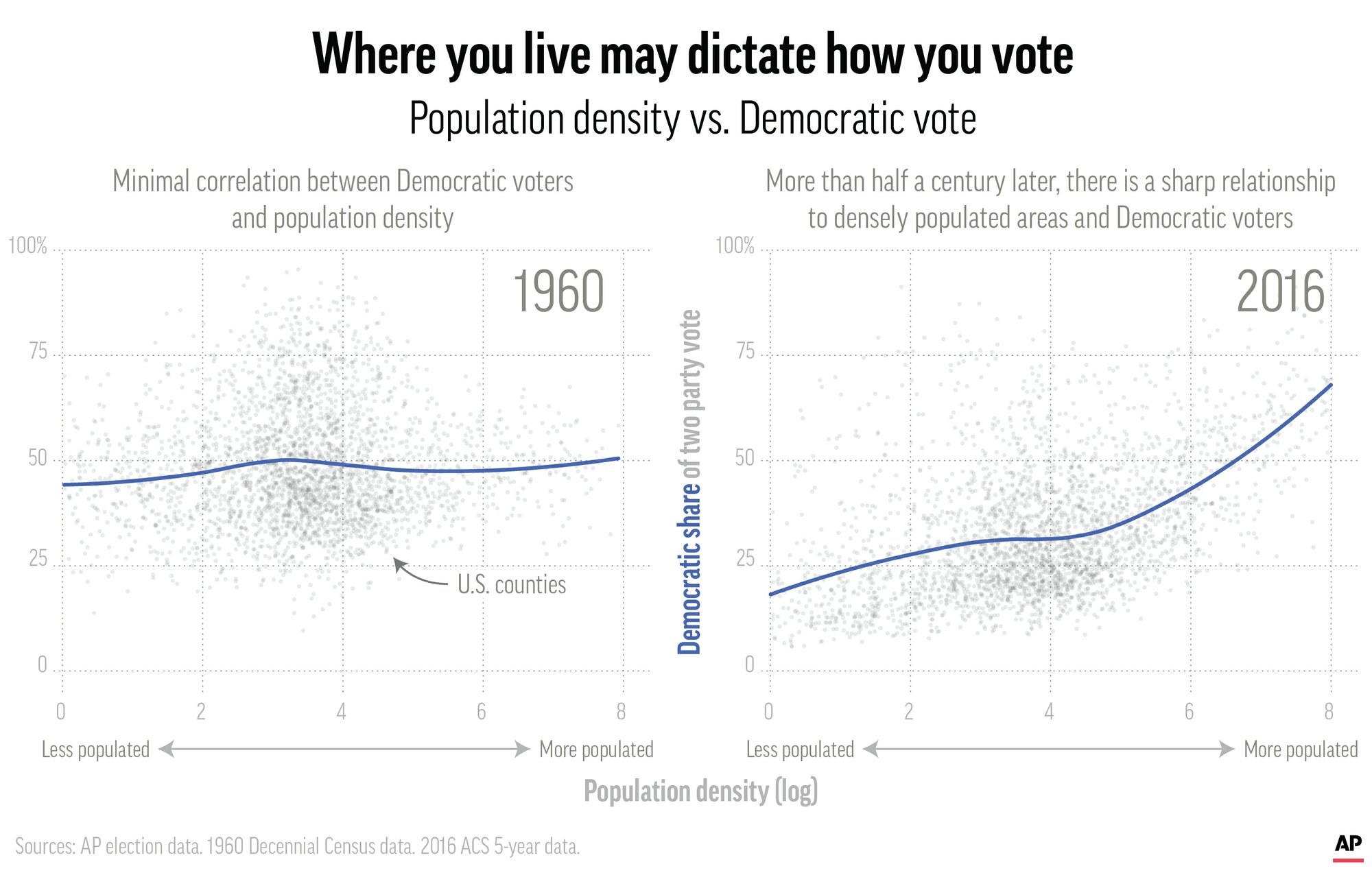
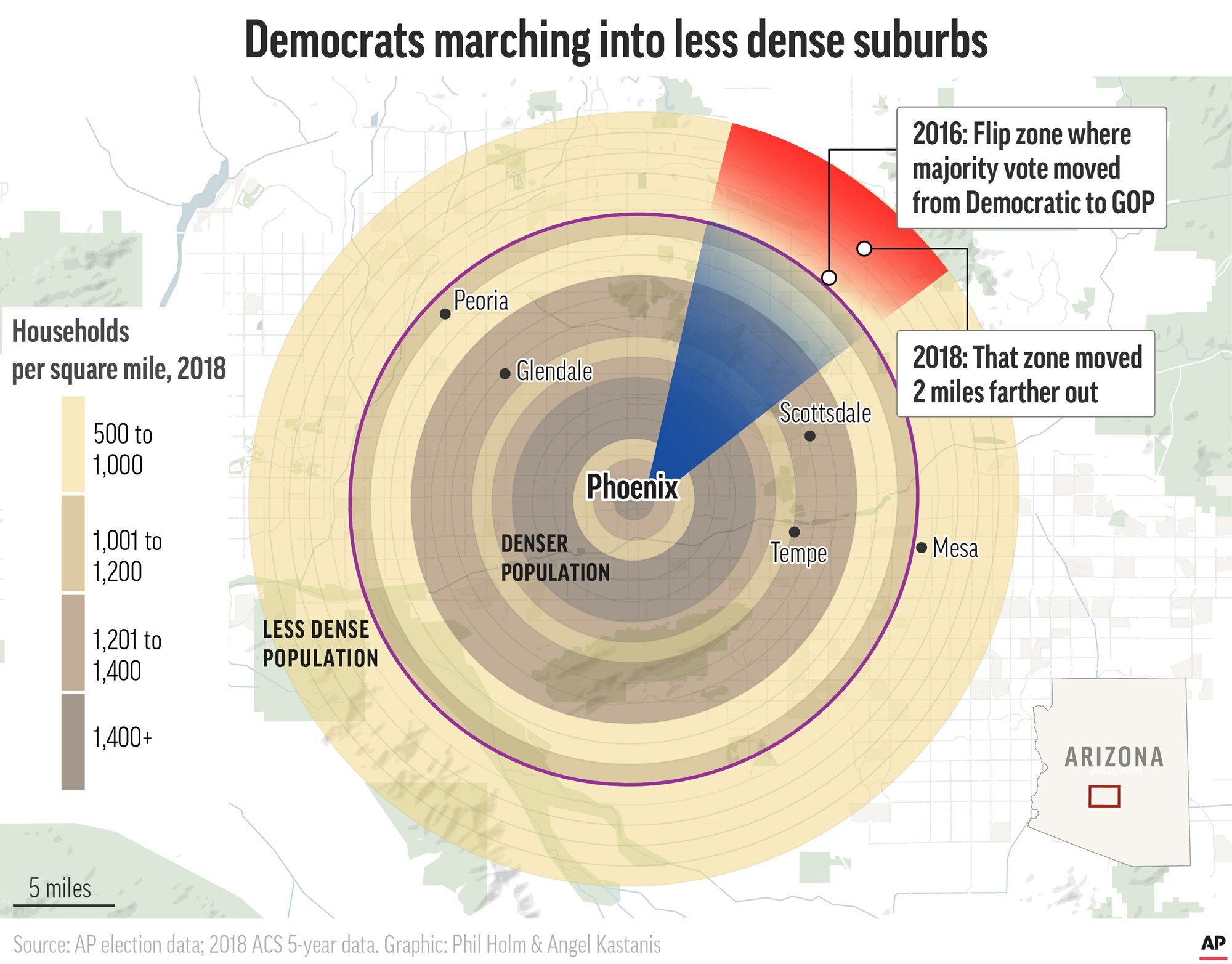
Numerous outlets have commented on the continued presence of an urban/rural divide in 2020 voting. Here is another example:

Photo by Pixabay on Pexels.com

Rather than flipping more Obama-Trump counties, Biden instead exceeded previous Democratic win margins in Wisconsin’s two biggest cities, Milwaukee and Madison.

That pattern extended to Michigan and other battleground states, with Biden building upon Democrats’ dominance in urban and suburban jurisdictions but Trump leaving most of exurban and rural America awash in red.

The urban-rural divide illustrates the pronounced polarization evident in preliminary 2020 election results. The split underscores fundamental disagreements among Americans about how to control the coronavirus pandemic or whether to even try; how to revitalize the economy and restore jobs; how to combat climate change or whether it is an emergency at all; and the roles of morality, empathy and the rule of law in the body politic.

Four thoughts in reaction to this.

  1. The urban/rural divide is described in an interesting way above: it is cities and suburbs for Democrats and exurbs and rural areas for Republicans. This matches the patterns of this and recent elections. However, is separating the suburbs and exurbs worthwhile? Here is where county level analysis may not be fine-grained enough to see the patterns. Another way to put it might be this: there is a gradient in voting by party as the distance from the big city increases. Does it shade over to Republicans only in exurbs – which are suburbs on the outer edges? Is the 50/50 split a little before exurbs? A concentric circles approach could help though there still could be pockets that break with the overall pattern.
  2. Suburbs might just be too broad of a term to be useful in such analysis. The exurb/suburb split it one way to put it. Might it help to also think of different types of suburbs (wealthier bedroom communities, ethnoburbs/majority-minority communities, working-class suburbs, industrial suburbs, etc.)?
  3. Explaining the differences as urban/rural has a nice short ring to it and it fits the data. Introducing more categories in the middle is interesting to campaigns, pundits, and researchers but is harder to quickly describe. Perhaps the urban/suburban versus exurban/rural divide?
  4. Is the urban/rural divide one of the most fundamental aspects of polarization? Or, is it a symptom? In this story, the divide leads off the discussion of polarization on a number of fronts. But, what leads to these spatial patterns in the first place? While the geography is helpful to think about, are the real issues behind the urban/rural divide about race/ethnicity and class? Given residential segregation patterns in the United States, using the spatial patterns as an explanation covers up a lot of important social forces that led to those patterns in the first place.

64% of Americans “say social media have a mostly negative effect on the way things are going in the country” – but does this mean individual users will leave?

Pew Research recently released a new report on how Americans view social media’s effects on the country and politics. Here is one of the takeaways from the report:

This chart moves beyond many of the other takeaways which suggest majorities of Americans are skeptical about the intertwining of social media companies and politics. The responses to this particular question suggests the effect of social media is beyond politics: it affects “the way things are going in the country today.”

Since the other questions are about politics and government regulation, it is a little hard to know exactly what this means. Is it bad for young people? Families? Communities? Education? Public spaces? Physical health? It takes up a lot of time? Social media is too powerful compared to other institutions that should be leading the way?

All of these could be very interesting to explore. But, it is also worth examining how this question about social media and the direction of the country is related to the social media use of individual users. Does this mean that more people are not participating in social media? Are accounts being deactivated or deleted? Are people curtailing their time on social media? Is there interest in and movement toward more conversation outside of social media?

One finding of research I have conducted with sociologist Peter Mundey is that young adult social media users can articulate some of the problems with social media. And they modify their social media behavior to try to avoid negative interactions.

But, this does not necessarily mean that they drop out of social media or do not join in the first place. These young adults could also explain the advantages of social media, particularly the ability to maintain connections with people. Some of the connections may not always require effort but they are available. Other connections, say with family and close friends, are worth engaging in through social media. Plus, if they are not on social media, they might be missing out on social connections and events that are hard to access in other ways.

This might lead to a bit of an impasse. Americans think social media and politics is not a good mix. Social media could be bad for the country. But, withdrawing completely from social media might be a lot to ask. In many ways, it could work for individuals, particularly through providing connections to people and information.

Perhaps individual users will continue try to find ways to do both: engage with social media on a limited or focused basis. Or, avoid politics on social media. Maximize the good portions, minimize the negatives. Participate at arm’s length.

Only time will tell. Social media has had a meteoric rise but it is not guaranteed to last. Social media platforms can evolve. New opportunities can arise and social conditions are dynamic. We need to continue to look at how users engage social media. And if we see a steady trend of users leaving social media platforms, that will be worth noting.

First exit poll I have seen on suburban voters

In reporting exit polls yesterday, the New York Times included votes for Biden or Trump by location:

https://www.nytimes.com/interactive/2020/11/03/us/elections/exit-polls-president.html

The 2020 election, according to many pundits, was going to be decided by suburban voters.

The data above appears to follow the patterns from the last few elections. Cities go for Democrats. Rural areas and exurbs go for Republicans. The suburbs are contested ground. The splits are bigger in the table above: 9% advantage for Trump in small city or rural areas, 23% advantage for Biden in cities. And the suburbs are close with just a 3% gap.

Going even further, the suburbs of the true battleground states may be home to the truly important voters. In this election, the residents outside Atlanta, Charlotte, Raleigh-Durham, Cleveland, Columbus, Cincinnati, Pittsburgh, Philadelphia, Detroit, Grand Rapids, Milwaukee, Minneapolis, Phoenix and more might have just decided the election. That national 3% difference might not seem like much but it could matter a lot when state races are tight.

I am sure there will be more fine-grained analysis of the suburban vote by itself as well in comparisons to other demographic factors that influenced vote totals. But, this early data seems to suggest suburban voters will continue to be important in coming elections.

Trying to fit all the election results on one television screen

I watched briefly a number of election night broadcasts last night. One conclusion I came to: there is way too much data to fit on a television screen. And if you want more of the data, you need the Internet, not television.

The different broadcasts tried similar variations: flipping back and forth between a set of anchors and pundits at desks and analysts at a smart board showing election results from different states and locations. They have done this for enough election nights that the process is pretty established.

While they do this, there is often a lot of data on the screen. This could include: a map of the United States with states shaded; a chryon at the bottom with scrolling news; another panel at the bottom flipping through results from different races; and people talking, sometimes in connection to the data on the screen and sometimes. If the analyst at the smart board is on the screen, there is another set of maps to consider.

CNN broadcast, November 4, 2020

This is a lot to take in and it might not be enough. The broadcasts try to balance all of the levels of government – from the presidential race to congressional districts – and are flipping back and forth. I appreciated seeing the more simple approach of PBS which went with a lot less data on the screen, bigger images of the talking heads, and simple summary graphics of the winners.

But, if you want the data, the television broadcast does not cut it. Numerous websites offered single pages where one could monitor all of the major races in real-time. Want to keep up on both local and national races? Have two pages open. Want reaction? Add social media in a third window. Use multiple Internet-connected devices including smartphones, tablets, and computers (and maybe Internet-enabled televisions).

Furthermore, web pages give users more control over the data they are seeing. Take the final 2020 election forecast from FiveThirtyEight:

On one page, readers could see multiple presentations of data plus explanations. Want to scroll through in 10 seconds and see the headlines? Fine. Want to spend 5 minutes analyzing the various graphics? That works. Want to click on all the links for the metholodogy and commentary? A reader could do that too.

The one big advantage television offers is that it offers commentary and faces in real-time plus the potential for live coverage from the scene (such as images of gatherings for candidates) and feeling like the viewer is present when major announcements are made. The Internet has approximations of this – lively social media accounts, live blogs – but it is not the same feeling. (Of course, when you have more than ten live election night broadcasts available on your television, the audience will be pretty split there as well.) Elections are not just about data for many; they also include emotions, presence, and the potential for important memories.

Given these differences in media, I did what I am guessing many did last night: I consumed both television and Internet/social media coverage. Neither are perfect for the task. I had to go to sleep eventually. And whoever can figure out how to combine the best elements of both for election nights may do very well for themselves.

Fighting over the fate of Scabby the Rat

Reportedly, the National Relations Labor Board (NRLB) is working to trap Scabby for good:

https://en.wikipedia.org/wiki/Inflatable_rat

Scabby is a giant inflatable rodent, up to 25 feet tall, with angry red eyes, exceptionally prominent front teeth and sharp claws. Created some 30 years ago in Chicago, it’s a favorite device of unions trying to draw attention to their grievances, and it works. “Before, you could drive by and see six guys with picket signs and probably never notice them,” James Allen, president of District Council 1 of the International Union of Bricklayers, told the Tribune last year. Scabby is harder to miss…

But the NLRB’s general counsel, appointed by Donald Trump, is not smiling. Peter Robb, previously a management lawyer, “hates the rat,” one unidentified senior NRLB official told Bloomberg Law. At his direction, the agency is trying to eradicate Scabby.

The effort isn’t likely to succeed. Under Barack Obama, the NLRB ruled that putting this huge air-filled mascot outside the entrance of a hospital, accompanied by a union member holding a leaflet, was a form of free expression protected by the First Amendment…

“The rat balloon itself was symbolic speech,” said the board. “It certainly drew attention to the union’s grievance and cast aspersions on (the nonunion employer), but we perceive nothing in the location, size or features of the balloon that were likely to frighten those entering the hospital, disturb patients or their families, or otherwise interfere with the business of the hospital.”

Read a little more on how Scabby was developed in the Chicago area in this 2018 blog post.

Having seen Scabby in action several times, there at least three reasons the symbol works:

  1. No one wants to be associated with a rat. Even if there are people who like rats as pets, they are not viewed as cuddly or likeable creatures in the same way that many others animals are. A rat is a negative symbol, a reminder of urban squalor or dishonorable behavior.
  2. The size of Scabby and the particular look is not pleasant. This is not just a rat on a sign that is a cartoonish figure; this is a large inflatable that towers over the sidewalk. The eyes are red, teeth are showing, front legs are out. This is not a pleasant figure to look at.
  3. Putting #1 and #2 together, organizations or employers would not like the connotation of the inflatable rat nor the presence of it in front of what they hope to present as a welcoming or pleasant place of business or activity.

This means Scabby could help attract attention to a labor cause. As noted in the story above, it is a visceral image that grabs the attention of people passing by. Without such a large symbol, it could take a lot more work to garner attention including larger pickets or significant media attention. Whether the prolonged presence of Scabby leads to a better outcome for the union or employees is another matter.

Changes in “countrypolitan,” exurban counties more than just political

The analysis of the 2020 election includes many analyses of suburban voters. But, there is more at stake here than just voting patterns as this look at Union County, North Carolina suggests:

Google Maps – Union County, North Carolina

Union County is what one scholar terms a “countrypolitan” place: Under federal government designations, it lies within a metropolitan area, but it also has a strong rural and agricultural history. For the most part, it doesn’t look like a cookie-cutter suburb, nor is it impoverished. In fact, Union is North Carolina’s wealthiest county, according to the Census Bureau. There are places like it around the United States. They are distinct from rural areas, which are mostly Republican, and cities, which are heavily Democratic; many voters in these places are neither die-hard Trump fans nor urban liberals. That makes them pivotal counties, in 2020 and in the future.

Everyone agrees that Union County is changing. The question is how it’s changing, and how fast. There’s no doubt that Republicans will carry the county up and down the ticket this year—Carter, ensconced at East Frank, was the last Democratic presidential candidate to win here, back in 1980—but the GOP’s overall success in the state will hinge largely on how big a margin it is able to run up in exurban counties such as this one. Democrats’ control of inner-ring suburbs continues to strengthen, and the future of the Republican Party nationally depends on keeping firm control over places like Union County…

The reason Union County is changing is simple math. When Helms was born, about 4,000 people lived in Monroe. Today, nearly 36,000 do. Since 1990, the overall county population has almost tripled, from about 84,000 to roughly 240,000. As I traveled around the county, I began to notice something peculiar: Virtually everyone I talked with was a transplant. Some of them had moved only recently, and others had been around for 10 years, or 20…

“Union County when Jesse was in the Senate was a very rural county,” Wrenn says. “Now it’s got a big chunk of suburban in it. If the long-term trends continue, the Republicans are going to have to find a way to compete in the suburbs. It can be done, but you just have to change your whole way of thinking.”

The temptation in such stories about suburban voters is to look at counties and communities and just see political change. And it sounds like Union County has had its share comparing before the Civil Rights Era, after, and today.

The basic explanation for this recent change is new residents. The population has grown and new residents, not as familiar with the ways of Union County, have moved in. What was once a small population with low density is now much larger and in bigger cities and towns.

But, is this all that has changed: new people moved in and they came with some new political views? I suspect there is more going on here that both contributes to the political change and also exists outside of it. Here are a few possible factors at play:

  1. The suburbs and the spread of metropolitan areas are not just about increasing populations and higher population densities. The suburbs come with a particular way of life. People who seek out such locations want single-family homes, middle-class opportunities and peace for their family, responsive local government, and the ability to live in a place they chose with people who look more like them. This is different than a more rural or working-class character in communities. This desire for the American suburbs does not easily line up with either political party on all the issues but it certainly is a different way of life.
  2. The decline of agriculture, particularly family-owned farms and opportunities, could be at play here. As farming becomes more difficult or less desirable for subsequent generations, the land can be sold off and be turned into subdivisions. This is a significant change in land use as well as who lives there: farmers and those connected to agriculture versus middle-class suburbanites.
  3. Connected to #2, the economic landscape has changed tremendously in the last half-century or so, moving away not just from agriculture but also manufacturing and moving more toward retail, services, and a knowledge economy. Union County and many other locations in the United States are still trying to adapt to these large shifts that affect employment, tax bases, and local businesses.
  4. Numerous local institutions have likely had to adjust in light of growing populations. Schools need more space for kids. Local governments need to provide more services (and they might now have larger tax bases to draw on) and local officials are addressing new issues. Established churches now compete with new congregations. In sum, the civic and social institutions that may have existed for decades in roughly the same form now need to adapt. This can present challenges in any community.

In sum, this is not just about politics. A shift toward a suburban lifestyle in Union County has many consequences and politics may just be one of them.

Missing any conversation about housing in the 2020 presidential campaign

The Democrat presidential primary for 2020 contained occasional talk of housing on the campaign trail or in debates. But, leading up to Election Day 2020, there has been little attention paid to housing. A few notes on this:

Photo by Element5 Digital on Pexels.com
  1. Some broader campaign themes could be related to housing: talking about the middle-class, taxes, providing opportunities for more Americans. But, these typically do not directly address housing even if it may be implied (such as being middle-class includes the ability to own a home, often in the suburbs).
  2. COVID-19 has had a direct effect on a number of areas. While there has been much said about jobs and the economy, the connection to housing is missing. For many, employment status directly affects housing status and there have been moratoriums regarding rent and evictions. Yet, the primary focus is on the direct means of making money (jobs, stock market, etc.) rather than what many hope their earnings translate into (a nice residence to own or rent in a good neighborhood). Additionally, the housing and real estate industry contribute to the broader economy but little has been said about activity here outside of some people are leaving cities.
  3. Even without the 2020 election and COVID-19, housing is related to a number of other key forces in American society: local schools, property values, building wealth, local neighbors and social networks, access to jobs, health care, amenities, and local services. Yet, it continues to merit little mention or go under the radar all together. Even as it is a difficult issue to address at the national level due to local complications and a complicated and controversial history in the United States, ignoring the issue does little.

Patterns in political yard signs

A new book by three political scientists look at how Americans have deployed and reacted to yard signs in recent election cycles:

We just started being puzzled about it. We did things like code the amount of traffic on a given street, and we thought maybe people on a street with high traffic would be more likely to put up signs. But you find out that those people wanted to let other people know where they stand- that it wasn’t just about catching the eye of passing traffic [to try to get out the vote for a candidate]. We found out that there’s a combination of expressive and communicative motives…

One of the things that was really clear from our studies is that signs are really important to people who display them. They’re emotionally invested in these dynamics and are more likely than people who don’t put up signs to say that it’s a good thing, or a reasonable thing, for neighborhoods to be doing.

I also think this is why we hear about these stories of theft and vandalism-people going to extremes around signs. At least seemingly, in news reports, it can accelerate fast, from people putting up signs to some kind of an altercation, a police report, a fight on the street. I think it’s because people view it as a real affront when someone messes with their expression of self…

You really notice, when you’re walking around, those places where signs are battling one another. But when we did spatial analysis to look at the clustering of signs systematically, in a way that would cut through those strong anecdotal impressions, we found that, really, there wasn’t much evidence of the intermingling of signs-the famous Sign Wars, where there’s a Biden sign at one house and a Trump sign next to it. Really, it was more about like-minded clustering: pockets of Biden supporters signaling to one another, pockets of Trump supporters signaling to one another. More solidarity than outright conflict.

I appreciate the systematic approach for a phenomenon that lends itself to anecdotes. This is how social science can be really helpful: many people have experiences with or have seen yard signs but unless researchers approach the issue in a rigorous way, it is hard to know what exactly is going on.

For example, I regularly walk in two different places in my suburb and I have been keeping an eye on yard signs. At least in the areas I walk, the signs are primarily in favor of one party in the national election while local election signs are more varied. Furthermore, the number of people who have signs is still pretty limited even in a heated political climate. But, just based on my walks, I do not know if what I am seeing match my suburb as a whole let alone communities across the United States. And unless I interact in some way with the people with (and without) yard signs, I have little idea of what is motivating them.

I wonder how the behavior of putting out political yard signs relates to other political behavior. If a political yard sign is expressive, how much does this carry over to other parts of life? Are these the people who are most active in local political activity? Are they the most partisan? Are they the ones always bringing up politics at family gatherings or among friends?

I would also be curious to how this relates to social class and particular neighborhoods. Lawns, in some places, are sacred: they should be green, free of weeds and leaves. Property values are important in many places. Political signs might mess up particular aesthetics or introduce the idea of conflict when suburbanites just want to leave each other alone.

Population density as a factor in deciding suburban votes

An AP story highlights how “Democrats march deeper into suburbia” and discusses the role of density:

https://apnews.com/article/election-2020-virus-outbreak-phoenix-suburbs-health-care-reform-76dea954e5f5dc13b3ad65fd29ac678c

For decades, an area’s population per square mile has been a reliable indicator of its political tilt. Denser areas vote Democratic, less dense areas vote Republican. The correlation between density and voting has been getting stronger, as people began to sort themselves by ethnicity, education, personality, income and lifestyle.

The pattern is so reliable it can quantified, averaged and applied to most American cities. At around 800 households per square mile, the blue of Democratic areas starts to bleed into red Republican neighborhoods.

A purple ring — call it the flip zone — emerges through the suburbs…

In Dallas, the purple ring through the suburbs was 18.7 miles in 2016 out from city hall, at an average of 714 households per square mile. The border runs close to AT&T Stadium in Arlington, where the Dallas Cowboys play. Arlington is a so-called boomburb that morphed through new construction from a suburb to a city of 400,000.

A few thoughts on the potential role of density. First, an additional graphic (see below) works with the last paragraph cited above to draw concentric circles a city. This, however, suggests density is linear as one moves further out from the city. In general, this may be true but it would be interesting to see how pockets of higher density suburbs at different distances from the city affect these patterns.

https://apnews.com/article/election-2020-virus-outbreak-phoenix-suburbs-health-care-reform-76dea954e5f5dc13b3ad65fd29ac678c

Second, Is it density that predicts these outcomes or factors related to density? A third chart in the story looks at the population demographics at different densities and shows differences. Does the density come first or the population changes? The analysis here suggests a relationship or correlation but it is not clear whether this analysis accounts for other possible factors.

In the larger picture, what do Americans think about having these “flip zones” or middle suburbs be the current political battleground? For example, one current argument about getting rid of the electoral college suggests certain parts of the country should not a disproportionate sway over other more populous parts of the country. Right now, these middle suburbanites, particularly in swing states, have the influence and both parties want their votes. Are the interests of these suburban voters the interests of the entire country?

Trying to use statistics in a post-evidence political world

Ahead of the presidential debate last night, my Statistics class came up with a short list of guidelines for making sense of the statistics that were sure to be deployed in the discussion. Here is my memory of those strategies:

Photo by Pixabay on Pexels.com
  1. What is the source of the data?
  2. How was the statistic obtained (sample, questions asked, etc.)?
  3. Is the number unreasonable or too good/too bad to be true?
  4. How is the statistic utilized in an argument or what are the implications of the statistic?

These are good general tips for approaching any statistic utilized in the public realm. Asking good questions about data helps us move beyond accepting all numbers because they are numbers or rejecting all numbers because they can be manipulated. Some statistics are better than others and some are deployed more effectively than others.

But, after watching the debate, I wonder if these strategies make much sense in our particular political situation. Numbers were indeed used by both candidates. This suggests they still have some value. But, it would be easy for a viewer to leave thinking that statistics are not trustworthy. If every number can be debated – methods, actual figures, implications – depending on political view or if every number can be answered with another number that may or may not be related, what numbers can be trusted? President Trump throws out unverified numbers, challenges other numbers, and looks for numbers that boost him.

When Stephen Colbert coined the term “truthiness” in 2005, he hinted at this attitude toward statistics:

Truthiness is tearing apart our country, and I don’t mean the argument over who came up with the word …

It used to be, everyone was entitled to their own opinion, but not their own facts. But that’s not the case anymore. Facts matter not at all. Perception is everything. It’s certainty. People love the President [George W. Bush] because he’s certain of his choices as a leader, even if the facts that back him up don’t seem to exist. It’s the fact that he’s certain that is very appealing to a certain section of the country. I really feel a dichotomy in the American populace. What is important? What you want to be true, or what is true? …

Truthiness is ‘What I say is right, and [nothing] anyone else says could possibly be true.’ It’s not only that I feel it to be true, but that I feel it to be true. There’s not only an emotional quality, but there’s a selfish quality.

Combine numbers with ideology and what statistics mean can change dramatically.

This does not necessarily mean a debate based solely on numbers would lead to clearer answers. I recall some debate exchanges in previous years where candidates argued they each had studies to back up their side. In that instance, what is a viewer to decide (probably not having read any of the studies)? Or, if science is politicized, where do numbers fit? Or, there might be instances where a good portion of the electorate thinks statistics based arguments are not appropriate compared to other lines of reasoning. And the issue may not be that people or candidates are innumerate; indeed, they may know numbers all too well and seek to exploit how they are used.